CSS弹性布局
CSS弹性布局
认识弹性布局
弹性布局就是使用Flex来进行布局,这是CSS3的一种新的布局方式,相较于浮动布局以及定位布局,弹性布局在开发效率以及维护性上都远胜与前两者。
Flex全称为Flexible Box,因此也被称之为弹性盒子。
学习弹性布局最主要的还是要由两个方面入手
弹性盒子
弹性元素
弹性盒子即是被设置成display:fiex;的盒子元素,而弹性元素则是指被弹性盒子包裹的元素,一个大的弹性盒子中可以包含多个小的弹性盒子。
我们可以控制弹性盒子中弹性元素的排列方式,也可以单独的为弹性元素进行区域的划分,排列方式的改变等等,总之来说就是非常方便,非常牛逼。
弹性盒子
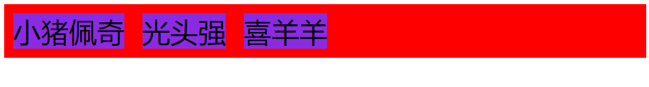
我们可以使用display:flex;以及display:inline-flex;来声明一个元素为弹性盒子。
flex的弹性盒子其实是独占一行的。相当于block块元素,默认其中的弹性元素全部变为inline-block状态。而
inline-flex的弹性盒子并非类似block块元素,而是类似于inline-block内联块级元素,默认其中的弹性元素全部变为inline-block状态。
flex盒子本身:类似于
block块元素独占一行弹性元素:全部变为
inline-block内联块级元素
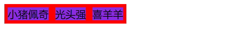
inline-flex盒子本身:类似于
inline-block内联块级元素,不会独占一行弹性元素:全部变为
inline-block内联块级元素
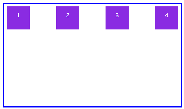
flex盒子本身,红色区域,独占一行。
盒子元素,蓝色区域,由原本的block状态变为类似于inline-block状态
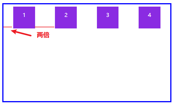
inline-flex盒子本身,红色区域,不独占一行
盒子元素,蓝色区域,由原本的block状态变为类似于inline-block状态


<!DOCTYPE html> <html lang="en"> <head> <meta charset="UTF-8"> <meta name="viewport" content="width=device-width, initial-scale=1.0"> <title>Document</title> <style> main{ /* display: flex; */ display: inline-flex; } main div{ background: blueviolet content-box; box-sizing: border-box; padding: 5px; } </style> </head> <body> <main> <div>小猪佩奇</div> <div>光头强</div> <div>喜羊羊</div> </main> </body> </html>
弹性盒子的声明
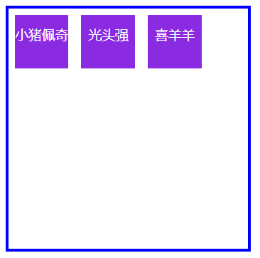
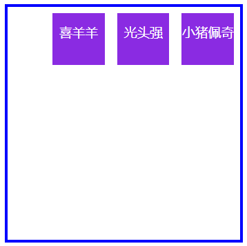
flex-direction 排列方式
我们可以在弹性盒子中设置flex-direction来控制盒子内部弹性元素的排列方式。
| 值 | 描述 |
|---|---|
| row | 从左到右水平排列元素(默认值) |
| row-reverse | 从右向左水平排列元素 |
| column | 从上到下垂直排列元素 |
| column-reverse | 从下到上垂直排列元素 |
默认值:row
从右到左水平排列:row-reverse
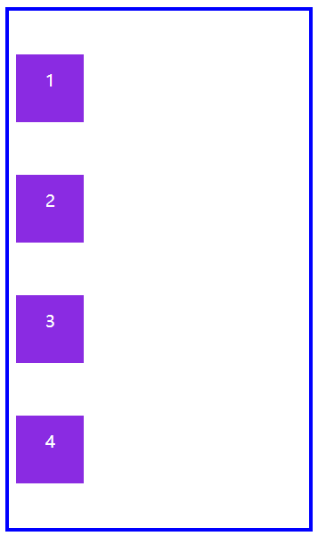
从上到下垂直排列:column
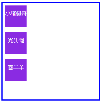
从下到上垂直排列:column-reverse
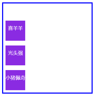
<!DOCTYPE html> <html lang="en"> <head> <meta charset="UTF-8"> <meta name="viewport" content="width=device-width, initial-scale=1.0"> <title>Document</title> <style> main{ display: flex; border: 2px solid blue; width: 180px; height: 180px; /* 注意,要在弹性盒子中使用 */ /* flex-direction: row; */ /* flex-direction: row-reverse; */ /* flex-direction: column; */ flex-direction: column-reverse; } main div{ background: blueviolet content-box; color: white; font-size: 10px; line-height: 3em; text-align: center; box-sizing: border-box; padding: 5px; width: 50px; height: 50px; } </style> </head> <body> <main> <div>小猪佩奇</div> <div>光头强</div> <div>喜羊羊</div> </main> </body> </html>
排列方式
flex-wrap 是否换行
当弹性盒子中的弹性元素太多时,我们可以使用flex-wrap来规定弹性元素是否换行显示,因为默认的话它不会进行换行,而是去挤压内部的弹性元素。
并且,我们还可以指定是否反向换行。
| 选项 | 说明 |
|---|---|
| nowrap | 元素不拆行或不拆列(默认值) |
| wrap | 容器元素在必要的时候拆行或拆列。 |
| wrap-reverse | 容器元素在必要的时候拆行或拆列,但是以相反的顺序 |
水平方向row排列与不换行nowrap(默认)
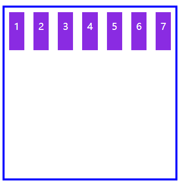
<!DOCTYPE html> <html lang="en"> <head> <meta charset="UTF-8"> <meta name="viewport" content="width=device-width, initial-scale=1.0"> <title>Document</title> <style> main{ display: flex; border: 2px solid blue; width: 180px; height: 180px; /* 注意,要在弹性盒子中使用 */ flex-direction: row; flex-wrap: nowrap; } main div{ background: blueviolet content-box; color: white; font-size: 10px; line-height: 3em; text-align: center; box-sizing: border-box; padding: 5px; width: 50px; height: 50px; } </style> </head> <body> <main> <div>1</div> <div>2</div> <div>3</div> <div>4</div> <div>5</div> <div>6</div> <div>7</div> </main> </body> </html>
水平排列不换行
水平方向row排列与换行wrap
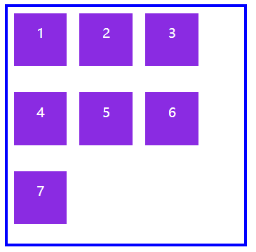
<!DOCTYPE html> <html lang="en"> <head> <meta charset="UTF-8"> <meta name="viewport" content="width=device-width, initial-scale=1.0"> <title>Document</title> <style> main{ display: flex; border: 2px solid blue; width: 180px; height: 180px; /* 注意,要在弹性盒子中使用 */ flex-direction: row; flex-wrap: wrap; } main div{ background: blueviolet content-box; color: white; font-size: 10px; line-height: 3em; text-align: center; box-sizing: border-box; padding: 5px; width: 50px; height: 50px; } </style> </head> <body> <main> <div>1</div> <div>2</div> <div>3</div> <div>4</div> <div>5</div> <div>6</div> <div>7</div> </main> </body> </html>
水平排列换行
水平方向row排列与反向换行wrap-reverse
<!DOCTYPE html> <html lang="en"> <head> <meta charset="UTF-8"> <meta name="viewport" content="width=device-width, initial-scale=1.0"> <title>Document</title> <style> main{ display: flex; border: 2px solid blue; width: 180px; height: 180px; /* 注意,要在弹性盒子中使用 */ flex-direction: row; flex-wrap: wrap-reverse; } main div{ background: blueviolet content-box; color: white; font-size: 10px; line-height: 3em; text-align: center; box-sizing: border-box; padding: 5px; width: 50px; height: 50px; } </style> </head> <body> <main> <div>1</div> <div>2</div> <div>3</div> <div>4</div> <div>5</div> <div>6</div> <div>7</div> </main> </body> </html>
水平排列反向换行
垂直方向column排列与不换行nowrap
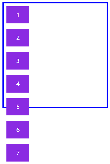
<!DOCTYPE html> <html lang="en"> <head> <meta charset="UTF-8"> <meta name="viewport" content="width=device-width, initial-scale=1.0"> <title>Document</title> <style> main{ display: flex; border: 2px solid blue; width: 180px; height: 180px; /* 注意,要在弹性盒子中使用 */ flex-direction: column; flex-wrap: nowrap; } main div{ background: blueviolet content-box; color: white; font-size: 10px; line-height: 3em; text-align: center; box-sizing: border-box; padding: 5px; width: 50px; height: 50px; } </style> </head> <body> <main> <div>1</div> <div>2</div> <div>3</div> <div>4</div> <div>5</div> <div>6</div> <div>7</div> </main> </body> </html>
垂直排列不换行
垂直方向column排列与换行wrap
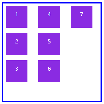
<!DOCTYPE html> <html lang="en"> <head> <meta charset="UTF-8"> <meta name="viewport" content="width=device-width, initial-scale=1.0"> <title>Document</title> <style> main{ display: flex; border: 2px solid blue; width: 180px; height: 180px; /* 注意,要在弹性盒子中使用 */ flex-direction: column; flex-wrap: wrap; } main div{ background: blueviolet content-box; color: white; font-size: 10px; line-height: 3em; text-align: center; box-sizing: border-box; padding: 5px; width: 50px; height: 50px; } </style> </head> <body> <main> <div>1</div> <div>2</div> <div>3</div> <div>4</div> <div>5</div> <div>6</div> <div>7</div> </main> </body> </html>
垂直排列换行
垂直方向column排列与反向换行wrap-reverse
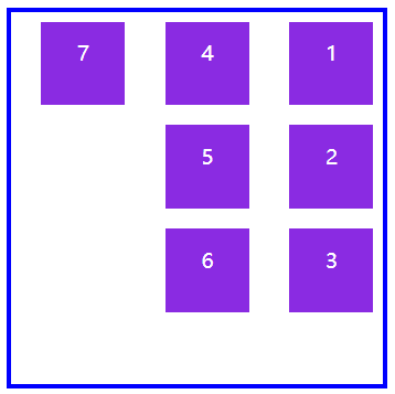
<!DOCTYPE html> <html lang="en"> <head> <meta charset="UTF-8"> <meta name="viewport" content="width=device-width, initial-scale=1.0"> <title>Document</title> <style> main{ display: flex; border: 2px solid blue; width: 180px; height: 180px; /* 注意,要在弹性盒子中使用 */ flex-direction: column; flex-wrap: wrap-reverse; } main div{ background: blueviolet content-box; color: white; font-size: 10px; line-height: 3em; text-align: center; box-sizing: border-box; padding: 5px; width: 50px; height: 50px; } </style> </head> <body> <main> <div>1</div> <div>2</div> <div>3</div> <div>4</div> <div>5</div> <div>6</div> <div>7</div> </main> </body> </html>
垂直方向反向换行
简写 flex-flow
flex-flow 是 flex-direction 与 flex-wrap 的组合简写模式,即排列方式与是否换行。
我们来尝试一下,垂直column排列与反向换行wrap-reverse
<!DOCTYPE html>
<html lang="en">
<head>
        <meta charset="UTF-8">
        <meta name="viewport" content="width=device-width, initial-scale=1.0">
        <title>Document</title>

        <style>

                main{
                           display: flex;
                        border: 2px solid blue;
                        width: 180px;
                        height: 180px;
                        /* 注意,要在弹性盒子中使用 */
                        flex-flow: column wrap-reverse;

                }
                main div{
                        background: blueviolet content-box;
                        color: white;
                        font-size: 10px;
                        line-height: 3em;
                        text-align: center;
                        box-sizing: border-box;
                        padding: 5px;
                        width: 50px;
                        height: 50px;
                }
        </style>

</head>
<body>
        <main>
                <div>1</div>
                <div>2</div>
                <div>3</div>
                <div>4</div>
                <div>5</div>
                <div>6</div>
                <div>7</div>
        </main>

</body>
</html>
垂直排列反向换行
认识轴
其实我们的弹性元素排列都是依靠轴来进行的,对于flex-flow:row wrap;来说内部弹性元素如果没换行就只有一条水平主轴,如果换行了还会增加一条垂直交叉轴。
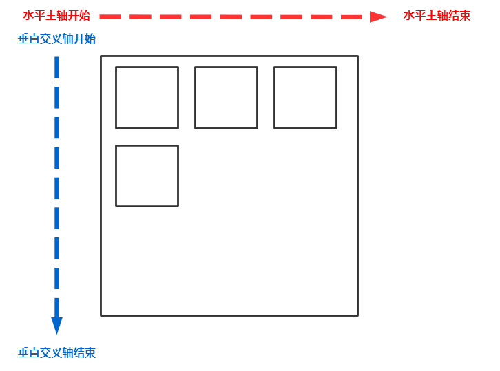
对于flex-flow:column wrap;来说内部弹性元素如果没换行就只有一条垂直主轴,如果换行了还会增加一条水平交叉轴。

这里一定要区分清楚交叉轴和主轴,它是根据弹性盒子定义的元素排列方式不同而发生变化的,并非一成不变的。如果排列方式是row-reverse或者column-reverse的话两条轴的开始和结束位置也会发生变化。
justify-content 主轴多行
该方法是用于控制弹性元素在主轴上的排列方式,一定要注意!是主轴的排列方式!
| 选项 | 说明 |
|---|---|
| flex-start | 弹性元素排列从主轴起始点开始 |
| flex-end | 弹性元素排列从主轴结束点开始 |
| center | 弹性元素排列从弹性盒子中心点开始 |
| space-between | 第一个元素靠起点,最后一个元素靠终点,余下元素平均分配空间 |
| space-around | 每个元素两侧的间隔相等,所以,项目之间的间隔比项目与边框的间隔大一倍 |
| space-evenly | 元素间距离平均分配 |
水平方向row排列,从水平主轴终点开始flex-end排列元素
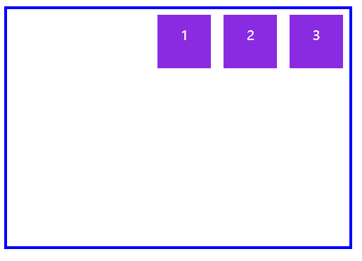
<!DOCTYPE html>
<html lang="en">
<head>
        <meta charset="UTF-8">
        <meta name="viewport" content="width=device-width, initial-scale=1.0">
        <title>Document</title>

        <style>
                body{
                        padding: 100px;
                }

                main{
                           display: flex;
                        border: 2px solid blue;
                        width: 260px;
                        height: 180px;
                        /* 注意,要在弹性盒子中使用 */
                        flex-flow: row wrap;
                        justify-content: flex-end;

                }
                main div{
                        background: blueviolet content-box;
                        color: white;
                        font-size: 10px;
                        line-height: 3em;
                        text-align: center;
                        box-sizing: border-box;
                        padding: 5px;
                        width: 50px;
                        height: 50px;
                }
        </style>

</head>
<body>
        <main>
                <div>1</div>
                <div>2</div>
                <div>3</div>
        </main>

</body>
</html>
水平主轴终点排列
水平方向row排列,从水平主轴中点开始center排列元素
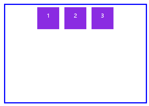
<!DOCTYPE html>
<html lang="en">
<head>
        <meta charset="UTF-8">
        <meta name="viewport" content="width=device-width, initial-scale=1.0">
        <title>Document</title>

        <style>
                body{
                        padding: 100px;
                }

                main{
                           display: flex;
                        border: 2px solid blue;
                        width: 310px;
                        height: 180px;
                        /* 注意,要在弹性盒子中使用 */
                        flex-flow: row wrap;
                        justify-content: center;

                }
                main div{
                        background: blueviolet content-box;
                        color: white;
                        font-size: 10px;
                        line-height: 3em;
                        text-align: center;
                        box-sizing: border-box;
                        padding: 5px;
                        width: 50px;
                        height: 50px;
                }
        </style>

</head>
<body>
        <main>
                <div>1</div>
                <div>2</div>
                <div>3</div>
                <div>4</div>
        </main>

</body>
</html>
水平主轴中心点排列
水平方向row排列,对水平主轴进行space-between排列划分
第一个元素靠起点,最后一个元素靠终点,余下元素平均分配空间
<!DOCTYPE html>
<html lang="en">
<head>
        <meta charset="UTF-8">
        <meta name="viewport" content="width=device-width, initial-scale=1.0">
        <title>Document</title>

        <style>
                body{
                        padding: 100px;
                }

                main{
                           display: flex;
                        border: 2px solid blue;
                        width: 310px;
                        height: 180px;
                        /* 注意,要在弹性盒子中使用 */
                        flex-flow: row wrap;
                        justify-content: space-between;

                }
                main div{
                        background: blueviolet content-box;
                        color: white;
                        font-size: 10px;
                        line-height: 3em;
                        text-align: center;
                        box-sizing: border-box;
                        padding: 5px;
                        width: 50px;
                        height: 50px;
                }
        </style>

</head>
<body>
        <main>
                <div>1</div>
                <div>2</div>
                <div>3</div>
                <div>4</div>
        </main>

</body>
</html>
水平主轴 space-between 划分
水平方向row排列,对水平主轴进行space-around排列划分
每个元素两侧的间隔相等,所以,项目之间的间隔比项目与边框的间隔大一倍
<!DOCTYPE html>
<html lang="en">
<head>
        <meta charset="UTF-8">
        <meta name="viewport" content="width=device-width, initial-scale=1.0">
        <title>Document</title>

        <style>
                body{
                        padding: 100px;
                }

                main{
                           display: flex;
                        border: 2px solid blue;
                        width: 310px;
                        height: 180px;
                        /* 注意,要在弹性盒子中使用 */
                        flex-flow: row wrap;
                        justify-content: space-around;

                }
                main div{
                        background: blueviolet content-box;
                        color: white;
                        font-size: 10px;
                        line-height: 3em;
                        text-align: center;
                        box-sizing: border-box;
                        padding: 5px;
                        width: 50px;
                        height: 50px;
                }
        </style>

</head>
<body>
        <main>
                <div>1</div>
                <div>2</div>
                <div>3</div>
                <div>4</div>
        </main>

</body>
</html>
水平主轴 space-around 划分
水平方向row排列,对水平主轴进行space-evenly排列划分
元素间距离平均分配
<!DOCTYPE html>
<html lang="en">
<head>
        <meta charset="UTF-8">
        <meta name="viewport" content="width=device-width, initial-scale=1.0">
        <title>Document</title>

        <style>
                body{
                        padding: 100px;
                }

                main{
                           display: flex;
                        border: 2px solid blue;
                        width: 310px;
                        height: 180px;
                        /* 注意,要在弹性盒子中使用 */
                        flex-flow: row wrap;
                        justify-content: space-evenly;

                }
                main div{
                        background: blueviolet content-box;
                        color: white;
                        font-size: 10px;
                        line-height: 3em;
                        text-align: center;
                        box-sizing: border-box;
                        padding: 5px;
                        width: 50px;
                        height: 50px;
                }
        </style>

</head>
<body>
        <main>
                <div>1</div>
                <div>2</div>
                <div>3</div>
                <div>4</div>
        </main>

</body>
</html>
水平主轴 space-evenly 划分
垂直方向column排列,对垂直主轴进行space-evenly排列划分
元素间距离平均分配
<!DOCTYPE html>
<html lang="en">
<head>
        <meta charset="UTF-8">
        <meta name="viewport" content="width=device-width, initial-scale=1.0">
        <title>Document</title>

        <style>
                body{
                        padding: 100px;
                }

                main{
                           display: flex;
                        border: 2px solid blue;
                        width: 180px;
                        height: 310px;
                        /* 注意,要在弹性盒子中使用 */
                        flex-flow: column wrap;
                        justify-content: space-evenly;

                }
                main div{
                        background: blueviolet content-box;
                        color: white;
                        font-size: 10px;
                        line-height: 3em;
                        text-align: center;
                        box-sizing: border-box;
                        padding: 5px;
                        width: 50px;
                        height: 50px;
                }
        </style>

</head>
<body>
        <main>
                <div>1</div>
                <div>2</div>
                <div>3</div>
                <div>4</div>
        </main>

</body>
</html>
垂直主轴 space-evenly 划分
align-items 交叉轴单行
用于控制单行弹性元素在交叉轴上的排列方式。
| 选项 | 说明 |
|---|---|
| stretch | 元素被拉伸以适应容器(默认值) |
| center | 元素位于容器的中心 |
| flex-start | 元素位于容器的交叉轴开头 |
| flex-end | 元素位于容器的交叉轴结尾 |
水平方向row排列,垂直交叉轴设置stretch拉伸元素
如果设置了
width | height | min-height | min-width | max-width | max-height,将影响stretch的结果,因为stretch优先级低于宽高设置。

<!DOCTYPE html>
<html lang="en">
<head>
        <meta charset="UTF-8">
        <meta name="viewport" content="width=device-width, initial-scale=1.0">
        <title>Document</title>

        <style>
                body{
                        padding: 100px;
                }

                main{
                           display: flex;
                        border: 2px solid blue;
                        width: 310px;
                        height: 180px;
                        /* 注意,要在弹性盒子中使用 */
                        flex-flow: row wrap;
                        /* 平均分配空间 */
                        justify-content: space-evenly;
                        /* 自动拉伸宽度以及高度,但是由于设置了宽度所以只能拉伸高度 */
                        align-items: stretch;

                }
                main div{
                        background: blueviolet content-box;
                        color: white;
                        font-size: 10px;
                        line-height: 3em;
                        text-align: center;
                        box-sizing: border-box;
                        padding: 5px;
                        width: 50px;
                        /* 取消高度设置,这会影响 align-items: stretch; 使其不生效*/
                        /* height: 50px; */
                }
        </style>

</head>
<body>
        <main>
                <div>1</div>
                <div>2</div>
                <div>3</div>
                <div>4</div>
        </main>

</body>
</html>
垂直交叉轴元素拉伸
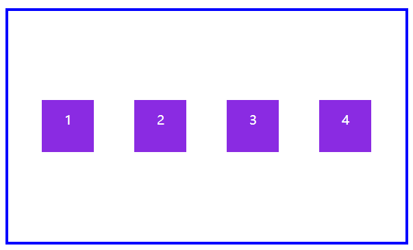
水平方向row排列,对齐到垂直交叉轴的顶部flex-start
<!DOCTYPE html>
<html lang="en">
<head>
        <meta charset="UTF-8">
        <meta name="viewport" content="width=device-width, initial-scale=1.0">
        <title>Document</title>

        <style>
                body{
                        padding: 100px;
                }

                main{
                           display: flex;
                        border: 2px solid blue;
                        width: 310px;
                        height: 180px;
                        /* 注意,要在弹性盒子中使用 */
                        flex-flow: row wrap;
                        /* 平均分配空间 */
                        justify-content: space-evenly;
                        /* 对齐到垂直交叉轴顶部*/
                        align-items: flex-start;

                }
                main div{
                        background: blueviolet content-box;
                        color: white;
                        font-size: 10px;
                        line-height: 3em;
                        text-align: center;
                        box-sizing: border-box;
                        padding: 5px;
                        width: 50px;
                        height: 50px;
                }
        </style>

</head>
<body>
        <main>
                <div>1</div>
                <div>2</div>
                <div>3</div>
                <div>4</div>
        </main>

</body>
</html>
垂直交叉轴顶部对齐
水平方向row排列,对齐到垂直交叉轴的底部flex-end
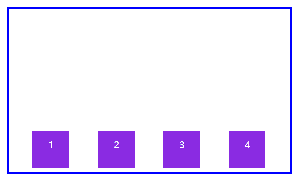
<!DOCTYPE html>
<html lang="en">
<head>
        <meta charset="UTF-8">
        <meta name="viewport" content="width=device-width, initial-scale=1.0">
        <title>Document</title>

        <style>
                body{
                        padding: 100px;
                }

                main{
                           display: flex;
                        border: 2px solid blue;
                        width: 310px;
                        height: 180px;
                        /* 注意,要在弹性盒子中使用 */
                        flex-flow: row wrap;
                        /* 平均分配空间 */
                        justify-content: space-evenly;
                        /* 对齐到垂直交叉轴底部*/
                        align-items: flex-end;

                }
                main div{
                        background: blueviolet content-box;
                        color: white;
                        font-size: 10px;
                        line-height: 3em;
                        text-align: center;
                        box-sizing: border-box;
                        padding: 5px;
                        width: 50px;
                        height: 50px;
                }
        </style>

</head>
<body>
        <main>
                <div>1</div>
                <div>2</div>
                <div>3</div>
                <div>4</div>
        </main>

</body>
</html>
垂直交叉轴底部对齐
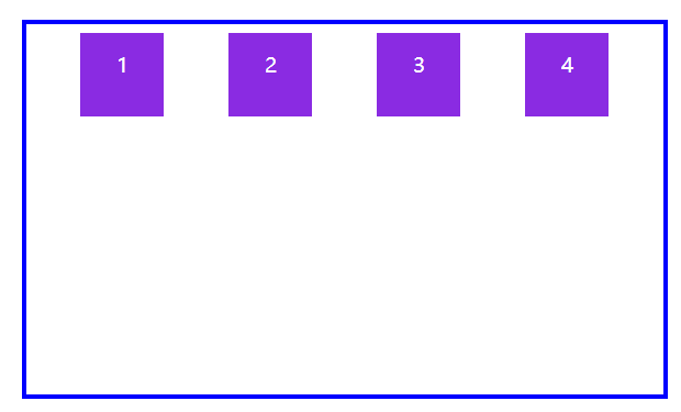
水平方向row排列,对齐到垂直交叉轴的中心点center
垂直交叉轴中心点对齐
垂直方向column排列,对齐到水平交叉轴的中心点center
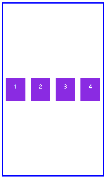
<!DOCTYPE html>
<html lang="en">
<head>
        <meta charset="UTF-8">
        <meta name="viewport" content="width=device-width, initial-scale=1.0">
        <title>Document</title>

        <style>
                body{
                        padding: 100px;
                }

                main{
                           display: flex;
                        border: 2px solid blue;
                        width: 180px;
                        height: 310px;
                        /* 注意,要在弹性盒子中使用 */
                        flex-flow: column wrap;
                        /* 平均分配空间 */
                        justify-content: space-evenly;
                        /* 对齐到水平交叉轴中心点*/
                        align-items: center;

                }
                main div{
                        background: blueviolet content-box;
                        color: white;
                        font-size: 10px;
                        line-height: 3em;
                        text-align: center;
                        box-sizing: border-box;
                        padding: 5px;
                        width: 50px;
                        height: 50px;
                }
        </style>

</head>
<body>
        <main>
                <div>1</div>
                <div>2</div>
                <div>3</div>
                <div>4</div>
        </main>

</body>
</html>
水平交叉轴中心点对齐
align-content 交叉轴多行
用于控制多行弹性元素在交叉轴上的排列方式。其实这个非常重要!
| stretch | 将空间平均分配给元素 |
|---|---|
| flex-start | 元素紧靠主轴起点 |
| flex-end | 元素紧靠主轴终点 |
| center | 元素从弹性容器中心开始 |
| space-between | 第一个元素靠起点,最后一个元素靠终点,余下元素平均分配空间 |
| space-around | 每个元素两侧的间隔相等。所以,项目之间的间隔比项目与边框的间隔大一倍 |
| space-evenly | 元素间距离平均分配 |
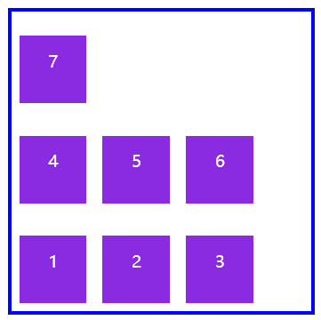
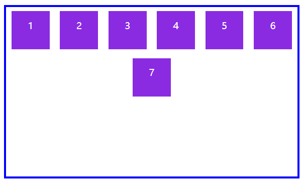
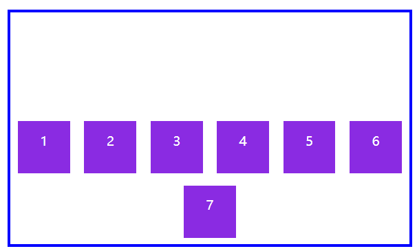
为什么说这个重要呢?比如下图如果产生多行弹性元素,那么它的排列方式就会乱掉,我们使用的是align-items,它只管一排,多出来的不会管。
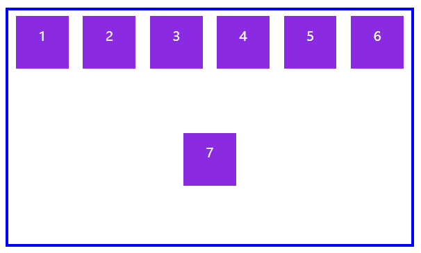
此时,我们只需要将它改为align-content即可完美解决,可以看到换行后的元素不会乱跑。
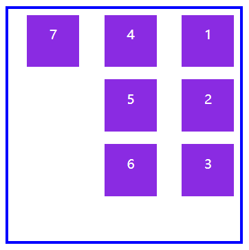
水平方向row排列,对齐到垂直交叉轴的顶部flex-start
<!DOCTYPE html>
<html lang="en">
<head>
        <meta charset="UTF-8">
        <meta name="viewport" content="width=device-width, initial-scale=1.0">
        <title>Document</title>

        <style>
                body{
                        padding: 100px;
                }

                main{
                           display: flex;
                        border: 2px solid blue;
                        width: 310px;
                        height: 180px;
                        /* 注意,要在弹性盒子中使用 */
                        flex-flow: row wrap;
                        /* 平均分配空间 */
                        justify-content: space-evenly;
                        /* 对齐到垂直交叉轴顶部*/
                        align-content: flex-start;

                }
                main div{
                        background: blueviolet content-box;
                        color: white;
                        font-size: 10px;
                        line-height: 3em;
                        text-align: center;
                        box-sizing: border-box;
                        padding: 5px;
                        width: 50px;
                        height: 50px;
                }
        </style>

</head>
<body>
        <main>
                <div>1</div>
                <div>2</div>
                <div>3</div>
                <div>4</div>
                <div>5</div>
                <div>6</div>
                <div>7</div>
        </main>

</body>
</html>
垂直交叉轴顶部对齐(多行)
水平方向row排列,对齐到垂直交叉轴的底部flex-end
<!DOCTYPE html>
<html lang="en">
<head>
        <meta charset="UTF-8">
        <meta name="viewport" content="width=device-width, initial-scale=1.0">
        <title>Document</title>

        <style>
                body{
                        padding: 100px;
                }

                main{
                           display: flex;
                        border: 2px solid blue;
                        width: 310px;
                        height: 180px;
                        /* 注意,要在弹性盒子中使用 */
                        flex-flow: row wrap;
                        /* 平均分配空间 */
                        justify-content: space-evenly;
                        /* 对齐到垂直交叉轴底部*/
                        align-content: flex-end;

                }
                main div{
                        background: blueviolet content-box;
                        color: white;
                        font-size: 10px;
                        line-height: 3em;
                        text-align: center;
                        box-sizing: border-box;
                        padding: 5px;
                        width: 50px;
                        height: 50px;
                }
        </style>

</head>
<body>
        <main>
                <div>1</div>
                <div>2</div>
                <div>3</div>
                <div>4</div>
                <div>5</div>
                <div>6</div>
                <div>7</div>
        </main>

</body>
</html>
垂直交叉轴底部对齐(多行)
水平方向row排列,对齐到垂直交叉轴的中心点center
<!DOCTYPE html>
<html lang="en">
<head>
        <meta charset="UTF-8">
        <meta name="viewport" content="width=device-width, initial-scale=1.0">
        <title>Document</title>

        <style>
                body{
                        padding: 100px;
                }

                main{
                           display: flex;
                        border: 2px solid blue;
                        width: 310px;
                        height: 180px;
                        /* 注意,要在弹性盒子中使用 */
                        flex-flow: row wrap;
                        /* 平均分配空间 */
                        justify-content: space-evenly;
                        /* 对齐到垂直交叉轴中心点*/
                        align-content: center;

                }
                main div{
                        background: blueviolet content-box;
                        color: white;
                        font-size: 10px;
                        line-height: 3em;
                        text-align: center;
                        box-sizing: border-box;
                        padding: 5px;
                        width: 50px;
                        height: 50px;
                }
        </style>

</head>
<body>
        <main>
                <div>1</div>
                <div>2</div>
                <div>3</div>
                <div>4</div>
                <div>5</div>
                <div>6</div>
                <div>7</div>
        </main>

</body>
</html>
垂直交叉轴中心点对齐(多行)
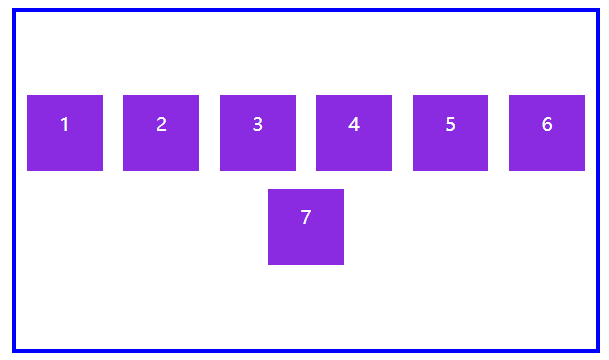
此外,还有space-between ,space-around ,space-evenly没有进行演示,可以参照一下just-content
弹性元素
放在弹性盒子中的元素即为弹性元素,它有以下三点需要注意:
弹性元素本身变为
inline-block内联块级元素不能使用
float与clear规则绝对定位的弹性元素不参与弹性布局中
其实说白了,任何脱离普通文档流的元素,都不能参与到弹性布局之中。
我们学习弹性元素前一定牢记一点,弹性盒子中的所有设置均是对其下所有的弹性元素生效,而弹性元素的所有设置则只是对自己本身生效。
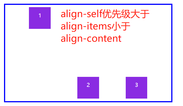
align-self 交叉轴自身
用于控制单个元素在交叉轴上的排列方式,注意区分align-items与align-content,这两个都是控制所有弹性元素,而align-self只控制自己。
注意,如果你设置了
align-content就不要设置align-self了,因为优先级比不过
| 选项 | 说明 |
|---|---|
| stretch | 将空间平均分配给元素 |
| flex-start | 元素紧靠主轴起点 |
| flex-end | 元素紧靠主轴终点 |
| center | 元素从弹性容器中心开始 |
可以看到,下图中元素1设置了align-self:flex-start;所以是依照垂直交叉轴的顶部进行排列,而元素2和3则是设置了align-self:flex-end;依照垂直交叉轴的底部进行排列。
<!DOCTYPE html>
<html lang="en">
<head>
        <meta charset="UTF-8">
        <meta name="viewport" content="width=device-width, initial-scale=1.0">
        <title>Document</title>

        <style>
                body{
                        padding: 100px;
                }

                main{
                        display: flex;
                        border: 2px solid blue;
                        width: 310px;
                        height: 180px;
                        /* 注意,要在弹性盒子中使用 */
                        flex-flow: row wrap;
                        /* 平均分配空间 */
                        justify-content: space-evenly;
                        /* 对齐到垂直交叉轴底部*/
                        align-items: flex-end;

                }

                main div:first-of-type{
                        /* 注意,要在自身弹性元素中使用 */
                        /* 对齐到垂直交叉轴顶部*/
                        align-self: flex-start;
                }

                main div{
                        background: blueviolet content-box;
                        color: white;
                        font-size: 10px;
                        line-height: 3em;
                        text-align: center;
                        box-sizing: border-box;
                        padding: 5px;
                        width: 50px;
                        height: 50px;
                }
        </style>

</head>
<body>
        <main>
                <div>1</div>
                <div>2</div>
                <div>3</div>
        </main>

</body>
</html>
单元素垂直交叉轴顶部对齐
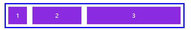
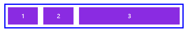
flex-grow 增加自身可用空间
用于将弹性盒子的可用空间,分配给弹性元素。可以使用整数或小数声明。
下例中为三个<div>弹性元素设置了1、3、6 ,即将总体宽度310px分成10等份,然后再按照1、3、6的比例进行分配。
盒子总宽度 / (元素1占比+元素2占比+元素3占比) * 要算的元素占比
<!DOCTYPE html>
<html lang="en">
<head>
        <meta charset="UTF-8">
        <meta name="viewport" content="width=device-width, initial-scale=1.0">
        <title>Document</title>

        <style>
                body{
                        padding: 100px;
                }

                main{
                        display: flex;
                        border: 2px solid blue;
                        width: 310px;
                        /* height: 180px; */
                        /* 注意,要在弹性盒子中使用 */
                        flex-flow: row wrap;
                        /* 平均分配空间 */
                        justify-content: space-evenly;
                        /* 对齐到垂直交叉轴顶部*/
                        align-items: flex-start;

                }

                main div:first-of-type{
                        /* 注意,要在自身弹性元素中使用 */
                        /* 十份占一份 */
                        flex-grow: 1;
                }

                main div:nth-of-type(2){
                        /* 注意,要在自身弹性元素中使用 */
                        /* 十份占三份 */
                        flex-grow: 3;
                }

                main div:last-of-type{
                        /* 注意,要在自身弹性元素中使用 */
                        /* 十份占六份 */
                        flex-grow: 6;
                }

                main div{
                        background: blueviolet content-box;
                        color: white;
                        font-size: 10px;
                        line-height: 3em;
                        text-align: center;
                        box-sizing: border-box;
                        padding: 5px;
                        /* width: 50px;
                        height: 50px; */
                }
        </style>

</head>
<body>
        <main>
                <div>1</div>
                <div>2</div>
                <div>3</div>
        </main>

</body>
</html>
可用空间分配(无宽度)
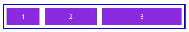
如果弹性元素设置了宽度,将把(弹性盒子-弹性元素宽度和)后按照 flex-grow 进行分配 。
<!DOCTYPE html>
<html lang="en">
<head>
        <meta charset="UTF-8">
        <meta name="viewport" content="width=device-width, initial-scale=1.0">
        <title>Document</title>

        <style>
                body{
                        padding: 100px;
                }

                main{
                        display: flex;
                        border: 2px solid blue;
                        width: 310px;
                        /* height: 180px; */
                        /* 注意,要在弹性盒子中使用 */
                        flex-flow: row wrap;
                        /* 平均分配空间 */
                        justify-content: space-evenly;
                        /* 对齐到垂直交叉轴顶部*/
                        align-items: flex-start;

                }

                main div:first-of-type{
                        /* 注意,要在自身弹性元素中使用 */
                        /* 十份占一份 */
                        flex-grow: 1;
                }

                main div:nth-of-type(2){
                        /* 注意,要在自身弹性元素中使用 */
                        /* 十份占三份 */
                        flex-grow: 3;
                }

                main div:last-of-type{
                        /* 注意,要在自身弹性元素中使用 */
                        /* 十份占六份 */
                        flex-grow: 6;
                }

                main div{
                        background: blueviolet content-box;
                        color: white;
                        font-size: 10px;
                        line-height: 3em;
                        text-align: center;
                        box-sizing: border-box;
                        padding: 5px;
                        width: 50px;
                        /* height: 50px; */
                }
        </style>

</head>
<body>
        <main>
                <div>1</div>
                <div>2</div>
                <div>3</div>
        </main>

</body>
</html>
可用空间分配(有宽度)
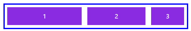
flex-shrink 缩小自身可用空间
与 flex-grow 相反 flex-shrink 是在弹性盒子装不下元素时定义的缩小值。
注意:要取消换行,才能进行缩小,否则就直接换行了。
溢出的总宽度 / (元素1宽度*元素1比例+元素2宽度*元素2比例+元素3宽度*元素3比例)*要算的元素比例*要算的元素宽度
<!DOCTYPE html>
<html lang="en">
<head>
        <meta charset="UTF-8">
        <meta name="viewport" content="width=device-width, initial-scale=1.0">
        <title>Document</title>

        <style>
                body{
                        padding: 100px;
                }

                main{
                        display: flex;
                        border: 2px solid blue;
                        width: 310px;
                        /* height: 180px; */
                        /* 注意,要在弹性盒子中使用 */
                        /* 要取消换行,才能进行缩小,否则就直接换行了。 */
                        /* flex-flow: row wrap; */
                        /* 平均分配空间 */
                        justify-content: space-evenly;
                        /* 对齐到垂直交叉轴顶部*/
                        align-items: flex-start;

                }

                main div:first-of-type{
                        /* 注意,要在自身弹性元素中使用 */
                        /* 十份占一份 */
                        flex-shrink: 1;
                }

                main div:nth-of-type(2){
                        /* 注意,要在自身弹性元素中使用 */
                        /* 十份占三份 */
                        flex-shrink: 3;
                }

                main div:last-of-type{
                        /* 注意,要在自身弹性元素中使用 */
                        /* 十份占六份 */
                        flex-shrink: 6;
                }

                main div{
                        background: blueviolet content-box;
                        color: white;
                        font-size: 10px;
                        line-height: 3em;
                        text-align: center;
                        box-sizing: border-box;
                        padding: 5px;
                        width: 150px;
                        /* height: 50px; */
                }
        </style>

</head>
<body>
        <main>
                <div>1</div>
                <div>2</div>
                <div>3</div>
        </main>

</body>
</html>
缩小可用空间
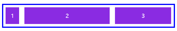
flex-basis 基准尺寸
基准尺寸指的是我们可以对单个弹性元素设置其占据主轴空间的比例,对于水平主轴来说则是设置宽度,对于垂直主轴来说则是设置高度。我们可以使用flex-basis进行设置,单位可以是%,也可以是px。
但是使用它需要注意一点,对于该项设置来说它的优先级是小于max-height以及max-width的,但是大于height和width。
<!DOCTYPE html>
<html lang="en">
<head>
        <meta charset="UTF-8">
        <meta name="viewport" content="width=device-width, initial-scale=1.0">
        <title>Document</title>

        <style>
                body{
                        padding: 100px;
                }

                main{
                        display: flex;
                        border: 2px solid blue;
                        width: 310px;
                        /* height: 180px; */
                        /* 注意,要在弹性盒子中使用 */
                        /* 平均分配空间 */
                        justify-content: space-evenly;
                        /* 对齐到垂直交叉轴顶部*/
                        align-items: flex-start;

                }

                main div:first-of-type{
                        /* 注意,要在自身弹性元素中使用 */
                        flex-basis: 20%;
                }

                main div:nth-of-type(2){
                        /* 注意,要在自身弹性元素中使用 */
                        flex-basis: 20%;
                }

                main div:last-of-type{
                        /* 注意,要在自身弹性元素中使用 */
                        flex-basis: 60%;
                }

                main div{
                        background: blueviolet content-box;
                        color: white;
                        font-size: 10px;
                        line-height: 3em;
                        text-align: center;
                        box-sizing: border-box;
                        padding: 5px;
                        width: 150px;
                }
        </style>

</head>
<body>
        <main>
                <div>1</div>
                <div>2</div>
                <div>3</div>
        </main>

</body>
</html>
基准尺寸
简写 flex
flex是flex-grow以及flex-shrink还有flex-basis的简写模式。
即:放大比例,缩小比例,主轴基准尺寸占比
<!DOCTYPE html>
<html lang="en">
<head>
        <meta charset="UTF-8">
        <meta name="viewport" content="width=device-width, initial-scale=1.0">
        <title>Document</title>

        <style>
                body{
                        padding: 100px;
                }

                main{
                        display: flex;
                        border: 2px solid blue;
                        width: 310px;
                        /* height: 180px; */
                        /* 注意,要在弹性盒子中使用 */
                        /* 要取消换行,才能进行缩小,否则就直接换行了。 */
                        /* flex-flow: row wrap; */
                        /* 平均分配空间 */
                        justify-content: space-evenly;
                        /* 对齐到垂直交叉轴顶部*/
                        align-items: flex-start;

                }

                main div:first-of-type{
                        /* 注意,要在自身弹性元素中使用 */
                        /* 放大尺寸:1 缩小尺寸0 主轴基准尺寸10% */
                        flex:1 0 10%
                }

                main div:nth-of-type(2){
                        /* 注意,要在自身弹性元素中使用 */
                        /* 放大尺寸:3 缩小尺寸1 主轴基准尺寸50% */
                        flex:3 1 50%;
                }

                main div:last-of-type{
                        /* 注意,要在自身弹性元素中使用 */
                        /* 放大尺寸:6 缩小尺寸2 主轴基准尺寸30% */
                        flex: 6 2 30%;
                }

                main div{
                        background: blueviolet content-box;
                        color: white;
                        font-size: 10px;
                        line-height: 3em;
                        text-align: center;
                        box-sizing: border-box;
                        padding: 5px;
                        /* width优先级小于flex-basis */
                        width: 150px;
                        /* height: 50px; */
                }
        </style>

</head>
<body>
        <main>
                <div>1</div>
                <div>2</div>
                <div>3</div>
        </main>

</body>
</html>
flex简写
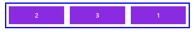
order 元素排序优先级
默认的order是0,我们可以设置order来对元素进行随心所欲的排序。
<!DOCTYPE html>
<html lang="en">
<head>
        <meta charset="UTF-8">
        <meta name="viewport" content="width=device-width, initial-scale=1.0">
        <title>Document</title>

        <style>
                body{
                        padding: 100px;
                }

                main{
                        display: flex;
                        border: 2px solid blue;
                        width: 310px;
                        /* height: 180px; */
                        /* 注意,要在弹性盒子中使用 */
                        flex-flow: row wrap;
                        /* 平均分配空间 */
                        justify-content: space-evenly;
                        /* 对齐到垂直交叉轴顶部*/
                        align-items: flex-start;

                }

                main div:first-of-type{
                        /* 注意,要在自身弹性元素中使用 */
                        order: 3;
                }

                main div:nth-of-type(2){
                        /* 注意,要在自身弹性元素中使用 */
                        order: 1;
                }

                main div:last-of-type{
                        /* 注意,要在自身弹性元素中使用 */
                        order: 2;
                }

                main div{
                        background: blueviolet content-box;
                        color: white;
                        font-size: 10px;
                        line-height: 3em;
                        text-align: center;
                        box-sizing: border-box;
                        padding: 5px;
                        width: 150px;
                }
        </style>

</head>
<body>
        <main>
                <div>1</div>
                <div>2</div>
                <div>3</div>
        </main>

</body>
</html>
元素排序优先级
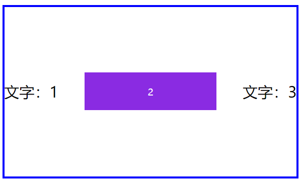
弹性文本
文本节点也在弹性布局操作范围内。即使它没有任何标签,但是在弹性布局中你仍然可以将它当做被包裹上了一套虚拟的标签。
<!DOCTYPE html>
<html lang="en">
<head>
        <meta charset="UTF-8">
        <meta name="viewport" content="width=device-width, initial-scale=1.0">
        <title>Document</title>

        <style>
                body{
                        padding: 100px;
                }

                main{
                        display: flex;
                        border: 2px solid blue;
                        width: 310px;
                        height: 180px;
                        /* 注意,要在弹性盒子中使用 */
                        flex-flow: row wrap;
                        /* 平均分配空间 */
                        justify-content: space-between;
                        /* 对齐到垂直交叉轴顶部*/
                        align-items: center;

                }

                main div{
                        background: blueviolet content-box;
                        color: white;
                        font-size: 10px;
                        box-sizing: border-box;
                        padding: 5px;
                        width: 150px;
                        height: 50px;
                        /* 弹性元素也可以是弹性盒子,这里我们将其内部的文本节点居中 */
                        display: flex;
                        align-items: center;
                        justify-content: center;
                }
        </style>

</head>
<body>
        <main>
                <!-- 文字也很听从弹性盒子定下的规则 -->
                文字:1
                <div>2</div>
                文字:3
        </main>

</body>
</html>
弹性文本
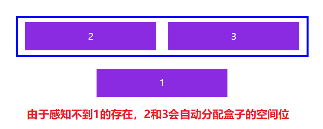
绝对定位
由于绝对定位不会留下文档流的空间位,故其他的弹性元素并不会感知它的距离存在。
一言蔽之,绝对定位的元素不参与进弹性布局中。
<!DOCTYPE html>
<html lang="en">
<head>
        <meta charset="UTF-8">
        <meta name="viewport" content="width=device-width, initial-scale=1.0">
        <title>Document</title>

        <style>
                body{
                        padding: 100px;
                }

                main{
                        display: flex;
                        border: 2px solid blue;
                        width: 310px;
                        /* height: 180px; */
                        /* 注意,要在弹性盒子中使用 */
                        /* 平均分配空间 */
                        justify-content: space-evenly;
                        /* 对齐到垂直交叉轴顶部*/
                        align-items: flex-start;
                        /* 内部绝对定位元素依照main元素为偏移参照 */
                        position: relative;

                }

                main div:first-of-type{
                        position: absolute;
                        top: 50px;
                }

                main div{
                        background: blueviolet content-box;
                        color: white;
                        font-size: 10px;
                        line-height: 3em;
                        text-align: center;
                        box-sizing: border-box;
                        padding: 5px;
                        width: 150px;
                }
        </style>

</head>
<body>
        <main>
                <div>1</div>
                <div>2</div>
                <div>3</div>
        </main>

</body>
</html>
绝对定位
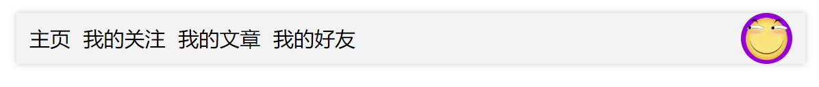
自动空间
在弹性布局中,对弹性元素使用margin-right:auto;等形式可以自动撑开余下的空间。如下这个案例,我们是水平排列方式,要将滑稽头像放在最右边,但是对于滑稽这个弹性元素来说没有那种能够将自己放在水平主轴结束位置的选项。
所以我们可以对左边的<ul>弹性元素使用margin-right:auto;来进行自动将右边撑开
<!DOCTYPE html>
<html lang="en">
<head>
        <meta charset="UTF-8">
        <meta name="viewport" content="width=device-width, initial-scale=1.0">
        <title>Document</title>
        <style>
                *{
                        margin: 0;
                        padding: 0;
                }

                ul{
                        list-style-type: none;
                }


                header{
                        width: 60%;
                        margin: 0 auto;
                        display: flex;
                        box-shadow: 0 0 5px rgba(0, 0, 0, .2);
                        background: #f3f3f3;
                        margin-top:20px ;
                        flex-direction: row;
                        justify-content: flex-start;
                        align-items: center;

                }

                header ul{
                        display: flex;
                        justify-content: space-between;
                        align-content: center;

                        /* 自动撑开 */
                        margin-right: auto;

                }

                header ul li{
                        margin-left: 10px;
                }

                img{
                        width: 40px;
                        background-color:darkviolet;
                        border-radius: 50%;
                        margin-right: 10px;

                }


        </style>
</head>
<body>
        <header>
                <ul>
                        <li>主页</li>
                        <li>我的关注</li>
                        <li>我的文章</li>
                        <li>我的好友</li>
                </ul>
                <img src="./huaji.png" alt="">
        </header>

</body>
</html>
自动空间
我们也可以对<header>的水平主轴进行justify-content:space-between;的设置,让这两个弹性元素一个在水平主轴开始位置,一个在水平主轴结束位置。
<!DOCTYPE html>
<html lang="en">
<head>
        <meta charset="UTF-8">
        <meta name="viewport" content="width=device-width, initial-scale=1.0">
        <title>Document</title>
        <style>
                *{
                        margin: 0;
                        padding: 0;
                }

                ul{
                        list-style-type: none;
                }


                header{
                        width: 60%;
                        margin: 0 auto;
                        display: flex;
                        box-shadow: 0 0 5px rgba(0, 0, 0, .2);
                        background: #f3f3f3;
                        margin-top:20px ;
                        flex-direction: row;
                        /* 一个在开始位置,一个在结束位置 */
                        justify-content: space-between;
                        align-items: center;

                }

                header ul{
                        display: flex;
                        justify-content: space-between;
                        align-content: center;

                }

                header ul li{
                        margin-left: 10px;
                }

                img{
                        width: 40px;
                        background-color:darkviolet;
                        border-radius: 50%;
                        margin-right: 10px;

                }


        </style>
</head>
<body>
        <header>
                <ul>
                        <li>主页</li>
                        <li>我的关注</li>
                        <li>我的文章</li>
                        <li>我的好友</li>
                </ul>
                <img src="./huaji.png" alt="">
        </header>

</body>
</html>
space-between
微信布局
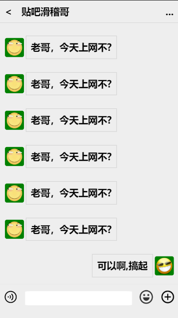
<!DOCTYPE html> <html lang="en"> <head> <meta charset="UTF-8"> <meta name="viewport" content="width=device-width, initial-scale=1.0"> <title>Document</title> <style> * { margin: 0; padding: 0; font-size: 20px; font-weight: 550; } ul{ list-style: none; } body{ height: 100vh; width: 100vw; display: flex; flex-direction: column; justify-content: space-between; } header{ background-color: #eee; display: flex; justify-content: flex-start; border-bottom: #ccc 1px solid; align-items: center; } header span{ padding: 10px; } header :nth-child(2){ margin-right:auto; } main{ /* 内容区自动撑开 */ background-color: #eee; flex: 1; display: flex; flex-direction: column; overflow: auto; } main ul{ display: flex; flex-direction: column; height: 100%; } main ul li{ margin:10px; display: flex; align-items: center; } main ul li:last-of-type{ align-self: flex-end; } main ul li span{ margin: 4px; padding: .5em; border: 1px solid #ccc; } main ul li img{ width: 40px; background-color: green; border-radius: 10%; } footer{ display: flex; align-items: center; justify-content: space-around; border-top: 1px solid #ddd; height: 3em; padding-bottom: .6em; background-color: #eee; } footer section img{ width: 30px; } footer section:nth-of-type(2){ background-color:#fff; border-radius: 5%; flex-basis: 60%; height: 30px; } </style> </head> <body> <header> <span><</span> <span>贴吧滑稽哥</span> <span>...</span> </header> <main> <ul> <li><img src="./huaji.png" alt=""><span>老哥,今天上网不?</span></li> <li><img src="./huaji.png" alt=""><span>老哥,今天上网不?</span></li> <li><img src="./huaji.png" alt=""><span>老哥,今天上网不?</span></li> <li><img src="./huaji.png" alt=""><span>老哥,今天上网不?</span></li> <li><img src="./huaji.png" alt=""><span>老哥,今天上网不?</span></li> <li><img src="./huaji.png" alt=""><span>老哥,今天上网不?</span></li> <li><img src="./huaji.png" alt=""><span>老哥,今天上网不?</span></li> <li><img src="./huaji.png" alt=""><span>老哥,今天上网不?</span></li> <li><img src="./huaji.png" alt=""><span>老哥,今天上网不?</span></li> <li><img src="./huaji.png" alt=""><span>老哥,今天上网不?</span></li> <li><img src="./huaji.png" alt=""><span>老哥,今天上网不?</span></li> <li><img src="./huaji.png" alt=""><span>老哥,今天上网不?</span></li> <li><img src="./huaji.png" alt=""><span>老哥,今天上网不?</span></li> <li><span>可以啊,搞起</span><img src="./mjg.png" alt=""></li> </ul> </main> <footer> <section><img src="./语音.png" alt=""></section> <section></section> <section><img src="./表情.png" alt=""></section> <section><img src="./加号.png" alt=""></section> </footer> </body> </html>
微信布局


