020_CSS3
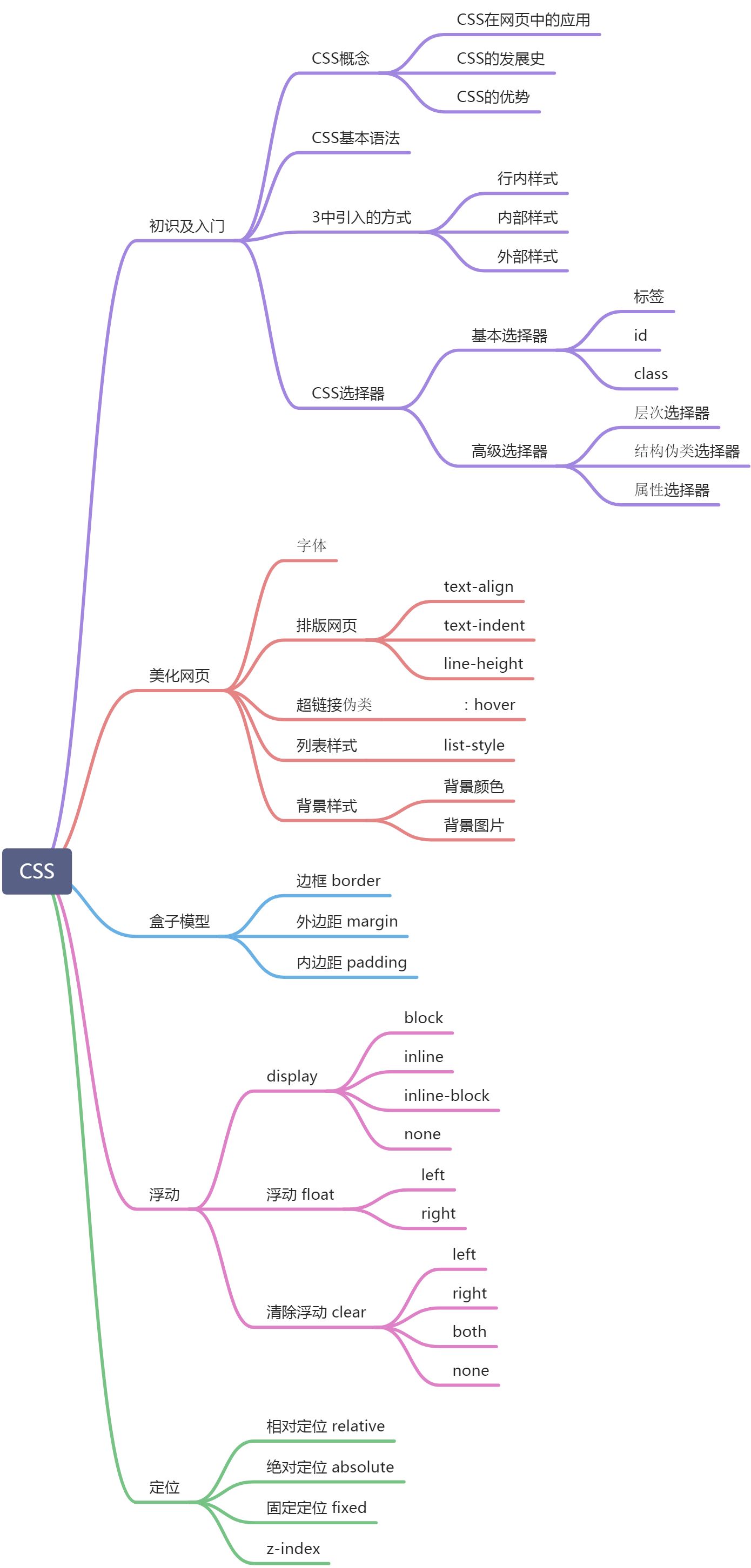
目錄
如何學習CSS
什麼是CSS
發展史
快速入門
- 第一種方式:style標籤中寫css程式碼;
<!DOCTYPE html>
<html lang="en">
<head>
    <meta charset="UTF-8">
    <title>Title</title>
    <!--規範,<style>可以編寫css程式碼,每一個聲明,最好使用分號結尾
        語法:
            選擇器{
                聲明1;
                聲明2;
                聲明3;
            }
    -->
    <style>
        h1{
            color:red;
        }
    </style>
</head>
<body>
<h1>武俠世界</h1>
</body>
</html>
- 第二種方式:寫css文件,HTML頁面引入css文件;(建議使用)
<!DOCTYPE html>
<html lang="en">
<head>
    <meta charset="UTF-8">
    <title>Title</title>
    <link rel="stylesheet" href="css/style.css">
</head>
<body>
<h1>武俠世界</h1>
</body>
</html>
h1{
    color:red;
}
css的優勢
三種CSS導入方式
- 行內樣式
- 內部樣式
- 外部樣式
- 優先順序:就近原則,行內樣式最優先,內部樣式和外部樣式看誰近
<!DOCTYPE html>
<html lang="en">
<head>
    <meta charset="UTF-8">
    <title>Title</title>
    <!--外部樣式-->
    <link rel="stylesheet" href="css/style.css">
    <!--內部樣式-->
    <style>
        h1{
            color: antiquewhite;
        }
    </style>
</head>
<body>
<!--優先順序:就近原則,行內樣式最優先,內部樣式和外部樣式看誰近-->
<!--行內樣式-->
<h1 style="color: aqua">武俠世界</h1>
</body>
</html>
h1{
    color:red;
}
拓展:外部樣式兩種寫法
- 鏈接式
<!--外部樣式-->
<link rel="stylesheet" href="css/style.css">
- 導入式:@import是CSS2.1特有的
<!--導入式-->
<style>
    @import url("css/style.css");
</style>
選擇器
基本選擇器
- 標籤選擇器:選擇同一類型的標籤 標籤{}
- 類選擇器:選擇同一class屬性的標籤 .class名{}
- id選擇器:全局唯一 #id名{}
- 優先順序:id選擇器>類選擇器>標籤選擇器
<!DOCTYPE html>
<html lang="en">
<head>
    <meta charset="UTF-8">
    <title>1.標籤選擇器</title>
    <style>
        /*標籤選擇器,會選擇頁面上所有的這個標籤的元素*/
        h1{
            background: aqua;
            border-radius: 25px;
        }
        p{
            color: red;
            font-size: 80px;
        }
    </style>
</head>
<body>
<h1>武俠世界</h1>
<h1>武俠世界</h1>
<p>流星蝴蝶劍</p>
</body>
</html>
<!DOCTYPE html>
<html lang="en">
<head>
    <meta charset="UTF-8">
    <title>2.類選擇器</title>
    <style>
        /*類選擇器的格式:.class的名稱{}
        好處:可以多個標籤歸類,使用同一個class,可以復用
        */
        .one{
            color: antiquewhite;
        }
        .two{
            color: aqua;
        }
    </style>
</head>
<body>
<h1 class="one">九陽真經</h1>
<h1 class="two">九陰真經</h1>
<h1 class="one">太極拳</h1>

<p class="two">降龍十八掌</p>
</body>
</html>
<!DOCTYPE html>
<html lang="en">
<head>
    <meta charset="UTF-8">
    <title>3.id選擇器</title>
    <style>
        /*id選擇器,全局唯一*/
        #one{
            color: antiquewhite;
        }
    </style>
</head>
<body>
<h1 id="one">九陽真經</h1>
</body>
</html>
層次選擇器
- 後代選擇器 body p{}
- 子選擇器 body>p{}
- 相鄰弟選擇器:只有一個,相鄰向下 .active+p{}
- 通用弟選擇器,向下的所有兄弟元素 .active~p{}
<!DOCTYPE html>
<html lang="en">
<head>
    <meta charset="UTF-8">
    <title>4.層次選擇器</title>
    <style>
        /*後代選擇器:包括所有後代,子,孫……*/
        body p{
            background: #cf8ab1;
        }
    </style>
</head>
<body>
    <p>p1</p>
    <p>p2</p>
    <p>p3</p>
    <ul>
        <li>
            <p>p4</p>
        </li>
        <li>
            <p>p5</p>
        </li>
        <li>
            <p>p6</p>
        </li>
    </ul>
</body>
</html>

<!DOCTYPE html>
<html lang="en">
<head>
    <meta charset="UTF-8">
    <title>4.層次選擇器</title>
    <style>
        /*後代選擇器:包括所有後代,子,孫……*/
        /*body p{*/
            /*background: #cf8ab1;*/
        /*}*/
        /*子選擇器*/
        body>p{
            background: #cf8ab1;
        }
    </style>
</head>
<body>
    <p>p1</p>
    <p>p2</p>
    <p>p3</p>
    <ul>
        <li>
            <p>p4</p>
        </li>
        <li>
            <p>p5</p>
        </li>
        <li>
            <p>p6</p>
        </li>
    </ul>
</body>
</html>

<!DOCTYPE html>
<html lang="en">
<head>
    <meta charset="UTF-8">
    <title>4.層次選擇器</title>
    <style>
        /*後代選擇器:包括所有後代,子,孫……*/
        /*body p{*/
            /*background: #cf8ab1;*/
        /*}*/
        /*子選擇器*/
        /*body>p{*/
            /*background: #cf8ab1;*/
        /*}*/
        /*相鄰弟選擇器,只有一個,並且相鄰向下*/
        .active+p{
            background: #cf8ab1;
        }
    </style>
</head>
<body>
    <p>p1</p>
    <p class="active">p2</p>
    <p>p3</p>
    <ul>
        <li>
            <p>p4</p>
        </li>
        <li>
            <p>p5</p>
        </li>
        <li>
            <p>p6</p>
        </li>
    </ul>
</body>
</html>

<!DOCTYPE html>
<html lang="en">
<head>
    <meta charset="UTF-8">
    <title>4.層次選擇器</title>
    <style>
        /*後代選擇器:包括所有後代,子,孫……*/
        /*body p{*/
            /*background: #cf8ab1;*/
        /*}*/
        /*子選擇器*/
        /*body>p{*/
            /*background: #cf8ab1;*/
        /*}*/
        /*相鄰弟選擇器,只有一個,並且相鄰向下*/
        /*.active+p{*/
            /*background: #cf8ab1;*/
        /*}*/
        /*通用弟選擇器,向下的所有兄弟元素*/
        .active~p{
            background: #cf8ab1;
        }
    </style>
</head>
<body>
    <p>p1</p>
    <p class="active">p2</p>
    <p>p3</p>
    <p>p4</p>
    <p>p5</p>
    <ul>
        <li>
            <p>p4</p>
        </li>
        <li>
            <p>p5</p>
        </li>
        <li>
            <p>p6</p>
        </li>
    </ul>
    <p>p6</p>
    <p>p7</p>
</body>
</html>

結構偽類選擇器
<!DOCTYPE html>
<html lang="en">
<head>
    <meta charset="UTF-8">
    <title>5.結構偽類選擇器</title>
    <style>
        /*ul的第一個子元素*/
        ul li:first-child{
            background: #cf8ab1;
        }
        /*ul的最後一個子元素*/
        ul li:last-child{
            background: aqua;
        }
        /*選擇當前p元素的父級元素的第一個子元素,並且是p元素才生效*/
        p:nth-child(1){
            background: antiquewhite;
        }
        p:nth-child(2){
            background: antiquewhite;
        }
        /*選擇當前p元素的父級元素的第二個p子元素*/
        p:nth-of-type(2){
            background: aquamarine;
        }
        /*滑鼠懸停效果*/
        a:hover{
            background: black;
        }
    </style>
</head>
<body>
    <h1>h1</h1>
    <p>p1</p>
    <p>p2</p>
    <p>p3</p>
    <p>p4</p>
    <p>p5</p>
    <ul>
        <li>li1</li>
        <li>li2</li>
        <li>li3</li>
    </ul>
    <p>p6</p>
    <p>p7</p>
    <a href="">a標籤</a>
</body>
</html>

屬性選擇器
- “value 是完整單詞” 類型的比較符號: ~=, |=
- “拼接字元串” 類型的比較符號: *=, ^=, $=
- [attribute~=value] 屬性中包含獨立的單詞為 value
- [attribute*=value] 屬性中做字元串拆分,只要能拆出來 value 這個詞就行
- [attribute|=value] 屬性中必須是完整且唯一的單詞,或者以 – 分隔開
- attribute^=value] 屬性的前幾個字母是 value 就可以
- [attribute$=value] 屬性的後幾個字母是 value 就可以
<!DOCTYPE html>
<html lang="en">
<head>
    <meta charset="UTF-8">
    <title>6.屬性選擇器</title>
    <style>
        .demo a{
            display: block;
            float: left;
            width: 50px;
            height: 50px;
            background: #cf8ab1;
            border-radius: 10px;
            margin-right: 10px;
            text-align: center;
            line-height: 50px;
            text-decoration: none;
            font-size: 20px;
        }

        /*存在id屬性的元素*/
        a[id]{
            background: red;
        }
        /*id屬性值=first的元素*/
        a[id=first]{
            background: orange;
        }
        /*class屬性值包含links的元素*/
        a[class*=links]{
            background: yellow;
        }
        /*href屬性中以http開頭的元素*/
        a[href^=http]{
            background: green;
        }
    </style>
</head>
<body>
<p class="demo">
    <a href="//www.baidu.com" class="links item first" id="first">1</a>
    <a href="" class="links item active" target="_blank" title="two">2</a>
    <a href="images/1.html" class="links item" id="three">3</a>
    <a href="images/1.png" class="links item">4</a>
    <a href="images/1.jpg" class="links item">5</a>
    <a href="abc" class="links item">6</a>
    <a href="/a.pdf" class="links item">7</a>
    <a href="/b.pdf">8</a>
</p>
</body>
</html>

美化網頁元素
為什麼要美化網頁
span標籤:需要重點突出的文字,使用span套起來,單獨設置樣式
字體樣式
<!DOCTYPE html>
<html lang="en">
<head>
    <meta charset="UTF-8">
    <title>Title</title>
    <style>
        /*
        font-family: 字體
        font-size: 字體大小
        font-weight: 字體粗細
        color: 字體顏色
        */
        body{
            font-family: "Ebrima",楷體;
            color: darkkhaki;
        }
        h1{
            font-size: 50px;
        }
        .p1{
            font-weight: bolder;
        }
    </style>
</head>
<body>
<h1>武俠 (武俠文化)</h1>
<p class="p1">武俠是華人界特有的一種流行文化。武俠文化以各式俠客為主角,以神乎其神的武術技巧為特點,刻畫宣揚俠客精神。</p>
<p>武俠與儒家在文化上有一定的聯繫。武俠按時間分有古代和民國武俠,按流派分有新、舊以及古仙武俠,武俠作者有20世紀的金庸、古龍、梁羽生、溫瑞安等,當代的以及其他時期的作家。</p>
<p>Whenever you need me, I'll be here。 Whenever you're in trouble, I'm always near。Whenever you feel alone, and you think everyone has given up。。。Reach out for me, and I will give you my everlasting love。</p>
</body>
</html>

文本樣式
- 顏色
- 文本對齊方式
- 首行縮進
- 行高
- 裝飾
<!DOCTYPE html>
<html lang="en">
<head>
    <meta charset="UTF-8">
    <title>Title</title>
    <style>
        /*
        rgba 顏色:紅(0-255)綠,藍,透明度(0-1)
        text-align 排版;居中,靠左,靠右
        text-indent 段落首行縮進
        line-height 行高和塊的高度一致,就可以垂直居中
        text-decoration 下劃線,中劃線,上劃線
        */
        h1{
            color: rgba(255,0,255,0.8);
            text-align: center;
        }
        .p1{
            text-indent: 2em;
            height: 50px;
            background: darkkhaki;
            line-height: 50px;
            text-decoration: underline;
        }
    </style>
</head>
<body>
<h1>武俠 (武俠文化)</h1>
<p class="p1">武俠是華人界特有的一種流行文化。武俠文化以各式俠客為主角,以神乎其神的武術技巧為特點,刻畫宣揚俠客精神。</p>
<p>武俠與儒家在文化上有一定的聯繫。武俠按時間分有古代和民國武俠,按流派分有新、舊以及古仙武俠,武俠作者有20世紀的金庸、古龍、梁羽生、溫瑞安等,當代的以及其他時期的作家。</p>
<p>Whenever you need me, I'll be here。 Whenever you're in trouble, I'm always near。Whenever you feel alone, and you think everyone has given up。。。Reach out for me, and I will give you my everlasting love。</p>
</body>
</html>

超鏈接偽類和陰影
/*默認的顏色*/
a{
    text-decoration: none;
    color: #000;
}
/*滑鼠懸浮*/
a:hover{
    color:orange;
    font-size: 50px;
}

/*text-shadow: 陰影顏色,水平偏移,垂直偏移,陰影半徑*/
#price{
    text-shadow: #3cc7f5 10px -10px 2px;
}
列表樣式
<!DOCTYPE html>
<html lang="en">
<head>
<meta charset="UTF-8">
<title>3.列表</title>
<link rel="stylesheet" href="css/style.css">
</head>
<body>
<div id="nav">
<h2 class="title">全部商品分類</h2>
<ul>
<li><a href="#">圖書</a> <a href="#">音像</a></li>
<li><a href="#">家用電器</a> <a href="#">手機</a></li>
<li><a href="#">電腦</a> <a href="#">辦公</a></li>
<li><a href="#">家居</a> <a href="#">家裝</a></li>
<li><a href="#">服飾鞋帽</a> <a href="#">個護化妝</a></li>
</ul>
</div>
</body>
</html>
#nav{
    background: rgba(52, 19, 39, 0.57);
    width: 300px;
}
.title{
    text-indent: 1em;
    background: red;
    font-size: 24px;
    font-weight: bold;
    line-height: 35px;
}
ul li{
    height: 30px;
    list-style: none;
    text-indent: 1em;
}
a{
    text-decoration: none;
    color: #000;
}
a:hover{
    color: aqua;
}
背景
- 背景顏色
- 背景圖片
<!DOCTYPE html>
<html lang="en">
<head>
    <meta charset="UTF-8">
    <title>4.背景</title>
    <style>
        div{
            width: 1000px;
            height: 700px;
            border: 1px solid red;
            /*默認平鋪*/
            background-image: url("images/1.jpg");
        }
        .div1{
            background-repeat: repeat-x;
        }
        .div2{
            background-repeat: repeat-y;
        }
        .div3{
            background-repeat: no-repeat;
        }
    </style>
</head>
<body>
<div class="div1"></div>
<div class="div2"></div>
<div class="div3"></div>
</body>
</html>
/*顏色 圖片 圖片位置 平鋪方式*/
background: red url("../images/d.gif") 270px 10px no-repeat;

background-image: url("../images/r.gif");
background-repeat: no-repeat;
background-position: 236px 2px;

漸變
//www.grabient.com/
調整效果後,複製,可以拷貝出css程式碼
background-color: #4158D0;
background-image: linear-gradient(43deg, #4158D0 0%, #C850C0 46%, #FFCC70 100%);

盒子模型
什麼是盒子模型

邊框
/*去除所有的外邊距和內邊距*/
body,h1,ul,li,a{
    margin: 0;
    padding: 0;
}
/*boder: 粗細 樣式 顏色*/
#box{
    border: 1px solid red;
}
內外邊距
/*外邊距設置居中*/
#box{
    margin: 0 auto;
}
圓角邊框
div{
  border-radius: 10px;
}
/*圓角邊框生成圓形圖片*/
img{
  border-radius: 25px;
}

<img src="images/1.jpg" alt="">

陰影
/*文字陰影*/
/*text-shadow: 陰影顏色,水平偏移,垂直偏移,陰影半徑*/
#price{
    text-shadow: #3cc7f5 10px -10px 2px;
}

/*盒子陰影*/
/*box-shadow: 陰影顏色,水平偏移,垂直偏移,陰影半徑*/
#box{
    box-shadow: #3cc7f5 10px -10px 2px;
}
浮動
display
/*
block 塊元素
inline 行內元素
inline-block 是塊元素,但是在一行
none 隱藏
*/
div{
  width: 100px;
  height: 100px;
  border: 1px solid red;
  display: inline;
}
span{
  width: 100px;
  height: 100px;
  border: 1px solid red;
  display: inline-block;
}
div{
  width: 100px;
  height: 100px;
  border: 1px solid red;
  display: none;
}
float
/*
float: left 左浮
float: right 右浮
clear: right; 右側不允許有浮動元素
clear: left; 左側不允許有浮動元素
clear: both; 兩側不允許有浮動元素
clear: none; 允許有浮動元素
*/
.layer01{
  float: left;
}
.layer01{
  float: right;
}
父級邊框塌陷的問題
解決方案:
- 增加父級元素的高度
#father{
  border: 1px solid #000;
  height: 800px;
}
- 增加一個空的div標籤,清除浮動
.clear{
  clear: both;
  margin: 0;
  padding: 0;
}

<div class="clear"></div>
- 父級元素中添加 overflow: hidden;
#father{
  border: 1px solid #000;
  overflow: hidden;
}
- 父級元素中添加偽類 after
#father{
  border: 1px solid #000;
}
#father:after{
  content: '';
  display: block;
  clear: both;
}
定位
相對定位-相對於自己原來的位置進行偏移
- 原來的位置會被保留
- position: relative;
- top: -10px;
- bottom: 20px;
- left: 30px;
- right: -40px;
<div id="father">
  <div id="first">第一個盒子</div>
  <div id="second">第二個盒子</div>
  <div id="third">第三個盒子</div>
</div>
body{
  padding: 20px;
}
div{
  margin: 10px;
  padding: 5px;
  font-size: 12px;
  line-height: 25px;
}
#father{
  border: 1px solid #666;
  padding: 0;
}
#first{
  border: 1px dashed #666;
  background-color: red;
  /*相對定位*/
  position: relative;
  top: -10px;
  left: 20px;
}
#second{
  border: 1px dashed #666;
  background-color: green;
}
#third{
  border: 1px dashed #666;
  background-color: blue;
}
絕對定位-相對於父級或瀏覽器進行偏移
- 原來的位置不會被保留
- 沒有父級元素定位的前提下,相對於瀏覽器定位
- 假設父級元素存在定位,通常會相對於父級元素進行偏移
- 在父級元素範圍內移動
- 父級元素:position: relative;
- 子級元素:
- position: absolute;
- top: 10px;
- bottom: 10px;
- left: 10px;
- right: 10px;
<div id="father">
  <div id="first">第一個盒子</div>
  <div id="second">第二個盒子</div>
  <div id="third">第三個盒子</div>
</div>
body{
  padding: 20px;
}
div{
  margin: 10px;
  padding: 5px;
  font-size: 12px;
  line-height: 25px;
}
#father{
  border: 1px solid #666;
  padding: 0;
  /*沒有時,子元素相對瀏覽器定位;有時,子元素相對父級元素定位*/
  position: relative;
}
#first{
  border: 1px dashed #666;
  background-color: red;
  /*絕對定位*/
  position: absolute;
  top: 30px;
  left: 20px;
}
#second{
  border: 1px dashed #666;
  background-color: green;
}
#third{
  border: 1px dashed #666;
  background-color: blue;
}
固定定位-fixed
- position: fixed;
- top: -10px;
- bottom: 20px;
- left: 30px;
- right: -40px;
<div id="father">
  <div id="first">第一個盒子</div>
  <div id="second">第二個盒子</div>
  <div id="third">第三個盒子</div>
</div>
body{
  padding: 20px;
}
div{
  margin: 10px;
  padding: 5px;
  font-size: 12px;
  line-height: 25px;
}
#father{
  border: 1px solid #666;
  padding: 0;
}
#first{
  border: 1px dashed #666;
  background-color: red;
  /*固定定位*/
  position: fixed;
  bottom: 10px;
  right: 0;
}
#second{
  border: 1px dashed #666;
  background-color: green;
}
#third{
  border: 1px dashed #666;
  background-color: blue;
}
z-index
/*z-index 默認是0,最高無限*/
z-index: 999;
/*背景透明度*/
opacity: 0.5;
CSS3動畫
總結