CSS動畫實例:移動的眼珠子
- 2020 年 8 月 21 日
- 筆記
- JavaScript程式設計
適當地利用CSS的box-shadow可以構造圖形,然後可以對構造的圖形添加動畫效果。下面我們通過移動的眼珠子、圓珠一二三、一分為四、四小圓旋轉擴散等實例來體會box-shadow屬性在動畫製作中的使用方法。
box-shadow屬性的基本格式為:
box-shadow: h-shadow v-shadow blur spread color inset;
其中,屬性值h-shadow為必需,表示水平陰影的位置,它允許負值;v-shadow也為必需,表示垂直陰影的位置,也允許負值:blur可選,表示模糊距離;spread可選,給定陰影的尺寸;color可選,表示陰影的顏色;inset 可選,表示將外部陰影 (outset) 改為內部陰影。
1.移動的眼珠子
設頁面中有<div class=”shape”></div>,若為. shape設置樣式規則如下:
.shape
{
width: 96px;
height: 64px;
border-radius: 50%;
background:#FFFAFA;
box-shadow: -105px 0 0 0px #FFFAFA;
position: relative;
margin-left:105px;
}
可在頁面中顯示如圖1所示的圖形,這兩個橢圓中前面的一個是由box-shadow屬性設置的。

圖1 兩個橢圓
再定義樣式. Shape:after如下:
.shape:after
{
content: “”;
width: 0;
height: 0;
border-radius: 50%;
left: 35%;
top: 30%;
position: absolute;
border:12px solid #000;
box-shadow: -102px 0 0 0 #000;
}
為表示眼珠的橢圓中加上兩個黑點,可在頁面中顯示如圖2所示的圖形。

圖2 兩顆眼珠子
為眼珠子中的黑點定義關鍵幀,使得它移動起來。編寫的HTML文件內容如下。


<!DOCTYPE html>
<html>
<head>
<title>移動的眼珠子</title>
<style>
  .container
  {
    margin: 0 auto;
    width: 300px;
    height:300px;
    position: relative;
    display:flex;
    justify-content:center;
    align-items:center;
    background:#d8d8d8;
    border: 4px solid rgba(255, 0, 0, 0.9);
    border-radius: 10%;
  }
  .shape
  {
    width: 96px;
    height: 64px;
    border-radius: 50%;
    background:#FFFAFA;
    box-shadow: -105px 0 0 0px #FFFAFA;
    position: relative;
    margin-left:105px;
  }
  .shape:after
  {
    content: "";
    width: 0;
    height: 0;
    border-radius: 50%;
    left: 35%;
    top: 30%;
    position: absolute;
    border:12px solid #000;
    box-shadow: -102px 0 0 0 #000;
    animation: move 0.8s linear infinite alternate;
  }
  @keyframes move
  {
    0%   { left: 0; }
    100% { left: 55px; }
  }
</style>
</head>
<body>
<div  class="container">
    <div class="shape"></div>
</div>
</body>
</html>
View Code
在瀏覽器中打開包含這段HTML程式碼的html文件,可以呈現出如圖3所示的動畫效果。
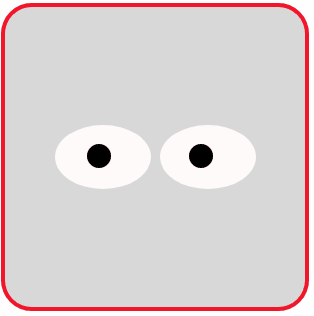
圖3 移動的眼珠子(雙眼)
為實現眼珠子移動動畫效果,還可以編寫如下的HTML文件。
<!DOCTYPE html>
<html>
<head>
<title>移動的眼珠子</title>
<style>
  .container
  {
    margin: 0 auto;
    width: 300px;
    height:300px;
    position: relative;
    display:flex;
    justify-content:center;
    align-items:center;
    background:#d8d8d8;
    border: 4px solid rgba(255, 0, 0, 0.9);
    border-radius: 10%;
  }
  .shape
  {
    position: relative;
    animation: 2s anim1 infinite;
  }
  .shape:before
  {
    content: '';
    display: block;
    overflow:hidden;
    width: 120px;
    height: 120px;
    border-radius: 80% 20%;
    background:#fff;
    border: 3px solid currentcolor;
    border-width: 3px 1.5px 1.5px 3px;
    transform: rotate(45deg);
  }
  .shape:after
  {
    content: '';
    display: block;
    width:30px;
    height: 30px;
    position: absolute;
    background: #000;
    top: 40px;
    left: 60%;
    border-radius: 50%;
    box-shadow: -4px 4px 0 10px #191970;
    animation: 2s anim2 linear infinite;
  }
  @keyframes anim1
  {
    0%, 30%, 100% { transform: scaleY(1); }
    10%     { transform: scaleY(0); }
  }
  @keyframes anim2
  {
    0%, 100% { left:60%; }
    30%      { left:10%; }
    50%      { left:80%;  }
  }
</style>
</head>
<body>
<div  class="container">
    <div class="shape"></div>
</div>
</body>
</html>
View Code
在瀏覽器中打開包含這段HTML程式碼的html文件,可以呈現出如圖4所示的動畫效果。
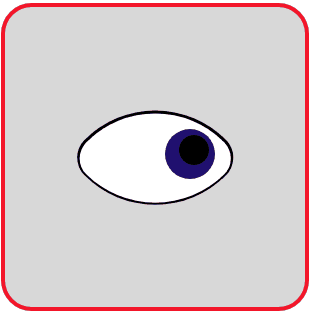
圖4 移動的眼珠子(單眼)
2.圓珠一二三
實現這樣一個動畫效果:一個大圓環每翻動一次,裡面增加一顆珠子,最多可增加到三顆。編寫如下的HTML文件。
<!DOCTYPE html>
<html>
<head>
<title>圓珠一二三</title>
<style>
  .container
  {
    margin: 0 auto;
    width: 300px;
    height:300px;
    position: relative;
    display:flex;
    justify-content:center;
    align-items:center;
    background:#d8d8d8;
    border: 4px solid rgba(255, 0, 0, 0.9);
    border-radius: 10%;
  }
  .shape
  {
    position: relative;
    width: 160px;
    height: 160px;
    border: 8px solid #f0f;
    border-radius: 50%;
    animation: anim1 1.25s infinite -0.3s;
  }
  .shape:after
  {
    content: '';
    position: absolute;
    top:0;
    left:0;
    right:0;
    bottom:0;
    margin:auto;
    width: 0;
    height: 0;
    border: 20px solid #f00;
    border-radius: 50%;
    transform: translate(-40px);
    animation: anim2 5s infinite steps(1);
  }
  @keyframes anim1
  {
     0%   { transform: rotateX(0deg); }
     100% { transform: rotateX(180deg); }
  }
  @keyframes anim2
  {
     0%   { opacity: 0; }
     25%  { opacity: 1; }
     50%  { box-shadow: 40px 0 0 #0f0; }
     75%  { box-shadow: 40px 0 0 #0f0, 80px 0 0 #00f; }
  }
</style>
</head>
<body>
<div  class="container">
    <div class="shape"></div>
</div>
</body>
</html>
View Code
在瀏覽器中打開包含這段HTML程式碼的html文件,可以呈現出如圖5所示的動畫效果。
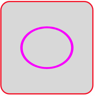
圖5 圓珠一二三
3.一分為四
將一個圓球向上下左右四個方向生成四個同樣的圓球,四個圓球採用box-shadow屬性設置。編寫如下的HTML文件。
<!DOCTYPE html>
<html>
<head>
<title>一分為四</title>
<style>
  .container
  {
    margin: 0 auto;
    width: 300px;
    height:300px;
    position: relative;
    display:flex;
    justify-content:center;
    align-items:center;
    background:#d8d8d8;
    border: 4px solid rgba(255, 0, 0, 0.9);
    border-radius: 10%;
  }
  .shape
  {
    position: relative;
    width: 30px;
    height: 30px;
    background: #f0f;
    border-radius: 50%;
    animation: anim 2s  linear infinite;
  }
  @keyframes anim
  {
     0%   { opacity: 0; }
     15%  { opacity: 1; }
     25%   { background:#d8d8d8; }
     100%
     {
          background:#d8d8d8;
           box-shadow: -80px 0 0 #f0f, 80px 0 0 #f0f,0 80px 0 0 #f0f,0 -80px 0 0 #f0f;
      }
  }
</style>
</head>
<body>
<div  class="container">
    <div class="shape"></div>
</div>
</body>
</html>
View Code
在瀏覽器中打開包含這段HTML程式碼的html文件,可以呈現出如圖6所示的動畫效果。

圖6 圓球一分為四
若修改關鍵幀定義為:
@keyframes anim
{
0%,100% { box-shadow: 0 0 0 #f0f; }
25% { box-shadow: -80px 0 0 #f0f, 80px 0 0 #f0f; }
50% { box-shadow: 0 0 0 #f0f; }
75% { box-shadow: 0 80px 0 0 #f0f,0 -80px 0 0 #f0f; }
}
則呈現出如圖7所示的動畫效果。

圖7 圓球一分為二
4.四個小圓旋轉擴散
設頁面中有<div class=”shape”></div>,若為. shape設置樣式規則如下:
.shape
{
position: relative;
width: 30px;
height: 30px;
border-radius: 50%;
box-shadow: -30px -30px 0 #f0f, 30px -30px 0 #f0f,
30px 30px 0 #f0f,-30px 30px 0 #f0f;
}
可在頁面中顯示如圖8所示的圖形,這4個小圓均是由box-shadow屬性設置的。
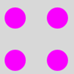
圖8 四個小圓
若將圖8的四個小圓作為初始幀,用
box-shadow: 60px -60px 0 #f0f,60px 60px 0 #f0f,-60px 60px 0 #f0f,-60px -60px 0 #f0f;
設置的另外4個圓作為終止幀,它和初始幀相比,四個小圓的大小不變,但位置發生了變化,這個變化產生的效果是小圓會旋轉擴散。
編寫的HTML文件內容如下。
<!DOCTYPE html>
<html>
<head>
<title>四小圓旋轉擴散</title>
<style>
  .container
  {
    margin: 0 auto;
    width: 300px;
    height:300px;
    position: relative;
    display:flex;
    justify-content:center;
    align-items:center;
    background:#d8d8d8;
    border: 4px solid rgba(255, 0, 0, 0.9);
    border-radius: 10%;
  }
  .shape
  {
    position: relative;
    width: 30px;
    height: 30px;
    border-radius: 50%;
    animation: anim 1s  linear infinite;
  }
  @keyframes anim
  {
     0%   { box-shadow: -30px -30px 0 #f0f, 30px -30px 0 #f0f,30px 30px  0 #f0f,-30px 30px 0 #f0f;  }
     100%
     {
        box-shadow: 60px -60px 0 #f0f,60px 60px 0 #f0f,-60px 60px 0 #f0f,-60px -60px 0 #f0f;    }
  }
</style>
</head>
<body>
<div  class="container">
    <div class="shape"></div>
</div>
</body>
</html>
View Code
在瀏覽器中打開包含這段HTML程式碼的html文件,可以呈現出如圖9所示的動畫效果。

圖9 四小圓旋轉擴散

