CSS浮動布局
浮動布局
浮動是CSS布局中經常使用的一種手段,其實說白了就是使元素進行漂浮脫離正常的文檔流排列機制,實現一堆原本的block狀態的標籤可以並排顯示,當然這也可以使用display:inline-block進行實現,但是通常情況我們不會那麼做。
那麼在使用浮動時我們應該注意下面的幾點。
1.浮動應該發生在一個大盒子內部
2.浮動元素會影響後面文檔流排列元素
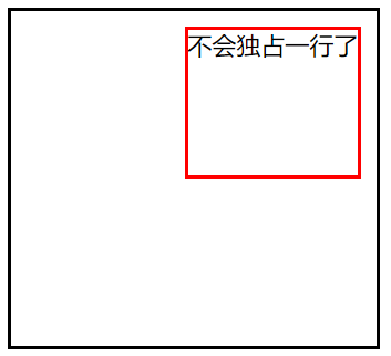
3.浮動元素會自動轉為
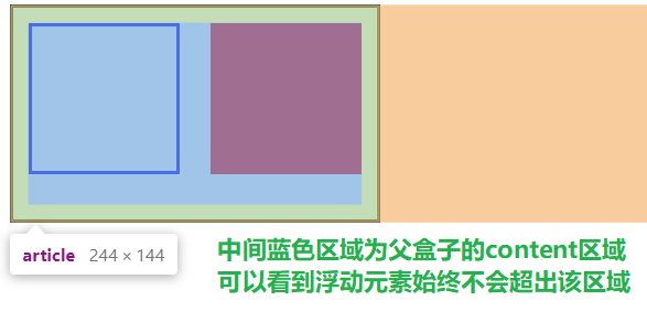
inline-block狀態,這意味著原本的inline元素可設置寬高,而原本的block元素不會獨佔一行4.浮動元素會在父盒子的
content區域中,不會超出父盒子的padding區域5.當一個父盒子中所有元素都進行浮動,那麼父盒子會丟失高度
對一個元素使用float就可以讓該元素飄起來,它可以指定以下一些方向。
| 選項 | 說明 |
|---|---|
| left | 向左浮動 |
| right | 向右浮動 |
| none | 不浮動 |
文檔流排列
文檔流排列就是自上向下的一種排列方式,對於block元素來說,它應該是獨佔一行的。


<!DOCTYPE html> <html lang="en"> <head> <meta charset="UTF-8"> <meta name="viewport" content="width=device-width, initial-scale=1.0"> <title>Document</title> <style> article{ width: 220px; padding: 10px; border: solid 2px black; } article section:first-child{ border: solid 2px blue; box-sizing: border-box; width: 100px; height: 100px; } article section:last-child{ box-sizing: border-box; width: 100px; height: 100px; } </style> </head> <body> <article> <section></section> <section></section> </article> </body> </html>
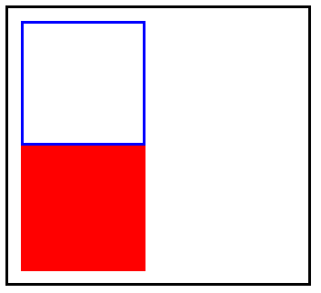
正常文檔流排列
空間佔用
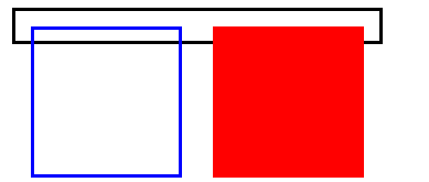
在同級情況下,排列在前的一個標籤如果進行浮動設置從而脫離了文檔流,那麼排列在後的標籤會佔用之前標籤的位置。
可以看到,當我們為排列在前的<section>標籤進行了浮動設置漂浮到了右邊,排列在後的<section>會自動向上頂,佔用掉之前<section>的位置。

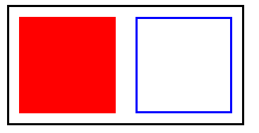
同理,我們將第排列在前的<section>標籤進行了浮動設置漂浮到了左邊,那麼排列在後的<section>依舊會向上頂,佔用掉之前的一個<section>的位置。
<!DOCTYPE html> <html lang="en"> <head> <meta charset="UTF-8"> <meta name="viewport" content="width=device-width, initial-scale=1.0"> <title>Document</title> <style> article{ width: 220px; padding: 10px; border: solid 2px black; } article section:first-child{ border: solid 2px blue; box-sizing: border-box; width: 100px; height: 100px; /* float: right; */ float: left; } article section:last-child{ box-sizing: border-box; width: 100px; height: 100px; } </style> </head> <body> <article> <section></section> <section></section> </article> </body> </html>
浮動元素會影響排在後面的同級元素排列方式
如果我們是對排列在後面的標籤進行浮動設置,排列在前的標籤不會受此影響,但是會出現父級盒子塌陷的問題,即父級盒子的高度會產生意料之外的情況。
<!DOCTYPE html> <html lang="en"> <head> <meta charset="UTF-8"> <meta name="viewport" content="width=device-width, initial-scale=1.0"> <title>Document</title> <style> article{ width: 220px; padding: 10px; border: solid 2px black; } article section:first-child{ border: solid 2px blue; box-sizing: border-box; width: 100px; height: 100px; /* float: right; */ /* float: left; */ } article section:last-child{ box-sizing: border-box; width: 100px; height: 100px; float: right; } </style> </head> <body> <article> <section></section> <section></section> </article> </body> </html>
浮動元素不會影響排在前面的同級元素排列方式
狀態轉換
我們將一個inline狀態的標籤進行浮動,它會轉為inline-block狀態,這意味著原本的inline狀態的標籤經過浮動後可以設置寬高了,而block狀態的標籤不會獨佔一行了。
原本的inline狀態的<span>標籤,即使設置了寬度或高度也沒用。
當成為浮動元素後,就可以為它設置寬度以及高度了。
<!DOCTYPE html> <html lang="en"> <head> <meta charset="UTF-8"> <meta name="viewport" content="width=device-width, initial-scale=1.0"> <title>Document</title> <style> div{ width: 220px; /* 為了防止父盒子塌陷,這裡設置了高度 */ height: 200px; padding: 10px; border: solid 2px black; } div span{ border: solid 2px red; width: 100px; height: 100px; float:right; box-sizing: border-box; } </style> </head> <body> <div> <span></span> </div> </body> </html>
inline元素設置浮動可設置寬高
如果我們對一個block狀態的標籤進行浮動設置,它將不會獨佔一行。
未設置浮動,獨佔一行,寬度為父盒子寬度。
設置浮動後,寬度為內容撐開的寬度,如果沒內容則沒有寬度。
<!DOCTYPE html> <html lang="en"> <head> <meta charset="UTF-8"> <meta name="viewport" content="width=device-width, initial-scale=1.0"> <title>Document</title> <style> div{ width: 220px; /* 為了防止父盒子塌陷,這裡設置了高度 */ height: 200px; padding: 10px; border: solid 2px black; } div section{ border: solid 2px red; height: 100px; float:right; box-sizing: border-box; } </style> </head> <body> <div> <section>不會獨佔一行了</section> </div> </body> </html>
block元素設置浮動不會獨佔一行
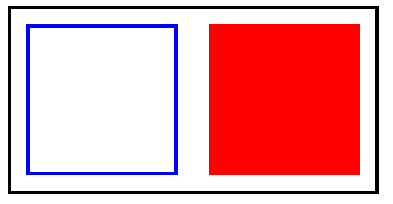
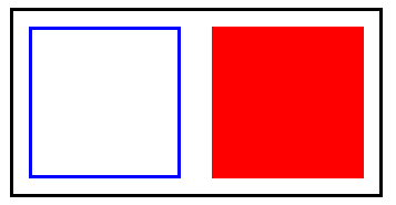
浮動邊界
當父盒子中的兩個子元素都進行了浮動,那麼他們始終會在父盒子的content區域中,即不會超出padding區域。
<!DOCTYPE html> <html lang="en"> <head> <meta charset="UTF-8"> <meta name="viewport" content="width=device-width, initial-scale=1.0"> <title>Document</title> <style> article{ width: 220px; /* 為了防止父盒子坍塌,這裡設置了高度 */ height: 120px; padding: 10px; border: solid 2px black; } article section:first-child{ border: solid 2px blue; box-sizing: border-box; width: 100px; height: 100px; float: left; } article section:last-child{ box-sizing: border-box; width: 100px; height: 100px; float: right; } </style> </head> <body> <article> <section></section> <section></section> </article> </body> </html>
浮動邊界
清除浮動
首先我們要了解為什麼要清除浮動,可以這麼說,清除浮動是非常非常重要的!
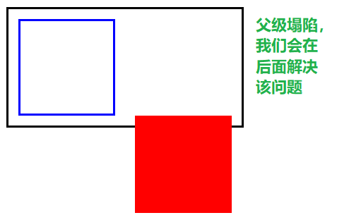
上面看到了父盒子塌陷問題,我們不可能給父盒子一個固定的高度,這是為什麼呢?看一下下面的示例:
黑色部分圈住的是一塊大的<div>標籤,其中的每個<a>標籤中都包裹著<img>標籤。
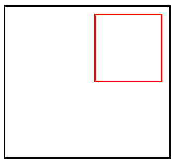
可以看見<a>標籤它本身設置了漂浮是可以定義寬高的,白色部分圈住的可以說明這點。
但是,我們通常不會給<a>設置高度,只會設置寬度,這就涉及到一個問題,如果我們對黑色框框住的<div>中每一個<a>標籤都進行漂浮,那麼<div>就會沒有高度了,下面所有的排版都會亂掉,如下圖
可能有人會說,那給他設置一個高度呀,當然這是可以的。但是,如果<a>標籤中包裹的<img>標籤在新的一輪方案中高度發生了變化,那麼我們的<div>也要相應的調整高度,這無疑是非常麻煩的,這並不是一個明智的解決方案。
怎麼解決這個問題呢?別著急,學會下面介紹的清除浮動的方式,該問題就可以迎刃而解了。
clear內牆法
clear可以給一個未浮動的元素使用,它的意思代表我不允許指定方位有浮動元素,有我就另起一行,而不是佔用浮動元素的空間位置。
| 選項 | 說明 |
|---|---|
| left | 左邊遠離浮動元素 |
| right | 右連遠離浮動元素 |
| both | 左右都遠離浮動元素 |
<!DOCTYPE html> <html lang="en"> <head> <meta charset="UTF-8"> <meta name="viewport" content="width=device-width, initial-scale=1.0"> <title>Document</title> <style> article{ width: 220px; padding: 10px; border: solid 2px black; } article section:first-of-type{ border: solid 2px blue; box-sizing: border-box; width: 100px; height: 100px; float: left; } article section:last-of-type{ box-sizing: border-box; width: 100px; height: 100px; float: right; } .clearfix{ /* clear:both 代表如果兩邊有浮動,我就另起一行,不佔據漂浮元素的空間位置 */ clear: both; height: 0; } </style> </head> <body> <article> <section></section> <section></section> <div class="clearfix"></div> </article> </body> </html>
clearfix內牆法
偽元素內牆法
上面的解決辦法任然有瑕疵,就是我們需要為每一個有浮動元素的父盒子都建立一個空標籤,這樣很累。
我們可以利用偽元素::after為有浮動元素的父盒子自動創建一個元素。
注意,一定要使用::after,因為它是插入到後面,如果使用::before的話是沒有效果的,浮動元素不會影響之前的元素排列方式。
<!DOCTYPE html> <html lang="en"> <head> <meta charset="UTF-8"> <meta name="viewport" content="width=device-width, initial-scale=1.0"> <title>Document</title> <style> article{ width: 220px; padding: 10px; border: solid 2px black; } article section:first-of-type{ border: solid 2px blue; box-sizing: border-box; width: 100px; height: 100px; float: left; } article section:last-of-type{ box-sizing: border-box; width: 100px; height: 100px; float: right; } .clearfix::after{ content: ""; clear: both; display: block; } </style> </head> <body> <!-- 我們只需要對每一個具有浮動元素的盒子添加上clearfix類即可,非常方便 --> <article class="clearfix"> <section></section> <section></section> </article> </body> </html>
偽元素::after內牆法
overflow
還有一種更方便的方式,就是為具有浮動元素的父盒子增加一個overflow屬性,可以是hidden,也可以是auto,這會觸發一個BFC機制解決浮動。
PS:如果想更詳細了解BFC機制,可以看看相關的文章。
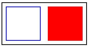
<!DOCTYPE html>
<html lang="en">
<head>
    <meta charset="UTF-8">
    <meta name="viewport" content="width=device-width, initial-scale=1.0">
    <title>Document</title>
    <style>
        article{
            width: 220px;
            padding: 10px;
            border: solid 2px black;
            /* overflow會觸發BFC機制,缺點是可能會造成浮動元素部分內容缺失 */
            overflow: hidden;

        }
        article section:first-of-type{
            border: solid 2px blue;
            box-sizing: border-box;
            width: 100px;
            height: 100px;
            float: left;
        }
        article section:last-of-type{
            background-color: red;
            box-sizing: border-box;
            width: 100px;
            height: 100px;
            float: right;

        }

    </style>
</head>
<body>
    <article>
        <section></section>
        <section></section>
    </article>
</body>
</html>
overflow觸發BFC機制
浮動環繞
浮動環繞就是讓文字內容對浮動元素進行環繞。類似於word中的環繞排版。
注意,要求必須是具有透明度的PNG格式圖片。
那麼我們怎麼做到上圖這種效果呢,別急,下面會介紹到。
距離控制
我們可以使用 shape-outside進行距離控制。
| 選項 | 說明 |
|---|---|
| margin-box | 外邊距環繞 |
| padding-box | 內邊距環繞 |
| border-box | 邊線環繞 |
| content-box | 內容環繞 |
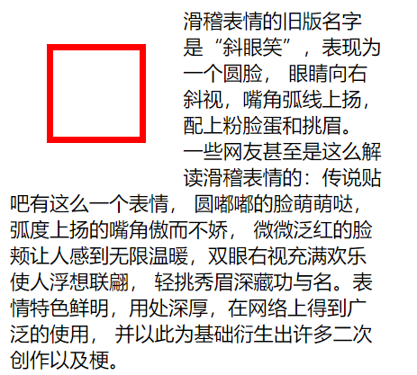
外邊距環繞
可以看到,文字緊緊的跟隨外邊距進行環繞。
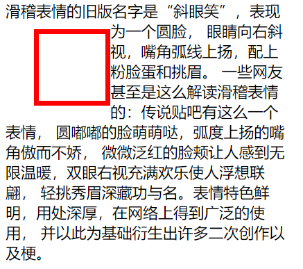
邊框環繞
可以看到,文字緊緊的跟隨邊框進行環繞。
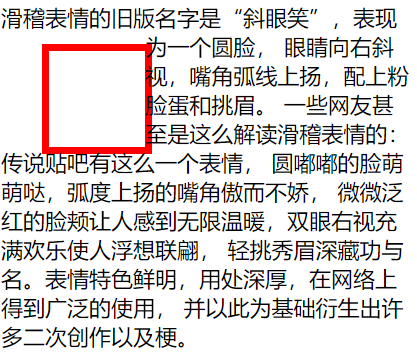
內邊距環繞
可以看到,文字緊緊的跟隨內邊距進行環繞。
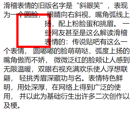
內容環繞
可以看到,文字緊緊的跟隨內容區域進行環繞。
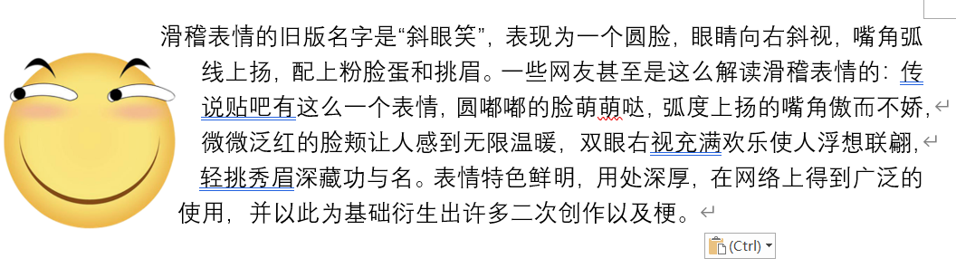
<!DOCTYPE html>
<html lang="en">
<head>
    <meta charset="UTF-8">
    <meta name="viewport" content="width=device-width, initial-scale=1.0">
    <title>Document</title>
    <style>
        article{
            width: 300px;
        }
        article div:first-of-type{
            float: left;
            width: 50px;
            height: 50px;
            padding: 10px;
            margin: 30px;
            border: solid 5px red;
            /* shape-outside: margin-box;
            shape-outside: border-box;
            shape-outside: padding-box;
            shape-outside: content-box; */
        }

    </style>
</head>
<body>
    <article>
        <div></div>
        <span>滑稽表情的舊版名字是「斜眼笑」,表現為一個圓臉,
            眼睛向右斜視,嘴角弧線上揚,配上粉臉蛋和挑眉。
            一些網友甚至是這麼解讀滑稽表情的:傳說貼吧有這麼一個表情,
            圓嘟嘟的臉萌萌噠,弧度上揚的嘴角傲而不嬌,
            微微泛紅的臉頰讓人感到無限溫暖,雙眼右視充滿歡樂使人浮想聯翩,
            輕挑秀眉深藏功與名。表情特色鮮明,用處深厚,在網路上得到廣泛的使用,
            並以此為基礎衍生出許多二次創作以及梗。</span>
    </article>
</body>
</html>
距離控制
顯示區域
我們可以使用clip-path來對標籤的顯示區域形狀進行控制,可以是我們想要的任意形狀。
| 選項 | 說明 |
|---|---|
| circle | 圓形 |
| ellipse | 橢圓 |
| polygon | 多邊形 |
圓形
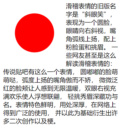
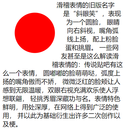
<!DOCTYPE html>
<html lang="en">
<head>
    <meta charset="UTF-8">
    <meta name="viewport" content="width=device-width, initial-scale=1.0">
    <title>Document</title>
    <style>
        article{
            width: 300px;
        }
        article div:first-of-type{
            float: left;
            width: 100px;
            height: 100px;
            padding: 10px;
            margin: 30px;
            box-sizing: border-box;
            background-color: red;
            /* 代表正圓,圓心在中間 */
            clip-path: circle(50% at center);
        }

    </style>
</head>
<body>
    <article>
        <div></div>
        <span>滑稽表情的舊版名字是「斜眼笑」,表現為一個圓臉,
            眼睛向右斜視,嘴角弧線上揚,配上粉臉蛋和挑眉。
            一些網友甚至是這麼解讀滑稽表情的:傳說貼吧有這麼一個表情,
            圓嘟嘟的臉萌萌噠,弧度上揚的嘴角傲而不嬌,
            微微泛紅的臉頰讓人感到無限溫暖,雙眼右視充滿歡樂使人浮想聯翩,
            輕挑秀眉深藏功與名。表情特色鮮明,用處深厚,在網路上得到廣泛的使用,
            並以此為基礎衍生出許多二次創作以及梗。</span>
    </article>
</body>
</html>
自定義顯示區域形狀 – 圓形
橢圓
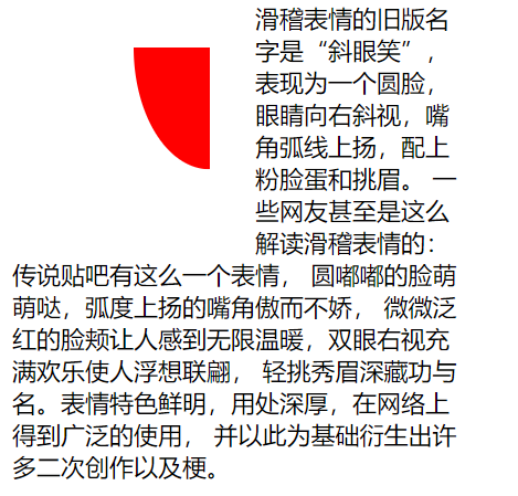
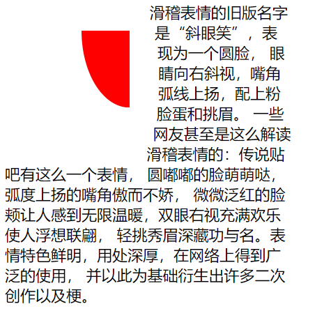
<!DOCTYPE html>
<html lang="en">
<head>
    <meta charset="UTF-8">
    <meta name="viewport" content="width=device-width, initial-scale=1.0">
    <title>Document</title>
    <style>
        article{
            width: 300px;
        }
        article div:first-of-type{
            float: left;
            width: 100px;
            height: 100px;
            padding: 10px;
            margin: 30px;
            box-sizing: border-box;
            background-color: red;
            /* 代表橢圓,圓心在右邊 兩個數,一個代表寬度,一個代表高度 */
            clip-path: ellipse(50% 80% at 100% 0);
        }

    </style>
</head>
<body>
    <article>
        <div></div>
        <span>滑稽表情的舊版名字是「斜眼笑」,表現為一個圓臉,
            眼睛向右斜視,嘴角弧線上揚,配上粉臉蛋和挑眉。
            一些網友甚至是這麼解讀滑稽表情的:傳說貼吧有這麼一個表情,
            圓嘟嘟的臉萌萌噠,弧度上揚的嘴角傲而不嬌,
            微微泛紅的臉頰讓人感到無限溫暖,雙眼右視充滿歡樂使人浮想聯翩,
            輕挑秀眉深藏功與名。表情特色鮮明,用處深厚,在網路上得到廣泛的使用,
            並以此為基礎衍生出許多二次創作以及梗。</span>
    </article>
</body>
</html>
自定義顯示區域形狀 – 橢圓
多邊形
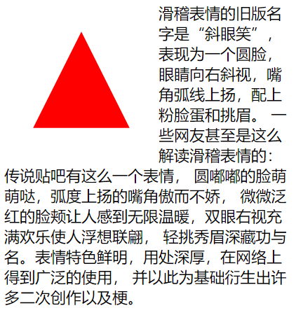
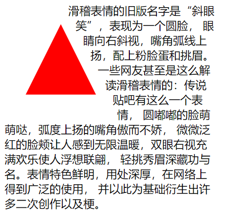
<!DOCTYPE html>
<html lang="en">
<head>
    <meta charset="UTF-8">
    <meta name="viewport" content="width=device-width, initial-scale=1.0">
    <title>Document</title>
    <style>
        article{
            width: 300px;
        }
        article div:first-of-type{
            float: left;
            width: 100px;
            height: 100px;
            padding: 10px;
            margin: 30px;
            box-sizing: border-box;
            background-color: red;
            /* clip-path: ellipse(50% 80% at 100% 0); */
            /* 代表三角形 */
            clip-path: polygon(50% 0, 100% 100%, 0 100%);
        }

    </style>
</head>
<body>
    <article>
        <div></div>
        <span>滑稽表情的舊版名字是「斜眼笑」,表現為一個圓臉,
            眼睛向右斜視,嘴角弧線上揚,配上粉臉蛋和挑眉。
            一些網友甚至是這麼解讀滑稽表情的:傳說貼吧有這麼一個表情,
            圓嘟嘟的臉萌萌噠,弧度上揚的嘴角傲而不嬌,
            微微泛紅的臉頰讓人感到無限溫暖,雙眼右視充滿歡樂使人浮想聯翩,
            輕挑秀眉深藏功與名。表情特色鮮明,用處深厚,在網路上得到廣泛的使用,
            並以此為基礎衍生出許多二次創作以及梗。</span>
    </article>
</body>
</html>
自定義顯示區域形狀 – 多邊形
內移距離
我們可以為shape-outside使用inset來進行自定義的控制環繞向內移動的距離,依舊是上右下左的順序。
<!DOCTYPE html>
<html lang="en">
<head>
    <meta charset="UTF-8">
    <meta name="viewport" content="width=device-width, initial-scale=1.0">
    <title>Document</title>
    <style>
        article{
            width: 300px;
        }
        article div:first-of-type{
            float: left;
            width: 50px;
            height: 50px;
            padding: 10px;
            margin: 30px;
            border: solid 5px red;
            shape-outside: inset(0px -30px 0px 50px) padding-box;
        }

    </style>
</head>
<body>
    <article>
        <div></div>
        <span>滑稽表情的舊版名字是「斜眼笑」,表現為一個圓臉,
            眼睛向右斜視,嘴角弧線上揚,配上粉臉蛋和挑眉。
            一些網友甚至是這麼解讀滑稽表情的:傳說貼吧有這麼一個表情,
            圓嘟嘟的臉萌萌噠,弧度上揚的嘴角傲而不嬌,
            微微泛紅的臉頰讓人感到無限溫暖,雙眼右視充滿歡樂使人浮想聯翩,
            輕挑秀眉深藏功與名。表情特色鮮明,用處深厚,在網路上得到廣泛的使用,
            並以此為基礎衍生出許多二次創作以及梗。</span>
    </article>
</body>
</html>
自定義環繞距離
環繞模式
我們對shape-outside可以進行環繞模式的控制,如下:
| 選項 | 說明 |
|---|---|
| circle | 圓形環繞 |
| ellipse | 橢圓環繞 |
| url | 圖片環繞 |
| polygan | 多邊環繞 |
圓形環繞
<!DOCTYPE html>
<html lang="en">
<head>
    <meta charset="UTF-8">
    <meta name="viewport" content="width=device-width, initial-scale=1.0">
    <title>Document</title>
    <style>
        article{
            width: 300px;
        }
        article div:first-of-type{
            float: left;
            width: 100px;
            height: 100px;
            padding: 10px;
            margin: 30px;
            box-sizing: border-box;
            background-color: red;
            /* 代表正圓,圓心在中間 */
            clip-path: circle(50% at center);
            /* 環繞的是正園,外邊距環繞 */
            shape-outside: circle(50%) margin-box;
        }

    </style>
</head>
<body>
    <article>
        <div></div>
        <span>滑稽表情的舊版名字是「斜眼笑」,表現為一個圓臉,
            眼睛向右斜視,嘴角弧線上揚,配上粉臉蛋和挑眉。
            一些網友甚至是這麼解讀滑稽表情的:傳說貼吧有這麼一個表情,
            圓嘟嘟的臉萌萌噠,弧度上揚的嘴角傲而不嬌,
            微微泛紅的臉頰讓人感到無限溫暖,雙眼右視充滿歡樂使人浮想聯翩,
            輕挑秀眉深藏功與名。表情特色鮮明,用處深厚,在網路上得到廣泛的使用,
            並以此為基礎衍生出許多二次創作以及梗。</span>
    </article>
</body>
</html>
圓形環繞
橢圓環繞
<!DOCTYPE html>
<html lang="en">
<head>
    <meta charset="UTF-8">
    <meta name="viewport" content="width=device-width, initial-scale=1.0">
    <title>Document</title>
    <style>
        article{
            width: 300px;
        }
        article div:first-of-type{
            float: left;
            width: 100px;
            height: 100px;
            padding: 10px;
            margin: 30px;
            box-sizing: border-box;
            background-color: red;
            /* 代表橢圓,圓心在右上 */
            clip-path: ellipse(50% 80% at 100% 0);
            /* 環繞的是橢圓,外邊距環繞 */
            shape-outside: ellipse(50% 80%) margin-box;
        }

    </style>
</head>
<body>
    <article>
        <div></div>
        <span>滑稽表情的舊版名字是「斜眼笑」,表現為一個圓臉,
            眼睛向右斜視,嘴角弧線上揚,配上粉臉蛋和挑眉。
            一些網友甚至是這麼解讀滑稽表情的:傳說貼吧有這麼一個表情,
            圓嘟嘟的臉萌萌噠,弧度上揚的嘴角傲而不嬌,
            微微泛紅的臉頰讓人感到無限溫暖,雙眼右視充滿歡樂使人浮想聯翩,
            輕挑秀眉深藏功與名。表情特色鮮明,用處深厚,在網路上得到廣泛的使用,
            並以此為基礎衍生出許多二次創作以及梗。</span>
    </article>
</body>
</html>
橢圓環繞
圖片環繞
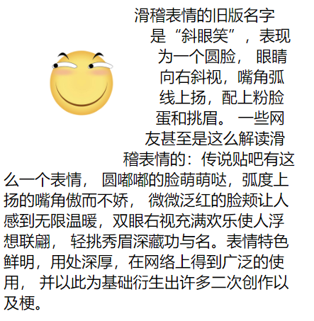
<!DOCTYPE html>
<html lang="en">
<head>
    <meta charset="UTF-8">
    <meta name="viewport" content="width=device-width, initial-scale=1.0">
    <title>Document</title>
    <style>
        article{
            width: 300px;
        }
        article img:first-of-type{
            float: left;
            width: 100px;
            height: 100px;
            padding: 10px;
            margin: 30px;
            box-sizing: border-box;
            /* 由於圖形是個圓形,所以我們用圓形即可。外邊距環繞 */
            shape-outside: circle(50%) margin-box;
        }

    </style>
</head>
<body>
    <article>
        <img src="./huaji.png" alt="">
        <span>滑稽表情的舊版名字是「斜眼笑」,表現為一個圓臉,
            眼睛向右斜視,嘴角弧線上揚,配上粉臉蛋和挑眉。
            一些網友甚至是這麼解讀滑稽表情的:傳說貼吧有這麼一個表情,
            圓嘟嘟的臉萌萌噠,弧度上揚的嘴角傲而不嬌,
            微微泛紅的臉頰讓人感到無限溫暖,雙眼右視充滿歡樂使人浮想聯翩,
            輕挑秀眉深藏功與名。表情特色鮮明,用處深厚,在網路上得到廣泛的使用,
            並以此為基礎衍生出許多二次創作以及梗。</span>
    </article>
</body>
</html>
圖片環繞
多邊環繞
<!DOCTYPE html>
<html lang="en">
<head>
    <meta charset="UTF-8">
    <meta name="viewport" content="width=device-width, initial-scale=1.0">
    <title>Document</title>
    <style>
        article{
            width: 300px;
        }
        article div:first-of-type{
            float: left;
            width: 100px;
            height: 100px;
            padding: 10px;
            margin: 30px;
            box-sizing: border-box;
            background-color: red;
            /* 代表橢三角形 */
            clip-path: polygon(50% 0, 100% 100%, 0 100%);
            /* 環繞的是三角形,外邊距環繞 */
            shape-outside: polygon(50% 0, 100% 100%, 0 100%) margin-box;
        }

    </style>
</head>
<body>
    <article>
        <div></div>
        <span>滑稽表情的舊版名字是「斜眼笑」,表現為一個圓臉,
            眼睛向右斜視,嘴角弧線上揚,配上粉臉蛋和挑眉。
            一些網友甚至是這麼解讀滑稽表情的:傳說貼吧有這麼一個表情,
            圓嘟嘟的臉萌萌噠,弧度上揚的嘴角傲而不嬌,
            微微泛紅的臉頰讓人感到無限溫暖,雙眼右視充滿歡樂使人浮想聯翩,
            輕挑秀眉深藏功與名。表情特色鮮明,用處深厚,在網路上得到廣泛的使用,
            並以此為基礎衍生出許多二次創作以及梗。</span>
    </article>
</body>
</html>
多邊環繞
頁面布局
完成頁面布局注意以下幾點
1.首先根據設計稿確定頁面大小(主要指寬度,移動端不需要考慮),如 1200px 寬度
2.水平分割頁面主要區域
3.每個區域中按以上兩步繼續細分
其實頁面布局就是不斷的大盒子套著小盒子,小盒子根據情況進行浮動定位,或者其他的一些布局方式微調。