從青銅到王者10個css3偽類使用技巧和運用
- 2019 年 10 月 10 日
- 筆記
作者:codercao 原文鏈接:https://juejin.im/post/5b6d0c5cf265da0f504a837f
寫在前面
偽類經常與偽元素混淆,偽元素的效果類似於通過添加一個實際的元素才能達到,而偽類的效果類似於通過添加一個實際的類來達到。實際上css3為了區分兩者,已經明確規定了偽類用一個冒號來表示,而偽元素則用兩個冒號來表示。偽類與偽元素的本質區別就是是否抽象創造了新元素。具體的偽類和偽元素相關知識本文就不深入,下面介紹一下從青銅到王者10個css3偽類使用技巧和運用。直擊案例程式碼
青銅-1、偽類實現盒子陰影
眾所周知,Animate/transition box-shadow可以使用box-shadow屬性來實現盒子陰影效果,但repaint消耗較多,於是這裡提出通過修改偽元素的透明度來實現盒子陰影
實現原理:
通過改變透明度,這樣從一個非默認值更新它的值,就不需要承擔任何重繪(參見:https://csstriggers.com/opacity)(ps:貌似莫名的解鎖了一個關於前端css優化,壞笑壞笑)
這裡設置一個空的偽元素設置陰影透明度為0隱藏,再通過滑鼠懸停恢復它的透明度,下面是傳統和偽類實現的程式碼對比
<div class="before"> <h1>Before</h1> <p>Animate/transition box-shadow 可以使用box-shadow屬性來實現盒子陰影效果,但重繪消耗較多</p> </div> <hr /> <div class="after"> <h1>After</h1> <p>通過修改偽元素的透明度來實現同樣的效果,沒有重繪消耗</p> </div>
.before { padding: 1em; background-color: #fff; -webkit-transition: 0.2s; transition: 0.2s; } .before:hover { box-shadow: 0 0 10px 0 rgba(0, 0, 0, 0.3); } .after { position: relative; padding: 1em; background-color: #fff; } .after:before { content: ""; position: absolute; top: 0; right: 0; bottom: 0; left: 0; z-index: -1; box-shadow: 0 0 10px 0 rgba(0, 0, 0, 0.3); opacity: 0; will-change: opacity; -webkit-transition: 0.2s; transition: 0.2s; } .after:hover:before { opacity: 1; }
效果:(完整程式碼見後文鏈接)

青銅-2、偽元素:before實現的麵包屑導航欄
<ul class="breadcrumb"> <li><a href="#">Home</a> </li> <li><a href="#">Pictures</a> </li> <li><a href="#">Summer 15</a> </li> <li>Italy</li> </ul>
ul.breadcrumb { padding: 8px 16px; list-style: none; background-color: #eee; } ul.breadcrumb li { display: inline; } ul.breadcrumb li+li:before { padding: 8px; color: black; content: "/�0a0"; } ul.breadcrumb li a { color: green; }
效果:

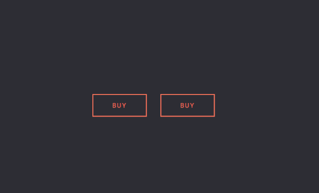
青銅-3、偽元素實現懸停時按鈕填充和邊界浮動動畫
效果:(完整程式碼見後文鏈接)
青銅-4、偽類after實現的三角箭頭
實現原理:三邊設置邊框,箭頭指向的那個方向的border不用設置,位於箭頭兩邊的邊框顏色為透明(transparent),對邊為主體邊框顏色(較大的)/主體背景顏色(較小的),因為我們要有邊框顏色的三角箭頭,當第一個箭頭(較大的)被第二個箭頭(較小的)通過準確覆蓋之後剩下沒被覆蓋的邊緣就是合成三角箭頭的邊框了,其顏色就是較大的那個三角箭頭的顏色,可調。而較小的那個三角箭頭的顏色要設置成主體顏色,進行負值定位偏移時要把主體邊框蓋住,從而與主體合在一起了
<div class='container'> <img alt='' src='http://placehold.it/400x200'> <div class='arrow-left'></div> </div> <div class='container new'> <div class='arrow-right'></div> <img alt='' src='http://placehold.it/400x200'> </div>
.arrow-left:before { z-index: 9999; content: ""; display: block; width: 0; height: 0; border-top: 20px solid transparent; border-bottom: 20px solid transparent; border-right: 20px solid #E9E9E9; position: absolute; left: -20px; top: 80px; }
效果:(完整程式碼見後文鏈接)

青銅-5、偽類after實現的圖片箭頭
效果:(完整程式碼見後文鏈接)

青銅-6、偽元素實現帶角度的底部邊界(傾斜的邊界)
原理:修改webkit-transform: skewY屬性來修改傾斜度(旋轉也是一樣的道理)
.edge--bottom { position: relative; z-index: 1; } .edge--bottom:after { background: inherit; content: ''; display: block; height: 50%; left: 0; position: absolute; right: 0; z-index: -1; } .edge--bottom:after { bottom: 0; -webkit-transform: skewY(-1.5deg); -ms-transform: skewY(-1.5deg); transform: skewY(-1.5deg); -webkit-transform-origin: 100%; -ms-transform-origin: 100%; transform-origin: 100%; }
效果:(完整程式碼見本文結尾鏈接)

王者-1、偽元素和平移(translate)變換實現的提示框
<div class="row"> <a rel="nofollow" rel="noreferrer" href="#" class="btn tooltip top"> <span>TOOLTIP TOP</span> <span class="tooltip-content">Lorem ipsum dolor sit amet</span> </a> </div>
.tooltip .tooltip-content::after { background: #05a8ff; content: ""; height: 10px; position: absolute; -webkit-transform: rotate(45deg); transform: rotate(45deg); width: 10px; } .tooltip.top .tooltip-content { bottom: calc(100% + 1.5em); left: 50%; -webkit-transform: translateX(-50%); transform: translateX(-50%); } .tooltip.top .tooltip-content::after { bottom: -5px; left: 50%; margin-left: -5px; }
效果:(完整程式碼見本文結尾鏈接)

王者-2、使用CSS3偽元素實現的自動打字動畫
原理:Typing Animation with Pseudo-Elements 看起來是打字,其實是使用偽元素覆蓋在字元串上,然後逐漸減少偽元素覆蓋寬度來實現的視覺效果
<div> <h1>Typing Animation</h1> <p class="tagline"> <span class="tagline-skill"><span class="tagline-skill_inner">webdesign</span></span> </p> </div>
.tagline-skill_inner:after { content: ""; position: absolute; top: -1px; right: 0; bottom: -2px; left: 0; border-left: 1px solid #fff; background-color: #2a2a28; -webkit-animation: animatetoright 1s steps(10) infinite alternate; animation: animatetoright 1s steps(10) infinite alternate; }
效果:(完整程式碼見本文結尾鏈接)

王者-3、CSS3 偽元素構建的文章水印背景
h1 { position: relative; margin: 0; font-weight: bold; letter-spacing: -0.05rem; line-height: 1; text-transform: uppercase; z-index: 10; } h1:before { content: "2018/08"; font-family: monospace; font-size: 10rem; position: absolute; top: 2rem; left: -2rem; z-index: 0; line-height: 1; color: rgba(50, 25, 0, 0.1); }
效果:(完整程式碼見本文結尾鏈接)

王者-4、CSS3 用偽元素做頁碼摘要
a { display: -webkit-box; display: -webkit-flex; display: -ms-flexbox; display: flex; -webkit-flex-flow: row nowrap; -ms-flex-flow: row nowrap; flex-flow: row nowrap; -webkit-box-align: baseline; -webkit-align-items: baseline; -ms-flex-align: baseline; align-items: baseline; text-decoration: none; -webkit-transition: color .2s ease-in-out; transition: color .2s ease-in-out; } a::before { height: .1em; -webkit-box-flex: 1; -webkit-flex: 1 1 auto; -ms-flex: 1 1 auto; flex: 1 1 auto; -webkit-box-ordinal-group: 2; -webkit-order: 1; -ms-flex-order: 1; order: 1; background: left bottom/contain repeat-x url(data:image/svg+xml;base64,PHN2ZyB4bWxucz0iaHR0cDovL3d3dy53My5vcmcvMjAwMC9zdmciIHZpZXdCb3g9IjAgMCA3IDIiPjxjaXJjbGUgZmlsbD0iI2ZmZiIgY3g9IjMuNSIgY3k9IjEiIHI9IjEiLz48L3N2Zz4=); content: ''; } a::after { -webkit-box-ordinal-group: 3; -webkit-order: 2; -ms-flex-order: 2; order: 2; content: "p." attr(data-page); }
效果:(完整程式碼見本文結尾鏈接)

王者-5、偽類兼容性了解一下
1、IE8不支援CSS3中很多特性,比如偽元素nth-child,可以使用+號(代表相鄰元素)來實現相同功能
2、Google的IE9.js是解決IE5.5到IE8,CSS3特性兼容性問題的JS庫
最後
CSS的世界很美好,每個知識點都可以值得深入研究和實踐,對於偽類、偽元素也有很多土味特效可以寫出來,比如說圖片遮罩、圖片背景模糊,更多高級的滑鼠經過事件特效等等,上邊的10個案例是我個人工作上總結和參考踏得網上資源整理,希望對大家有所幫助最後附上github示例源碼,可下載體驗。
github地址:https://github.com/HongqingCao/my-code/tree/Pseudo-classes
