CSS动画实例:跳跃的字符
- 2020 年 8 月 15 日
- 笔记
- JavaScript程序设计
1.翻转的字符
在页面中放置一个类名为container的层作为容器,在该层中放置5个字符区域,HTML代码描述如下:
<div class=”container”>
<span>H</span>
<span>E</span>
<span>L</span>
<span>L</span>
<span>O</span>
</div>
为container和span定义CSS样式规则,并定义实现5个字符翻转的动画关键帧。完整的HTML文件内容如下。


<!DOCTYPE html>
<html>
<head>
<title>字符翻转</title>
<style>
   .container
   {
      margin: 0 auto;
      width: 500px;
      height: 300px;
      position: relative;
      overflow: hidden;
      display:flex;
      align-items: center;
      justify-content: center;
      border: 4px solid rgba(255, 0, 0, 0.9);
      background:#d8d8d8;
      border-radius: 10%;
    }
   .container>span
   {
font-size: 130px;
    font-family: "Impact",sans-serif;
    display: inline-block;
    animation:flip 2s infinite linear;
    transform-origin:0 70%;
    transform-style:preserve-3d;
   }
   @keyframes flip
   {
    50%   { transform: rotateX(360deg); }
    100%  { transform: rotateX(360deg); }
   }
   .container>span:nth-child(1n+0)
   {
        color:var(--color);
        animation-delay: var(--delay);
   }
</style>
</head>
<body>
<div class="container">
    <span style="--delay:0s;--color:#f00">H</span>
    <span style="--delay:0.4s;--color:#f0f">E</span>
    <span style="--delay:0.8s;--color:#ff0">L</span>
    <span style="--delay:1.2s;--color:#0ff">L</span>
    <span style="--delay:1.6s;--color:#800080">O</span>
</div>
</body>
</html>
View Code
在浏览器中打开包含这段HTML代码的html文件,可以呈现出如图1所示的动画效果。

图1 字符绕X轴翻转
若将上面的关键帧设置中的两个属性值“rotateX”均改成“rotateY”,则呈现如图2所示的动画效果。
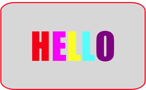
图2 字符绕Y轴翻转
若将上面的关键帧设置中的两个属性值“rotateX”均改成“rotateZ”,则呈现如图3所示的动画效果。
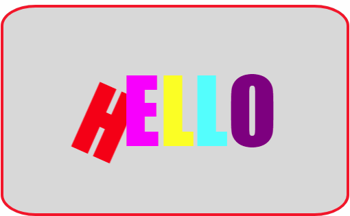
图3 字符绕Y轴翻转
2.跳跃的字符
我们可以通过修改字符区span的top属性的属性值让字符上下移动,同时设置文本的阴影,形成字符的跳跃动画效果。
编写的完整HTML文件如下。
<!DOCTYPE HTML>
<html>
<head>
<title>跳跃的字符</title>
<style>
   .container
   {
      margin: 0 auto;
      width: 600px;
      height: 200px;
      position: relative;
      overflow: hidden;
      display:flex;
      align-items: center;
      justify-content: center;
      border: 4px solid rgba(255, 0, 0, 0.9);
      background:#f5f5f5;
      border-radius: 10%;
    }
   .container>span
   {
      position: relative;
      top: 20px;
      display: inline-block;
      animation: bounce .3s ease infinite alternate;
      font-family: "Impact",sans-serif;
      font-size: 80px;
      text-shadow: 0 1px 0 #CCC,
                   0 2px 0 #CCC,
                   0 3px 0 #CCC,
                   0 4px 0 #CCC,
                   0 5px 0 #CCC,
                   0 6px 0 transparent,
                   0 7px 0 transparent,
                   0 8px 0 transparent,
                   0 9px 0 transparent,
                   0 10px 10px rgba(0, 0, 0, .4);
   }
   .container>span:nth-child(1n+0)
   {
      color:var(--color);
      animation-delay: var(--delay);
   }
   @keyframes bounce
   {
      100%
      {
         top: -20px;
         text-shadow: 0 1px 0 #CCC,
                      0 2px 0 #CCC,
                      0 3px 0 #CCC,
                      0 4px 0 #CCC,
                      0 5px 0 #CCC,
                      0 6px 0 #CCC,
                      0 7px 0 #CCC,
                      0 8px 0 #CCC,
                      0 9px 0 #CCC,
                      0 50px 25px rgba(0, 0, 0, .2);
      }
   }
</style>
</head>
<body>
<div class="container">
    <span style="--delay:0s;--color:#f00">H</span>
    <span style="--delay:0.1s;--color:#f0f">a</span>
    <span style="--delay:0.2s;--color:#ff0">p</span>
    <span style="--delay:0.3s;--color:#0f0">p</span>
    <span style="--delay:0.4s;--color:#0ff">y</span>
    <span style="--delay:0.5s;--color:#00f">N</span>
    <span style="--delay:0.6s;--color:#800080">e</span>
    <span style="--delay:0.7s;--color:#008080">w</span>
    <span style="--delay:0.8s;--color:#ff6347">Y</span>
    <span style="--delay:0.9s;--color:#ee82ee">e</span>
    <span style="--delay:1.0s;--color:#8b4513">a</span>
    <span style="--delay:1.1s;--color:#fa8072">r</span>
</div>
</body>
</html>
View Code
在浏览器中打开包含这段HTML代码的html文件,可以呈现出如图4所示的动画效果。
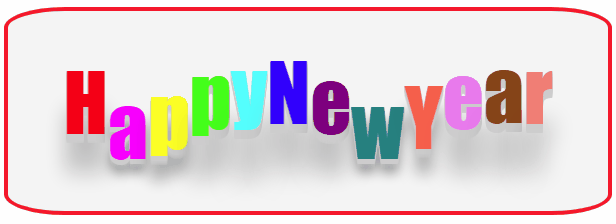
图4 跳跃的字符
3.霓虹字符
通过滤镜的方式让文字发光,形成霓虹文字效果。编写HTML文件内容如下。
<!DOCTYPE html>
<html>
<head>
<title>霓虹字符</title>
<style>
   .container
   {
      margin: 0 auto;
      width: 500px;
      height: 300px;
      position: relative;
      overflow: hidden;
      display:flex;
      align-items: center;
      justify-content: center;
      border: 4px solid rgba(255, 0, 0, 0.9);
      background:#000000;
      border-radius: 10%;
    }
    .container>span
    {
      margin-right: 10px;
      display: inline-block;
      font-size: 100px;
      font-family: "Impact",sans-serif;
      color: white;
      text-shadow: 0 0 10px #fff, 0 0 20px #fff, 0 0 30px #e60073, 0 0 40px #e60073, 0 0 50px #e60073, 0 0 60px #e60073, 0 0 70px #e60073;
      animation-name: anim;
      animation-timing-function: linear;
      animation-direction: alternate-reverse;
      animation-iteration-count: infinite;
   }
   .container>span:nth-child(1)
   {
      animation-delay: 0.2s;
      animation-duration: 0.5s;
   }
   .container>span:nth-child(2)
   {
      animation-delay: 0.4s;
      animation-duration: 1s;
   }
   .container>span:nth-child(3)
   {
      animation-delay: 0.6s;
      animation-duration: 1.5s;
   }
   .container>span:nth-child(4)
   {
      animation-delay: 0.8s;
      animation-duration: 2s;
   }
  .container>span:nth-child(5)
   {
      animation-delay: 1s;
      animation-duration: 2.5s;
   }
   @keyframes anim
   {
      0%
      {
         opacity: .1;
         background-position: 0 0;
            filter: hue-rotate(0deg);
      }
      10% { background-position: 5px 0; }
      20% { background-position: -5px 0; }
      30% { background-position: 15px 0; }
      40% { background-position: -5px 0; }
      50% { background-position: -25px 0; }
      60% { background-position: -50px 0; }
      70% { background-position: 0 -20px; }
      80% { background-position: -60px -20px;}
      81% { background-position: 0 0; }
      100%
      {
         opacity: 1;
         background-position: 0 0;
         filter: hue-rotate(360deg);
      }
   }
</style>
</head>
<body>
<div class="container">
   <span>W</span>
   <span>U</span>
   <span>H</span>
   <span>A</span>
   <span>N</span>
</div>
</body>
</html>
View Code
在浏览器中打开包含这段HTML代码的html文件,可以呈现出如图5所示的动画效果。
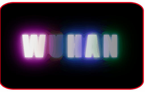
图5 霓虹文字

