ASP.NET Core Blazor Webassembly 之 組件
關於組件
現在前端幾大輪子全面組件化。組件讓我們可以對常用的功能進行封裝,以便復用。組件這東西對於搞.NET的同學其實並不陌生,以前ASP.NET WebForm的用戶控件其實也是一種組件。它封裝html代碼,封裝業務邏輯,對外提供屬性事件等信息,它完完全全就是個組件,只是用戶控件跑在服務端,而現在的組件大多數直接跑在前端。現在Blazor Webassembly微軟正式把組件帶到前端,讓我們看看它是怎麼玩的。
第一個組件
廢話不多說下面開始構建第一個組件。這個組件很簡單就是綠色的面板加一個標題的容器,我們就叫它GreenPanel吧。
新建Blazor Webassembly項目
前幾天的build大會,Blazor Webassembly已經正式release了。我們更新最新版的Core SDK就會安裝正式版的模板。
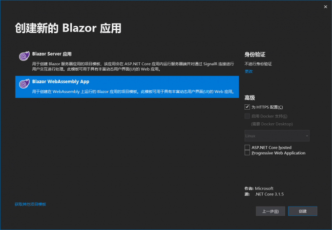
新建項目選Blazor Webassembly App項目模板
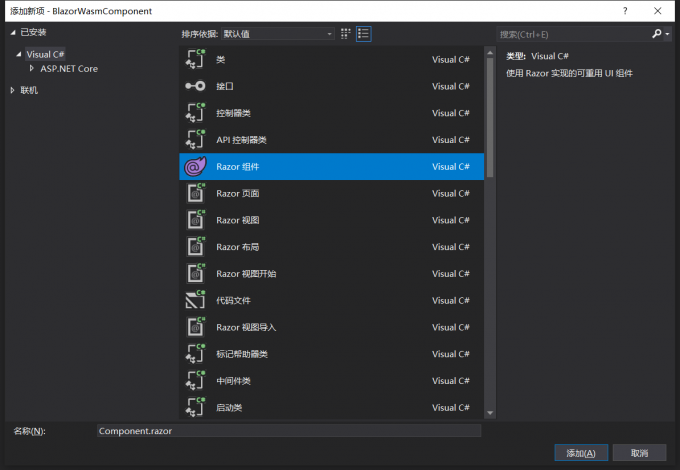
新建GreenPanel組件
在pages命令下新建一個文件夾叫做components,在文件夾下新建一個razor組件,命名為GreenPanel.razor。
注意:組件的命名必須大寫字母開頭
添加代碼如下:
<div class="green-panel">
    <div class="title">
        Green panel
    </div>
    <div class="content">
    </div>
</div>

<style>
    .green-panel{
        background-color: green;
        height:400px;
        width:400px;
    }
    .green-panel .title {
        border-bottom:1px solid #333;
        height:30px;
    }
    .green-panel .content {
    }
</style>

@code { override void OnInitialized()
        {
            base.OnInitialized();
        }
}
一個組件主要是由html,style ,code等組成。html,style用來控制ui表現層,code用來封裝邏輯。
注意:Blazor目前沒有樣式隔離技術,所以寫在組件內的style有可能會影響其他html元素
使用組件
使用組件跟其他框架大體是相同的,直接在需要使用的地方使用以我們組件名作為一個html元素插入:
如果不在同一層目錄下,則需要導入命名空間。在_Imports.razor文件內引用組件的命名空間:
...
@using BlazorWasmComponent.Components
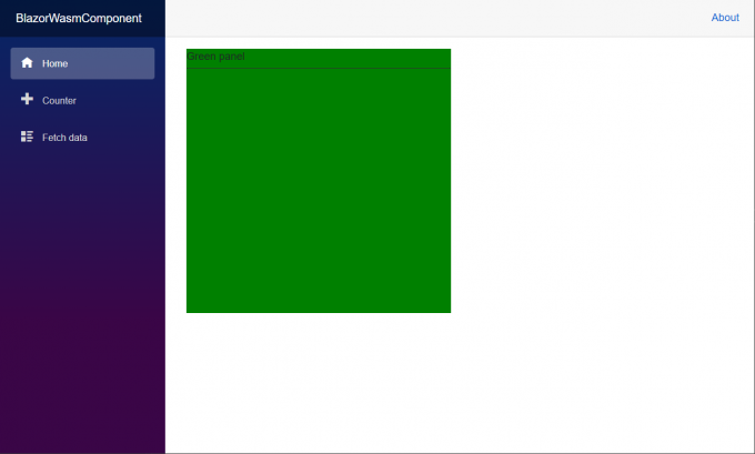
在index頁面使用組件:
<GreenPanel></GreenPanel>
運行一下:
組件類
每個組件最後都會編譯成一個C#類,讓我們用ILSPy看看一眼長啥樣:
// BlazorWasmComponent.Components.GreenPanel
using Microsoft.AspNetCore.Components;
using Microsoft.AspNetCore.Components.Rendering;

public class GreenPanel : ComponentBase
{
	protected override void BuildRenderTree(RenderTreeBuilder __builder)
	{
		__builder.AddMarkupContent(0, "<div class=\"green-panel\">\r\n    <div class=\"title\">\r\n        Green panel\r\n    </div>\r\n    <div class=\"content\">\r\n    </div>\r\n</div>\r\n\r\n");
		__builder.AddMarkupContent(1, "<style>\r\n    .green-panel{\r\n        background-color: green;\r\n        height:400px;\r\n        width:400px;\r\n    }\r\n    .green-panel .title {\r\n        border-bottom:1px solid #333;\r\n        height:30px;\r\n    }\r\n    .green-panel .content {\r\n    }\r\n</style>");
	}

	protected override void OnInitialized()
	{
		base.OnInitialized();
	}
}
GreenPanel組件會編譯成一個GreenPanel類,繼承自ComponentBase基類。裏面有幾個方法:
- BuildRenderTree 用來構建html,css等ui元素
- 其它code部分會也會被合併到這個類裏面
生命周期
了解組件聲明周期對我們使用組件有很大的幫助。一個組件的聲周期主要依次以下幾個階段:
- OnInitialized、OnInitializedAsync
- OnParametersSet、OnParametersSetAsync
- OnAfterRender、OnAfterRenderAsync
- Dispose
如果要在每個生命階段插入特定的邏輯,請重寫這些方法:
@implements IDisposable

@code {
    protected override void OnInitialized()
    {
        Console.WriteLine("OnInitialized");
        base.OnInitialized();
    }
    protected override Task OnInitializedAsync()
    {
        Console.WriteLine("OnInitializedAsync");
        return base.OnInitializedAsync();
    }
    protected override void OnParametersSet()
    {
        Console.WriteLine("OnParametersSet");
        base.OnParametersSet();
    }
    protected override Task OnParametersSetAsync()
    {
        Console.WriteLine("OnParametersSetAsync");

        return base.OnParametersSetAsync();
    }
    protected override void OnAfterRender(bool firstRender)
    {
        Console.WriteLine("OnAfterRender");
        base.OnAfterRender(firstRender);
    }
    protected override Task OnAfterRenderAsync(bool firstRender)
    {
        Console.WriteLine("OnAfterRenderAsync");
        return base.OnAfterRenderAsync(firstRender);
    }

    public void Dispose()
    {
        Console.WriteLine("Dispose");
    }
}
注意:組件默認並不繼承IDisposable接口,如果要重寫Dispose方法請手工使用@implements方法繼承接口IDisposable
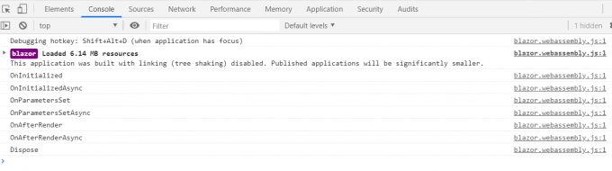
運行一下,並且切換一下頁面,使組件銷毀,可以看到所有生命周期方法依次執行:
組件屬性
我們定義組件總是免不了跟外部進行交互,比如從父組件接受參數,或者把自身的數據對外暴露。我們可以使用[Parameter]來定義一個組件的屬性。這裡叫做Parameter,估計是為了跟C#里的屬性(property,attribute)進行區分。
對我們的GreenPanel組件進行改進,支持從外部定義標題的內容:
<div class="green-panel">
    <div class="title">
        @Title
    </div>
    <div class="content">
    </div>
</div>

<style>
    .green-panel {
        background-color: green;
        height: 400px;
        width: 400px;
    }

        .green-panel .title {
            border-bottom: 1px solid #333;
            height: 30px;
        }

        .green-panel .content {
        }
</style>

@code {

    [Parameter]
    public string Title { get; set; }

    protected override void OnInitialized()
    {
        base.OnInitialized();
    }

}
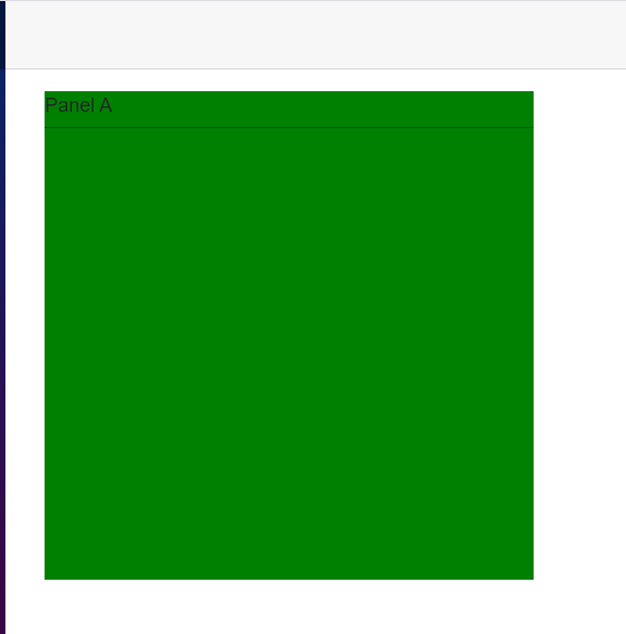
在父組件使用:
@page "/"

<GreenPanel Title="Panel A"></GreenPanel>
運行一下:
上面傳遞的是簡單類型String,下面讓我們試試傳遞複雜類型的數據進去。我們繼續對GreenPanel改造。改造成ColorPanel,它接受一個Setting對象來設置標題跟背景顏色。
定義Setting類:
  public class PanelSetting
    {
        public string Title { get; set; }

        public string BgColor { get; set; }
    }
定義ColorPanel:
<div class="green-panel">
    <div class="title">
        @Setting.Title
    </div>
    <div class="content">
    </div>
</div>

<style>
    .green-panel {
        background-color: @Setting.BgColor;
        height: 400px;
        width: 400px;
    }

        .green-panel .title {
            border-bottom: 1px solid #333;
            height: 30px;
        }

        .green-panel .content {
        }
</style>

@using BlazorWasmComponent.models;
@code {

    [Parameter]
    public PanelSetting Setting { get; set; }

    protected override void OnInitialized()
    {
        base.OnInitialized();
    }

}
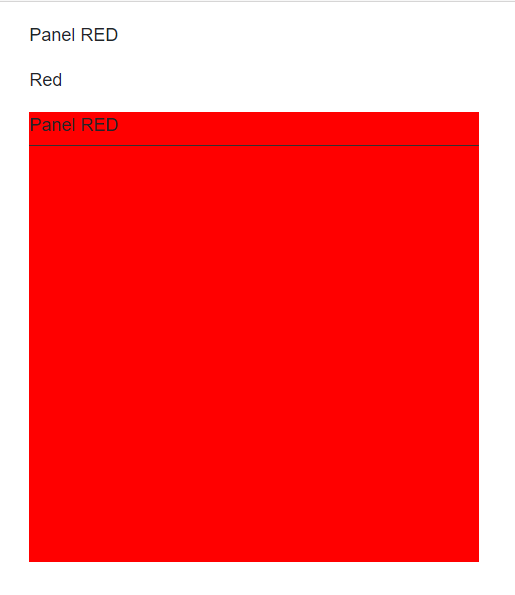
在父組件使用:
@page "/"

<p>@PanelSetting.Title</p>
<p>@PanelSetting.BgColor</p>

<ColorPanel Setting="PanelSetting"></ColorPanel>

@using BlazorWasmComponent.models;
@code{

    public PanelSetting PanelSetting { get; set; }

    protected override void OnInitialized()
    {
        PanelSetting = new PanelSetting
        {
            BgColor = "Red",
            Title = "Panel RED"
        };

        base.OnInitialized();
    }
}
運行一下:
注意:上一篇WebAssembly初探里有個錯誤,當時認為這個屬性是單向數據流,經過試驗子組件對父組件傳入的數據源進行修改的時候其實是會反應到父組件的,只是如果你使用@符號綁定數據的時候並不會像angularjs,vue等立馬進行刷新。關於這個事情感覺可以單獨寫一篇,這裡就不細說了。
組件事件
我們的組件當然也可以提供事件,已供外部訂閱,然後從內部激發來通知外部完成業務邏輯,實現類似觀察者模式。繼續改造ColorPanel,當點擊時候對外拋出事件。
使用EventCallback、EventCallback< T > 來定義事件:
<div class="green-panel" @onclick="DoClick">
    <div class="title">
        @Setting.Title
    </div>
    <div class="content">
    </div>
</div>

<style>
    .green-panel {
        background-color: @Setting.BgColor;
        height: 400px;
        width: 400px;
    }

        .green-panel .title {
            border-bottom: 1px solid #333;
            height: 30px;
        }

        .green-panel .content {
        }
</style>

@using BlazorWasmComponent.models;
@code {

    [Parameter]
    public PanelSetting Setting { get; set; }
    [Parameter]
    public EventCallback OnClick { get; set; }

    protected override void OnInitialized()
    {

        base.OnInitialized();
    }

    public void DoClick()
    {
        OnClick.InvokeAsync(null);
    }
}
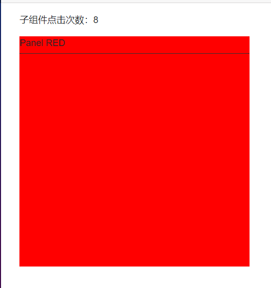
父組件訂閱事件:
@page "/"

<p>
    子組件點擊次數:@ClickCount
</p>
<ColorPanel Setting="PanelSetting" OnClick="HandleClick"></ColorPanel>

@using BlazorWasmComponent.models;
@code{

    public PanelSetting PanelSetting { get; set; }

    public int ClickCount { get; set; }

    protected override void OnInitialized()
    {
        PanelSetting = new PanelSetting
        {
            BgColor = "Red",
            Title = "Panel RED"
        };

        base.OnInitialized();
    }

    private void HandleClick()
    {
        ClickCount++;
    }
}
運行一下,並點擊子組件,父組件的計數器會被+1:
子內容
當我們定義容器級別的組件時往往需要往組件內傳遞子內容。比如我們的ColorPanel明顯就有這種需求,這個Panel內部會被放上其它元素或者其它組件,這個時候我們可以使用ChildContent屬性來實現。
<div class="green-panel" @onclick="DoClick">
    <div class="title">
        @Setting.Title
    </div>
    <div class="content">
        @ChildContent
    </div>
</div>

<style>
    .green-panel {
        background-color: @Setting.BgColor;
        height: 400px;
        width: 400px;
    }

        .green-panel .title {
            border-bottom: 1px solid #333;
            height: 30px;
        }

        .green-panel .content {
        }
</style>

@using BlazorWasmComponent.models;
@code {

    [Parameter]
    public PanelSetting Setting { get; set; }
    [Parameter]
    public EventCallback OnClick { get; set; }

    [Parameter]
    public RenderFragment ChildContent { get; set; }

    protected override void OnInitialized()
    {

        base.OnInitialized();
    }

    public void DoClick()
    {
        OnClick.InvokeAsync(null);
    }
}
定義一個類型為RenderFragment名稱為ChildContent的屬性,然後在html內使用@ChildContent來指代它。這樣子內容就會被替換到指定的位置。
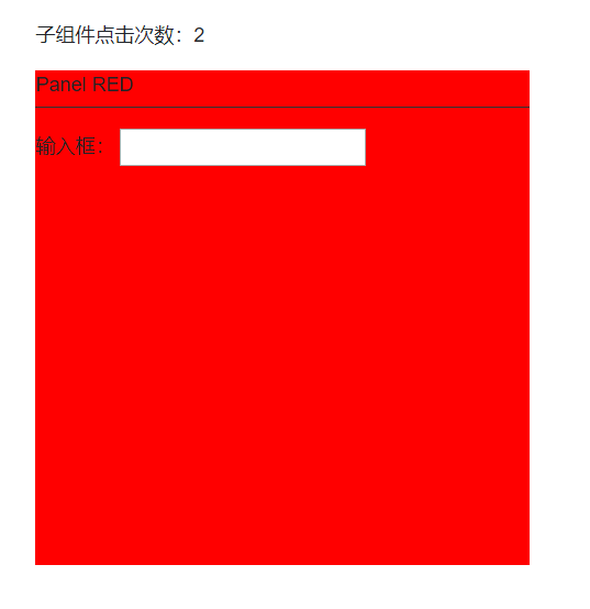
父組件使用,我們給ColorPanel的內部設置一個文本框吧:
@page "/"

<p>
    子組件點擊次數:@ClickCount
</p>
<ColorPanel Setting="PanelSetting" OnClick="HandleClick">

   輸入框: <input />

</ColorPanel>

@using BlazorWasmComponent.models;
@code{

    public PanelSetting PanelSetting { get; set; }

    public int ClickCount { get; set; }

    protected override void OnInitialized()
    {
        PanelSetting = new PanelSetting
        {
            BgColor = "Red",
            Title = "Panel RED"
        };

        base.OnInitialized();
    }

    private void HandleClick()
    {
        ClickCount++;
    }
}
運行一下看看我們的文本框會不會出現在panel內部:
@ref
因為我們的組件使用是在html內,當你在@code內想要直接通過代碼操作子組件的時候可以給子組件設置@ref屬性來直接獲取到子組件的對象。繼續改造ColorPanel,在它初始化的時候生產一個ID。
<div class="green-panel" @onclick="DoClick">
    <div class="title">
        @Setting.Title
    </div>
    <div class="content">
        @ChildContent
    </div>
</div>

<style>
    .green-panel {
        background-color: @Setting.BgColor;
        height: 400px;
        width: 400px;
    }

        .green-panel .title {
            border-bottom: 1px solid #333;
            height: 30px;
        }

        .green-panel .content {
        }
</style>

@using BlazorWasmComponent.models;
@code {

    public string ID { get; set; }

    [Parameter]
    public PanelSetting Setting { get; set; }
    [Parameter]
    public EventCallback OnClick { get; set; }

    [Parameter]
    public RenderFragment ChildContent { get; set; }

    protected override void OnInitialized()
    {
        ID = Guid.NewGuid().ToString();
        base.OnInitialized();
    }

    public void DoClick()
    {
        OnClick.InvokeAsync(null);
    }
}
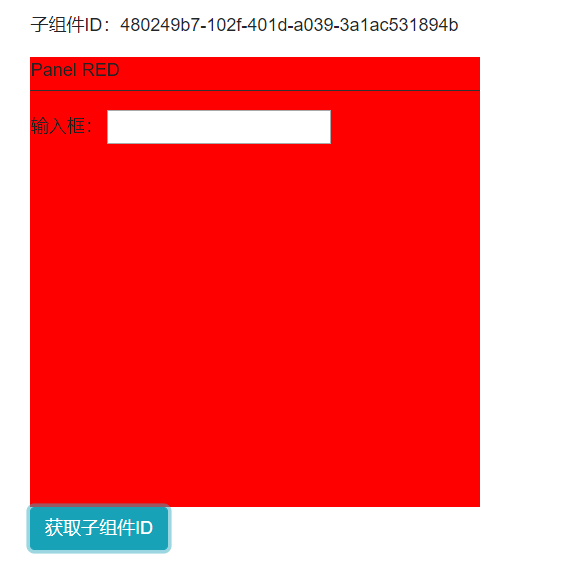
修改父組件,添加一個按鈕,當點擊的時候直接獲取子組件的Id:
@page "/"

<p>
    子組件ID:@subId
</p>
<ColorPanel Setting="PanelSetting" OnClick="HandleClick" @ref="colorPanel">
   輸入框: <input />
</ColorPanel>
<button @onclick="GetSubComponentId" class="btn btn-info">獲取子組件ID</button>

@using BlazorWasmComponent.models;
@code{

    private string subId;

    private ColorPanel colorPanel;

    public PanelSetting PanelSetting { get; set; }

    public int ClickCount { get; set; }

    protected override void OnInitialized()
    {
        PanelSetting = new PanelSetting
        {
            BgColor = "Red",
            Title = "Panel RED"
        };

        base.OnInitialized();
    }

    private void HandleClick()
    {
        ClickCount++;
    }

    private void GetSubComponentId ()
    {
        this.subId = colorPanel.ID;
    }
}
運行一下:
@key
當使用循環渲染組件的時候請在組件上使用@key來加速Blazor的diff算法。有了key就可以快速的區分哪些組件是可以復用的,哪些是要新增或刪除的,特別是在對循環列表插入對象或者刪除對象的時候特別有用。如果使用過vue就應該很容易明白有了key可以降低虛擬dom算法的複雜度,在這裡猜測blazor內部應該也是類似的算法。
@page "/"


@foreach (var key in List)
{
    <ColorPanel @key="key" Setting="PanelSetting"></ColorPanel>
}

@using BlazorWasmComponent.models;
@code{

    public List<String> List = new List<string>
    {
        Guid.NewGuid().ToString(),
         Guid.NewGuid().ToString(),
          Guid.NewGuid().ToString()
    };

    public PanelSetting PanelSetting { get; set; }


    protected override void OnInitialized()
    {
        PanelSetting = new PanelSetting
        {
            BgColor = "Red",
            Title = "Panel RED"
        };

        base.OnInitialized();
    }

}
太晚了就這樣吧,喜歡的話請點個贊,謝謝!
相關內容:
ASP.NET Core Blazor 初探之 Blazor WebAssembly
ASP.NET Core Blazor 初探之 Blazor Server


