封装Vue Element的可编辑table表格组件
前一段时间,有博友在我那篇封装Vue Element的table表格组件的博文下边留言说有没有那种“表格行内编辑”的封装组件,我当时说我没有封装过这样的组件,因为一直以来在实际开发中也没有遇到过这样的需求,但我当时给他提供了一个思路。
时间过去了这么久,公司的各种需求也不停地往外冒,什么地图图表、表格行内编辑、动态新增表单等等,只有你做不到,没有产品想不到,贼鸡儿累。再加上很快又要过年了,大家工作的心态基本呈直线下滑趋势而玩忽职守、尸位素餐以致饱食终日。只是话虽如此,但越是到年底,需求开发却越是紧急,平时可能一两周的开发任务,现在却要压缩到一周左右就要完成,苦不堪言。这不公司刚刚评完了需求,年前就让开发完成并提测,说是等年后来了,测试同学搞定后就上线。
话说这表格行内编辑,不光要在表格一行内实现文字的编辑,而且还要实现可新增一行或多行表格行内编辑的功能,同时还希望实现表格行内表单的正则验证。听着复杂,想着实现起来也复杂,其实不然,我们完全可以参照element动态增减表单项的模式来搞。原理大概其就是利用每一行的索引来设置每一个表单所需的prop和v-model,如果需要新增一行可编辑的表格行,只需往数据源数组中push一行相同的数据即可。
多说一句,年底了,这马上就要放假了,公司里很多人已经回老家了,我们这些留下来的人有一个算一个实在是没心思工作,但你以为这就可以放松了?可以摸摸鱼、划划水了?美得你。听没听说过一个女人:亚里士多德的妹妹,珍妮玛士多?
不过话又说回来,我们作为打工人,本职工作就是打工。你不工作,你还有脸称自己是打工人吗?你不是打工人,你连饭都吃不到嘴里,你还有脸说自己是“干饭人”?你还真想“十年一觉扬州梦”?东方不亮西方亮,二哈啥样你啥样。好好干活吧你!!!
这两天,趁着中午休息的时候,就把前一段时间加班加点完成的开发需求中的一个表格行内编辑的封装组件给发出来,兹当是给大家又提供了一个轮子亦或是多了一种选择吧。
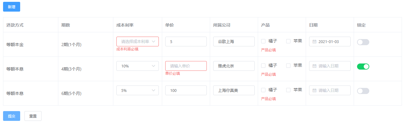
照例先来张效果图:
1、封装的可编辑表格组件TableForm.vue
<template>
  <el-form :model="form" ref="form" size="small">
    <el-form-item v-if="!isDetail">
      <el-button type="primary" @click="add">新增</el-button>
    </el-form-item>
    <el-table :data="form.list" border>
      <el-table-column v-for="x in columns" :key="x.prop" :label="x.label" :prop="x.prop" v-bind="x.attr">
        <template slot-scope="{row, $index}">
          <t-text v-if="!x.edit" :row="{x, row}" />
          <template v-else>
            <t-text v-if="isDetail" :row="{x, row}" />
            <t-input v-else v-model="row[`${x.prop}`]" v-bind="componentAttrs(x, $index)" class="width100" />
          </template>
        </template>
      </el-table-column>
    </el-table>
    <el-form-item v-if="!isDetail" style="margin-top:18px;">
      <el-button type="primary" @click="submit">提交</el-button>
      <el-button @click="reset">重置</el-button>
    </el-form-item>
  </el-form>
</template>

<script>
export default {
  props: {config: Object},
  computed: {
    isDetail(){
      const { isDetail = false } = this.config || {}
      return isDetail
    }
  },
  components: {
    TInput: {
      functional: true,
      props: ['prop', 'rules', 'type', 'options'],
      render: (h, {props: { prop, rules, type, options = [] }, data, listeners: {input = _.identity}}) => {
        const children = h => {
          if(type == 'select') return h('el-select', {class: 'width100', props: {...data.attrs}, on: {change(v){input(v)}}}, options.map(o => h('el-option', {props: {...o, key: o.value}})))
          else if(type == 'checkbox') return h('el-checkbox-group', {props: {...data.attrs}, on: {input(v) {input(v)}}}, options.map(o => h('el-checkbox', {props: {...o, label: o.value, key: o.value}}, [o.label])))
          else if(type == 'switch') return h('el-switch', {props: {activeColor: '#13ce66'}, ...data})
          else if(type == 'date') return h('el-date-picker', {props: {type: 'date', valueFormat: 'yyyy-MM-dd',}, ...data})
          return h('el-input', data)
        }

        return h('el-form-item', {props: {prop, rules}}, [children(h)])
      }
    },
    TText: {
      functional: true,
      props: ['row'],
      render: (h, {props: { row: { x, row } }}) => {
        if(!row[`${x.prop}`]) return h('span', '-')
        else if(x.format && typeof x.format == 'function') return h('span', x.format(row))
        else return h('span', row[`${x.prop}`])
      }
    },
  },
  data(){
    const { columns = [], data = [] } = this.config || {}
    return {
      form: {
        list: (data && data.length > 0) ? data.map(n => columns.reduce((r, c) => ({...r, [c.prop]: n[c.prop] == false ? n[c.prop] : (n[c.prop] || (c.type == 'checkbox' ? [] : ''))}), {})) : [columns.reduce((r, c) => ({...r, [c.prop]: c.type == 'checkbox' ? [] : (c.type == 'switch' ? false : '')}), {})]
      },
      columns,
      rules: columns.reduce((r, c) => ({...r, [c.prop]: { required: c.required == false ? false : true, message: c.label + '必填'}}), {})
    }
  },
  methods: {
    componentAttrs(item, idx){
      const {type, label} = item, attrs = Object.fromEntries(Object.entries(item).filter(n => !/^(prop|edit|label|attr|format)/.test(n[0]))),
      placeholder = (/^(select|el-date-picker)/.test(type) ? '请选择' : '请输入') + label
      Object.assign(attrs, {prop: `list.${idx}.${item.prop}`, rules: this.rules[item.prop]})
      return {...attrs, placeholder}
    },
    add(){
      const { columns = [] } = this.config || {}, obj = columns.reduce((r, c) => ({...r, [c.prop]: c.type == 'checkbox' ? [] : (c.type == 'switch' ? false : '')}), {})
      this.form.list.push(obj)
    },
    submit(){
      this.$refs.form.validate((valid) => {
        if (valid) {
          this.$emit('submit', this.form.list)
        }
      })
    },
    reset(){
      this.$refs.form.resetFields();
    },
  }
}
</script>
<style scoped>
.width100{width: 100%;}
</style>
本次封装的可编辑的表格组件,基本把大家在表格中内嵌的一些常用表单如:input输入框、select下拉框/选择器、日期选择器、checkbox复选框、switch开关等都封装进去了,大家只需根据自己的实际需求去添加不同的type就可以了,如果你还有其他的表单组件需要加进去,你自己按照我这个套路给封装进去就完事了。
另外,本次封装有几个点,大家注意下:
1)本次封装的组件,不光可以实现表格行内的编辑,同样当你编辑完成下次需要回显这些数据的时候,你只需多传一个isDetail参数就可以了,该参数默认为false。你往这儿看:
computed: {
  isDetail(){
    const { isDetail = false } = this.config || {}
    return isDetail
  }
}
页面当中也加了这个isDetail计算属性的判断。
2)也许有同学已经注意到了,在本次封装所用到的data数据对象中,有一串很长的实现方法:
list: (data && data.length > 0) ? data.map(n => columns.reduce((r, c) => ({...r, [c.prop]: n[c.prop] == false ? n[c.prop] : (n[c.prop] || (c.type == 'checkbox' ? [] : ''))}), {})) : [columns.reduce((r, c) => ({...r, [c.prop]: c.type == 'checkbox' ? [] : (c.type == 'switch' ? false : '')}), {})]
这段代码是干嘛滴的呢?
它两种用途:
-
没有数据需要回显时的可编辑表格的数据源
-
有数据需要回显时的可编辑表格的数据源
n[c.prop] == false ? n[c.prop] : ...这段代码的判断或许有人会疑惑。大家要知道element的switch组件的值是非false既true的,不加这个判断,当数据回显时,switch为false的值就回显不出来。
2、使用方法:
<template>
  <TableForm :config="config" @submit="submit" style="margin:20px;" />
</template>

<script>
import TableForm from "./TableForm";

const repayTypeList = {
   averageCapital: '等额本金',
   averageInterest: '等额本息'
},
columns = [
  { prop: 'repaymentMethod', label: '还款方式', attr: {width: '180'}, format: ({ repaymentMethod }) => repayTypeList[repaymentMethod]},
  { prop: 'productPer', label: '期数', attr: {width: '180'}, format: ({ productPer }) => `${+ productPer + 1}期(${productPer}个月)` },
  { prop: 'costRate', label: '成本利率', attr: {minWidth: '110'}, edit: true, type: 'select', options: [{label: '5%', value: '5'}, {label: '10%', value: '10'}] },
  { prop: 'price', label: '单价', attr: {minWidth: '110'}, edit: true },
  { prop: 'company', label: '所属公司', attr: {minWidth: '110'}, edit: true },
  { prop: 'product', label: '产品', attr: {minWidth: '110'}, edit: true, type: 'checkbox', options: [{label: '橘子', value: 'orange'}, {label: '苹果', value: 'apple'}] },
  { prop: 'date', label: '日期', attr: {minWidth: '110'}, edit: true, type: 'date', required: false, },
  { prop: 'opt', label: '锁定', attr: {minWidth: '110'}, edit: true, type: 'switch' },
]

export default {
  components: {
    TableForm,
  },
  data(){
    return {
      config: {
        columns,
        data: [],
      },
    }
  },
  created(){
    this.config.data = [
      {repaymentMethod: 'averageCapital', productPer: '1', price: '5', company: '谷歌上海', date: '2021-01-03', opt: false},
      {repaymentMethod: 'averageInterest', productPer: '3', costRate: '10', price: '', company: '雅虎北京', opt: true},
      {repaymentMethod: 'averageInterest', productPer: '5', costRate: '5', price: '100', company: '上海你真美', opt: false},
    ]
  },
  methods: {
    submit(res){
      console.log(res)
    }
  }
}
</script>
在使用的过程中,有一个需要注意的地方就是在columns数组中有一个required的属性,该属性默认为true,这个属性主要是用来控制当前的表单是否需要必填的校验的。还有需要说明的是,本次封装只是封装了每个表单是否需要必填的正则校验rules,没有对其他的正则验证如数字类型、小数位数等加以封装,如有需要你可以自行添加。
最后,通过子组件触发父组件的submit函数的方式来获取表格中表单的输入值。


