通過Blazor使用C#開發SPA單頁面應用程式(4) - Ant Design Button
- 2019 年 10 月 3 日
- 筆記
前面學習了Blazor的特點、環境搭建及基礎知識,現在我們嘗試的做個實際的組件。
Ant Design是螞蟻金服是基於Ant Design設計體系的 UI 組件庫,主要用於研發企業級中後台產品。目前官方是基於React和Angular實現的,今年也推出了Vue的實現。其組件涵蓋面較廣,其組件風格及交互效果還是比較驚艷的,後面準備利用Ant Design的樣式文件利用Blazor模仿幾個組件的實現。
由於也是新學的Blazor開發,可能實現的方式有些笨拙,希望高手提出寶貴意見,先看看實現的Button 按鈕、Grid 柵格、導航欄的效果。
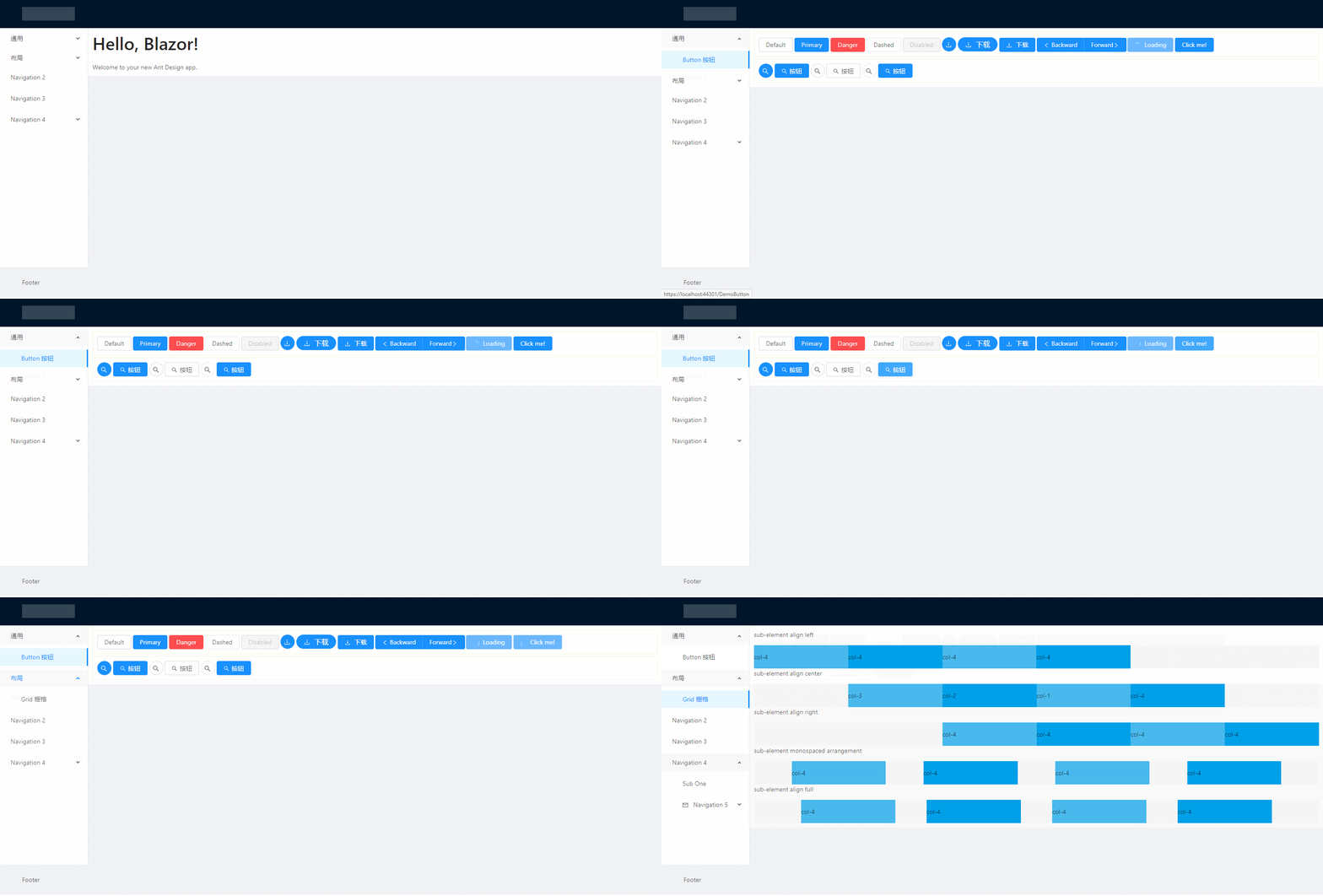
先來看看Button按鈕,它支援多種風格,是否只顯示圖標,loading狀態等。實現步驟及主要程式碼且聽我娓娓道來,
1、引用樣式文件
首先去antd.css cdn 下載穩定版的css文件,放到 wwwroot 文件夾下。再 _Host.cshtml 引用該文件。

2、建立 AButtonBase 類
AButtonBase類定義了按鈕的屬性參數;註冊了class名稱(例如:class="ant-btn ant-btn-primary")的計算表達式,class內容是根據屬性參數的設置情況計算出來的。
屬性set 的 ClassMapper.Dirty() 是通知樣式名生成方法屬性改變了需要重新生成樣式名稱。
而ClassMapper是用於註冊組件需要用到的樣式構建類,PrefixCls()是添加樣式共用的前綴,Add有多個重載,可以是直接的樣式名稱;也可以是根據第一個參數的bool表達式來確定,第二個參數的樣式是否啟用。
using BlazorAntDesign.Core; using Microsoft.AspNetCore.Components; using Microsoft.AspNetCore.Components.RenderTree; using System; using System.Collections.Generic; using System.Linq; using System.Threading.Tasks; namespace BlazorAntDesign.General { public class AButtonBase : BaseComponent { #region Properties /// <summary> /// 設置按鈕大小,可選值為 Small、Large 或者不設 /// </summary> [Parameter] protected AButtonSizes ButtonSize { get => buttonSize; set { buttonSize = value; ClassMapper.Dirty(); } } private AButtonSizes buttonSize = AButtonSizes.Default; /// <summary> /// 設置按鈕類型,可選值為 Primary、Dashed、Danger 或者不設 /// </summary> [Parameter] protected AButtonTypes ButtonType { get => buttonType; set { buttonType = value; ClassMapper.Dirty(); } } private AButtonTypes buttonType = AButtonTypes.Default; /// <summary> /// 設置按鈕形狀,可選值為 Circle、 Round 或者不設 /// </summary> [Parameter] protected AButtonShapes ButtonShape { get => buttonShape; set { buttonShape = value; ClassMapper.Dirty(); } } private AButtonShapes buttonShape = AButtonShapes.Default; /// <summary> /// 設置 button 原生的 type 值,可選值請參考 HTML 標準 /// </summary> [Parameter] protected AButtonHTMLTypes HtmlType { get; set; } = AButtonHTMLTypes.Button; /// <summary> /// 按鈕標題 /// </summary> [Parameter] protected string Title { get => title; set { title = value; ClassMapper.Dirty(); } } private string title; /// <summary> /// 設置按鈕的圖標名稱 /// </summary> [Parameter] protected string IconName { get; set; } /// <summary> /// 將按鈕寬度調整為其父寬度的選項 /// </summary> [Parameter] protected bool Block { get => block; set { block = value; ClassMapper.Dirty(); } } private bool block; /// <summary> /// 幽靈屬性,使按鈕背景透明。幽靈按鈕將按鈕的內容反色,背景變為透明,常用在有色背景上。 /// </summary> [Parameter] protected bool Ghost { get => ghost; set { ghost = value; ClassMapper.Dirty(); } } private bool ghost; /// <summary> /// 設置按鈕載入狀態 /// </summary> [Parameter] protected bool Loading { get => loading; set { loading = value; ClassMapper.Dirty(); } } private bool loading; /// <summary> /// 按鈕失效狀態 /// </summary> [Parameter] protected bool Disabled { get; set; } [Parameter] protected RenderFragment ChildContent { get; set; } /// <summary> /// 點擊按鈕時的回調 /// </summary> [Parameter] public EventCallback<UIMouseEventArgs> OnClick { get; set; } //protected System.Action Clicked { get; set; } protected bool click_animating { get; set; } #endregion protected override void RegisterClasses() { ClassMapper.PrefixCls("ant-btn") .Add(() => ClassMapper.GetEnumName(buttonSize)) .Add(() => ClassMapper.GetEnumName(buttonType)) .Add(() => ClassMapper.GetEnumName(buttonShape)) .Add(() => Block, () => "block") .Add(() => Ghost, () => "background-ghost") .Add(() => Loading, () => "loading") .Add(() => string.IsNullOrEmpty(title) && ChildContent == null, () => "icon-only"); base.RegisterClasses(); } protected void buttonDown() { click_animating = false; } protected void buttonUp() { click_animating = true; } } }
AButtonSizes、AButtonTypes、AButtonShapes、AButtonHTMLTypes 屬性參數是定義的枚舉,例如:
namespace BlazorAntDesign.General { /// <summary> /// 按鈕尺寸選項 /// </summary> public enum AButtonSizes { /// <summary> /// 預設,中 /// </summary> [ClassNamePart("")] Default, /// <summary> /// 大 /// </summary> [ClassNamePart("lg")] Large, /// <summary> /// 小 /// </summary> [ClassNamePart("sm")] Small } }
namespace BlazorAntDesign.General  {      /// <summary>      /// 按鈕類型選項      /// </summary>      public enum AButtonTypes      {          /// <summary>          /// 預設,次按鈕          /// </summary>          [ClassNamePart("")]          Default,            /// <summary>          /// 主按鈕          /// </summary>          Primary,            /// <summary>          ///          /// </summary>          Ghost,            /// <summary>          /// 虛線按鈕          /// </summary>          Dashed,

          Danger      }  }
AButtonBase類繼承自自定義的BaseComponent,BaseComponent繼承自Blazor的ComponentBase類。
BaseComponent主要定義了所有組件共用的屬性,ElementId、Style、ClassMapper等,
using System; using System.Collections.Generic; using System.Linq; using System.Threading.Tasks; using Microsoft.AspNetCore.Components; namespace BlazorAntDesign.Core { public abstract class BaseComponent : ComponentBase, IDisposable { #region Members private bool disposed; private ElementRef elementRef; #endregion #region Constructors public BaseComponent() { ElementId = Utils.IDGenerator.Instance.Generate; ClassMapper = new ClassMapper(); RegisterClasses(); } #endregion #region Methods protected virtual void RegisterClasses() { ClassMapper.AddCustomClass(() => customClass); } public void Dispose() { Dispose(true); GC.SuppressFinalize(this); } protected virtual void Dispose(bool disposing) { if (!disposed) { if (disposing) { if (ClassMapper != null) { //ClassMapper.Dispose(); ClassMapper = null; } } disposed = true; } } #endregion #region Properties /// <summary> /// 定義用戶自定義的 ClassName /// </summary> [Parameter] protected string ClassName { get => customClass; set { customClass = value; ClassMapper.Dirty(); } } private string customClass; /// <summary> /// Gets the reference to the rendered element. /// </summary> public ElementRef ElementRef { get => elementRef; protected set => elementRef = value; } /// <summary> /// 獲取 element 唯一 Id. /// </summary> public string ElementId { get; } [Parameter] protected string Style { get; set; } /// <summary> /// 獲取 ClassMapper. /// </summary> protected ClassMapper ClassMapper { get; private set; } #endregion } }
3、建立 AButton.razor
@inherits BlazorAntDesign.General.AButtonBase <button class="@ClassMapper.Class" type="@(Enum.GetName(typeof(AButtonHTMLTypes), HtmlType).ToLower())" ant-click-animating-without-extra-node="@(click_animating ? "true" : "")" disabled="@Disabled" @onkeydown="@buttonDown" @onmousedown="@buttonDown" @onkeyup="@buttonUp" @onmouseup="@buttonUp" @onclick="@OnClick"> @*圖標*@ @if (Loading) {<AIcon IconName="loading"></AIcon>} else { if (!string.IsNullOrEmpty(IconName)) {<AIcon IconName="@IconName"></AIcon>} } @*標題*@ @if (!string.IsNullOrEmpty(Title)) {<span>@Title</span>} @*子內容*@ @ChildContent</button>
其中 @inherits BlazorAntDesign.General.AButtonBase 是程式碼隱藏方式,指定後台程式碼繼承自AButtonBase類,button class="@ClassMapper.Class",將採用的樣式根據指定的屬性值計算出來賦值給button的class屬性。下面根據屬性設置判斷是否顯示圖標、標題、子內容。
4、使用 AButton
建立DemoButton.razor文件,樣例程式碼如下:
@page "/DemoButton" @using BlazorAntDesign.General; <div style="border:1px solid beige;padding:10px"> <AButton Title="Default"></AButton> <AButton Title="Primary" ButtonType="AButtonTypes.Primary"></AButton> <AButton Title="Danger" ButtonType="AButtonTypes.Danger"></AButton> <AButton Title="Dashed" ButtonType="AButtonTypes.Dashed"></AButton> <AButton Title="Disabled" Disabled="true"></AButton> <AButton ButtonType="AButtonTypes.Primary" IconName="download" ButtonShape="AButtonShapes.Circle"></AButton> <AButton Title="下載" ButtonType="AButtonTypes.Primary" IconName="download" ButtonShape="AButtonShapes.Round"></AButton> <AButton Title="下載" ButtonType="AButtonTypes.Primary" IconName="download"></AButton> <AButtonGroup><AButton ButtonType="AButtonTypes.Primary" IconName="left">Backward</AButton><AButton ButtonType="AButtonTypes.Primary">Forward<AIcon IconName="right" /></AButton></AButtonGroup> <AButton Title="Loading" ButtonType="AButtonTypes.Primary" Loading="true"></AButton> <AButton Title="Click me!" ButtonType="AButtonTypes.Primary" Loading="@isLoading" OnClick="@(()=> { isLoading = true; })"></AButton> </div> <div style="border:1px solid beige;padding:10px;margin-top:5px"> <AButton IconName="search" ButtonType="AButtonTypes.Primary" ButtonShape="AButtonShapes.Circle"></AButton> <AButton IconName="search" ButtonType="AButtonTypes.Primary">按鈕</AButton> <AButton IconName="search" ButtonShape="AButtonShapes.Circle"></AButton> <AButton IconName="search">按鈕</AButton> <AButton IconName="search" ButtonType="AButtonTypes.Dashed" ButtonShape="AButtonShapes.Circle"></AButton> <AButton IconName="search" ButtonType="AButtonTypes.Primary">按鈕</AButton> </div> @code{ private bool isLoading = false; private void LoadingClick() { isLoading = true; } }
@page "/DemoButton" 為組件路由
@using BlazorAntDesign.General; 為應用組件命名空間
好了Button的實現思路今天就學習到這了,希望有興趣的同仁共同學習探討,讓Blazor真正走向SPA開發的舞台,讓.net core七龍珠面向全棧開發,更好的擁抱社區,刷新業界對.net體系的認知。
番 外 篇
Blazor 在發展:
微軟已將 Blazor 移出了實驗階段,進入了官方預覽版。使用組件模型進行伺服器端渲染的 Blazor 版本將與.NET Core 3 的最終版本一起發布(請參閱.NET Core 路線圖),客戶端版本將在隨後不久發布。還有工作要完成:調試體驗極其有限,必須改進;有機會通過提前編譯生成本機 Wasm 來優化程式碼性能;在將未使用的程式碼庫發送到瀏覽器之前,需要從庫中刪除未使用的程式碼,從而降低總體大小(這個過程稱為樹抖動)。對 WebAsssembly 的興趣和採用與日俱增,藉助 Blazor,編寫可以在任何地方運行的 C#和.NET 程式碼的夢想終於實現了。
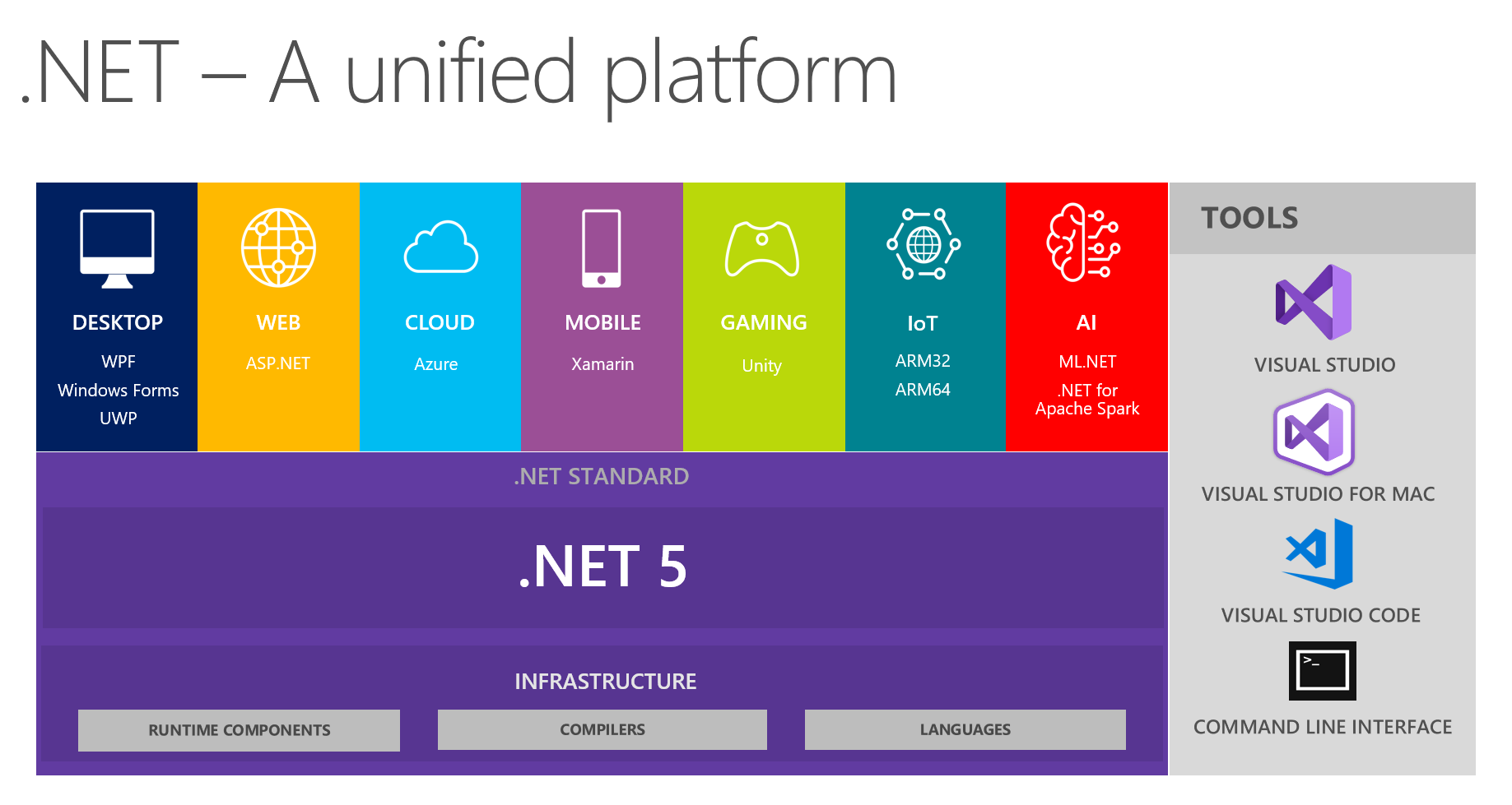
.net core將踏上新的征程: