Flutter 標籤類控制項大全Chip

老孟導讀:Flutter內置了多個標籤類控制項,但本質上它們都是同一個控制項,只不過是屬性參數不同而已,在學習的過程中可以將其放在放在一起學習,方便記憶。
RawChip
Material風格標籤控制項,此控制項是其他標籤控制項的基類,通常情況下,不會直接創建此控制項,而是使用如下控制項:
- Chip
- InputChip
- ChoiceChip
- FilterChip
- ActionChip
如果你想自定義標籤類控制項時通常使用此控制項。
RawChip可以通過設置onSelected被選中,設置onDeleted被刪除,也可以通過設置onPressed而像一個按鈕,它有一個label屬性,有一個前置(avatar)和後置圖標(deleteIcon)。
基本用法如下:
RawChip(
  label: Text('老孟'),
)
效果如下:

禁用狀態設置:
RawChip(
  label: Text('老孟'),
  isEnabled: false,
)
效果如下:

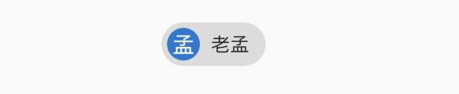
設置左側控制項,一般是圖標:
RawChip(
  avatar: CircleAvatar(
    child: Text('孟'),
  ),
  label: Text('老孟'),
)
效果如下:
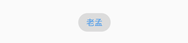
設置label的樣式和內邊距:
RawChip(
  label: Text('老孟'),
  labelStyle: TextStyle(color: Colors.blue),
  labelPadding: EdgeInsets.symmetric(horizontal: 10),
)
效果如下:
設置刪除相關屬性:
RawChip(
  label: Text('老孟'),
  onDeleted: (){
    print('onDeleted');
  },
  deleteIcon: Icon(Icons.delete),
  deleteIconColor: Colors.red,
  deleteButtonTooltipMessage: '刪除',
)
效果如下:

點擊刪除圖標,回調onDeleted。
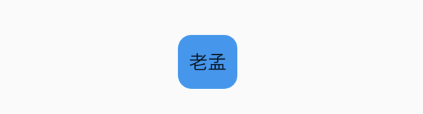
設置形狀、背景顏色及內邊距:
RawChip(
  label: Text('老孟'),
  shape: RoundedRectangleBorder(borderRadius: BorderRadius.circular(10)),
  backgroundColor: Colors.blue,
  padding: EdgeInsets.symmetric(vertical: 10),
)
效果如下:
設置陰影:
RawChip(
  label: Text('老孟'),
  elevation: 8,
  shadowColor: Colors.blue,
)
效果如下:

materialTapTargetSize屬性控制最小點擊區域,詳情查看:MaterialTapTargetSize
設置選中狀態、顏色:
bool _selected = false;
RawChip(
  label: Text('老孟'),
  selected: _selected,
  onSelected: (v){
    setState(() {
      _selected = v;
    });
  },
  selectedColor: Colors.blue,
  selectedShadowColor: Colors.red,
)
效果如下:

設置選中狀態下「前置對勾」圖標:
RawChip(
  label: Text('老孟'),
  selected: true,
  showCheckmark: true,
  checkmarkColor: Colors.red,
)
效果如下:
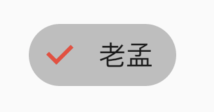
showCheckmark為false時,無「前置對勾」圖標。
設置點擊屬性:
RawChip(
  label: Text('老孟'),
  onPressed: (){
    print('onPressed');
  },
  pressElevation: 12,
)
效果如下:
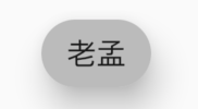
點擊時有水波紋效果。
Chip
Chip是一個簡單的標籤控制項,僅顯示資訊和刪除相關屬性,是一個簡化版的RawChip,用法和RawChip一樣。源程式碼如下:
@override
Widget build(BuildContext context) {
  assert(debugCheckHasMaterial(context));
  return RawChip(
    avatar: avatar,
    label: label,
    labelStyle: labelStyle,
    labelPadding: labelPadding,
    deleteIcon: deleteIcon,
    onDeleted: onDeleted,
    deleteIconColor: deleteIconColor,
    deleteButtonTooltipMessage: deleteButtonTooltipMessage,
    tapEnabled: false,
    shape: shape,
    clipBehavior: clipBehavior,
    focusNode: focusNode,
    autofocus: autofocus,
    backgroundColor: backgroundColor,
    padding: padding,
    materialTapTargetSize: materialTapTargetSize,
    elevation: elevation,
    shadowColor: shadowColor,
    isEnabled: true,
  );
}
InputChip
以緊湊的形式表示一條複雜的資訊,例如實體(人,地方或事物)或對話文本。
InputChip 本質上也是RawChip,用法和RawChip一樣。源程式碼如下:
@override
Widget build(BuildContext context) {
  assert(debugCheckHasMaterial(context));
  return RawChip(
    avatar: avatar,
    label: label,
    labelStyle: labelStyle,
    labelPadding: labelPadding,
    deleteIcon: deleteIcon,
    onDeleted: onDeleted,
    deleteIconColor: deleteIconColor,
    deleteButtonTooltipMessage: deleteButtonTooltipMessage,
    onSelected: onSelected,
    onPressed: onPressed,
    pressElevation: pressElevation,
    selected: selected,
    tapEnabled: true,
    disabledColor: disabledColor,
    selectedColor: selectedColor,
    tooltip: tooltip,
    shape: shape,
    clipBehavior: clipBehavior,
    focusNode: focusNode,
    autofocus: autofocus,
    backgroundColor: backgroundColor,
    padding: padding,
    materialTapTargetSize: materialTapTargetSize,
    elevation: elevation,
    shadowColor: shadowColor,
    selectedShadowColor: selectedShadowColor,
    showCheckmark: showCheckmark,
    checkmarkColor: checkmarkColor,
    isEnabled: isEnabled && (onSelected != null || onDeleted != null || onPressed != null),
    avatarBorder: avatarBorder,
  );
}
ChoiceChip
允許從一組選項中進行單個選擇,創建一個類似於單選按鈕的標籤,本質上ChoiceChip也是一個RawChip,ChoiceChip本身不具備單選屬性。
單選demo如下:
int _selectIndex = 0;
Wrap(
  spacing: 15,
  children: List.generate(10, (index) {
    return ChoiceChip(
      label: Text('老孟 $index'),
      selected: _selectIndex == index,
      onSelected: (v) {
        setState(() {
          _selectIndex = index;
        });
      },
    );
  }).toList(),
)
效果如下:
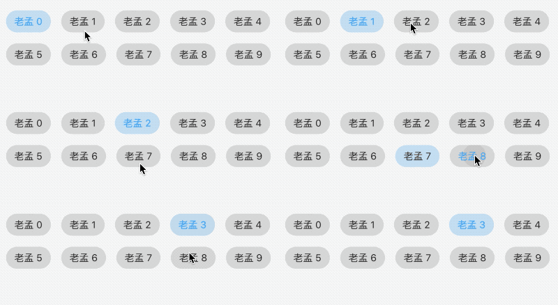
本控制項由共建者普通程式設計師提供。
FilterChip
FilterChip可以作為過濾標籤,本質上也是一個RawChip,用法如下:
List<String> _filters = [];

Column(
  children: <Widget>[
    Wrap(
      spacing: 15,
      children: List.generate(10, (index) {
        return FilterChip(
          label: Text('老孟 $index'),
          selected: _filters.contains('$index'),
          onSelected: (v) {
            setState(() {
              if(v){
                _filters.add('$index');
              }else{
                _filters.removeWhere((f){
                  return f == '$index';
                });
              }
            });
          },
        );
      }).toList(),
    ),
    Text('選中:${_filters.join(',')}'),
  ],
)
效果如下:

ActionChip
顯示與主要內容有關的一組動作,本質上也是一個RawChip,用法如下:
ActionChip(
    avatar: CircleAvatar(
      backgroundColor: Colors.grey.shade800,
      child: Text('孟'),
    ),
    label: Text('老孟'),
    onPressed: () {
      print("onPressed");
    })
效果如下:
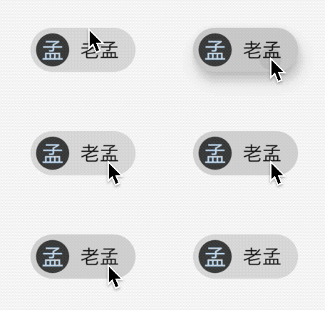
效果很像按鈕類控制項。
交流
老孟Flutter部落格地址(近200個控制項用法)://laomengit.com
歡迎加入Flutter交流群(微信:laomengit)、關注公眾號【老孟Flutter】:
 |
 |

