通过Blazor使用C#开发SPA单页面应用程序(4) – Ant Design Button
- 2019 年 10 月 3 日
- 筆記
前面学习了Blazor的特点、环境搭建及基础知识,现在我们尝试的做个实际的组件。
Ant Design是蚂蚁金服是基于Ant Design设计体系的 UI 组件库,主要用于研发企业级中后台产品。目前官方是基于React和Angular实现的,今年也推出了Vue的实现。其组件涵盖面较广,其组件风格及交互效果还是比较惊艳的,后面准备利用Ant Design的样式文件利用Blazor模仿几个组件的实现。
由于也是新学的Blazor开发,可能实现的方式有些笨拙,希望高手提出宝贵意见,先看看实现的Button 按钮、Grid 栅格、导航栏的效果。
先来看看Button按钮,它支持多种风格,是否只显示图标,loading状态等。实现步骤及主要代码且听我娓娓道来,
1、引用样式文件
首先去antd.css cdn 下载稳定版的css文件,放到 wwwroot 文件夹下。再 _Host.cshtml 引用该文件。

2、建立 AButtonBase 类
AButtonBase类定义了按钮的属性参数;注册了class名称(例如:class=”ant-btn ant-btn-primary”)的计算表达式,class内容是根据属性参数的设置情况计算出来的。
属性set 的 ClassMapper.Dirty() 是通知样式名生成方法属性改变了需要重新生成样式名称。
而ClassMapper是用于注册组件需要用到的样式构建类,PrefixCls()是添加样式共用的前缀,Add有多个重载,可以是直接的样式名称;也可以是根据第一个参数的bool表达式来确定,第二个参数的样式是否启用。
using BlazorAntDesign.Core; using Microsoft.AspNetCore.Components; using Microsoft.AspNetCore.Components.RenderTree; using System; using System.Collections.Generic; using System.Linq; using System.Threading.Tasks; namespace BlazorAntDesign.General { public class AButtonBase : BaseComponent { #region Properties /// <summary> /// 设置按钮大小,可选值为 Small、Large 或者不设 /// </summary> [Parameter] protected AButtonSizes ButtonSize { get => buttonSize; set { buttonSize = value; ClassMapper.Dirty(); } } private AButtonSizes buttonSize = AButtonSizes.Default; /// <summary> /// 设置按钮类型,可选值为 Primary、Dashed、Danger 或者不设 /// </summary> [Parameter] protected AButtonTypes ButtonType { get => buttonType; set { buttonType = value; ClassMapper.Dirty(); } } private AButtonTypes buttonType = AButtonTypes.Default; /// <summary> /// 设置按钮形状,可选值为 Circle、 Round 或者不设 /// </summary> [Parameter] protected AButtonShapes ButtonShape { get => buttonShape; set { buttonShape = value; ClassMapper.Dirty(); } } private AButtonShapes buttonShape = AButtonShapes.Default; /// <summary> /// 设置 button 原生的 type 值,可选值请参考 HTML 标准 /// </summary> [Parameter] protected AButtonHTMLTypes HtmlType { get; set; } = AButtonHTMLTypes.Button; /// <summary> /// 按钮标题 /// </summary> [Parameter] protected string Title { get => title; set { title = value; ClassMapper.Dirty(); } } private string title; /// <summary> /// 设置按钮的图标名称 /// </summary> [Parameter] protected string IconName { get; set; } /// <summary> /// 将按钮宽度调整为其父宽度的选项 /// </summary> [Parameter] protected bool Block { get => block; set { block = value; ClassMapper.Dirty(); } } private bool block; /// <summary> /// 幽灵属性,使按钮背景透明。幽灵按钮将按钮的内容反色,背景变为透明,常用在有色背景上。 /// </summary> [Parameter] protected bool Ghost { get => ghost; set { ghost = value; ClassMapper.Dirty(); } } private bool ghost; /// <summary> /// 设置按钮载入状态 /// </summary> [Parameter] protected bool Loading { get => loading; set { loading = value; ClassMapper.Dirty(); } } private bool loading; /// <summary> /// 按钮失效状态 /// </summary> [Parameter] protected bool Disabled { get; set; } [Parameter] protected RenderFragment ChildContent { get; set; } /// <summary> /// 点击按钮时的回调 /// </summary> [Parameter] public EventCallback<UIMouseEventArgs> OnClick { get; set; } //protected System.Action Clicked { get; set; } protected bool click_animating { get; set; } #endregion protected override void RegisterClasses() { ClassMapper.PrefixCls("ant-btn") .Add(() => ClassMapper.GetEnumName(buttonSize)) .Add(() => ClassMapper.GetEnumName(buttonType)) .Add(() => ClassMapper.GetEnumName(buttonShape)) .Add(() => Block, () => "block") .Add(() => Ghost, () => "background-ghost") .Add(() => Loading, () => "loading") .Add(() => string.IsNullOrEmpty(title) && ChildContent == null, () => "icon-only"); base.RegisterClasses(); } protected void buttonDown() { click_animating = false; } protected void buttonUp() { click_animating = true; } } }
AButtonSizes、AButtonTypes、AButtonShapes、AButtonHTMLTypes 属性参数是定义的枚举,例如:
namespace BlazorAntDesign.General { /// <summary> /// 按钮尺寸选项 /// </summary> public enum AButtonSizes { /// <summary> /// 缺省,中 /// </summary> [ClassNamePart("")] Default, /// <summary> /// 大 /// </summary> [ClassNamePart("lg")] Large, /// <summary> /// 小 /// </summary> [ClassNamePart("sm")] Small } }
namespace BlazorAntDesign.General  {      /// <summary>      /// 按钮类型选项      /// </summary>      public enum AButtonTypes      {          /// <summary>          /// 缺省,次按钮          /// </summary>          [ClassNamePart("")]          Default,            /// <summary>          /// 主按钮          /// </summary>          Primary,            /// <summary>          ///          /// </summary>          Ghost,            /// <summary>          /// 虚线按钮          /// </summary>          Dashed,

          Danger      }  }
AButtonBase类继承自自定义的BaseComponent,BaseComponent继承自Blazor的ComponentBase类。
BaseComponent主要定义了所有组件共用的属性,ElementId、Style、ClassMapper等,
using System; using System.Collections.Generic; using System.Linq; using System.Threading.Tasks; using Microsoft.AspNetCore.Components; namespace BlazorAntDesign.Core { public abstract class BaseComponent : ComponentBase, IDisposable { #region Members private bool disposed; private ElementRef elementRef; #endregion #region Constructors public BaseComponent() { ElementId = Utils.IDGenerator.Instance.Generate; ClassMapper = new ClassMapper(); RegisterClasses(); } #endregion #region Methods protected virtual void RegisterClasses() { ClassMapper.AddCustomClass(() => customClass); } public void Dispose() { Dispose(true); GC.SuppressFinalize(this); } protected virtual void Dispose(bool disposing) { if (!disposed) { if (disposing) { if (ClassMapper != null) { //ClassMapper.Dispose(); ClassMapper = null; } } disposed = true; } } #endregion #region Properties /// <summary> /// 定义用户自定义的 ClassName /// </summary> [Parameter] protected string ClassName { get => customClass; set { customClass = value; ClassMapper.Dirty(); } } private string customClass; /// <summary> /// Gets the reference to the rendered element. /// </summary> public ElementRef ElementRef { get => elementRef; protected set => elementRef = value; } /// <summary> /// 获取 element 唯一 Id. /// </summary> public string ElementId { get; } [Parameter] protected string Style { get; set; } /// <summary> /// 获取 ClassMapper. /// </summary> protected ClassMapper ClassMapper { get; private set; } #endregion } }
3、建立 AButton.razor
@inherits BlazorAntDesign.General.AButtonBase <button class="@ClassMapper.Class" type="@(Enum.GetName(typeof(AButtonHTMLTypes), HtmlType).ToLower())" ant-click-animating-without-extra-node="@(click_animating ? "true" : "")" disabled="@Disabled" @onkeydown="@buttonDown" @onmousedown="@buttonDown" @onkeyup="@buttonUp" @onmouseup="@buttonUp" @onclick="@OnClick"> @*图标*@ @if (Loading) {<AIcon IconName="loading"></AIcon>} else { if (!string.IsNullOrEmpty(IconName)) {<AIcon IconName="@IconName"></AIcon>} } @*标题*@ @if (!string.IsNullOrEmpty(Title)) {<span>@Title</span>} @*子内容*@ @ChildContent</button>
其中 @inherits BlazorAntDesign.General.AButtonBase 是代码隐藏方式,指定后台代码继承自AButtonBase类,button class=”@ClassMapper.Class”,将采用的样式根据指定的属性值计算出来赋值给button的class属性。下面根据属性设置判断是否显示图标、标题、子内容。
4、使用 AButton
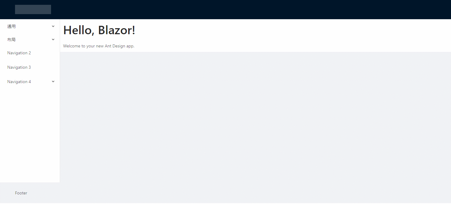
建立DemoButton.razor文件,样例代码如下:
@page "/DemoButton" @using BlazorAntDesign.General; <div style="border:1px solid beige;padding:10px"> <AButton Title="Default"></AButton> <AButton Title="Primary" ButtonType="AButtonTypes.Primary"></AButton> <AButton Title="Danger" ButtonType="AButtonTypes.Danger"></AButton> <AButton Title="Dashed" ButtonType="AButtonTypes.Dashed"></AButton> <AButton Title="Disabled" Disabled="true"></AButton> <AButton ButtonType="AButtonTypes.Primary" IconName="download" ButtonShape="AButtonShapes.Circle"></AButton> <AButton Title="下载" ButtonType="AButtonTypes.Primary" IconName="download" ButtonShape="AButtonShapes.Round"></AButton> <AButton Title="下载" ButtonType="AButtonTypes.Primary" IconName="download"></AButton> <AButtonGroup><AButton ButtonType="AButtonTypes.Primary" IconName="left">Backward</AButton><AButton ButtonType="AButtonTypes.Primary">Forward<AIcon IconName="right" /></AButton></AButtonGroup> <AButton Title="Loading" ButtonType="AButtonTypes.Primary" Loading="true"></AButton> <AButton Title="Click me!" ButtonType="AButtonTypes.Primary" Loading="@isLoading" OnClick="@(()=> { isLoading = true; })"></AButton> </div> <div style="border:1px solid beige;padding:10px;margin-top:5px"> <AButton IconName="search" ButtonType="AButtonTypes.Primary" ButtonShape="AButtonShapes.Circle"></AButton> <AButton IconName="search" ButtonType="AButtonTypes.Primary">按钮</AButton> <AButton IconName="search" ButtonShape="AButtonShapes.Circle"></AButton> <AButton IconName="search">按钮</AButton> <AButton IconName="search" ButtonType="AButtonTypes.Dashed" ButtonShape="AButtonShapes.Circle"></AButton> <AButton IconName="search" ButtonType="AButtonTypes.Primary">按钮</AButton> </div> @code{ private bool isLoading = false; private void LoadingClick() { isLoading = true; } }
@page “/DemoButton” 为组件路由
@using BlazorAntDesign.General; 为应用组件命名空间
好了Button的实现思路今天就学习到这了,希望有兴趣的同仁共同学习探讨,让Blazor真正走向SPA开发的舞台,让.net core七龙珠面向全栈开发,更好的拥抱社区,刷新业界对.net体系的认知。
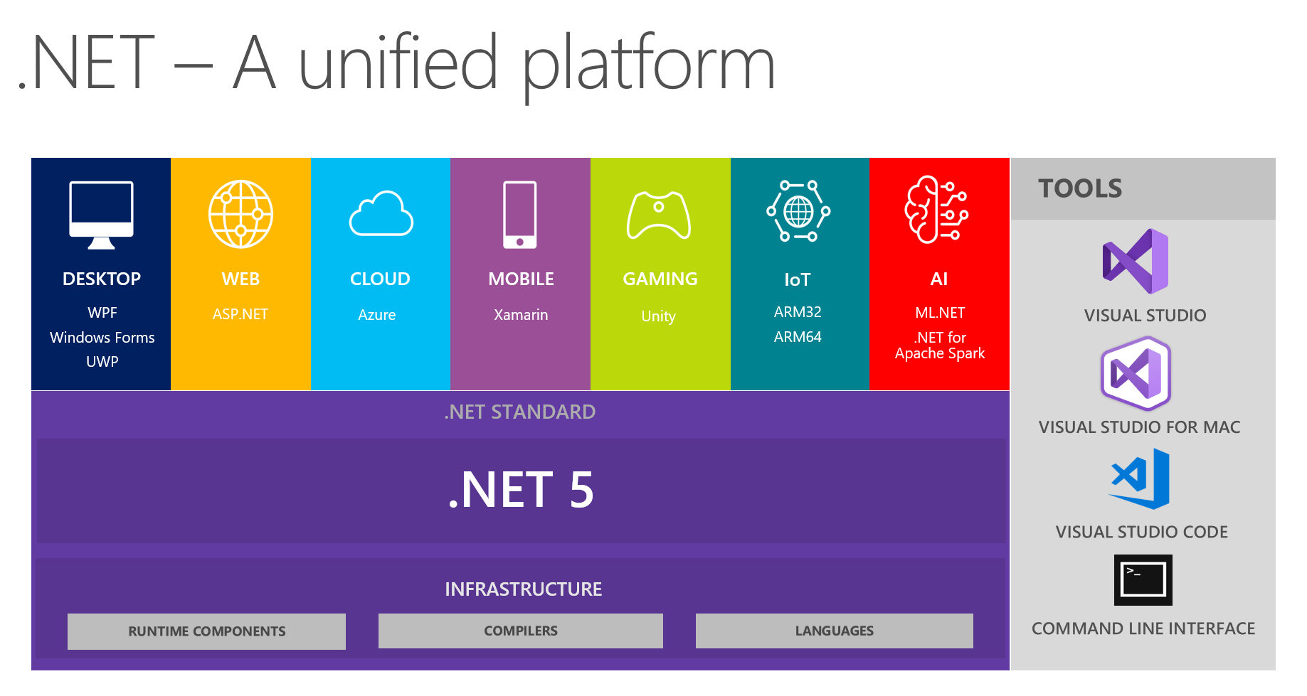
番 外 篇
Blazor 在发展:
微软已将 Blazor 移出了实验阶段,进入了官方预览版。使用组件模型进行服务器端渲染的 Blazor 版本将与.NET Core 3 的最终版本一起发布(请参阅.NET Core 路线图),客户端版本将在随后不久发布。还有工作要完成:调试体验极其有限,必须改进;有机会通过提前编译生成本机 Wasm 来优化代码性能;在将未使用的代码库发送到浏览器之前,需要从库中删除未使用的代码,从而降低总体大小(这个过程称为树抖动)。对 WebAsssembly 的兴趣和采用与日俱增,借助 Blazor,编写可以在任何地方运行的 C#和.NET 代码的梦想终于实现了。
.net core将踏上新的征程: