ggplot2(11) 總結回顧&案例練習
- 2020 年 3 月 16 日
- 筆記
從2020年2月20到2月27日,3月13日到2020年3月16日,學習了ggplot2:數據分析與圖形藝術(哈德利·威克姆 著 統計之都 譯),歷時12天。另外,3月6日到3月9日參加了美賽,也用到了剛學的ggplot2。
- qplot:基本掌握,可以快速繪圖,不局限於數據框;
- 語法:有所了解,不大涉及具體應用;
- 圖層:了解;
- 工具箱:重點,各種繪圖形式;
- 標度,定位:修飾,細化;
- 輸出:ggsave;布局:一頁多圖;
- 數據操作:ddply、transform、colwise、melt。
用平板看的書,在電腦編輯程式碼和部落格。

如果有需要書籍資源的小夥伴可以評論留下郵箱……
其他各章鏈接:
- ggplot2(1) 簡介
- ggplot2(2) 從qplot開始入門
- ggplot2(3) 語法突破
- ggplot2(4) 用圖層構建影像
- ggplot2(5) 工具箱
- ggplot2(6) 標度、坐標軸和圖例
- ggplot2(7) 定位
- ggplot2(8) 精雕細琢
- ggplot2(9) 數據操作
- ggplot2(10) 減少重複性工作
下面通過幾個示例進行練習,同時以便以後套用。
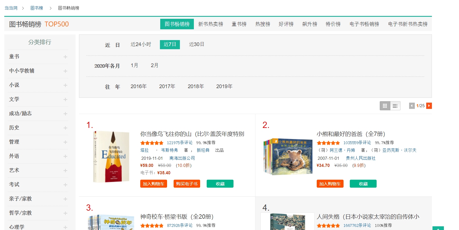
1. 噹噹網數據
目標網址:http://bang.dangdang.com/books/bestsellers/01.00.00.00.00.00-recent7-0-0-1-1
共25頁,結尾數字從1~25
1.1 爬取數據
所用程式包:
- dplyr:進行管道操作;
- stringr:使用str_c函數對網頁地址字元串進行處理,以便同時提取多個網頁的資訊;
- xml2:使用其中的read_html函數讀取網頁;
- rvest:使用其中的html_nodes從網頁文件中選擇節點,html_text獲取網頁資訊。
觀察其網頁結構,以第一本書為例:
<div class="list_num red">1.</div> <div class="pic"><a href="http://product.dangdang.com/28473192.html" target="_blank"><img src="http://img3m2.ddimg.cn/0/27/28473192-1_l_3.jpg" alt="你當像鳥飛往你的山(比爾·蓋茨年度特別推薦,登頂《紐約時報》暢銷榜80 周!多一個人讀到這個真實故事,就多一個人勇敢做自己!)" title="你當像鳥飛往你的山(比爾·蓋茨年度特別推薦,登頂《紐約時報》暢銷榜80 周!多一個人讀到這個真實故事,就多一個人勇敢做自己!)"/></a></div> <div class="name"><a href="http://product.dangdang.com/28473192.html" target="_blank" title="你當像鳥飛往你的山(比爾·蓋茨年度特別推薦,登頂《紐約時報》暢銷榜80 周!多一個人讀到這個真實故事,就多一個人勇敢做自己!)">你當像鳥飛往你的山(比爾·蓋茨年度特別推薦,登頂《紐約時報》<span class='dot'>...</span></a></div> <div class="star"><span class="level"><span style="width: 93.8%;"></span></span><a href="http://product.dangdang.com/28473192.html?point=comment_point" target="_blank">121975條評論</a><span class="tuijian">99.9%推薦</span></div> <div class="publisher_info"><a href="http://search.dangdang.com/?key=塔拉" title="塔拉 · 韋斯特弗 著 , 新經典 出品" target="_blank">塔拉</a> · <a href="http://search.dangdang.com/?key=韋斯特弗" title="塔拉 · 韋斯特弗 著 , 新經典 出品" target="_blank">韋斯特弗</a> 著 , <a href="http://search.dangdang.com/?key=新經典" title="塔拉 · 韋斯特弗 著 , 新經典 出品" target="_blank">新經典</a> 出品</div> <div class="publisher_info"><span>2019-11-01</span> <a href="http://search.dangdang.com/?key=南海出版公司" target="_blank">南海出版公司</a></div> <div class="price"> <p> <span class="price_n">¥59.00</span> <span class="price_r">¥59.00</span> (<span class="price_s">10.0折</span>) </p> <p class="price_e">電子書:<span class="price_n">¥35.40</span></p> <div class="buy_button"> <a ddname="加入購物車" name="" href="javascript:AddToShoppingCart('28473192');" class="listbtn_buy">加入購物車</a> <a name="" href="http://product.dangdang.com/1901169911.html" class="listbtn_buydz" target="_blank">購買電子書</a> <a ddname="加入收藏" id="addto_favorlist_28473192" name="" href="javascript:showMsgBox('addto_favorlist_28473192',encodeURIComponent('28473192&platform=3'), 'http://myhome.dangdang.com/addFavoritepop');" class="listbtn_collect">收藏</a> </div> </div>
因此可設計程式碼如下:
library(xml2) library(dplyr) library(stringr) library(rvest) books<-data.frame() #使用for循環進行批量數據爬取 for(i in 1:25){ web<-read_html(str_c("http://bang.dangdang.com/books/bestsellers/01.00.00.00.00.00-recent7-0-0-1-",i),encoding="gbk") #排名 rank<-web%>%html_nodes(".list_num")%>%html_text() #書名 name<-web%>%html_nodes(".name a")%>%html_text() #作者 author<-web%>%html_nodes(".star+ .publisher_info")%>%html_text() #價格 price<-web%>%html_nodes("p:nth-child(1) .price_n")%>%html_text() #原價 original_price<-web%>%html_nodes("p:nth-child(1) .price_r")%>%html_text() #折扣 discount<-web%>%html_nodes("p:nth-child(1) .price_s")%>%html_text() #評論數 review<-web%>%html_nodes(".star")%>%html_text() #創建數據框並存儲以上資訊 book<-data_frame(rank,name,author,price,original_price, discount,review) books<-rbind(books,book) } #將數據寫入csv文檔 #write.csv(books,file="books.csv")
以上程式碼將數據寫入數據框中,如果有必要可以用write.csv函數寫出。
1.2 數據清理
#查看數據格式 str(books)
Classes ‘tbl_df’, ‘tbl’ and ‘data.frame’: 500 obs. of 7 variables:
$ rank : chr “1.” “2.” “3.” “4.” …
$ name : chr “你當像鳥飛往你的山(比爾·蓋茨年度特別推薦,登頂《紐約時報》…” “小熊和最好的爸爸(全7冊)” “神奇校車·橋樑書版(全20冊)” “人間失格(日本小說家太宰治的自傳體小說,李現推薦)” …
$ author : chr “塔拉 · 韋斯特弗 著 , 新經典 出品” “(荷)阿蘭德·丹姆 著,(荷)亞歷克斯·沃爾夫 繪,漆仰平,愛桐 譯” “喬安娜柯爾 著 布魯斯迪根 圖 施芳 譯” “(日)太宰治 著,楊偉 譯” …
$ price : chr “¥59.00” “¥34.70” “¥148.50” “¥18.80” …
$ original: chr “¥59.00” “¥35.00” “¥150.00” “¥25.00” …
$ discount: chr “10.0折” “9.9折” “9.9折” “7.5折” …
$ review : chr “121994條評論99.9%推薦” “1035562條評論99.7%推薦” “872932條評論99.9%推薦” “1667777條評論100%推薦” …
提取有用資訊並進行格式轉換:
SUB<-function(t,REG) { m<-gregexpr(REG, t) start<-m[[1]] stop<-start+attr(m[[1]],"match.length")-1 l<-length(start) r<-rep("1",l) for(i in 1:l) { r[i]<-substr(t,start[i],stop[i]) } return(r) } #修改數據類型 books$rank<-lapply(books$rank,SUB,REG="[0-9]+")%>%as.integer() books$price<-lapply(books$price,SUB,REG="[0-9.]+$")%>%as.numeric() books$original<-lapply(books$original,SUB,REG="[0-9.]+$")%>%as.numeric() books$discount<-lapply(books$discount,SUB,REG="^[0-9.]+")%>%as.numeric() books$review<-lapply(books$review,SUB,REG="^[0-9]+")%>%as.integer() books<-books[c(-2,-3)] books<-books[!apply(is.na(books),1,sum),]
1.3 繪圖
cor(books) cor.test(books$review,books$rank)
rank price original discount review
rank 1.00000000 -0.06882118 -0.05829241 -0.05690682 -0.35888334
price -0.06882118 1.00000000 0.98859115 0.16187930 0.05107963
original -0.05829241 0.98859115 1.00000000 0.05381846 0.05132552
discount -0.05690682 0.16187930 0.05381846 1.00000000 -0.07028547
review -0.35888334 0.05107963 0.05132552 -0.07028547 1.00000000
Pearson’s product-moment correlation
data: books$review and books$rank
t = -8.5718, df = 497, p-value < 2.2e-16
alternative hypothesis: true correlation is not equal to 0
95 percent confidence interval:
-0.4330207 -0.2799231
sample estimates:
cor
-0.3588833
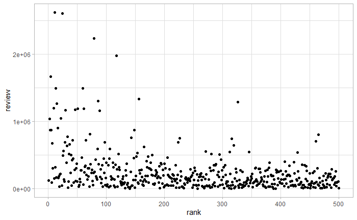
通過相關係數和相關性檢驗,可以看到書籍排名和評論數目有相關關係,排名越靠前,評論數目越多。畫出二者散點圖,如下圖所示。
qplot(rank,review,data=books)
畫出書籍價格分布直方圖,如下圖所示。
library(ggplot2) theme_set(theme_light()) qplot(price,data=books,geom="histogram",xlim=c(0,200))+labs(title="Histogram of the price distribution of popular books")+theme(plot.title = element_text(hjust = 0.5))

p1<-ggplot(data=books, aes(review,price,colour=rank,alpha=I(1/3)))+ guides(colour=FALSE)+ geom_point()+ scale_x_continuous(breaks=c(0,1e6,2e6),labels=expression(0,1%*%10^6,2%*%10^6))+ annotate('segment',x=5e5,xend=1.05e6,y=110,yend=300,colour="red",arrow=arrow()) p2<-p1+aes(size=I(0.5),alpha=I(1))+labs(x=NULL,y=NULL)+ scale_x_continuous(expand=c(0,0),limits=c(0,5e5), breaks=c(0,2e5,4e5),labels=expression(0,2%*%10^5,4%*%10^5))+ scale_y_continuous(expand=c(0,0),limits=c(0,150)) library(grid) pdf("test.pdf",width=4,height=3) p1 print(p2,vp=viewport(x=0.74,y=0.74,width=0.5,height=0.5)) dev.off()
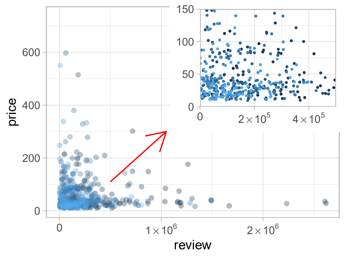
通過上例,練習了散點圖繪製,顏色標度及一頁多圖(子圖)操作。
關於R語言爬蟲,學習自:
關於箭頭繪製,學習自:
https://cloud.tencent.com/developer/ask/119325/answer/214891
https://www.cnblogs.com/xihehe/p/8309480.html
2. 電力數據
國家統計局→統計數據→年度數據→能源→電力平衡表→時間:2000-2017
http://data.stats.gov.cn/easyquery.htm?cn=C01
2.1 清理數據
從國家統計局下載csv格式的文件,讀入並選取電力生產量相關數據。
library(dplyr) library(reshape2) electricity<-read.csv("電力平衡表.csv",header=FALSE) production<-electricity[5,-1]%>%t()%>%as.numeric() hydraulic<-electricity[6,-1]%>%t()%>%as.numeric() thermal<-electricity[7,-1]%>%t()%>%as.numeric() nuclear<-electricity[8,-1]%>%t()%>%as.numeric() wind<-electricity[9,-1]%>%t()%>%as.numeric() st<-as.Date("2000","%Y") en<-as.Date("2017","%Y") time<-seq(en,st,by="-1 year") ee<-data.frame(time,production,hydraulic,thermal,nuclear,wind) ee<-melt(ee,id="time")
2.2 繪圖
程式包:
- showtext、Cairo:解決漢字的字體問題;
- grid:用於矩形網路輸出。
library(showtext) library(Cairo) library(ggplot2) library(grid) font_add("song","song.ttf") CairoPDF("ee1.pdf",width=8,height=6) grid.newpage() pushViewport(viewport(layout = grid.layout(3, 3))) vplayout <- function(x, y) viewport(layout.pos.row = x, layout.pos.col = y) showtext_begin() theme_set(theme_light()) my_theme<-theme(axis.title.x=element_text(size=10,family="song",hjust=1), axis.title.y=element_text(size=10,family="song",hjust=1), axis.text.y=element_text(angle=90), plot.title=element_text(hjust=0.5,family="song")) p1<-ggplot(data=ee[ee$variable=="production",],aes(time,value))+geom_line()+ labs(x="時間(年)",y="電力生產總量(億千瓦小時)")+ ggtitle("")+my_theme p2<-ggplot(data=ee[ee$variable!="production",],aes(time,value))+geom_line()+ labs(x="時間(年)",y="電力生產量(億千瓦小時)")+ facet_wrap(~variable,nrow=2,ncol=2,scales="free_y", labeller=as_labeller(c("hydraulic"="水電","thermal"="火電","nuclear"="核電","wind"="風電")))+ ggtitle("電力生產量年度數據")+my_theme+theme(plot.title=element_text(hjust=0)) print(p1,vp=vplayout(1:3,1)) print(p2,vp=vplayout(1:3,2:3)) showtext_end() dev.off()
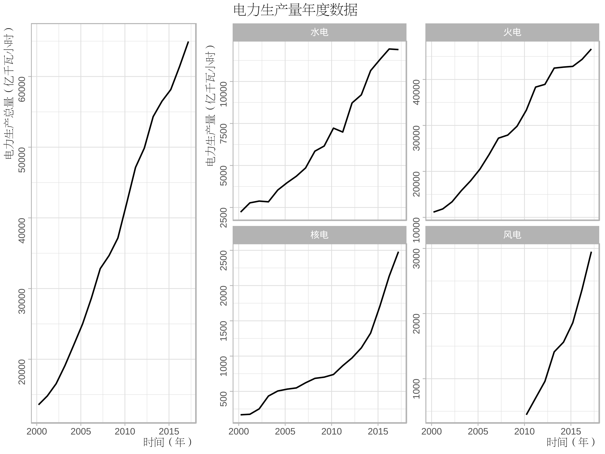
關於ggplot2分面標籤的修改,學習自:https://ggplot2.tidyverse.org/reference/as_labeller.html
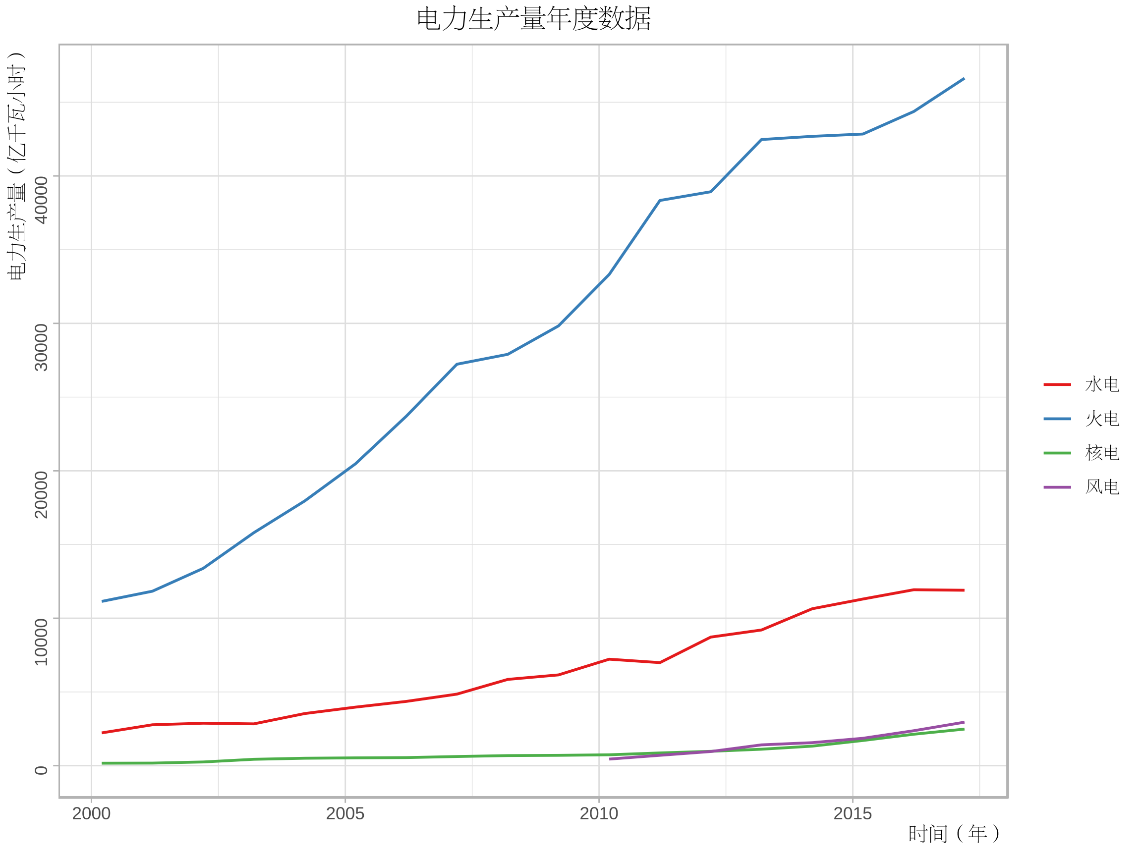
CairoPDF("ee2.pdf",width=8,height=6) showtext_begin() theme_set(theme_light()) p3<-ggplot(data=ee[ee$variable!="production",],aes(time,value,colour=variable))+geom_line() p3+labs(x="時間(年)",y="電力生產量(億千瓦小時)")+ scale_colour_brewer(palette = "Set1","",breaks=c("hydraulic","thermal","nuclear","wind"), labels=c("水電","火電","核電","風電"))+ ggtitle("電力生產量年度數據")+my_theme+theme(legend.text=element_text(family="song")) showtext_end() dev.off()
關於中文字體的設置,學習自:
https://www.jianshu.com/p/97c915e66ff4
3. 2019美賽C題數據
3.1 數據清洗
題目背景是美國正在經歷關於使用合成和非合成阿片類藥物的國家危機,第一份文件(MCM_NFLIS_Data.xlsx)中包含了美國5個州各縣2010到2017年麻醉鎮痛葯(合成阿片類藥物)和海洛因的藥物案件計數。
下面我們對這個文件中的數據進行可視化探索,繪製出這五個州在8年中海洛因案件計數的變化情況。
首先導入數據並進行數據清洗。
library(xlsx) library(dplyr) library(tidyverse) #讀取數據 drug<-read.xlsx("MCM_NFLIS_Data.xlsx","Data") #篩選數據 drug<-drug[drug$SubstanceName=="Heroin",] #分類匯總 Heroin<-tapply(drug$DrugReports,paste(drug$YYYY,drug$State),sum) Heroin<-data.frame(id=names(Heroin),num=Heroin)%>% separate(col=id,into=c("date","state"),sep=" ") row.names(Heroin)<-1:dim(Heroin)[1]
這裡我們只保留的海洛因的相關數據,並且按照州名和年份進行了分類匯總。
- 由於原文件是xlsx文件,需要使用xlsx包;
- 採用tidyverse包中的separate函數,可以輕鬆拆分列,類似於excel數據菜單中的分列操作。

3.2 折線圖
採用gganimate中的函數繪製動圖GIF,程式碼如下。
library(ggplot2) library(gganimate) theme_set(theme_light()) #繪製影像 p1<-ggplot(data=Heroin,aes(as.Date(date,"%Y"),num,colour=state)) p1+geom_point()+geom_line()+labs(x="time(year)",y="Drug Reports Number")+ ggtitle("State total count of Heroin")+ theme(axis.title.x=element_text(hjust=1), axis.title.y=element_text(hjust=1), axis.text.y=element_text(angle=90), plot.title=element_text(hjust=0.5))+ transition_manual(date,cumulative=TRUE)
- 設置主題為light,圖形更清晰;
- 採用cumulative = TRUE,累加展示圖形。

可以看到總體上OH州情況最為嚴重,但後兩年情況有所緩解,WV州情況相對比較樂觀。
3.3 地圖
library(maps) library(plyr) Heroin<-left_join(Heroin,data.frame(state=state.abb,region=state.name),by="state") Heroin$region<-tolower(Heroin$region) states<-map_data("state",unique(Heroin$region)) mapdata<-merge(states,Heroin,by="region") mid_range<-function(x) mean(range(x,na.rm=TRUE)) centres<-ddply(mapdata,.(state),colwise(mid_range,.(lat,long))) #對中心位置進行微調 centres[centres$state %in% c("KY","VA"),c("lat")]<- centres[centres$state %in% c("KY","VA"),c("lat")]-0.5 library(RColorBrewer) myPalette<-colorRampPalette(brewer.pal(9,"YlOrRd")) ggplot(data=mapdata,aes(long,lat,group=group,fill=num))+geom_polygon()+ labs(x="longitude",y="latitude", title="The quantitative distribution of heroin reports by state", subtitle="Year:{current_frame}")+ scale_fill_gradientn(colours=myPalette(9))+ guides(fill=guide_legend(title=" State totalncount of Heroin"))+ theme(plot.title=element_text(hjust=0.5), plot.subtitle=element_text(hjust=0.5))+ geom_text(aes(label=state,group = NULL,fill=NULL), data = centres, size = 8, angle = 45)+ transition_manual(as.integer(date))
- state.abb,state.name用於獲取美國州名和簡稱;
- tolower把字母轉換為小寫,便於匹配;
- 採用map_data函數獲取地圖資訊;
- 計算所有點的橫縱坐標(經緯度)的均值作為州的中心,因為有的州形狀比較特殊,可以對中心位置centres進行微調;
- 將RColorBrewer包中的配色應用到連續顏色標度,需要使用colorRampPalette、brewer.pal函數。

從上圖中可以看出各州形勢變換情況,與折線圖反映的資訊一致。
關於地圖的繪製以及標籤的添加,回顧了:https://www.cnblogs.com/dingdangsunny/p/12354072.html#_label6
關於動圖的繪製,學習自以下兩篇文章:
https://blog.csdn.net/weixin_42933967/article/details/96200053
https://github.com/thomasp85/gganimate
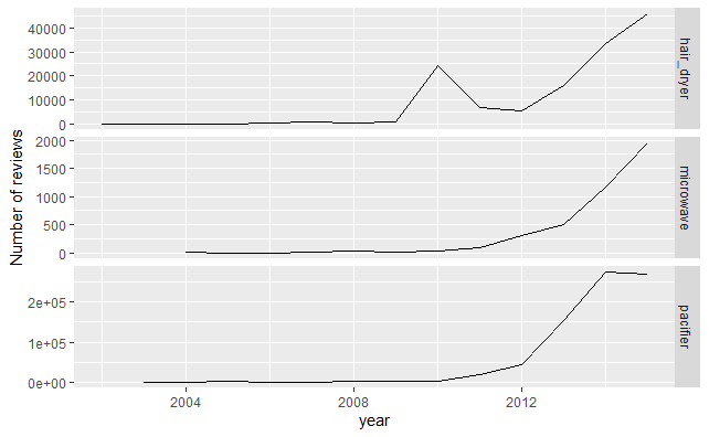
4. 2020美賽C題數據
在其創建的在線市場中,亞馬遜為客戶提供了對購買進行評分和評價的機會。個人評級(稱為“星級”)使購買者可以使用1(低評級,低滿意度)到5(高評級,高滿意度)的等級來表示他們對產品的滿意度。
文件中給出了3種產品(微波爐,嬰兒奶嘴和吹風機)的歷史星級評價資訊,下面對這些資訊進行簡單的可視化。
4.1 數據清洗
首先讀入數據:
library(readr)#用來讀入tsv數據 #讀取原始數據 hair_dryer <- read_tsv("hair_dryer.tsv") hair_dryer <- hair_dryer[dim(hair_dryer)[1]:1,] microwave <- read_tsv("microwave.tsv") microwave <- microwave[dim(microwave)[1]:1,] pacifier <- read_tsv("pacifier.tsv") pacifier <- pacifier[dim(pacifier)[1]:1,]
由於題目中給的是tsv格式的數據,這裡採用readr包讀取。
數據預處理:
#數據預處理 hair_dryer$class<-"hair_dryer" microwave$class<-"microwave" pacifier$class<-"pacifier" #合併數據為data,便於整體分析 data<-rbind(hair_dryer,microwave,pacifier) data<-as.data.frame(data) data$class<-as.factor(data$class) #將變數轉化為合適的類型 data$review_date <- as.Date(data$review_date, format = "%m/%d/%Y")
4.2 產品評論數目折線圖
library(ggplot2) library(plyr) #3種不同產品的每年的評論總數變化圖 review_count<-ddply(data,.(review_date,class),nrow) names(review_count)<-c("review_date","class","count") data<-left_join(data,review_count,by=c("review_date","class")) p1<-ggplot(data,aes(as.integer(format.Date(review_date,"%Y")),count)) p1+stat_summary(fun.y="sum",geom="line")+facet_grid(class~.,scales="free_y")+ labs(x="year",y="Number of reviews")
4.3 星級變化圖
#3種不同產品2010~2015年每月的平均star_rating變化圖 p2<-ggplot(data[data$review_date>as.Date("2010","%Y"),],aes(as.integer(format(review_date,"%m")),star_rating,colour=class)) p2+stat_summary(fun.y="mean",geom="line")+facet_wrap(~as.integer(format.Date(review_date,"%Y")),nrow=2,ncol=3)+ labs(x="month",y="average of star rating")+ ggtitle("Average star rating of each month for 3 kinds of products")
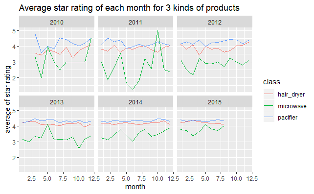
這裡複習了ggplot2統計摘要stat_summary的使用方法,可以直接在原始數據基礎上得到具有概括性的圖形。
5.疫情數據
數據來源於:https://news.qq.com/zt2020/page/feiyan.htm(騰訊新聞網)
數據採集於2020年3月15日。
關於數據採集,參考:https://blog.csdn.net/xufive/article/details/104093197
不得不說R在爬蟲方面確實比不上python方便,所以……趕快溜去學python了
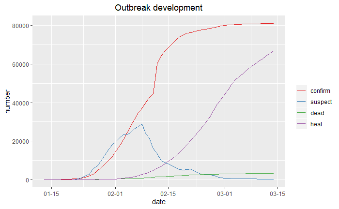
5.1 折線趨勢圖
首先讀入準備的數據。
news<-read.csv("疫情防控.csv",stringsAsFactors=FALSE) dis<-read.csv("distribution.csv") ten<-read.csv("tendency.csv")
利用ggplot2繪圖:
library(reshape2) library(ggplot2) library(scales) ten<-melt(ten,id="date") ten$date<-as.Date(ten$date) p1<-ggplot(data=ten,aes(date,value,colour=variable))+geom_line() p1+labs(x="date",y="number")+ scale_x_date(labels=date_format("%m-%d"))+ scale_colour_brewer(palette="Set1","")+ ggtitle("Outbreak development")+ theme(plot.title=element_text(hjust=0.5))
5.2 地區分布圖(中國地圖)
library(maptools) library(dplyr) map_data<-readShapePoly('bou2_4p.shp') x <- map_data@data%>% data.frame(id=as.character(seq(0:924)-1)) china_map <- fortify(map_data)%>% left_join(x,by="id") SUB<-function(t,REG) { m<-gregexpr(REG, t) start<-m[[1]] stop<-start+attr(m[[1]],"match.length")-1 l<-length(start) r<-rep("1",l) for(i in 1:l) { r[i]<-substr(t,start[i],stop[i]) } return(r) } china_map$province<-lapply(china_map$NAME,SUB,REG="^[u4e00-u9fa5]{2}")%>%unlist() dis$province<-lapply(dis$province,SUB,REG="^[u4e00-u9fa5]{2}")%>%unlist() china_map<-left_join(china_map,dis,by="province") library(RColorBrewer) myPalette <- colorRampPalette(brewer.pal(9, "YlOrRd")) p2<-ggplot(china_map,aes(x=long,y=lat,group=group,fill=log(confirm))) + geom_polygon(colour="grey") p2+coord_map("polyconic")+ labs(x="longitude",y="latitude", title="Cumulative number of confirmed cases", subtitle="(as of 15 March)")+ scale_fill_gradientn(colours = myPalette(9))+ guides(fill=guide_legend(title=" Number of nconfirmed casesn (logarithm)"))+ theme(plot.title=element_text(hjust=0.5), plot.subtitle=element_text(hjust=0.5))
- 這裡首先需要用maptools包中的readShapePoly函數讀入我們的中國地圖數據並進行是黨的格式轉換。
- 由於兩個數據框對於省份一個是簡稱一個是全稱,所以均提取前兩個漢字進行匹配。
- 疫情數據中包含澳門,在地圖數據中沒有包含,因此這裡沒有畫出澳門的數據情況。
- 由於湖北數值很大,所以取了對數;如果先用cut函數對confirm數值進行適當的切分,轉換為離散型,效果應該也是不錯的。
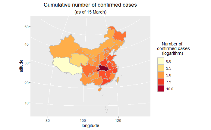
關於用ggplot2畫中國地圖,學習自:
http://blog.sina.com.cn/s/blog_6bc5205e0102vma9.html
5.3 詞雲圖
繪製了中國社會組織公共服務平台關於疫情防控的報道的詞雲圖。
http://www.chinanpo.gov.cn/1944/125174/nextindex.html
library(jiebaR) library(wordcloud2) library(tidytext) #讀入停用詞 stopwords<-readLines("stopwords.txt") #分離出辭彙表:使用jieba對文本進行處理 eng=worker() word<-segment(news$body,eng) word<-word[!(word %in% stopwords)] counts<-table(word)%>% data.frame() counts%>% top_n(200)%>% wordcloud2(fontFamily="微軟雅黑",color="random-dark", backgroundColor="white")
這裡採用jieba分詞,並讀入了停用詞表進行剔除,得到結果如下。

這段時間,新型冠狀病毒”疫情,一直牽動著全國人民的心,戰勝病毒,人人有責。從3月11到15日,湖北新增病例連續5天個位數;3月15日,湖北全省新增新冠肺炎確診病例4例,其中武漢市4例,其他16個市州均為0例。不鬆懈,繼續加油!我們堅信,在黨中央、國務院的堅強領導下,在全國人民的共同努力下,我們一定會取得疫情防控阻擊戰的最終勝利!
最後,向鍾院士致敬,向一線工作者致敬。感謝他們能夠在國難當前堅決做到牢記使命、不圖虛名、堅守底線、一心為民。
對上面提到鏈接的部落客表示真誠的感謝,歡迎小夥伴們批評指正!
本文所用的數據、程式碼(包括地圖文件、字體文件、停用詞表等)都已打包上傳到百度網盤,永久有效:
鏈接:https://pan.baidu.com/s/1RU4fJHW9V5U-zRqqXk9nhA
提取碼:asnc
複製這段內容後打開百度網盤手機App,操作更方便哦