VUE實現Studio管理後台(九):開關(Switch)控制項,輸入框input系列
- 2020 年 3 月 8 日
- 筆記
接下來幾篇作文,會介紹用到的輸入框系列,今天會介紹組普通的調用方式,因為RXEditor要求複雜的輸入功能,後面的例子會用VUE的component動態調用,就沒有今天的這麼直觀了,控制項的實現原理都一樣,只是調用方式的區別,今天的例子的調用程式碼為了寫作文特殊製作的,寫完作文還要恢復回去。
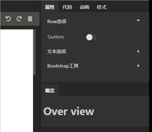
開關控制項(Switch)的實現效果:
給組件取個好聽的名字,叫RxSwitch吧。調用程式碼:
<RxSwitch :onValue = "'on-value'" :offValue = "'off-value'" v-model = "inputValue" > </RxSwitch>
組件程式碼:
<template> <div class="rx-switch" :class="onValue === inputValue? 'on' : ''" @click="click"> </div> </template> <script> export default { name: 'RxSwitch', props:{ value:{ default:'' }, onValue:{ default:'on' }, offValue:{ default:'off' }, }, computed:{ inputValue: { get:function() { return this.value; }, set:function(val) { this.$emit('input', val); }, }, }, methods: { click(){ this.inputValue = this.inputValue === this.onValue ? this.offValue : this.onValue }, }, } </script> <style> .rx-switch{ position: relative; width: 26px; height: 14px; background: #424242; margin-top:4px; border-radius:6px; cursor: pointer; } .rx-switch::after{ content: ''; position: absolute; top:-1px; left:-1px; height: 16px; width: 16px; background: #e0e0e0; border-radius: 50%; box-shadow: 2px 2px 5px 0px rgba(0, 0, 0, 0.4); } .rx-switch.on{ background: #75b325; } .rx-switch.on::after{ content: ''; position: absolute; top:-1px; left:auto; right: -1px; height: 16px; width: 16px; background: #e0e0e0; border-radius: 50%; box-shadow: 2px 2px 5px 0px rgba(0, 0, 0, 0.4); } </style>
原理:滑鼠點擊時,切換v-model(inputValue)的值,模板根據inputValue的值確定是否顯示on狀態。
通過css偽類::after繪製開關上的觸控點。具體可以參看CSS程式碼。
感謝耐心閱讀,詳細程式碼,請參考Github:https://github.com/vularsoft/studio-ui
若有有問題,請留言交流。


