Bootstrap5 如何創建多媒體對象
一、在Bootstra5中使用媒體對象
Bootstrap 媒體對象在版本 5 中已經停止支援了。但是,我們仍然可以使用 flex 和 margin 創建包含左對齊或右對齊媒體對象(如影像或影片)以及文本內容(如部落格評論、推文等)的布局 。
<!doctype html>
<html lang="zh-CN">
<head>
<meta charset="utf-8">
<meta name="viewport" content="width=device-width, initial-scale=1">
<link href="//cdn.jsdelivr.net/npm/[email protected]/dist/css/bootstrap.min.css" rel="stylesheet">
<script src="//cdn.jsdelivr.net/npm/[email protected]/dist/js/bootstrap.bundle.min.js"></script>
</head>
<body>
<div class="container-fluid">
<div class="row">
<div class="col-md-2"></div>
<div class="col-md-8">
<br>
<div class="d-flex">
<div class="flex-shrink-0">
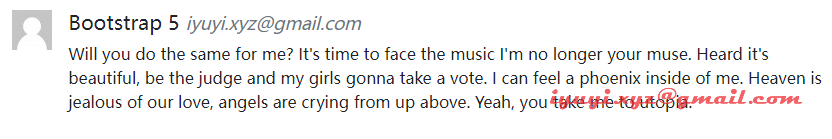
<img src="img/xyz.png" class="rounded-circle" alt="Sample Image">
</div>
<div class="flex-grow-1 ms-3">
<h5>Bootstrap 5 <small class="text-muted"><i>[email protected]</i></small></h5>
<p>Will you do the same for me? It's time to face the music I'm no longer your muse. Heard it's beautiful, be the judge and my girls gonna take a vote. I can feel a phoenix inside of me. Heaven is jealous of our love, angels are crying from up above. Yeah, you take me to utopia.</p>
</div>
</div>
<div class="col-md-2"></div>
</div>
</div>
</body>
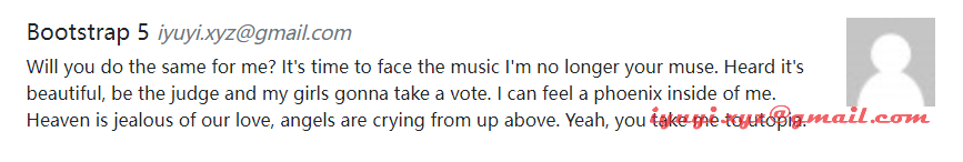
</html>顯示的結果如下
我們還可以創建媒體對象的其他變體。
將 .rounded 或 .rounded-circle 等影像修飾符類應用於影像來創建圓角或圓形影像。
<div class="d-flex">
<div class="flex-shrink-0">
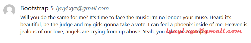
<img src="img/xyz.png" class="rounded-circle" alt="Sample Image">
</div>
<div class="flex-grow-1 ms-3">
<h5>Bootstrap 5 <small class="text-muted"><i>[email protected]</i></small></h5>
<p>Will you do the same for me? It's time to face the music I'm no longer your muse. Heard it's beautiful, be the judge and my girls gonna take a vote. I can feel a phoenix inside of me. Heaven is jealous of our love, angels are crying from up above. Yeah, you take me to utopia.</p>
</div>
</div>顯示的結果如下
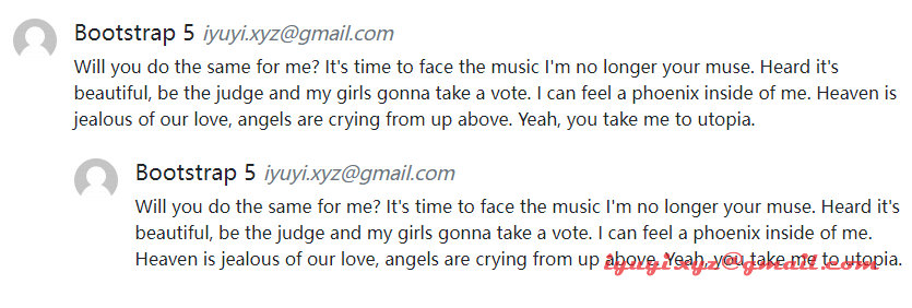
二、創建嵌套的媒體對象
媒體對象也可以嵌套在其他媒體對象中。
<div class="d-flex">
    <div class="flex-shrink-0">
        <img src="img/xyz.png" class="rounded-circle" alt="Sample Image">
    </div>
    <div class="flex-grow-1 ms-3">
        <h5>Bootstrap 5 <small class="text-muted"><i>[email protected]</i></small></h5>
        <p>Will you do the same for me? It's time to face the music I'm no longer your muse. Heard it's beautiful, be the judge and my girls gonna take a vote. I can feel a phoenix inside of me. Heaven is jealous of our love, angels are crying from up above. Yeah, you take me to utopia.</p>

        <!-- Nested media object -->
        <div class="d-flex mt-4">
            <div class="flex-shrink-0">
                <img src="img/xyz.png" class="rounded-circle" alt="Sample Image">
            </div>
            <div class="flex-grow-1 ms-3">
                <h5>Bootstrap 5 <small class="text-muted"><i>[email protected]</i></small></h5>
                <p>Will you do the same for me? It's time to face the music I'm no longer your muse. Heard it's beautiful, be the judge and my girls gonna take a vote. I can feel a phoenix inside of me. Heaven is jealous of our love, angels are crying from up above. Yeah, you take me to utopia.</p>
            </div>
        </div>
    </div>
</div>
嵌套媒體對象顯示的結果如下
三、媒體對象對齊
我們還可以通過簡單地調整 HTML 程式碼本身來更改內容以及媒體對象的水平對齊方式。
<div class="d-flex">
     <div class="flex-grow-1 me-3">
         <h5>Bootstrap 5 <small class="text-muted"><i>[email protected]</i></small></h5>
         <p>Will you do the same for me? It's time to face the music I'm no longer your muse. Heard it's beautiful, be the judge and my girls gonna take a vote. I can feel a phoenix inside of me. Heaven is jealous of our love, angels are crying from up above. Yeah, you take me to utopia.</p>
     </div>
     <div class="flex-shrink-0">
         <img src="img/xyz.png" alt="Sample Image">
     </div>
</div>
顯示的結果如下
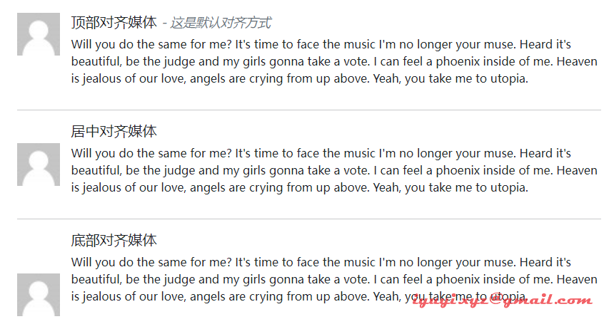
除此之外,我們還可以使用 flexbox 實用程式類在內容塊的中間或底部對齊影像或其他媒體對象,例如,可以使用 .align-self-center 類進行垂直居中對齊,使用 .align-self-end 類用於底部對齊。
默認情況下,媒體對象內的媒體是頂部對齊的。
<!--頂部對齊媒體-->
<div class="d-flex">
    <div class="flex-shrink-0">
        <img src="img/xyz.png" width="60" height="60" alt="Sample Image">
    </div>
    <div class="flex-grow-1 ms-3">
        <h5>頂部對齊媒體 <small class="text-muted"><i>- 這是默認對齊方式</i></small></h5>
        <p>Will you do the same for me? It's time to face the music I'm no longer your muse. Heard it's beautiful, be the judge and my girls gonna take a vote. I can feel a phoenix inside of me. Heaven is jealous of our love, angels are crying from up above. Yeah, you take me to utopia.</p>
    </div>
</div>
<hr>

<!--居中對齊媒體-->
<div class="d-flex">
    <div class="flex-shrink-0 align-self-center">
        <img src="img/xyz.png" width="60" height="60" alt="Sample Image">
    </div>
    <div class="flex-grow-1 ms-3">
        <h5>居中對齊媒體</h5>
        <p>Will you do the same for me? It's time to face the music I'm no longer your muse. Heard it's beautiful, be the judge and my girls gonna take a vote. I can feel a phoenix inside of me. Heaven is jealous of our love, angels are crying from up above. Yeah, you take me to utopia.</p>
    </div>
</div>
<hr>

<!--底部對齊媒體-->
<div class="d-flex">
    <div class="flex-shrink-0 align-self-end">
        <img src="img/xyz.png" width="60" height="60" alt="Sample Image">
    </div>
    <div class="flex-grow-1 ms-3">
        <h5>底部對齊媒體</h5>
        <p>Will you do the same for me? It's time to face the music I'm no longer your muse. Heard it's beautiful, be the judge and my girls gonna take a vote. I can feel a phoenix inside of me. Heaven is jealous of our love, angels are crying from up above. Yeah, you take me to utopia.</p>
    </div>
</div>
顯示的結果如下