我的Vue之旅、04 CSS媒體查詢完全指南(Media Quires)
什麼是SCSS
Sass: Sass Basics (sass-lang.com)
SCSS 是 CSS 的預處理器,它比常規 CSS 更強大。
- 可以嵌套選擇器,更好維護、管理程式碼。
- 可以將各種值存儲到變數中,方便復用。
- 可以使用 Mixins 混合重複程式碼,方便復用。
scss導入html
方法一 VSCODE 插件
方法二 手動編譯
npm install -g sass

sass input.scss output.css ::單次編譯
sass --watch scss/index.scss css/index.css ::多次編譯

<link rel="stylesheet" href="css/index.css"> ::寫在HTML里
可能遇到的問題
Refused to apply style from ‘//127.0.0.1:5500/CSS媒體查詢/css/style.css‘ because its MIME type (‘text/html’) is not a supported stylesheet MIME type, and strict MIME checking is enabled.
解決方法: 404 Not Found,提供的文件地址有誤。
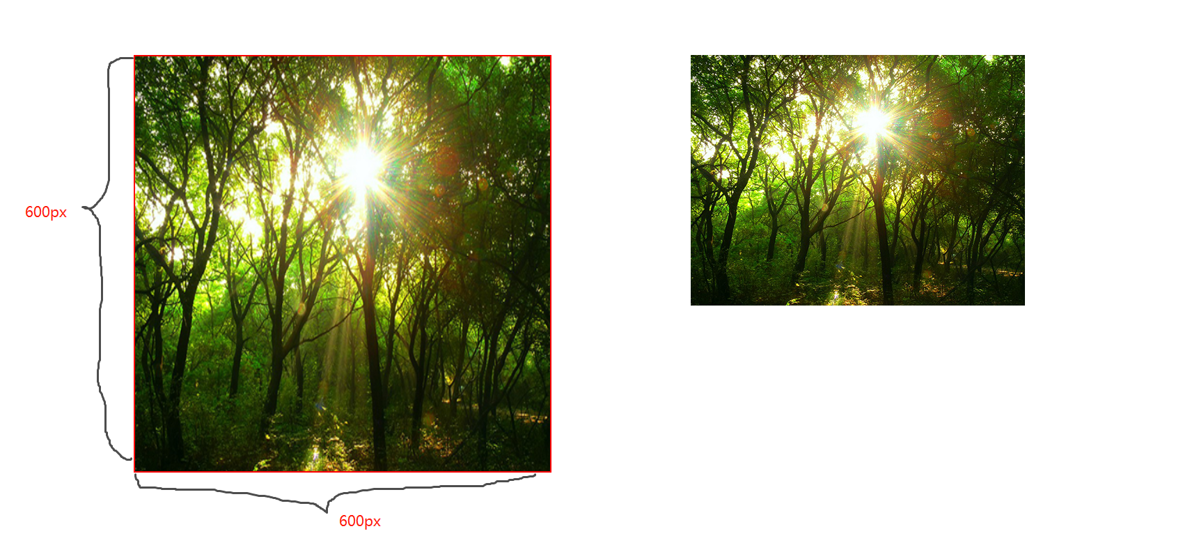
CSS屬性 background-size
contain;
圖片寬高比不變,縮放至圖片自身能完全顯示出來,所以容器會有留白區域
cover;
圖片寬高比不變,鋪滿整個容器的寬高,而圖片多出的部分則會被截掉
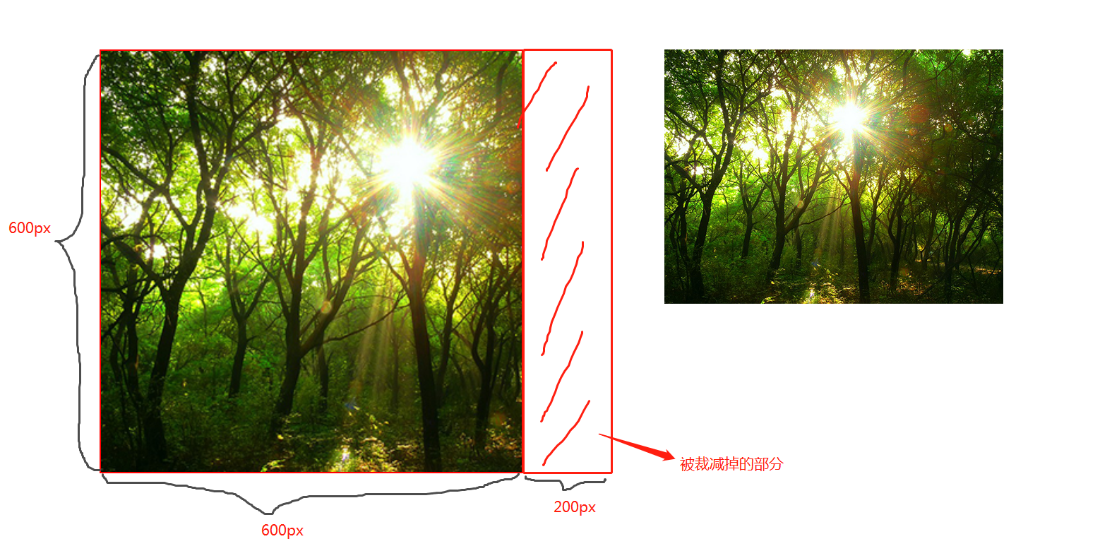
100%;
圖片寬高比改變,縮放至和div寬高一致的尺寸。
CSS媒體查詢
CSS媒體查詢允許您創建從桌面到移動設備的所有螢幕尺寸的響應式網站。
語法
定義
@media screen and (max-width: 768px){
  .container{
   // 你的程式碼
  }
}
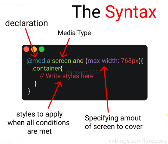
- 媒體查詢聲明, @media
- 媒體查詢類型, screen
- 覆蓋的螢幕範圍, max-width: 768px
- 更改樣式, Write styles here
深入
媒體查詢聲明
媒體查詢以@media聲明開頭。目的是告訴瀏覽器我們已指定媒體查詢。
媒體查詢類型
- all 所有媒體設備
- print 列印設備
- screen 電腦、平板、手機螢幕
- speech 螢幕閱讀器
@media screen
為什麼要加and
在肯德基買東西,你想要炸雞和漢堡,這是兩個需求條件。
現在你已經確定了一個條件,即 screen 媒體查詢類型。你要指定其他條件,比如想要規定在某一個螢幕範圍內,那麼就可以用 and 來連接。
@media screen and (max-width : 768px) {
  .container{
     // 在screen媒體類型,螢幕寬度<=768px時這部分程式碼將被觸發
  }
}
跳過查詢類型
你可以只用 min-width & max-width 來跳過媒體查詢類型。
@media (min-width : 480px) and (max-width : 768px) {
  .container{
     // 在螢幕寬度為 480px 和 768px 之間這部分程式碼將被觸發
  }
}
多個條件需求
當條件大於等於三個時,可以用 comma 連接。
//Targeting screen sizes between 480px & 768px

@media screen, (min-width : 480px) and (max-width : 768px) {
  .container{
     // 在screen媒體類型,螢幕寬度為 480px 和 768px 之間這部分程式碼將被觸發
  }
}
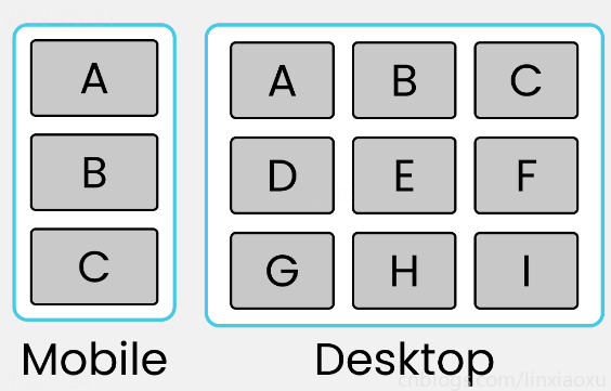
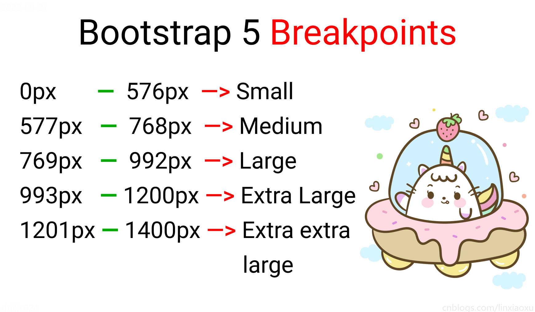
螢幕斷點
螢幕斷點(screen break-point)用於規定一個範圍內的螢幕寬度所屬類別,目前沒有標準的螢幕斷點。
學習使用、案例程式碼下載
學習使用①初入響應式
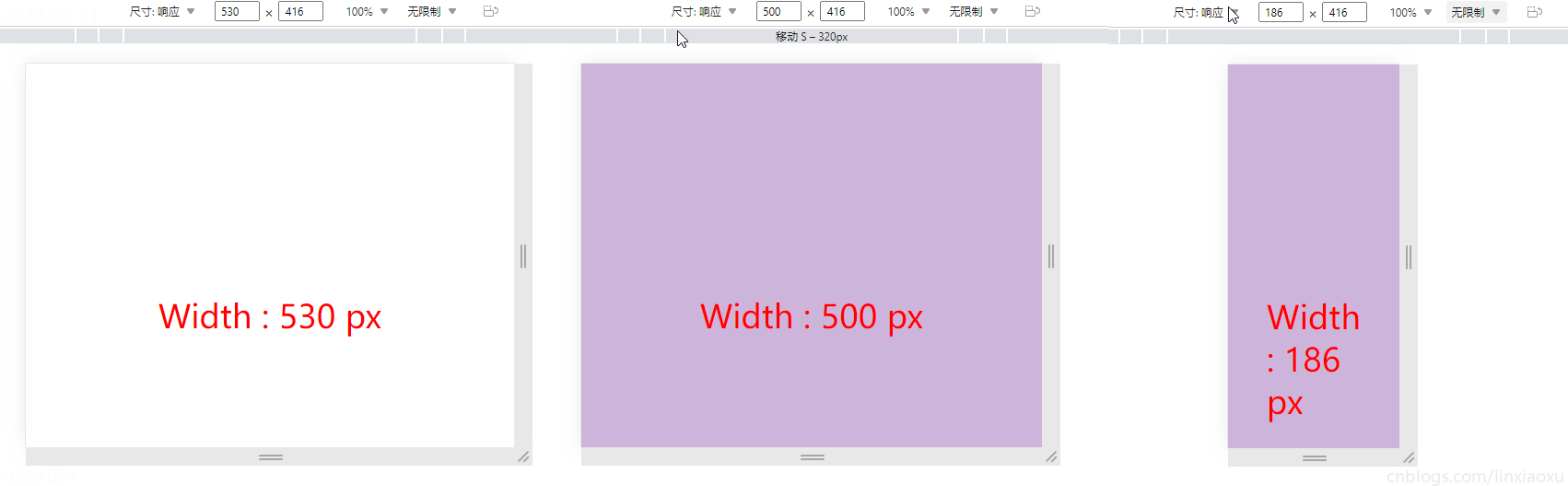
讓我們試著寫一個響應式頁面 。新建main.js、media.html、style.scss,即時編譯並watch style.scss。
main.js
// 當改變窗口大小、窗口載入時觸發 screen
window.onresize = screen;
window.onload = screen;

// 一個函數獲取當前螢幕寬度並將內容設置在ID為size的元素上

function screen() {
  Width = window.innerWidth;
  document.getElementById("size").innerHTML
   = "Width : " + Width + " px"
}
media.html
首先我們先建立一個media.html。然後導入剛剛寫的main.js。導入style.css,是scss即時編譯的css文件。
<!DOCTYPE html>
<html lang="en">
<head>
  <title></title>
  <meta charset="UTF-8">
  <meta name="viewport" content="width=device-width, initial-scale=1">
  <link href="./style.css" rel="stylesheet">
  <script type="text/javascript" src="./main.js"></script>
</head>

<body>
  <div class="container">
    <div id="size">
      程式設計師勇往直前,當導入main.js後,這句話會被替換掉
    </div>
  </div>
</body>
</html>
保存顏色變數
SCSS創建四個變數分別保存十六進位RGB
$color-1 : #cdb4db ; // 手機端
$color-2 : #fff1e6 ; // 平板端
$color-3 : #52b788 ; // 筆記型電腦端
$color-4 : #bee1e6 ; // 台式大屏
居中container元素
.container {

  display: grid;
  place-items: center;

  background-color: $color-1;
  height: 100vh;
}
place-items 是 align-items 、 justify-items 的簡寫。
max-width 媒體查詢
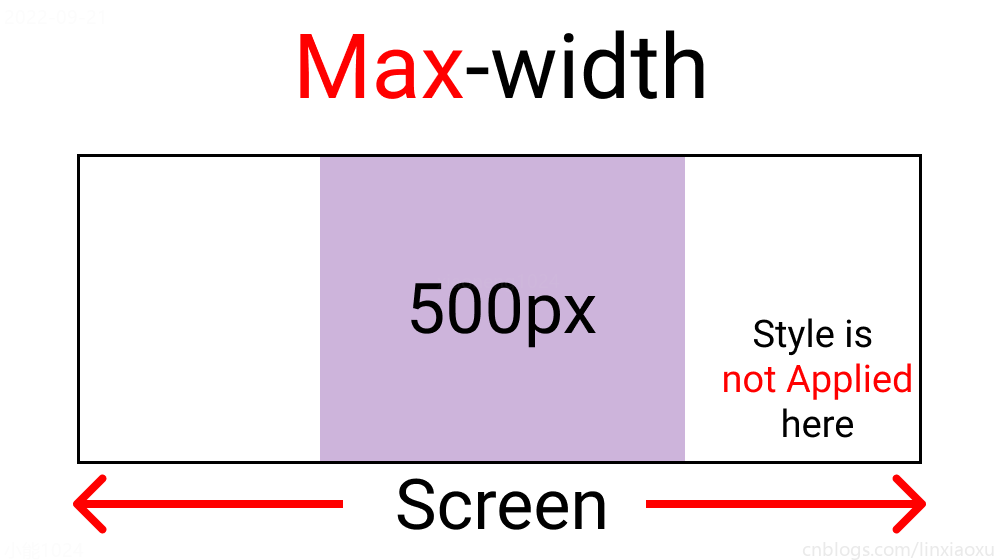
@media screen and (max-width : 500px) {
  .container {
    background-color: $color-1;
  }
}
😄當前完整scss程式碼
$color-1 : #cdb4db; // 手機端
$color-2 : #fff1e6; // 平板端
$color-3 : #52b788; // 筆記型電腦端
$color-4 : #bee1e6; // 台式大屏

* {
  margin: 0px;
  padding: 0px;
  box-sizing: border-box;

  body {
    font-size: 35px;
    font-family: sans-serif;
  }
}

.container {
  //元素居中

  display: grid;
  place-items: center;

  background-color: $color-1;
  height: 100vh;
}

#size {
  position: absolute;

  top: 60%;
  left: 50%;

  transform: translateX(-50%);

  color: red;
  font-size: 35px;
}

.text {
  // 還沒添加內容
}

.container {
  background-color: white;
  height: 100vh;
  display: grid;
  place-items: center;
}


@media screen and (max-width : 500px) {
  .container {
    background-color: $color-1;
  }
}
min-width 媒體查詢
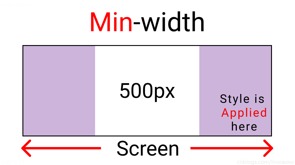
@media screen and (min-width : 500px){
  .container{
    background-color: $color-1;
  }
}
與max-width相反。寬度>=500px時程式碼生效。
螢幕斷點
根據四種類型,我們將有四個媒體查詢。
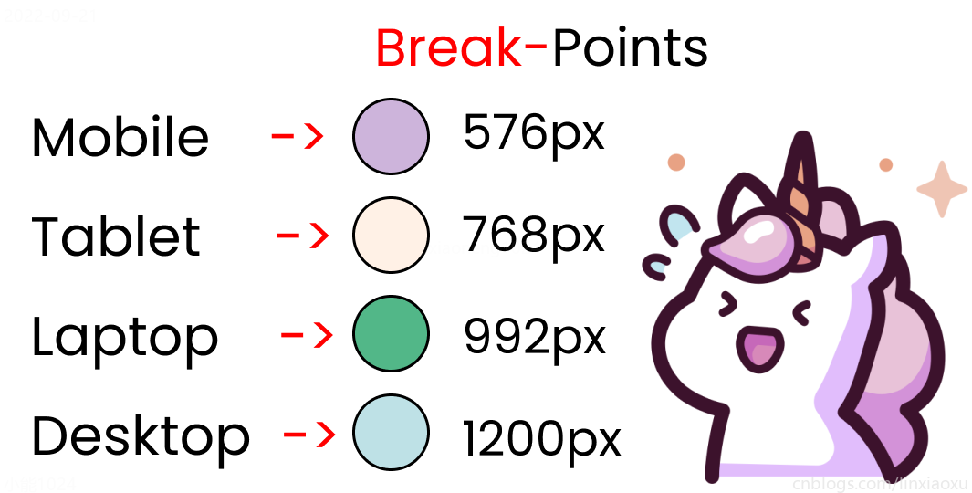
給scss添加新的變數
$mobile : 576px;
$tablet : 768px;
$laptop : 992px;
$desktop : 1200px;
添加一系列媒體查詢
在添加媒體查詢時,需要遵循正確的數據,從最大寬度到最小寬度。
@media screen and (max-width: $desktop){
  .container{
    background-color: $color-4;
  }
}
@media screen and (max-width: $laptop){
  .container{
    background-color: $color-3;
  }
}
@media screen and (max-width: $tablet){
  .container{
    background-color: $color-2;
  }
}
@media screen and (max-width : $mobile){
  .container{
    background-color: $color-1;
  }
}
現在改變螢幕寬度將顯示不同的背景顏色。
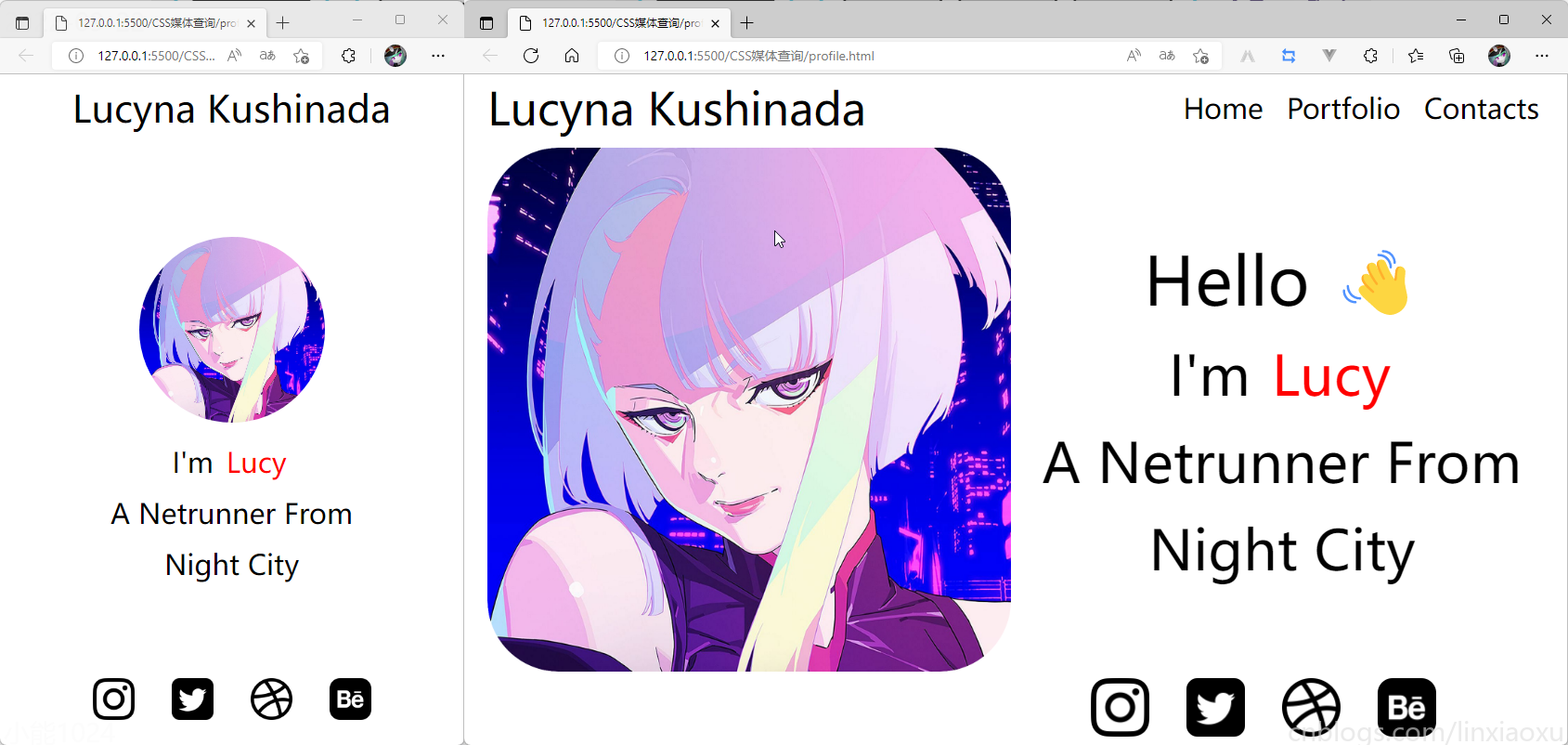
學習使用②響應式個人介紹
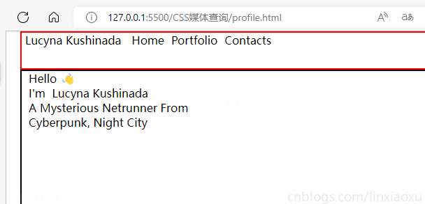
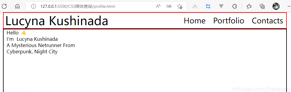
profile.html
<!DOCTYPE html>
<html lang="en">

<head>
  <title></title>
  <meta charset="UTF-8">
  <meta name="viewport" content="width=device-width, initial-scale=1">
</head>

<body>
  <div class="container">
    <div class="header"></div>
    <div class="header__logo">Lucyna Kushinada</div>
    <div class="header__menu">
      <div class="header__menu-1"> Home </div>
      <div class="header__menu-2"> Portfolio </div>
      <div class="header__menu-3"> Contacts </div>
    </div>
    <div class="main">
      <div class="main">
        <div class="main__image"></div>
        <div class="main__text">
            <div class="main__text-1">Hello 👋</div>
            <div class="main__text-2">I'm <span>Lucy</span></div>
            <div class="main__text-3">A Netrunner From</div>
            <div class="main__text-4">Night City</div>
        </div>
      </div>
    </div>
    <div class="footer">
      <div class="footer__instagram">
        <img src="./images/instagram.png" alt="">
      </div>
      <div class="footer__twitter">
        <img src="./images/twitter-sign.png" alt="">
      </div>
      <div class="footer__dribbble">
        <img src="./images/dribbble-logo.png" alt="">
      </div>
      <div class="footer__behance">
        <img src="./images/behance.png" alt="">
      </div>
    </div>
  </div>
</body>
</html>
profile.scss
scss需要編譯成css再導入到html中,我們先修改全局默認樣式。
* {
  margin: 0px 5px;

  padding: 0px;
  box-sizing: border-box;

  body {
    font-family: sans-serif;
  }
}
如果你不會Flexbox屬性請看 我的Vue之旅、01 深入Flexbox布局完全指南 – 小能日記
先把所有樣式類與子級結構寫好。嵌套在樣式類中的&__logo是.header__logo的快捷方式
.header{
  &__logo{}
  &__menu{}
}

.main{
  &__image{}
  &__text{}
}

.footer{
  [class ^="footer__"]{}
}
然後添加樣式,.container採用flex布局,按列布局。.header__menu也採用flex布局的方式。
.container{
  height: 100vh;
  display: flex;
  flex-direction: column;
}

.header{
  display: flex;
  flex-direction: row;
  border: 2px solid red;
  height: 10%;

  &__logo{}

  &__menu{
    display: flex;
    flex-direction: row;
  }
}

.main{
  border: 2px solid black;
  height: 80%;
}

.footer{
  border: 2px solid green;
  height: 10%;
}
我們修改 .header
.header {
  display: flex;
  flex-direction: row;
  border: 2px solid red;
  height: 10%;
  // 元素垂直居中
  align-items: center;
  // 元素均勻分布
  justify-content: space-between;
  &__logo {
    font-size: 4vw;
  }

  &__menu {
    display: flex;
    flex-direction: row;
    font-size: 2.5vw;
    // 讓各個元素產生一定間隔距離
    gap: 15px;
  }
}
再修改 .main
.main {
// 圖片和文字塊排版會採用行形式
display: flex;
flex-direction: row;
border: 2px solid black;
height: 80%;
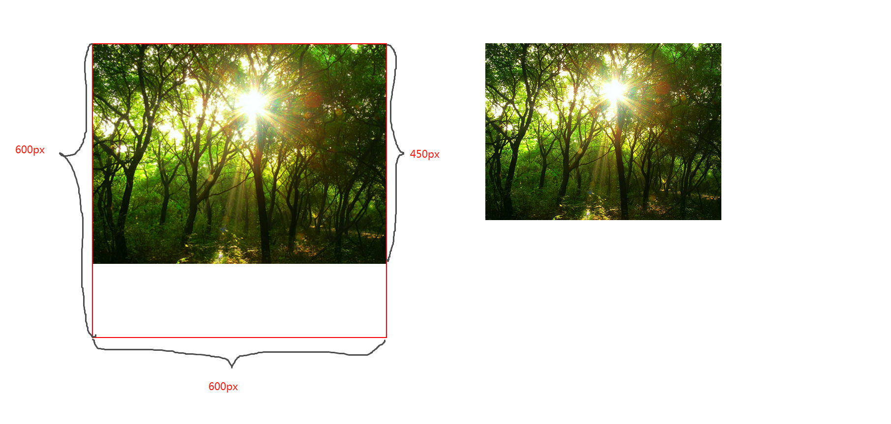
&__image {
// 添加圖片
background-image: url("./images/Portrait.jpg");
// 寬度為main寬度的50%
width: 50%;
// 縮放至圖片自身能完全顯示出來,足夠大的容器會有留白區域
background-size: contain;
// 不重複平鋪圖片
background-repeat: no-repeat;
background-position: left center;
}
&__text {
// 寬度為main寬度的50%
width: 50%;
}
}
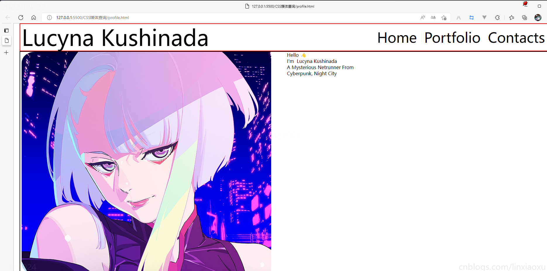
給文字加樣式
  &__text {
    // 寬度為main一半寬度
    width: 50%;
    // 讓每行字按列排列
    display: flex;
    flex-direction: column;

    // 居中
    justify-content: center;
    align-items: center;

    gap: 15px;

    &-1 {
      font-size: 10vw;
    }

    &-2,
    &-3,
    &-4 {
      font-size: 5vw;
    }
  }

  span {
    color: red;
  }
}
接下來給圖片添加樣式
.footer{
  // 類匹配器,能夠選擇一個類的集合,如style class 為footer__1、footer__2
  [class^="footer__"] {
    img {
      width: 5.3vw;
    }
  }
}

.footer{
  display: flex;
  flex-direction: row;

  align-items: center;
  justify-content: flex-end;
  gap: 20px;

  margin-right: 10%;
}
我們還需要添加媒體查詢
@media (max-width: 650px) {
  .header {

    justify-content: center;

    &__logo {
      font-size: 40px;
    }

    // 隱藏menu
    &__menu {
      display: none;
    }
  }

  .main {
    flex-direction: column;
    justify-content: center;
    align-items: center;

    &__image {
      // 圖片大小
      height: 200px;
      width: 200px;
      background-size: 100%;

      // 圓形圖片
      border-radius: 100%;
      background-position: center;
      margin-bottom: 5%;
    }

    // 修改字體樣式
    &__text {
      width: 100%;

      &-1 {
        // 讓hello不顯示
        display: none;
      }

      &-2,
      &-3,
      &-4 {
        font-size: 30px;
      }
    }
  }

  .footer {
    // 元素按中心對齊
    justify-content: center;
    margin: 0px;

    // gap: 20px;  注意這個沒有改,默認還是生效的
    [class^="footer__"] {

      // 重新修改圖片大小適應移動端
      img {
        width: 45px;
        height: 45px;
      }
    }
  }
}
😄當前完整scss程式碼
* {
  margin: 0px 5px;

  padding: 0px;
  box-sizing: border-box;

  body {
    font-family: sans-serif;
  }
}

.container {
  height: 100vh;
  display: flex;
  flex-direction: column;
}

.header {
  display: flex;
  flex-direction: row;
  height: 10%;

  // 元素垂直居中
  align-items: center;
  // 元素均勻分布
  justify-content: space-between;

  &__logo {
    font-size: 4vw;
  }

  &__menu {
    display: flex;
    flex-direction: row;

    font-size: 2.5vw;
    // 讓各個元素產生一定間隔距離
    gap: 15px;
  }
}

.main {
  // 圖片和文字塊排版會採用行形式
  display: flex;
  flex-direction: row;

  height: 80%;

  &__image {
    // 添加圖片
    background-image: url("./images/Portrait.png");
    // 寬度為main寬度的50%
    width: 50%;
    // 縮放至圖片自身能完全顯示出來,足夠大的容器會有留白區域
    background-size: contain;
    // 不重複平鋪圖片
    background-repeat: no-repeat;
    background-position: left center;
  }

  &__text {
    // 寬度為main一半寬度
    width: 50%;
    // 讓每行字按列排列
    display: flex;
    flex-direction: column;

    // 居中
    justify-content: center;
    align-items: center;

    gap: 15px;

    &-1 {
      font-size: 6vw;
    }

    &-2,
    &-3,
    &-4 {
      font-size: 5vw;
    }
  }

  span {
    color: red;
  }
}

.footer {
  [class^="footer__"] {
    img {
      width: 5.3vw;
    }
  }
}

.footer {
  display: flex;
  flex-direction: row;

  align-items: center;
  justify-content: flex-end;
  gap: 20px;

  margin-right: 10%;

  [class^="footer__"] {
    img {
      width: 5.3vw;
    }
  }
}

@media (max-width: 650px) {
  .header {

    justify-content: center;

    &__logo {
      font-size: 40px;
    }

    // 隱藏menu
    &__menu {
      display: none;
    }
  }

  .main {
    flex-direction: column;
    justify-content: center;
    align-items: center;

    &__image {
      // 圖片大小
      height: 200px;
      width: 200px;
      background-size: 100%;

      // 圓形圖片
      border-radius: 100%;
      background-position: center;
      margin-bottom: 5%;
    }

    // 修改字體樣式
    &__text {
      width: 100%;

      &-1 {
        // 讓hello不顯示
        display: none;
      }

      &-2,
      &-3,
      &-4 {
        font-size: 30px;
      }
    }
  }

  .footer {
    // 元素按中心對齊
    justify-content: center;
    margin: 0px;

    // gap: 20px;  注意這個沒有改,默認還是生效的
    [class^="footer__"] {

      // 重新修改圖片大小適應移動端
      img {
        width: 45px;
        height: 45px;
      }
    }
  }
}
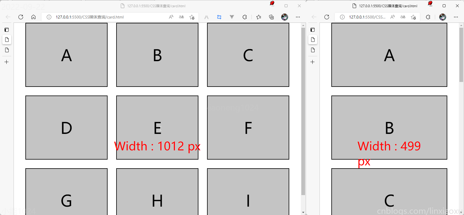
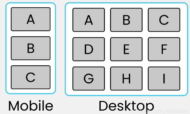
學習使用③卡片布局
我們會用到第一個例子中的 main.js 函數來顯示窗口寬度。
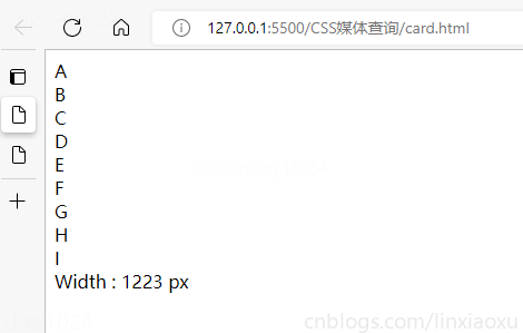
card.html
<!DOCTYPE html>
<html lang="en">

<head>
  <title></title>
  <meta charset="UTF-8">
  <meta name="viewport" content="width=device-width, initial-scale=1">
  <link href="css/style.css" rel="stylesheet">
  <script type="text/javascript" src="./main.js"></script>
</head>

<body>
  <div class="container">
    <div class="row-1">
      <div class="box-1">A</div>
      <div class="box-2">B</div>
      <div class="box-3">C</div>
    </div>

    <div class="row-2">
      <div class="box-4">D</div>
      <div class="box-5">E</div>
      <div class="box-6">F</div>
    </div>

    <div class="row-3">
      <div class="box-7">G</div>
      <div class="box-8">H</div>
      <div class="box-9">I</div>
    </div>
  </div>
  <div id="size"></div>
</body>

</html>
card.scss
* {
  margin: 0px;
  padding: 0px 10px;
  box-sizing: border-box;

  body {
    font-family: sans-serif;
    font-size: 55px;
  }
}

#size {
  position: absolute;
  // 設置為絕對定位
  top: 60%;
  left: 50%;
  // 水平居中
  transform: translateX(-50%);
  color: red;
  font-size: 40px;
}

.container {
  display: flex;
  flex-direction: column;
  height: 100vh;

  gap: 30px;
}

[class ^="row-"] {
  display: flex;
  flex-direction: row;
  gap: 30px;
}

[class ^="box-"] {

  background-color: #c4c4c4;
  border: 2px solid black;

  width: (100%)/3;
  // 設置為當前視窗大小的三分之一
  height: (100vh)/3;

  // 元素居中
  display: grid;
  place-items: center;
}

@media (max-width: 650px) {

  [class ^="row-"] {
    flex-direction: column;
  }

  [class ^="box-"] {
    width: 100%;
  }
}