Vue slot 插槽用法:自定義列表組件
Vue 框架的插槽(slot)功能相對於常用的 v-for, v-if 等指令使用頻率少得多,但在實現可復用的自定義組件時十分有用。例如,如果經常使用前端組件庫的話,就會經常看到類似的用法:
<card>
	<template slot="title">訂製卡片組件的標題欄,例如插入icon、操作按鈕等</template>
</card>
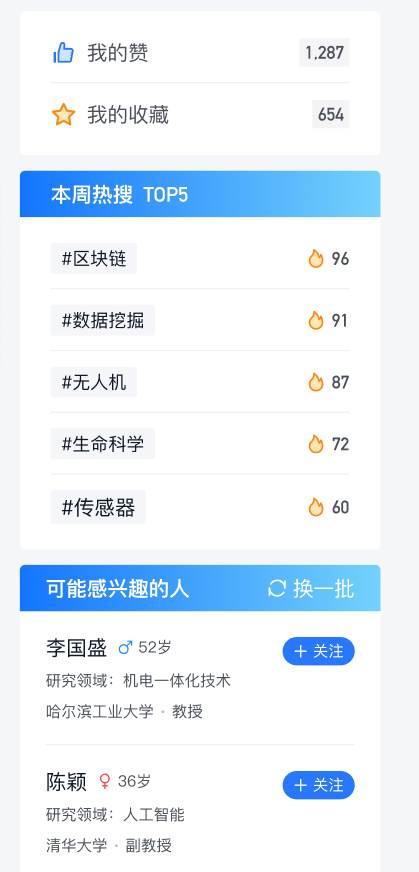
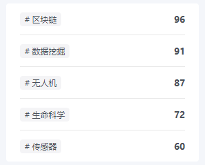
之前在寫前端時,發現產品原型的多個頁面中多次出現了基本一致的資訊欄,如下圖。如果只在一個頁面中出現一兩次,複製幾遍列表程式碼,寫一套樣式也關係不大;但在多個頁面中來回複製粘貼就很麻煩,增加無效程式碼量,以後也不好修改(眾所周知,前端 UI 修改並不罕見)。因此將這個資訊欄抽象成一個組件,可以多次復用,實現內容與樣式分離。接下來借這個例子分享一下 Vue 插槽的幾種主要用法。
基本用法
默認插槽
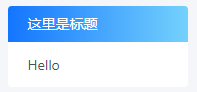
首先新建 InfoCard.vue 組件,寫好基本的模板結構和樣式:上面一條標題欄,下面一個列表(項目中用的是 antd 組件庫中的組件,只是樣式,不影響理解)。CSS 不重要就不貼了。
<!-- InfoCard.vue -->
<template>
  <div class="side-card">
    <div class="side-card-title">這裡是標題</div>
    <a-list>
      <a-list-item>
        <slot></slot>
      </a-list-item>
    </a-list>
  </div>
</template>
在頁面中引入組件後可以在模板中用標籤使用:
<!-- index.vue -->
<info-card>Hello</info-card>
由於組件中只有一個 <slot> 元素(也就是「插槽」),標籤內的內容就會被「插入」插槽對應的位置:
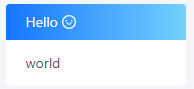
具名插槽
如果組件中有不止一個插槽,就需要通過名字來區分。
- 在組件中,使用
<slot name="xx">屬性指定插槽的名字 - 在頁面中,使用
<template slot="xx">屬性將內容分發到對應的插槽
<!-- InfoCard.vue -->
<div class="side-card">
  <div class="side-card-title" v-if="!hideTitle">
    <slot name="title"></slot>
  </div>
  <a-list>
    <a-list-item>
      <slot name="content"></slot>
    </a-list-item>
  </a-list>
</div>


<!-- index.vue -->
<info-card>
  <template slot="title">
    <p>Hello <a-icon type="smile" /></p>
  </template>
  <template slot="content"> world </template>
</info-card>
預設內容
有時候組件的可變部分有默認值,並不必須在使用時指定(例如默認提示語)。在組件的 <slot> 標籤內部的內容就是該插槽的預設內容,如果在使用時沒有傳入相應內容,將使用預設內容進行渲染。
在這個例子中,標題部分多數情況下是純文本,少數情況下才需要使用 HTML 進行訂製(例如包含操作按鈕)。因此可以配合組件的傳入參數,讓標題定義變得更簡潔,不需要為了一行文本去寫整個標籤。(順便增加一個參數可以隱藏標題欄。)
提示:組件傳參的時候注意區分
title="xxx"和:title="xxx",平時寫多了冒號容易手滑。加冒號是簡寫的v-bind指令,這個「xxx」代表的是 data 中一個叫做 xxx 的變數;不加冒號的才是傳入字元串「xxx」作為參數 title 的值。
<!-- InfoCard.vue -->
<div class="side-card">
  <div class="side-card-title" v-if="!hideTitle">
    <slot name="title">{{ title }}</slot>
  </div>
  <a-list>
    <a-list-item>
      <slot name="content"></slot>
    </a-list-item>
  </a-list>
</div>


<!-- index.vue -->
<info-card title="Hello">
  <template slot="content">world</template>
</info-card>
作用域
列表組件應該接收一個數組作為參數,使用 v-for 循環顯示,並且每個列表項的具體內容由頁面傳入的插槽內容決定(因為不同列表裡的對象不一致)。
<a-list>
  <a-list-item v-for="item in items" :key="item.id">
    <slot name="content"></slot>
  </a-list-item>
</a-list>
但是如果在頁面中這樣使用,會產生報錯 Cannot read property 'tag' of undefined。
<info-card title="Hello" :items="hotTags">
  <template slot="content">
    <a-tag># {{ item.tag }}</a-tag>
    <span class="number">{{ item.count }}</span>
  </template>
</info-card>
產生錯誤的原因在於,父頁面插槽中的內容先在父頁面中渲染,之後才整體插入子組件的插槽;而不是先插入 HTML 後再一起渲染。很顯然,items、item 都是定義在子組件中的變數數據,在父組件中沒有定義,自然也無法訪問(父頁面中的數據是 hotTags)。
插槽 prop
這裡使用的是 Vue 2.6.0 起更新的語法,原來的作用域插槽
slot-scope屬性已棄用
頁面傳遞給子組件的參數作用域在子組件內部,而列表項的內容需要在父頁面中定義;因此,需要一種在父組件訪問子組件數據的機制。這就是插槽 prop 的作用。
在子組件的 <slot> 標籤中使用 v-bind 綁定的屬性就是插槽 prop(這裡為了清晰才區分命名了 itemprop 和 item,其實實際用的時候全命名成一樣的即可,省的倒來倒去)。
頁面使用組件時,通過命令 v-slot:name="slotProps" 即可通過 slotProps 訪問 name 插槽中綁定的插槽 prop。
<!-- InfoCard.vue -->
<a-list>
  <a-list-item v-for="item in items" :key="item.id">
    <slot name="content" :itemprop="item">
      {{ item }}
    </slot>
  </a-list-item>
</a-list>


<!-- index.vue -->
<info-card hideTitle :items="hotTags">
  <template v-slot:content="props">
    <a-tag># {{ props.itemprop.tag }}</a-tag>
    <span class="number">{{ props.itemprop.count }}</span>
  </template>
</info-card>
注意:如前文所述,插槽內容是在父頁面中渲染的。因此其中元素的樣式(例如這裡 a-tag 的樣式)也應該定義在父頁面中。
簡寫
v-slot:指令可以簡寫為#- 可以使用ES2015 解構解析插槽 prop 中的各個屬性,更加清晰簡潔
<template #content="{ itemprop }">
  <a-tag># {{ itemprop.tag }}</a-tag>
  <span class="number">{{ itemprop.count }}</span>
</template>
結語
以上是藉助自定義表單組件案例對 Vue 插槽基本用法的介紹,希望對你有所幫助,如有疏漏歡迎留言指正討論。
文末附上開頭圖片中資訊欄案例的大部分實現程式碼,可以對照進行參考。
參考資料:Vue slot
附錄
以下是 InfoCard.vue 的全部程式碼:
<template>
  <div class="side-card">
    <div class="side-card-title" v-if="!hideTitle">
      <slot name="title">{{ title }}</slot>
    </div>
    <a-list>
      <a-list-item v-for="item in items" :key="item.id">
        <slot name="content" :item="item">
          {{ item }}
        </slot>
      </a-list-item>
    </a-list>
  </div>
</template>

<script>
export default {
  props: {
    title: {
      type: String,
      default: '',
    },
    hideTitle: {
      type: Boolean,
      default: false,
    },
    items: {
      type: Array,
      required: true,
    },
  },
}
</script>

<style lang="less" scoped>
.side-card {
  border-radius: 4px;
  background-color: @item-background;
  .side-card-title {
    height: 36px;
    line-height: 36px;
    padding: 0 20px;
    color: #ffffff;
    border-radius: 4px 4px 0 0;
    background: linear-gradient(90deg, #1375ff 0%, #a4fffa 149.57%);
    display: flex;
    justify-content: space-between;
  }
  .ant-list {
    padding: 0 20px;
    .ant-list-item {
      display: flex;
    }
  }
}
</style>
以下是實現開頭三個資訊欄的父頁面程式碼(缺少一些 icon):
<list-card hideTitle :items="myData" class="side-card">
  <template #content="{ item }">
    <span>{{ item.title }}</span>
    <a-tag class="number">{{ item.count }}</a-tag>
  </template>
</list-card>

<list-card title="本周熱搜 TOP5" :items="hotTags" class="side-card">
  <template #content="{ item }">
    <a-tag># {{ item.tag }}</a-tag>
    <span class="number">{{ item.count }}</span>
  </template>
</list-card>

<list-card :items="suggestScholars" class="side-card">
  <template slot="title">
    <span>可能感興趣的人</span>
    <span>換一批</span>
  </template>
  <template #content="{ item }">
    <div class="scholar">
      <div class="name">
        <h2>{{ item.name }}</h2>
        <a-button v-if="item.followed" shape="round" class="btn">
          已關注
        </a-button>
        <a-button v-else type="primary" shape="round" class="btn">
          關注
        </a-button>
      </div>
      <div>研究領域:{{ item.field }}</div>
      <div>{{ item.institution }} · {{ item.position }}</div>
    </div>
  </template>
</list-card>


