css_transition_animation(內含貝賽爾曲線詳解)
- 2019 年 10 月 3 日
- 筆記
區別:
transition也叫過渡動畫,主要是用於讓一個元素從一種狀態過渡到另一種狀態效果,常用於主動觸發的效果。例如移動端的頁面切換(很常用)、button點擊效果(也很常見)。
animation才是css3正宗的動畫,主要是用於實現某種持續的動畫效果(當然簡單的過渡動畫也可以實現),常用於自動觸發的效果。例如載入中的持續動畫效果等等。
在學習這兩種動畫之前要最好是先了解一下 transition-timing-function(過渡效果時間曲線);
舉個栗子:
比如一輛小汽車從a點到b點的運動過程是一個動畫,那麼過渡效果時間曲線就是這輛小汽車到底是勻速過去呢還是一直加速衝過去,又或者說一會加速沖一會減速慢行。
這個屬性有五種可供選擇的屬性值和一種可以自定義的屬性值
自定義屬性值:cubic-bezier(n,n,n,n)
在了解這個自定義屬性值之前我們再來深入了解一下貝塞爾曲線。
為什麼要了解貝塞爾曲線?因為這個自定義時間過渡曲線就是用貝塞爾曲線表示的。(這是一個三階的貝塞爾曲線)
貝塞爾曲線應用場景有哪些?貝塞爾曲線不僅僅在描述速度、時間上會起作用,在ps中的色彩調節和一些建築工程學上面都會有涉及。
那我們先來畫一個二階的貝塞爾曲線吧。
首先打開ps,在一個平面內隨便畫三個點a、b、c然後連接起來,如下圖。
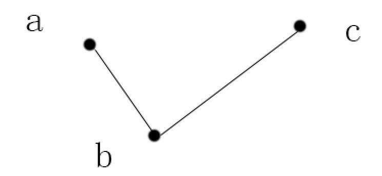
然後在a、b中找到一點d,在b、c中找到一點e,滿足公式:ad/ab = be/bc
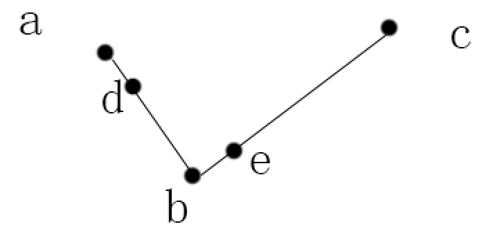
然後呢,連接d、e,在de線上找到一點f,滿足公式:df/de = ad/ab = be/bc
然後就沒有然後了,因為這個二階貝塞爾曲線已經畫完了,這個曲線就是所有可能的f點。
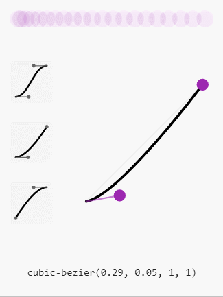
然後我用Google瀏覽器調試工具再演示一下二階貝塞爾曲線圖(本來是想用火狐演示的,但是火狐瀏覽器調試曲線的時候層級有點高,還很敏感,無法用gif工具錄製,所以就放棄了,但實際上我更喜歡火狐的調試動畫調試工具一點。)
1、上面的球代表動畫執行的過程,球越快,顏色越淺,反之越深。
2、兩個固定點的坐標是(0,0)和(1,1)
3、可調試點的坐標是隨意拉動的,x軸要在0-1之間,y軸隨意。
4、x軸代表的時間,y軸代表的是路程(因為很多動畫並不是簡單的左右移動,所以以後要理解成動畫執行的過程),注意:y軸不是速度,更不是加速度哦。
5、最下面的是cubic-bezier屬性具體取到的值(後面再講裡面4個值得具體含義)

但實際開發過程中我們用到的大部分都是三階貝塞爾曲線(當然也有用多階貝塞爾曲線的),也就是用兩個點去控制曲線的弧度,具體原理和上面的類似,如圖:
現在就可以解釋cubic-bezier為什麼有四個值,就是這個兩個坐標點。
再次聲明一下,y軸是距離,不是速度和加速度
cubic-bezier屬性還有五個可供選擇的值:(其實就是幾種寫死的過渡效果曲線)
·linear 規定以相同速度開始至結束的過渡效果(等於 cubic-bezier(0,0,1,1))。 ·ease 規定慢速開始,然後變快,然後慢速結束的過渡效果(cubic-bezier(0.25,0.1,0.25,1))。 ·ease-in 規定以慢速開始的過渡效果(等於 cubic-bezier(0.42,0,1,1))。 ·ease-out 規定以慢速結束的過渡效果(等於 cubic-bezier(0,0,0.58,1))。 ·ease-in-out 規定以慢速開始和結束的過渡效果(等於 cubic-bezier(0.42,0,0.58,1))。一、transition (過渡動畫)
| 屬性 | 描述 | CSS |
|---|---|---|
|
transition |
簡寫屬性,用於在一個屬性中設置四個過渡屬性。 | 3 |
|
transition-property |
規定應用過渡的 CSS 屬性的名稱。 | 3 |
|
transition-duration |
定義過渡效果花費的時間。默認是 0。 | 3 |
|
transition-timing-function |
規定過渡效果的時間曲線。默認是 “ease”。 | 3 |
|
transition-delay |
規定過渡效果何時開始。默認是 0。 | 3 |
實例:
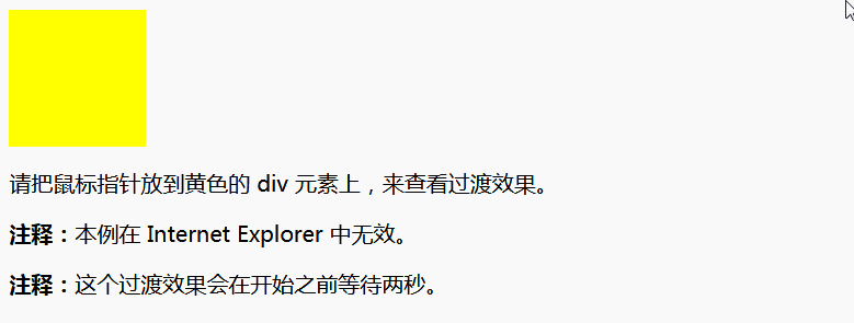
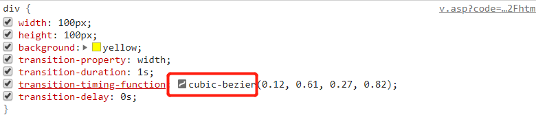
<!DOCTYPE html> <html> <head> <style> div{ width:100px; height:100px; background:yellow; transition-property:width; transition-duration:1s; transition-timing-function:cubic-bezier(0,0,1,1); transition-delay:0s; } div:hover{ width:500px; } </style> </head> <body> <div></div> <p>請把滑鼠指針放到黃色的 div 元素上,來查看過渡效果。</p> <p><b>注釋:</b>本例在 Internet Explorer 中無效。</p> <p><b>注釋:</b>這個過渡效果會在開始之前等待兩秒。</p> </body> </html>效果如下
transition簡化屬性寫法:
transition: property duration timing-function delay;
默認值是transition:all 0 ease 0;
注意事項
在移動開發中直接使用transition動畫會讓頁面變得非常卡頓(親測),所以我們常用transform:translate3D(0,0,0)或者transform:translateZ(0)來開啟移動端動畫的gpu加速,使動畫過程更流暢。
translate3D(0,0,0)是指電儀3D轉換
translateZ(0)是指定義3D轉換,只用Z軸
二、animation(動畫效果)
因為animation動畫是一段持續且循環的動畫效果,所以不像transition過渡動畫那樣簡潔,可能會涉及到很複雜的動畫效果,所以我們要先學習一下@keyframes規則
該規則是用來創建動畫的,說直白點就是告訴元素按哪種動畫效果執行
@keyframes語法
@keyframes animationname {keyframes-selector {css-styles;}}| 值 | 描述 |
|---|---|
| animationname | 必需。定義動畫的名稱。 |
| keyframes-selector |
必需。動畫時長的百分比。 合法的值:
|
| css-styles | 必需。一個或多個合法的 CSS 樣式屬性。 |
案例
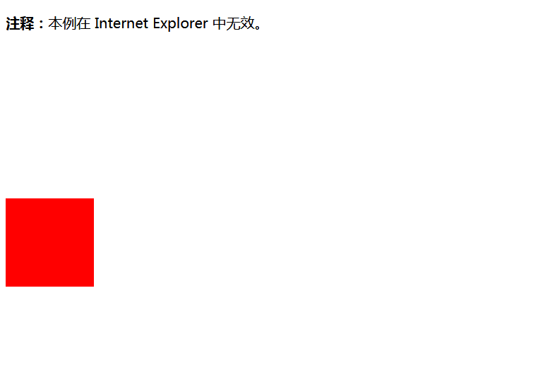
<!DOCTYPE html> <html> <head> <style> div{ width:100px; height:100px; background:red; position:relative; animation:mymove 5s infinite; -moz-animation:mymove 5s infinite; /* Firefox */ -webkit-animation:mymove 5s infinite; /*Safari and Chrome */ -o-animation:mymove 5s infinite; /* Opera */ } @keyframes mymove{ 0% {top:0px;} 25% {top:200px;} 75% {top:50px} 100% {top:100px;} } @-moz-keyframes mymove /* Firefox */{ 0% {top:0px;} 25% {top:200px;} 75% {top:50px} 100% {top:100px;} } @-webkit-keyframes mymove /* Safari and Chrome */{ 0% {top:0px;} 25% {top:200px;} 75% {top:50px} 100% {top:100px;} } @-o-keyframes mymove /* Opera */{ 0% {top:0px;} 25% {top:200px;} 75% {top:50px} 100% {top:100px;} } </style> </head> <body> <p><b>注釋:</b>本例在 Internet Explorer 中無效。</p> <div></div> </body> </html>效果如下:
說明
也就是說keyframes允許你設置在不同的時間段執行不同的動畫效果
css3 動畫屬性
| 屬性 | 描述 | CSS |
|---|---|---|
|
@keyframes |
規定動畫。 | 3 |
|
animation |
所有動畫屬性的簡寫屬性,除了 animation-play-state 屬性。 | 3 |
|
animation-name |
規定 @keyframes 動畫的名稱。 | 3 |
|
animation-duration |
規定動畫完成一個周期所花費的秒或毫秒。默認是 0。 | 3 |
|
animation-timing-function |
規定動畫的速度曲線。默認是 “ease”。 | 3 |
|
animation-delay |
規定動畫何時開始。默認是 0。 | 3 |
|
animation-iteration-count |
規定動畫被播放的次數。默認是 1。 | 3 |
|
animation-direction |
規定動畫是否在下一周期逆向地播放。默認是 “normal”。 | 3 |
|
animation-play-state |
規定動畫是否正在運行或暫停。默認是 “running”。 | 3 |
|
animation-fill-mode |
規定對象動畫時間之外的狀態。 | 3 |
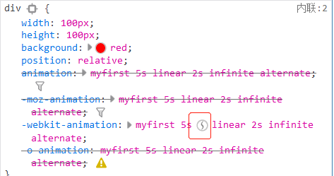
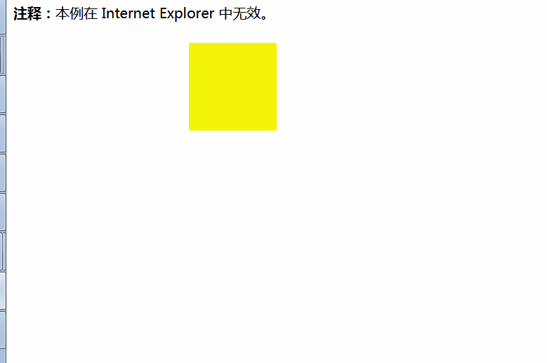
<!DOCTYPE html> <html> <head> <style> div{ width:100px; height:100px; background:red; position:relative; animation:myfirst 5s linear 2s infinite alternate; -moz-animation:myfirst 5s linear 2s infinite alternate;/* Firefox: */ -webkit-animation:myfirst 5s linear 2s infinite alternate;/* Safari and Chrome: */ -o-animation:myfirst 5s linear 2s infinite alternate;/* Opera: */ } @keyframes myfirst{ 0% {background:red; left:0px; top:0px;} 25% {background:yellow; left:200px; top:0px;} 50% {background:blue; left:200px; top:200px;} 75% {background:green; left:0px; top:200px;} 100% {background:red; left:0px; top:0px;} } @-moz-keyframes myfirst /* Firefox */{ 0% {background:red; left:0px; top:0px;} 25% {background:yellow; left:200px; top:0px;} 50% {background:blue; left:200px; top:200px;} 75% {background:green; left:0px; top:200px;} 100% {background:red; left:0px; top:0px;} } @-webkit-keyframes myfirst /* Safari and Chrome */{ 0% {background:red; left:0px; top:0px;} 25% {background:yellow; left:200px; top:0px;} 50% {background:blue; left:200px; top:200px;} 75% {background:green; left:0px; top:200px;} 100% {background:red; left:0px; top:0px;} } @-o-keyframes myfirst /* Opera */{ 0% {background:red; left:0px; top:0px;} 25% {background:yellow; left:200px; top:0px;} 50% {background:blue; left:200px; top:200px;} 75% {background:green; left:0px; top:200px;} 100% {background:red; left:0px; top:0px;} } </style> </head> <body> <p><b>注釋:</b>本例在 Internet Explorer 中無效。</p> <div></div> </body> </html> 效果如下:
彩蛋
在火狐和Google中可以很方便的調處過渡效果時間曲線的定時函數編輯器,只用點擊下面的按鈕就可以了。
Google中:
火狐中: