Flutter 1.22版本新增的Button

Flutter 1.22版本新增了3個按鈕,TextButton、OutlinedButton、ElevatedButton,雖然以前的Button沒有被廢棄,但還是建議使用新的Button。
為什麼會新增 Button?因為想要將以前的按鈕調整為統一的外觀比較麻煩,因此以前經常使用自定義的按鈕,而新增的按鈕解決了此類問題,可以非常方便的設置整體外觀。
| 1.22版本前的按鈕 | 主題 | 1.22版本後的按鈕 | 主題 |
|---|---|---|---|
| FlatButton | ButtonTheme | TextButton | TextButtonTheme |
| OutlineButton | ButtonTheme | OutlinedButton | OutlinedButtonTheme |
| RaisedButton | ButtonTheme | ElevatedButton | ElevatedButtonTheme |
樣式對比:
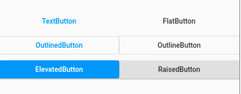
外觀上並沒有很大的不同,但TextButton、OutlinedButton、ElevatedButton 將外觀屬性集合為一個 ButtonStyle,非常方便統一控制。
TextButton、OutlinedButton、ElevatedButton 這3個按鈕的用法和屬性完全相同,下面以 TextButton 為例。
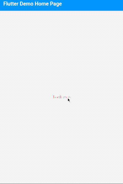
簡單使用:
TextButton(
  child: Text('TextButton'),
)
當 onPressed 不設置或者設置為 null 時,按鈕為不可用狀態。
TextButton(
  child: Text('TextButton'),
  onPressed: (){},
)
onPressed 為點擊回調,onLongPress 為長按回調。
下面是最重要的屬性 ButtonStyle,一切外觀都是通過這個屬性進行控制,屬性如下:
const ButtonStyle({
  this.textStyle, //字體
  this.backgroundColor, //背景色
  this.foregroundColor, //前景色
  this.overlayColor, // 高亮色,按鈕處於focused, hovered, or pressed時的顏色
  this.shadowColor, // 陰影顏色
  this.elevation, // 陰影值
  this.padding, // padding
  this.minimumSize, //最小尺寸
  this.side, //邊框
  this.shape, //形狀
  this.mouseCursor, //滑鼠指針的游標進入或懸停在此按鈕的[InkWell]上時。
  this.visualDensity, // 按鈕布局的緊湊程度
  this.tapTargetSize, // 響應觸摸的區域
  this.animationDuration, //[shape]和[elevation]的動畫更改的持續時間。
  this.enableFeedback, // 檢測到的手勢是否應提供聲音和/或觸覺回饋。例如,在Android上,點擊會產生咔噠聲,啟用回饋後,長按會產生短暫的振動。通常,組件默認值為true。
});
這些屬性的用法也和以前的不一樣,比如 textStyle 並不是直接設置 TextStyle,下面設置字體:
TextButton(
  child: Text('TextButton'),
  onPressed: () {},
  style: ButtonStyle(
    textStyle: MaterialStateProperty.all(TextStyle(fontSize: 20)),
  ),
)
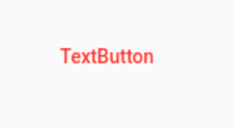
注意:字體顏色的設置不通過textStyle 設置,而是通過 foregroundColor:
TextButton(
  child: Text('TextButton'),
  onPressed: () {},
  style: ButtonStyle(
    foregroundColor: MaterialStateProperty.all(Colors.red),
  ),
)
根據按鈕的狀態改變字體顏色:
TextButton(
                    child: Text('TextButton'),
                    onPressed: () {},
                    style: ButtonStyle(
                      foregroundColor:
                          MaterialStateProperty.resolveWith((states) {
                        return states.contains(MaterialState.pressed)
                            ? Colors.blue
                            : Colors.red;
                      }),
                    ),
                  )
其他屬性用法和上面類似,不在一一介紹。
進行全局控制:
MaterialApp(
  title: 'Flutter Demo',
  theme: ThemeData(
    textButtonTheme: TextButtonThemeData(
      style: ButtonStyle()
    ),
    elevatedButtonTheme: ElevatedButtonThemeData(
        style: ButtonStyle()
    ),
    outlinedButtonTheme: OutlinedButtonThemeData(
        style: ButtonStyle()
    )
  ),
  home: MyHomePage(title: 'Flutter Demo Home Page'),
)
ButtonStyle 內的屬性配置和單個按鈕的用法是一致的。
通過上面的介紹,建議使用 TextButton、OutlinedButton、ElevatedButton 替換 FlatButton、OutlineButton、RaisedButton。
交流
老孟Flutter部落格(330個控制項用法+實戰入門系列文章)://laomengit.com
歡迎加入Flutter交流群(微信:laomengit)、關注公眾號【老孟Flutter】:
 |
 |

