CSS動畫實例:圓的漣漪擴散
- 2020 年 8 月 24 日
- 筆記
- CSS3圖形與動畫設計
設頁面中有<div class=”circle “></div>,定義.circle的樣式規則繪製一個半徑為75px,邊框厚度為4px的圓,再定義關鍵幀,使得圓從不可見到可見,再到放大後又不可見。
編寫的HTML文件如下。
<!DOCTYPE html>
<html>
<head>
<title>圓的放大</title>
<style>
.container
{
margin: 0 auto;
width: 300px;
height:300px;
position: relative;
display:flex;
justify-content:center;
align-items:center;
background:#d8d8d8;
border: 4px solid rgba(255, 0, 0, 0.9);
border-radius: 10%;
}
.circle
{
width:150px;
height:150px;
border: 4px solid #000;
border-radius: 50%;
animation: anim 1s ease-out infinite;
}
@keyframes anim
{
0% { transform: scale(0); opacity: 0; }
50% { opacity: 1; }
100% { transform: scale(1); opacity: 0; }
}
</style>
</head>
<body>
<div class=”container”>
<div class=”circle”></div>
</div>
</body>
</html>
在瀏覽器中打開包含這段HTML程式碼的html文件,可以呈現出如圖1所示的動畫效果。
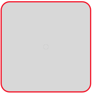
圖1 圓的放大(一)
若將上面文件中的「border: 4px solid #000;」改寫為「background: #000;」,則呈現出如圖2所示的動畫效果。

圖2 圓的放大(二)
在圖1的基礎上再增加一個圓,並且新增加的圓延遲0.5s執行動畫過程。編寫如下的HTML文件。
<!DOCTYPE html>
<html>
<head>
<title>圓的放大</title>
<style>
.container
{
margin: 0 auto;
width: 300px;
height:300px;
position: relative;
display:flex;
justify-content:center;
align-items:center;
background:#d8d8d8;
border: 4px solid rgba(255, 0, 0, 0.9);
border-radius: 10%;
}
.circle
{
position: relative;
width:150px;
height:150px;
border: 0 solid transparent;
border-radius: 50%;
}
.circle:before, .circle:after
{
content: ”;
border: 10px solid #000;
border-radius: 50%;
width: inherit;
height: inherit;
position: absolute;
top: 0;
left: 0;
animation: anim 1s linear infinite;
opacity: 0;
}
.circle:after
{
animation-delay: .5s;
}
@keyframes anim
{
0% { transform: scale(0); opacity: 0; }
50% { opacity: 1; }
100% { transform: scale(1); opacity: 0; }
}
</style>
</head>
<body>
<div class=”container”>
<div class=”circle”></div>
</div>
</body>
</html>
在瀏覽器中打開包含這段HTML程式碼的html文件,可以呈現出如圖3所示的動畫效果。
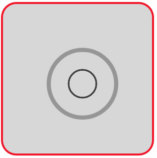
圖3 兩個圓的放大(一)
同樣,若將上面文件中的「border: 10px solid #000;」改寫為「background: #000;」,則呈現出如圖4所示的動畫效果。
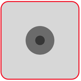
圖4 兩個圓的放大(二)
增加到4個圓,其中一個圓保持不變,另外三個圓按給定延遲執行放大動畫過程,形成圓的漣漪擴散效果。編寫的HTML文件內容如下。
<!DOCTYPE html>
<html>
<head>
<title>圓的漣漪擴散</title>
<style>
.container
{
margin: 0 auto;
width: 300px;
height:300px;
position: relative;
display:flex;
justify-content:center;
align-items:center;
background:#d8d8d8;
border: 4px solid rgba(255, 0, 0, 0.9);
border-radius: 10%;
}
.circle
{
position:absolute;
width:60px;
height:60px;
border-radius:50%;
background-color:#666;
}
.circle:nth-child(1)
{
animation:anim 3s linear infinite;
}
.circle:nth-child(2)
{
animation:anim 3s linear 0.8s infinite;
}
.circle:nth-child(3)
{
animation:anim 3s linear 1.6s infinite;
}
@keyframes anim
{
from { opacity:1; transform:scale(0); }
to { opacity:0; transform:scale(4); }
}
</style>
</head>
<body>
<div class=”container”>
<div class=’circle’></div>
<div class=’circle’></div>
<div class=’circle’></div>
<div class=’circle’></div>
</div>
</body>
</html>
在瀏覽器中打開包含這段HTML程式碼的html文件,可以呈現出如圖5所示的動畫效果。
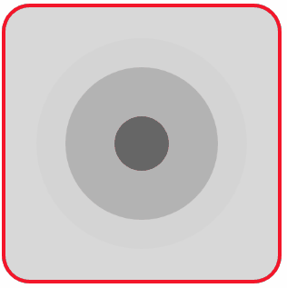
圖5 圓的漣漪擴散


