CSS動畫實例:行星和衛星
- 2020 年 8 月 23 日
- 筆記
- CSS3圖形與動畫設計
設頁面中有<div class=” planet “></div>,用來繪製一個行星和衛星圖形。這個圖形包括三部分:行星、衛星和衛星旋轉的軌道。定義. planet的樣式規則如下:
.planet
{
position:absolute;
top:80px;
left:80px;
height:100px;
width:100px;
border-radius:50%; border:1px solid #f00;
animation:rond 3s linear infinite;
}
.planet:before
{
content: “”;
height:10px;
width:10px;
position:absolute;
background-color:#f00;
border-radius:50%;
top:50px;
left:-5px;
}
.planet:after
{
content: ”;
height:60px;
width:60px;
background:#f00;
border-radius:50%;
position:absolute;
top:20px;
left:20px;
}
可在頁面中顯示如圖1所示的圖案。
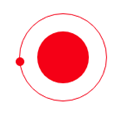
圖1 行星和衛星
定義關鍵幀,使得衛星在軌道上繞行星旋轉。編寫的HTML文件如下。


<!DOCTYPE html>
<html>
<head>
<title>行星和衛星</title>
<style>
  .container
  {
     width:350px;
     height:350px;
     margin:100px auto;
     position:relative;
     border: 4px solid rgba(255, 0, 0, 0.9);
     border-radius: 10%;
  }
  .planet
 {
    position:absolute;
    top:80px;
    left:80px;
    height:100px;
    width:100px;
    border-radius:50%;  border:1px solid #f00;
    animation:rond 3s  linear infinite;
  }
  .planet:before
  {
    content: "";
    height:10px;
    width:10px;
    position:absolute;
    background-color:#f00;
    border-radius:50%;
    top:50px;
    left:-5px;
  }
  .planet:after
  {
    content: '';
    height:60px;
    width:60px;
    background:#f00;
    border-radius:50%;
    position:absolute;
    top:20px;
    left:20px;
  }
  @keyframes rond
  {
     0% {transform : rotate(0deg);}
     100% {transform : rotate(360deg);}
  }
</style>
</head>
<body>
<div class="container">
  <div class="planet"></div>
</div>
</body>
</html>
View Code
在瀏覽器中打開包含這段HTML程式碼的html文件,可以呈現出如圖2所示的動畫效果。
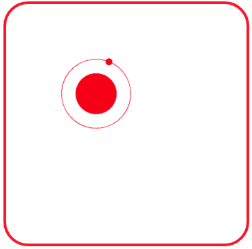
圖2 繞行星旋轉的衛星
在圖2中有一顆紅色的小衛星繞著紅色的衛星旋轉,再加入一個藍色的小衛星繞著藍色的行星旋轉。可以編寫如下的HTML文件。
<!DOCTYPE html>
<html>
<head>
<title>行星和衛星</title>
<style>
  .container
  {
     width:350px;
     height:350px;
     margin:100px auto;
     position:relative;
     border: 4px solid rgba(255, 0, 0, 0.9);
     border-radius: 10%;
  }
  .planet1
 {
    position:absolute;
    top:80px;
    left:80px;
    height:100px;
    width:100px;
    border-radius:50%;  border:1px solid #f00;
    animation:rond 3s  linear infinite;
  }
  .planet1:before
  {
    content: "";
    height:10px;
    width:10px;
    position:absolute;
    background-color:#f00;
    border-radius:50%;
    top:50px;
    left:-5px;
  }
  .planet1:after
  {
    content: '';
    height:60px;
    width:60px;
    background:#f00;
    border-radius:50%;
    position:absolute;
    top:20px;
    left:20px;
  }
  .planet2
 {
    position:absolute;
    top:180px;
    left:180px;
    height:80px;
    width:80px;
    border-radius:50%;  border:1px solid #00f;
    animation:rond 3s  linear infinite;
  }
  .planet2:before
  {
    content: "";
    height:10px;
    width:10px;
    position:absolute;
    background-color:#00f;
    border-radius:50%;
    top:40px;
    left:-5px;
  }
  .planet2:after
  {
    content: '';
    height:40px;
    width:40px;
    background:#00f;
    border-radius:50%;
    position:absolute;
    top:20px;
    left:20px;
  }
  @keyframes rond
  {
     0% {transform : rotate(0deg);}
     100% {transform : rotate(360deg);}
  }
</style>
</head>
<body>
<div class="container">
  <div class="planet1"></div>
  <div class="planet2"></div>
</div>
</body>
</html>
View Code
在瀏覽器中打開包含這段HTML程式碼的html文件,可以呈現出如圖3所示的動畫效果。
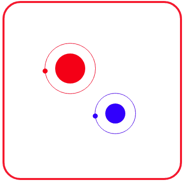
圖3 繞各自軌道旋轉的兩顆衛星
上面的HTML文件中,為了繪製兩顆行星,頁面中定義了兩個div:一個類名為planet1,另一個名為planet2。分別為兩個類定義樣式規則,這兩個類的樣式規則基本相同,複製後略作修改即可。
若在頁面中搞多個繞各自軌道旋轉的衛星怎麼辦呢?採用類似的方法(定義類名為planet3、planet4、…等層,再複製樣式規則略作修改)雖然可以實現,但重複程式碼太多,導致HTML文件大小偏大。因此,採用自定義變數的方式更好些。
比較類.planet1和.planet2的樣式規則定義,可以為一個繞軌道旋轉的衛星抽象出5個屬性:表示行星大小的–size、表示行星位置的–top和–left,表示衛星旋轉速度的—speed、表示顏色的–color。
編寫的HTML文件內容如下。
<!DOCTYPE html>
<html>
<head>
<title>行星和衛星</title>
<style>
  .container
  {
     width:350px;
     height:350px;
     margin:100px auto;
     position:relative;
     border: 4px solid rgba(255, 0, 0, 0.9);
     border-radius: 10%;
  }
  .planet
 {
    position:absolute;
    top:var(--top);
    left:var(--left);
    height:calc(var(--size) + 40px);
    width:calc(var(--size) + 40px);
    border-radius:50%;  border:1px solid var(--color);
    animation:rond var(--speed)  linear infinite;
  }
  .planet:before
  {
    content: "";
    height:10px;
    width:10px;
    position:absolute;
    background-color:var(--color);
    border-radius:50%;
    top:calc(var(--size) / 2 + 20px);
    left:-5px;
  }
  .planet:after
  {
    content: '';
    height:var(--size);
    width:var(--size);
    background:var(--color);
    border-radius:50%;
    position:absolute;
    top:20px;
    left:20px;
  }
  @keyframes rond
  {
     0% {transform : rotate(0deg);}
     100% {transform : rotate(360deg);}
  }
</style>
</head>
<body>
<div class="container">
  <div class="planet" style="--size:60px;--left:50px; --top: 30px; --color:#f00; --speed: 3s;"></div>
  <div class="planet" style="--size:60px;--left:200px; --top: 30px; --color:#f0f; --speed: 3s;"></div>
  <div class="planet" style="--size:40px;--left:25px; --top: 135px; --color:#ff0; --speed: 2.5s;"></div>
  <div class="planet" style="--size:40px;--left:135px; --top: 135px; --color:#0f0; --speed: 2.5s;"></div>
  <div class="planet" style="--size:40px;--left:245px; --top: 135px; --color:#0ff; --speed: 2.5s;"></div>
  <div class="planet" style="--size:60px;--left:50px; --top: 220px; --color:#00f; --speed: 3s;"></div>
  <div class="planet" style="--size:60px;--left:200px; --top: 220px; --color:#800080; --speed: 3s;"></div>
</div>
</body>
</html>
View Code
在瀏覽器中打開包含這段HTML程式碼的html文件,可以呈現出如圖4所示的動畫效果。
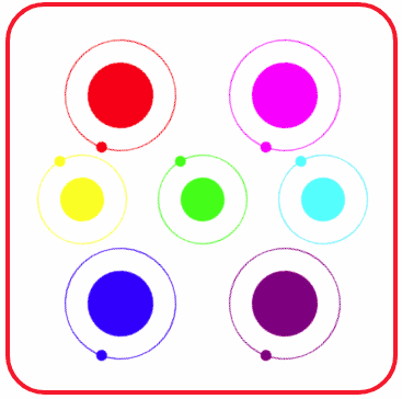
圖4 繞各自軌道旋轉的七顆衛星
通過這個例子,可以體會CSS中自定義變數的使用方法。


