CSS實現大數據熱點波紋圖
CSS實現大數據熱點波紋圖
實現效果: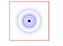
涉及知識點:
- 定位
- 盒子陰影
- 動畫
思想:以3道波紋為例。首先使用一個div盒子作為圓心,然後每道波紋作為一個div。4個盒子均使用定位屬性定位到圓心。然後設置寬高為正方形,並設置border-radius。波紋的顯示使用box-shadow陰影實現。動畫製作方面,主要是每執行一段時間調整寬高來實現圓的半徑變大,並結合opacity透明度來實現若隱若現的感覺。最後通過三道波紋的動畫的時差來實現層疊的效果。程式碼如下:
.a {
            position: relative;
            width: 100px;
            height: 100px;
            margin: 100px auto;
            border: 1px solid red;
        }
        .center {
            position: absolute;
            top: 50%;
            left: 50%;
            width: 8px;
            height: 8px;
            transform: translate(-50%, -50%);
            background-color: blue;
            border-radius: 50%;


        }
        div[class^="border"] {
            position: absolute;
            top: 50%;
            left: 50%;
            width: 8px;
            height: 8px;
            transform: translate(-50%, -50%);
            border-radius: 50%;
            box-shadow: 0 0 12px blue;
            animation: big 1.4s linear infinite;
        }
        div.border2 {
            animation-delay: 0.4s;
        }
        div.border3 {
            animation-delay: 0.8s;
        }
        @keyframes big{
            70% {
                width: 40px;
                height: 40px;
                opacity: 1;
            }
            100% {
                width: 70px;
                height: 70px;
                opacity: 0;
            }
        }
<div class="a">
        <div class="center"></div>
        <div class="border1"></div>
        <div class="border2"></div>
        <div class="border3"></div>
    </div>
可能有讀者會說擴大圓的半徑為什麼不使用scale()屬性。因為,使用這個屬性後波紋的陰影會跟著擴大。


