CSS定位布局
基礎知識
在CSS布局中,定位布局也是一種非常常見的技術手段,我們以京東為例:
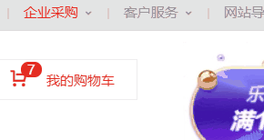
上面是非常好的例子,對於定位布局來說它可以將一個元素放在頁面上的任意一個位置。
但是定位布局也不能濫用,因為它可能會出現一些意料之外的問題,所以我們只對一些需要定位的元素進行定位,而不需要定位的元素則使用文檔流與浮動即可。
定位類型
我們可以對一個元素使用position讓它來進行定位,共有以下的定位選項。
| 選項 | 說明 |
|---|---|
| static | 默認形為,參考文檔流 |
| relative | 相對定位 |
| absolute | 絕對定位,脫離文檔流 |
| fixed | 固定定位,脫離文檔流 |
| sticky | 粘性定位 |
位置偏移
上面說過,定位布局就是為了將一個元素可以放在頁面上的任意一個位置而產生的,那麼我們就可以對某些以添加定位選項的定位元素設置上,下,左,右的位置偏移。
| 選項 | 說明 |
|---|---|
| top | 距離頂邊 |
| bottom | 距離下邊 |
| left | 距離左部 |
| right | 距離右邊 |
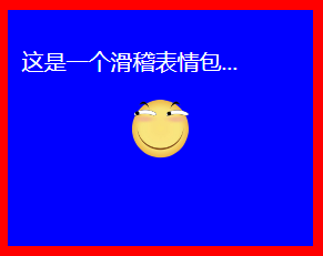
相對定位
相對定位relative是相對於元素原本的位置進行控制,當元素髮生偏移時,原位置保留(未脫離文檔流,就會原位置留空)。
原本位置:
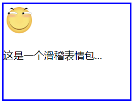
相對定位,距離頂邊30px:
我們可以看到,下方的文字並沒有去填補<img>原本的位置。


<!DOCTYPE html> <html lang="en"> <head> <meta charset="UTF-8"> <meta name="viewport" content="width=device-width, initial-scale=1.0"> <title>Document</title> <style> article{ width: 200px; height: 150px; border: 2px solid blue; } article img{ width: 50px; height: 50px; position: relative; top: 30px; } </style> </head> <body> <article> <img src="./huaji.png" alt=""> <p>這是一個滑稽表情包...</p> </article> </body> </html>
相對定位
絕對定位
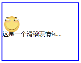
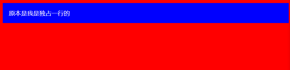
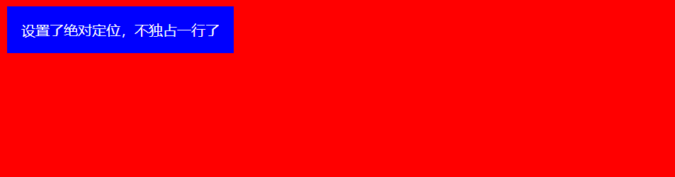
絕對定位absolute是脫離於文檔流的,你可以將它理解為漂浮,被絕對定位後的元素擁有inline-block特性(不獨佔一行,能設置寬高)。
此外還要注意一點,絕對定位的元素是會影響同級的正常文檔流元素的,即後面元素會自動向上補齊。
可以看到,下面絕對定位後的<img>標籤空間位置被<p>標籤佔用了。
<!DOCTYPE html> <html lang="en"> <head> <meta charset="UTF-8"> <meta name="viewport" content="width=device-width, initial-scale=1.0"> <title>Document</title> <style> body{ } div{ color: white; padding: 1em; position: absolute; } </style> </head> <body> <div>設置了絕對定位,不獨佔一行了</div> </body> </html>
絕對定位元素不會獨佔一行
<!DOCTYPE html> <html lang="en"> <head> <meta charset="UTF-8"> <meta name="viewport" content="width=device-width, initial-scale=1.0"> <title>Document</title> <style> article{ width: 200px; height: 150px; border: 2px solid blue; } article img{ width: 50px; height: 50px; position: absolute; top: 30px; } </style> </head> <body> <article> <img src="./huaji.png" alt=""> <p>這是一個滑稽表情包...</p> </article> </body> </html>
絕對定位元素文檔流空間位會被佔據
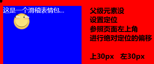
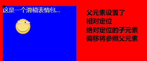
參照元素
絕對定位的元素不受文檔流的控制,所以默認它是按照頁面左上角來進行偏移。
但是如果被絕對定位元素的父元素設置了relative或者fixed以及sticky定位的話,則該絕對定位子元素將會參照此父元素進行定位。
<!DOCTYPE html> <html lang="en"> <head> <meta charset="UTF-8"> <meta name="viewport" content="width=device-width, initial-scale=1.0"> <title>Document</title> <style> body{ } article{ width: 200px; height: 150px; color: white; position: relative; } article img{ width: 50px; height: 50px; position: absolute; top: 30px; left: 30px; } </style> </head> <body> <article> <img src="./huaji.png" alt=""> <p>這是一個滑稽表情包...</p> </article> </body> </html>
參照元素
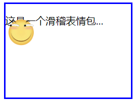
默認位置
如果被定位的子元素沒有設置任何偏移,那麼它將會受到父元素padding等屬性的影響。但是使用定位的元素一般都會進行偏移設置。
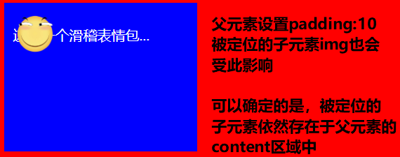
<!DOCTYPE html> <html lang="en"> <head> <meta charset="UTF-8"> <meta name="viewport" content="width=device-width, initial-scale=1.0"> <title>Document</title> <style> body{ } article{ width: 200px; height: 150px; color: white; position: relative; padding: 10px; } article img{ width: 50px; height: 50px; position: absolute; } </style> </head> <body> <article> <img src="./huaji.png" alt=""> <p>這是一個滑稽表情包...</p> </article> </body> </html>
默認位置
設置尺寸
我們可以為定位的元素設定偏移值來改變該元素的尺寸大小。
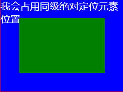
<!DOCTYPE html> <html lang="en"> <head> <meta charset="UTF-8"> <meta name="viewport" content="width=device-width, initial-scale=1.0"> <title>Document</title> <style> body{ } article{ width: 200px; height: 150px; color: white; position: relative; } article div{ position: absolute; left: 30px; top: 30px; bottom: 30px; right: 30px; } </style> </head> <body> <article> <div></div> <p>我會佔用同級絕對定位元素位置...</p> </article> </body> </html>
設置尺寸
居中定位
通過將 left 設置為50% ,並向左偏移子元素寬度一半可以實現水平居中,垂直居中使用方式類似。
<!DOCTYPE html> <html lang="en"> <head> <meta charset="UTF-8"> <meta name="viewport" content="width=device-width, initial-scale=1.0"> <title>Document</title> <style> body{ } article{ width: 200px; height: 150px; color: white; position: relative; padding: 10px; } article img{ width: 50px; height: 50px; position: absolute; left: 50%; top: 50%; margin-left: -25px; margin-top: -25px; } </style> </head> <body> <article> <img src="./huaji.png" alt=""> <p>這是一個滑稽表情包...</p> </article> </body> </html>
居中定位
滾動行為
無論是絕對定位或者相對定位的元素,都會隨著滾動條發生滾動。
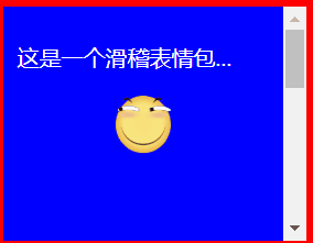
<!DOCTYPE html> <html lang="en"> <head> <meta charset="UTF-8"> <meta name="viewport" content="width=device-width, initial-scale=1.0"> <title>Document</title> <style> body{ } article{ width: 200px; height: 150px; color: white; position: relative; padding: 10px; /* 顯示滾動條 Y軸 */ overflow-y: scroll; } article img{ width: 50px; height: 50px; position: absolute; left: 50%; top: 50%; margin-left: -25px; margin-top: -25px; } article p{ /* 內容足夠長,出現滾動條 */ height: 500px; } </style> </head> <body> <article> <img src="./huaji.png" alt=""> <p>這是一個滑稽表情包...</p> </article> </body> </html>
滾動行為
z-index
如果兩個同級的元素都進行定位且位置相同,那麼後定位的元素會層疊在先定位的元素之上,這個時候我們就需要用到z-index來改變層疊優先順序。
未定位:
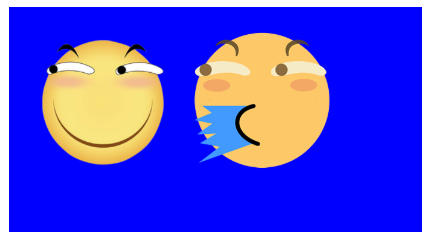
兩個都進行絕對定位,依照藍色父盒子的左上角,層疊在一起,可以看到只顯示出一個,這是因為噴水滑稽比普通滑稽要大一點:
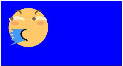
改變噴水滑稽的尺寸大小,就可以它下面的看見普通滑稽了。
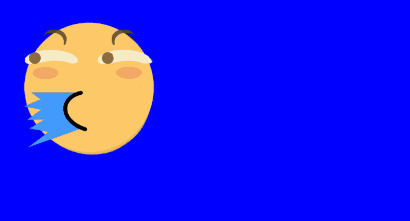
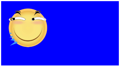
此時我們可以將噴水的滑稽進行偏移挪開,或者使用z-index提升優先順序,讓原本在下面的普通滑稽層疊在噴水滑稽上面。
<!DOCTYPE html> <html lang="en"> <head> <meta charset="UTF-8"> <meta name="viewport" content="width=device-width, initial-scale=1.0"> <title>Document</title> <style> article section{ width: 200px; height: 100px; padding: 10px; position: relative; } article section img:first-of-type{ width: 80px; position: absolute; /* 默認的層疊都是0,所以我們提成1即可 */ z-index: 1; } article section img:last-of-type{ width: 80px; position: absolute; } </style> </head> <body> <article> <section> <img src="./huaji.png" alt=""> <!-- 排列在後的疊在排列前的上面 --> <img src="./ps.png" alt=""> </section> </article> </body> </html>
z-index
固定定位
固定定位fixed是脫離文檔流(影響後面元素排列,固定定位元素不會留下空間)的一種定位方式,固定定位的元素不會隨著滾動條進行滾動,它的偏移參照點是頁面左上角。
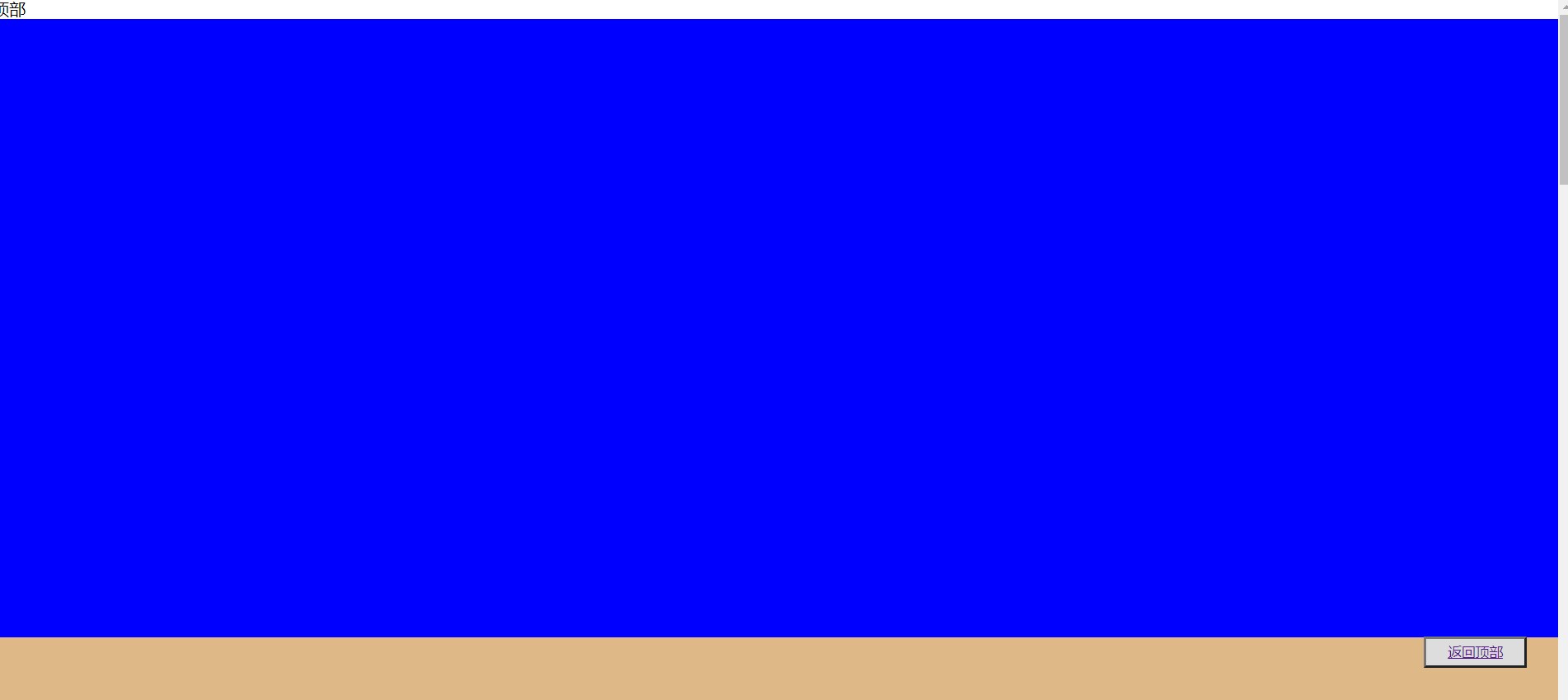
<!DOCTYPE html> <html lang="en"> <head> <meta charset="UTF-8"> <meta name="viewport" content="width=device-width, initial-scale=1.0"> <title>Document</title> <style> *{ padding: 0; margin: 0; } main>button{ position: fixed; height: 30px; width: 100px; right: 2%; bottom: 10%; text-decoration: none; } main>section{ height: 600px; } main>section:nth-of-type(1){ } main>section:nth-of-type(2){ } main>section:nth-of-type(3){ } main>section:nth-of-type(4){ } main>section:last-of-type{ } </style> </head> <body> <main> <span di="top">頂部</span> <section> </section> <section> </section> <section> </section> <section> </section> <section> </section> <button><a href="#top">返回頂部</a></button> </main> </body> </html>
固定定位
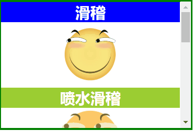
粘性定位
同級粘性定位
同級粘性定位sticky是會進行層疊的,後面的粘性定位元素不會擠掉上面的粘性定位元素。
同級指的就是不同的粘性定位元素粘的是同一個父級元素。
<!DOCTYPE html> <html lang="en"> <head> <meta charset="UTF-8"> <meta name="viewport" content="width=device-width, initial-scale=1.0"> <title>Document</title> <style> * { margin: 0; padding: 0; } img { width: 100px; } main { border: 3px solid green; width: 300px; height: 200px; overflow-y: scroll; } main section { height: 700px; text-align: center; } main section h2 { color: white; position: sticky; top: 0; } main section h2:nth-of-type(even) { } main section h2:nth-of-type(odd) { } </style> </head> <body> <main> <section> <h2>滑稽</h2> <img src="./huaji.png" alt=""> <h2>噴水滑稽</h2> <img src="./ps.png" alt=""> <h2>墨鏡哥</h2> <img src="./mjg.png" alt=""> <h2>眩暈怪</h2> <img src="./xyg.png" alt=""> </section> </main> </body> </html>
同級粘性定位
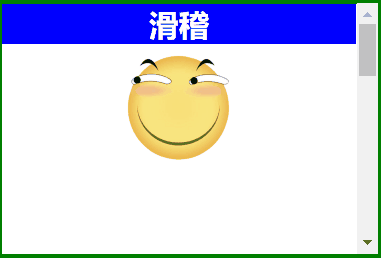
非同級粘性定位
非同級粘性定位sticky是不會進行層疊的,後面的粘性定位元素會擠掉上面的粘性定位元素。
非同級指的就是不同的粘性定位元素粘的不是同一個父級元素。
<!DOCTYPE html> <html lang="en"> <head> <meta charset="UTF-8"> <meta name="viewport" content="width=device-width, initial-scale=1.0"> <title>Document</title> <style> *{ margin: 0; padding: 0; } img { width: 100px; } main { border: 3px solid green; width: 300px; height: 200px; overflow-y: scroll; } main section{ height: 200px; text-align: center; } main section h2 { color: white; position:sticky; top:0; } main section:nth-of-type(even) h2 { } main section:nth-of-type(odd) h2 { } </style> </head> <body> <main> <section> <h2>滑稽</h2> <img src="./huaji.png" alt=""> </section> <section> <h2>噴水滑稽</h2> <img src="./ps.png" alt=""> </section> <section> <h2>墨鏡哥</h2> <img src="./mjg.png" alt=""> </section> <section> <h2>眩暈怪</h2> <img src="./xyg.png" alt=""> </section> </main> </body> </html>
非同級粘性定位
定位使用場景程式碼
<!DOCTYPE html> <html lang="en"> <head> <meta charset="UTF-8"> <meta name="viewport" content="width=device-width, initial-scale=1.0"> <title>Document</title> <style> * { padding: 0; margin: 0; } main { width: 600px; padding: 100px; margin: 0 auto; } main article { width: 150px; position: relative; cursor: pointer; font-size: 14px; color: #555; } main article:hover div:nth-of-type(1) { border-bottom: none; } main article:hover div:nth-of-type(2) { display: block; } main article div { box-sizing: border-box; height: 50px; line-height: 3.5em; text-align: center; border: solid 2px blueviolet; background: white; } main article div:nth-of-type(1) { position: relative; /* 掩蓋第二個DIV的上邊框線 */ z-index: 2; } main article div:nth-of-type(2) { display: none; position: absolute; right: 0; /* 掩蓋上邊框線 */ top: 48px; left: -150px; z-index: 1; } </style> </head> <body> <main> <article> <div>我的購物車</div> <div>購物車中暫無產品</div> </article> </main> </body> </html>
定位使用場景程式碼


