幾種常見的CSS布局
- 2019 年 10 月 10 日
- 筆記
本文概要
本文將介紹如下幾種常見的布局:

其中實現三欄布局有多種方式,本文著重介紹聖杯布局和雙飛翼布局。另外幾種可以猛戳實現三欄布局的幾種方法
一、單列布局

常見的單列布局有兩種:
- header,content和footer等寬的單列布局
- header與footer等寬,content略窄的單列布局
1.如何實現
對於第一種,先通過對header,content,footer統一設置width:1000px;或者max-width:1000px(這兩者的區別是當螢幕小於1000px時,前者會出現滾動條,後者則不會,顯示出實際寬度);然後設置margin:auto實現居中即可得到。
<div class="header"></div> <div class="content"></div> <div class="footer"></div>
.header{ margin:0 auto; max-width: 960px; height:100px; background-color: blue; } .content{ margin: 0 auto; max-width: 960px; height: 400px; background-color: aquamarine; } .footer{ margin: 0 auto; max-width: 960px; height: 100px; background-color: aqua; }
對於第二種,header、footer的內容寬度不設置,塊級元素充滿整個螢幕,但header、content和footer的內容區設置同一個width,並通過margin:auto實現居中。
<div class="header"> <div class="nav"></div> </div> <div class="content"></div> <div class="footer"></div>
.header{ margin:0 auto; max-width: 960px; height:100px; background-color: blue; } .nav{ margin: 0 auto; max-width: 800px; background-color: darkgray; height: 50px; } .content{ margin: 0 auto; max-width: 800px; height: 400px; background-color: aquamarine; } .footer{ margin: 0 auto; max-width: 960px; height: 100px; background-color: aqua; }
二、兩列自適應布局
兩列自適應布局是指一列由內容撐開,另一列撐滿剩餘寬度的布局方式
1.float+overflow:hidden
如果是普通的兩列布局,浮動+普通元素的margin便可以實現,但如果是自適應的兩列布局,利用float+overflow:hidden便可以實現,這種辦法主要通過overflow觸發BFC,而BFC不會重疊浮動元素。由於設置overflow:hidden並不會觸發IE6-瀏覽器的haslayout屬性,所以需要設置zoom:1來兼容IE6-瀏覽器。具體程式碼如下:
<div class="parent" style="background-color: lightgrey;"> <div class="left" style="background-color: lightblue;"> <p>left</p> </div> <div class="right" style="background-color: lightgreen;"> <p>right</p> <p>right</p> </div> </div>
.parent { overflow: hidden; zoom: 1; } .left { float: left; margin-right: 20px; } .right { overflow: hidden; zoom: 1; }
注意點:如果側邊欄在右邊時,注意渲染順序。即在HTML中,先寫側邊欄後寫主內容
2.Flex布局
Flex布局,也叫彈性盒子布局,區區簡單幾行程式碼就可以實現各種頁面的的布局。
//html部分同上 .parent { display:flex; } .right { margin-left:20px; flex:1; }
3.grid布局
Grid布局,是一個基於網格的二維布局系統,目的是用來優化用戶介面設計。
//html部分同上 .parent { display:grid; grid-template-columns:auto 1fr; grid-gap:20px }
三、三欄布局
特徵:中間列自適應寬度,旁邊兩側固定寬度
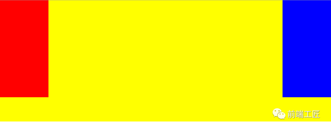
1.聖杯布局
① 特點
比較特殊的三欄布局,同樣也是兩邊固定寬度,中間自適應,唯一區別是dom結構必須是先寫中間列部分,這樣實現中間列可以優先載入。
.container { padding-left: 220px;//為左右欄騰出空間 padding-right: 220px; } .left { float: left; width: 200px; height: 400px; background: red; margin-left: -100%; position: relative; left: -220px; } .center { float: left; width: 100%; height: 500px; background: yellow; } .right { float: left; width: 200px; height: 400px; background: blue; margin-left: -200px; position: relative; right: -220px; }
<article class="container"> <div class="center"> <h2>聖杯布局</h2> </div> <div class="left"></div> <div class="right"></div> </article>
② 實現步驟
- 三個部分都設定為左浮動,否則左右兩邊內容上不去,就不可能與中間列同一行。然後設置center的寬度為100%(實現中間列內容自適應),此時,left和right部分會跳到下一行

- 通過設置margin-left為負值讓left和right部分回到與center部分同一行
- 通過設置父容器的padding-left和padding-right,讓左右兩邊留出間隙。

- 通過設置相對定位,讓left和right部分移動到兩邊。

③ 缺點
- center部分的最小寬度不能小於left部分的寬度,否則會left部分掉到下一行
- 如果其中一列內容高度拉長(如下圖),其他兩列的背景並不會自動填充。(藉助等高布局正padding+負margin可解決,下文會介紹)

2.雙飛翼布局
① 特點
同樣也是三欄布局,在聖杯布局基礎上進一步優化,解決了聖杯布局錯亂問題,實現了內容與布局的分離。而且任何一欄都可以是最高欄,不會出問題。
.container { min-width: 600px;//確保中間內容可以顯示出來,兩倍left寬+right寬 } .left { float: left; width: 200px; height: 400px; background: red; margin-left: -100%; } .center { float: left; width: 100%; height: 500px; background: yellow; } .center .inner { margin: 0 200px; //新增部分 } .right { float: left; width: 200px; height: 400px; background: blue; margin-left: -200px; }
<article class="container"> <div class="center"> <div class="inner">雙飛翼布局</div> </div> <div class="left"></div> <div class="right"></div> </article>
② 實現步驟(前兩步與聖杯布局一樣)
- 三個部分都設定為左浮動,然後設置center的寬度為100%,此時,left和right部分會跳到下一行;
- 通過設置margin-left為負值讓left和right部分回到與center部分同一行;
- center部分增加一個內層div,並設margin: 0 200px;
③ 缺點
多加一層 dom 樹節點,增加渲染樹生成的計算量。
3.兩種布局實現方式對比:
- 兩種布局方式都是把主列放在文檔流最前面,使主列優先載入。
- 兩種布局方式在實現上也有相同之處,都是讓三列浮動,然後通過負外邊距形成三列布局。
- 兩種布局方式的不同之處在於如何處理中間主列的位置: 聖杯布局是利用父容器的左、右內邊距+兩個從列相對定位; 雙飛翼布局是把主列嵌套在一個新的父級塊中利用主列的左、右外邊距進行布局調整
四、等高布局
等高布局是指子元素在父元素中高度相等的布局方式。接下來我們介紹常見幾種實現方式:
1.利用正padding+負margin
我們通過等布局便可解決聖杯布局的第二點缺點,因為背景是在 padding 區域顯示的,設置一個大數值的 padding-bottom,再設置相同數值的負的 margin-bottom,並在所有列外面加上一個容器,並設置 overflow:hidden 把溢出背景切掉。這種可能實現多列等高布局,並且也能實現列與列之間分隔線效果,結構簡單,兼容所有瀏覽器。新增程式碼如下:
.center, .left, .right { padding-bottom: 10000px; margin-bottom: -10000px; } .container { padding-left: 220px; padding-right: 220px; overflow: hidden;//把溢出背景切掉 }

2.利用背景圖片
這種方法是我們實現等高列最早使用的一種方法,就是使用背景圖片,在列的父元素上使用這個背景圖進行Y軸的鋪放,從而實現一種等高列的假象。實現方法簡單,兼容性強,不需要太多的css樣式就可以輕鬆實現,但此方法不適合流體布局等高列的布局。
在製作樣式之前需要一張類似下面的背景圖:

<div class=」container clearfix」> <div class=」left」></div> <div class=」content」></div> <div class=」right」></div> </div>
.container { background: url("column.png") repeat-y; width: 960px; margin: 0 auto; } .left { float: left; width: 220px; } .content { float: left; width: 480px; } .right { float: left; width: 220px; }
3.模仿表格布局
這是一種非常簡單,易於實現的方法。不過兼容性不好,在ie6-7無法正常運行。
<div class="container table"> <div class="containerInner tableRow"> <div class="column tableCell cell1"> <div class="left aside"> .... </div> </div> <div class="column tableCell cell2"> <div class="content section"> ... </div> </div> <div class="column tableCell cell3"> <div class="right aside"> ... </div> </div> </div> </div>
.table { width: auto; min-width: 1000px; margin: 0 auto; padding: 0; display: table; } .tableRow { display: table-row; } .tableCell { display: table-cell; width: 33%; } .cell1 { background: #f00; height: 800px; } .cell2 { background: #0f0; } .cell3 { background: #00f; }
4.使用邊框和定位
這種方法是使用邊框和絕對定位來實現一個假的高度相等列的效果。結構簡單,兼容各瀏覽器,容易掌握。假設你需要實現一個兩列等高布局,側欄高度要和主內容高度相等。
#wrapper { width: 960px; margin: 0 auto; } #mainContent { border-right: 220px solid #dfdfdf; position: absolute; width: 740px; height: 800px; background: green; } #sidebar { background: #dfdfdf; margin-left: 740px; position: absolute; height: 800px; width: 220px; }
<div id="wrapper"> <div id="mainContent">...</div> <div id="sidebar">...</div> </div>
五、粘連布局
1.特點
- 有一塊內容
<main>,當<main>的高康足夠長的時候,緊跟在<main>後面的元素<footer>會跟在<main>元素的後面。 - 當
<main>元素比較短的時候(比如小於螢幕的高度),我們期望這個<footer>元素能夠「粘連」在螢幕的底部

具體程式碼如下:
<div id="wrap"> <div class="main"> main <br /> main <br /> main <br /> </div> </div> <div id="footer">footer</div>
* { margin: 0; padding: 0; } html, body { height: 100%;//高度一層層繼承下來 } #wrap { min-height: 100%; background: pink; text-align: center; overflow: hidden; } #wrap .main { padding-bottom: 50px; } #footer { height: 50px; line-height: 50px; background: deeppink; text-align: center; margin-top: -50px; }
2.實現步驟
(1)footer必須是一個獨立的結構,與wrap沒有任何嵌套關係
(2)wrap區域的高度通過設置min-height,變為視口高度
(3)footer要使用margin為負來確定自己的位置
(4)在main區域需要設置 padding-bottom。這也是為了防止負 margin 導致 footer 覆蓋任何實際內容。
於2019.1.2重新修改,如果覺得文章對你有些許幫助,歡迎在我的GitHub部落格點贊和關注,感激不盡!
參考文章
- 雙飛翼布局介紹-始於淘寶UED
- CSS三欄布局的四種方法
- CSS 兩列布局—左側固定,右側自適應
- 兩列自適應布局的四種思路
- css常見布局之九:三欄布局的常見實現
- 【布局】聊聊為什麼淘寶要提出「雙飛翼」布局
- CSS的單列布局與二&三列布局
