Matplotlib 精簡實例入門
- 2020 年 3 月 29 日
- 筆記
Matplotlob 簡明實例入門

通過幾個實例,快速了解matplotlib.pyplot 中最為常見的折線圖,散點圖,柱狀圖,直方圖,餅圖的用法
如果您需要更為詳細的內容,請參考官方文檔:
https://matplotlib.org/gallery/
import matplotlib.pyplot as plt import random from pylab import mpl # 設置顯示中文字體 mpl.rcParams["font.sans-serif"] = ["SimHei"] mpl.rcParams["axes.unicode_minus"] = False 案例1:顯示溫度變化狀況
# 0.生成數據 x = range(60) y_shanghai = [random.uniform(10, 15) for i in x] # 1.創建畫布 plt.figure(figsize=(20,8), dpi=100) # 2.圖形繪製 plt.plot(x, y_shanghai) ## 2.1添加x,y軸刻度 y_ticks = range(40) x_ticks_labels = ['11點{}分'.format(i) for i in x] plt.xticks(x[::5], x_ticks_labels[::5]) plt.yticks(y_ticks[::5]) # 2.2 顯示網格 ,True可以不給,後面有其他值默認為True plt.grid(True, linestyle='--', alpha=0.7) # 2.3 添加描述信息 plt.xlabel('時間', fontsize=16) plt.ylabel('溫度', fontsize=16) plt.title('中午溫度變化圖示', fontsize=20) # 3.保存圖形 # plt.savefig('./data/temperature.png') # 4.圖形展示, 會釋放內存中的資源 plt.show() 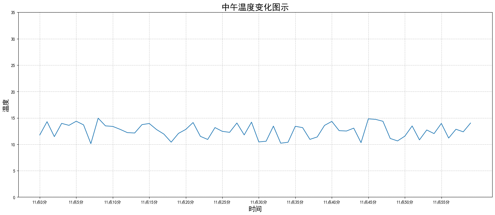
案例2. 同一個坐標系中繪製多個圖像
# 0.新增北京溫度數據 x = range(60) y_beijing = [random.uniform(1, 3) for i in x] # 1.創建畫布 plt.figure(figsize=(20, 8), dpi=100) # 2.繪製折線圖 # 2.1 繪製x, y刻度 x_ticks = ['11點{}分'.format(i) for i in x] y_ticks = range(40) plt.xticks(x[::5], x_ticks[::5]) plt.yticks(y_ticks[::1]) # 2.2 繪製坐標軸描述 plt.xlabel('時間', fontsize=16) plt.ylabel('溫度', fontsize=16) plt.title('北京上海兩地溫度變化圖', fontsize=20) # 2.3 繪製網格線 plt.grid(True, linestyle='--', alpha=0.7) # 3 繪製圖形 plt.plot(x, y_beijing, color='c', linestyle='-.',label='北京') plt.plot(x, y_shanghai, color='m', linestyle='--',label='上海') # 4. 繪製圖例, 需要在繪製圖形時指定label plt.legend(loc='best') # 5. 保存圖片,需要在plt.show()釋放內存資源之前 plt.savefig('./data/北京上海兩地氣溫變化圖.png') # 5.顯示圖像 plt.show() 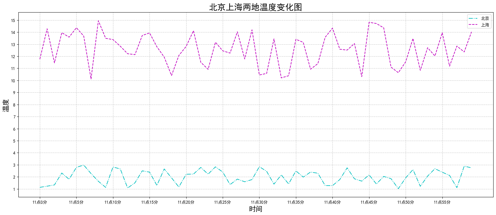
案例3. 多個坐標系顯示(子圖)
# 0.獲取數據 x = range(60) y_beijing = [random.uniform(1, 5) for i in x] y_shanghai = [random.uniform(15, 25) for i in x] # 1.創建畫布 fig, axes = plt.subplots(nrows=1, ncols=2, figsize=(20, 8), dpi=100) # 2.繪製圖像 axes[0].plot(x, y_beijing, label='北京') axes[1].plot(x, y_shanghai, label='上海', color='c', ls='--') # 2.1 繪製刻度 x_ticks_label = ['11點{}分'.format(i) for i in x] y_ticks = range(40) # 先設定數據標籤set_xticks, 然後再改為字符串set_xticklabels (不是xtickslabels !!) axes[0].set_xticks(x[::5]) axes[0].set_xticklabels(x_ticks_labels[::5]) axes[0].set_yticks(y_ticks[::5]) axes[1].set_xticks(x[::5]) axes[1].set_xticklabels(x_ticks_labels[::5]) axes[1].set_yticks(y_ticks[::5]) # 2.2 設定網格顯示 axes[0].grid(True, linestyle='--', alpha=0.5) axes[1].grid(True, linestyle='-.', alpha=0.5) # 2.3 添加描述信息 axes[0].set_xlabel('時間', fontsize=16) axes[0].set_ylabel('北京溫度', fontsize=16) axes[0].set_title('北京溫度變化圖', fontsize=20) axes[1].set_xlabel('時間', fontsize=16) axes[1].set_ylabel('北京溫度', fontsize=16) axes[1].set_title('北京溫度變化圖', fontsize=20) # 2.4 添加圖例 axes[0].legend(loc=0) axes[1].legend(loc=0) # 3. 保存圖像 plt.savefig('北京上海兩地溫度子圖.png') # 4. 顯示圖像 plt.show() 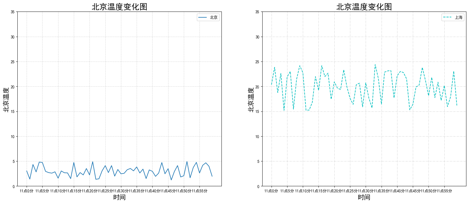
案例4.常見其他圖形繪製
4.1 散點圖繪製
# 0.準備數據 x = [225.98, 247.07, 253.14, 457.85, 241.58, 301.01, 20.67, 288.64, 163.56, 120.06, 207.83, 342.75, 147.9 , 53.06, 224.72, 29.51, 21.61, 483.21, 245.25, 399.25, 343.35] y = [196.63, 203.88, 210.75, 372.74, 202.41, 247.61, 24.9 , 239.34, 140.32, 104.15, 176.84, 288.23, 128.79, 49.64, 191.74, 33.1 , 30.74, 400.02, 205.35, 330.64, 283.45] # 1. 創建畫布 plt.figure(figsize=(20, 8), dpi=100) # 2.繪製散點圖 plt.scatter(x, y) # 3. 顯示圖形 plt.show() 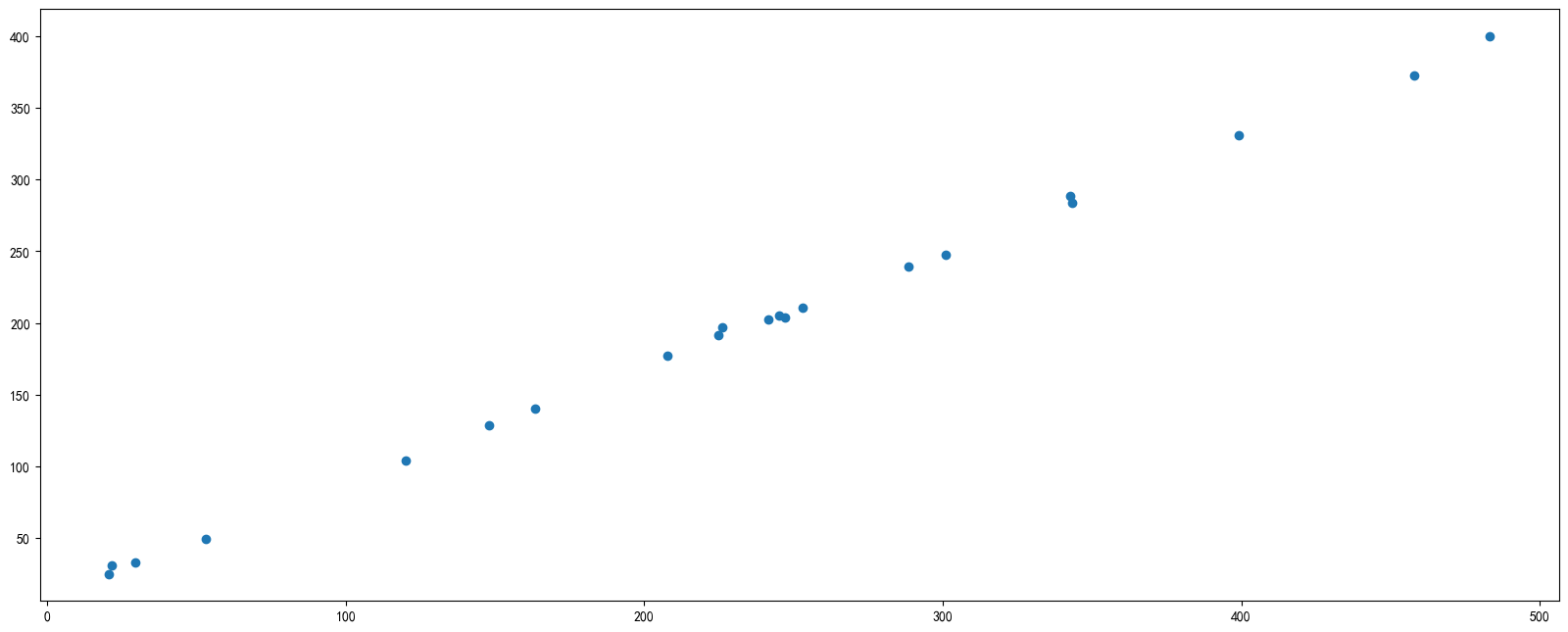
4.2 柱狀圖繪製
# 0. 準備數據(以某月電影票房為例) movie_name = ['雷神3:諸神黃昏','正義聯盟','東方快車謀殺案','尋夢環遊記','全球風暴','降魔傳','追捕','七十七天','密戰','狂獸','其它'] # x, y 分別為電影名稱和票房 x = range(len(movie_name)) y = [73853,57767,22354,15969,14839,8725,8716,8318,7916,6764,52222] # 1.創建畫布 plt.figure(figsize=(20, 8), dpi=100) # 2.繪製柱狀圖 # 可以添加每個的寬度和顏色(列表輸入) plt.bar(x, y, width=0.5, color=['b','r','g','y','c','m','y','k','c','g','b']) # 2.1 修改x軸刻度 # plt.xticks(ticks=x, labels=movie_name) # ticks -> 原刻度, labels->新標籤 plt.xticks(x, movie_name, fontsize=15) # 2.2 網格 plt.grid(ls='--', lw=1, alpha=0.5) # ls->linestyle, lw->linewidth # 2.4 添加標題和坐標軸名稱 plt.title('電影票房對比') plt.xlabel('電影名稱') plt.ylabel('上映票數') # 3.顯示圖像 plt.show() 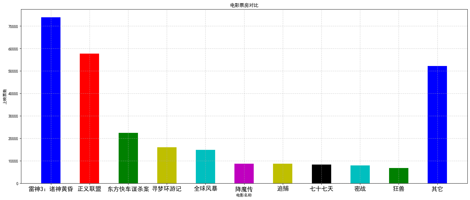
4.3 直方圖
# 0.生成數據 x = [random.uniform(0, 100) for i in range(200)] # 1.繪製圖形 # 直方圖用來表示數據的分佈,橫軸表示數據範圍,總之表示分佈情況, bins表示分組數量 # y軸表示每個組的佔比(百分數)或者數量 plt.hist(x, bins=30) # 2.顯示圖形 plt.show() 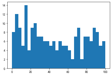
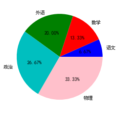
4.4 餅狀圖
# 0.獲取數據 # 以不同學科的成績佔比 label_names = ['語文', '數學', '外語', '政治', '物理'] # 每部分的佔比(字段換算成百分比) rate = [1,2,3,4,5] # 1.繪製圖像 # autopct參數為顯示佔比百分數 plt.pie(rate, labels=label_names, colors=['b','r','g','c','pink'], autopct='%1.2f%%') plt.show() # 參考資料: # https://matplotlib.org/gallery/pie_and_polar_charts/pie_features.html#sphx-glr-gallery-pie-and-polar-charts-pie-features-py