一篇帶你看懂Flutter疊加組件Stack
- 2020 年 3 月 6 日
- 筆記

注意:無特殊說明,Flutter版本及Dart版本如下:
- Flutter版本: 1.12.13+hotfix.5
- Dart版本: 2.7.0
Stack
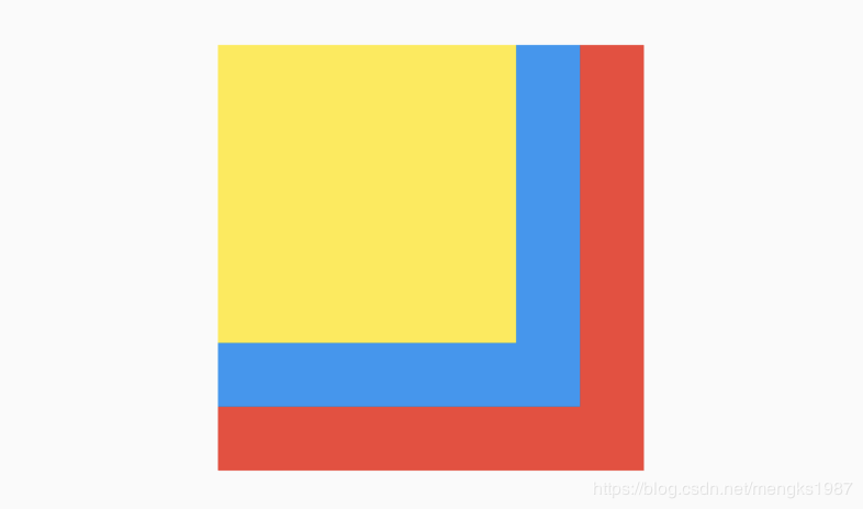
Stack組件可以將子組件疊加顯示,根據子組件的順利依次向上疊加,用法如下:
Stack( children: <Widget>[ Container( height: 200, width: 200, color: Colors.red, ), Container( height: 170, width: 170, color: Colors.blue, ), Container( height: 140, width: 140, color: Colors.yellow, ) ], )效果如下:
Stack未定位的子組件大小由fit參數決定,默認值是StackFit.loose,表示子組件自己決定,StackFit.expand表示儘可能的大,用法如下:
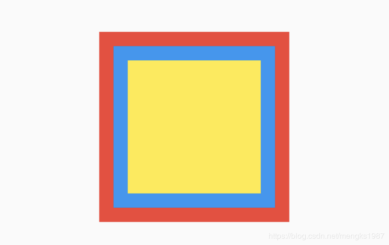
Stack( fit: StackFit.expand, ... )Stack未定位的子組件的默認左上角對齊,通過alignment參數控制,用法如下:
Stack( alignment: Alignment.center, ... )效果如下:
有沒有注意到fit和alignment參數控制的都是未定位的子組件,那什麼樣的組件叫做定位的子組件?使用Positioned包裹的子組件就是定位的子組件,用法如下:
Stack( alignment: Alignment.center, children: <Widget>[ Container( height: 200, width: 200, color: Colors.red, ), Positioned( left: 10, right: 10, bottom: 10, top: 10, child: Container( color: Colors.green, ), ) ], )Positioned組件可以指定距Stack各邊的距離,效果如下:

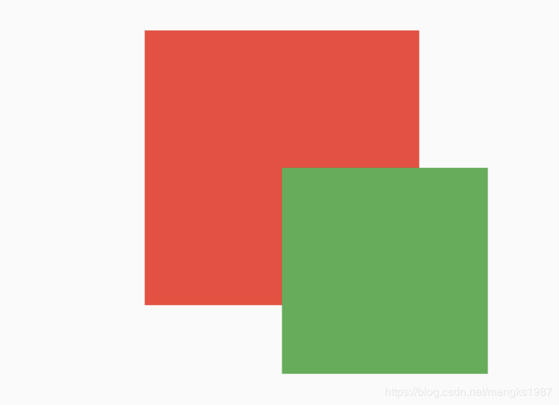
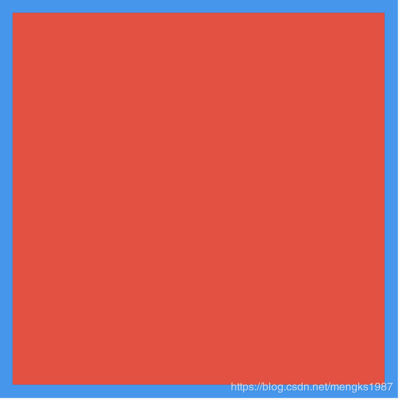
如果子組件超過Stack邊界由overflow控制,默認是裁剪,下面設置總是顯示的用法:
Stack( overflow: Overflow.visible, children: <Widget>[ Container( height: 200, width: 200, color: Colors.red, ), Positioned( left: 100, top: 100, height: 150, width: 150, child: Container( color: Colors.green, ), ) ], )效果如下:
IndexedStack
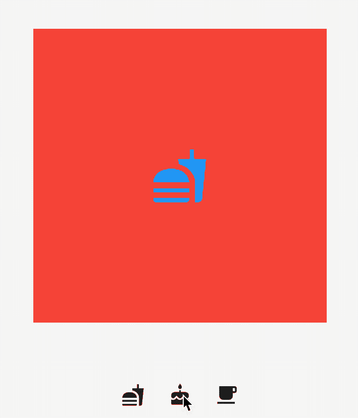
IndexedStack是Stack的子類,Stack是將所有的子組件疊加顯示,而IndexedStack只顯示指定的子組件,用法如下:
IndexedStack( index: _index, children: <Widget>[ Center( child: Container( height: 300, width: 300, color: Colors.red, alignment: Alignment.center, child: Icon( Icons.fastfood, size: 60, color: Colors.blue, ), ), ), Center( child: Container( height: 300, width: 300, color: Colors.green, alignment: Alignment.center, child: Icon( Icons.cake, size: 60, color: Colors.blue, ), ), ), Center( child: Container( height: 300, width: 300, color: Colors.yellow, alignment: Alignment.center, child: Icon( Icons.local_cafe, size: 60, color: Colors.blue, ), ), ), ], )通過點擊按鈕更新_index值,代碼如下:
Row( mainAxisAlignment: MainAxisAlignment.center, children: <Widget>[ IconButton( icon: Icon(Icons.fastfood), onPressed: () { setState(() { _index = 0; }); }, ), IconButton( icon: Icon(Icons.cake), onPressed: () { setState(() { _index = 1; }); }, ), IconButton( icon: Icon(Icons.local_cafe), onPressed: () { setState(() { _index = 2; }); }, ), ], )效果如下:
Positioned
Positioned用於定位Stack子組件,Positioned必須是Stack的子組件,基本用法如下:
Stack( children: <Widget>[ Positioned( left: 10, right: 10, top: 10, bottom: 10, child: Container(color: Colors.red), ), ], )效果如下:
相關說明:
- 提供
top、bottom、left、right四種定位屬性,分別表示距離上下左右的距離。 - 只能用於Stack組件中。
left、right和width3個參數只能設置其中2個,因為設置了其中2個,第三個已經確定了,同理top、bottom和height也只能設置其中2個。
Positioned提供便捷的構建方式,比如Positioned.fromRect、Positioned.fill等,這些便捷的構建方式萬變不離其宗,只不過換了一種方式設置top、bottom、left、right四種定位屬性。
今天的文章對大家是否有幫助?如果有,請在文章底部留言和點贊,以表示對我的支持,你們的留言、點贊和轉發關注是我持續更新的動力!