Jetpack Compose學習(7)——MD樣式架構組件Scaffold及導航底部菜單
- 2021 年 10 月 4 日
- 筆記
- Android, Jetpack Compose
Jetpack Compose學習(7)——MD樣式架構組件Scaffold及導航底部菜單 | Stars-One的雜貨小窩
Compose給我們提供了一個Material Design樣式的首頁組件(Scaffold),我們可以直接套用從而完成一個APP的首頁界面
本系列以往文章請查看此分類鏈接Jetpack compose學習
由於Scaffold中還包含有其他的組件,所以講解Scaffold先講解前置的一些組件
TopAppBar
首先,便是TopAppBar,其本質就是我們Android原生常見的Toolbar,不過其封裝的比較好,可以快速構建,下面是其的參數列表
TopAppBar(
    title: @Composable () -> Unit,
    modifier: Modifier = Modifier,
    navigationIcon: @Composable (() -> Unit)? = null,
    actions: @Composable RowScope.() -> Unit = {},
    backgroundColor: Color = MaterialTheme.colors.primarySurface,
    contentColor: Color = contentColorFor(backgroundColor),
    elevation: Dp = AppBarDefaults.TopAppBarElevation
)
title標題,接收Compose組件,可以傳個Text文本進去modifier修飾符,詳情見上一章節navigationIcon導航圖標actions動作組件backgroundColor背景色contentColor內容顏色elevation陰影
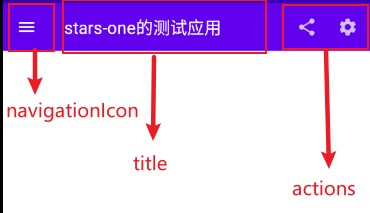
可能說的那麼明確,我們直接上代碼和效果圖,各位就清晰了
TopAppBar(
    navigationIcon = {
        IconButton(
            onClick = {}
        ) {
            Icon(Icons.Filled.Menu, null)
        }
    },
    title = {
        Text("stars-one的測試應用")
    },actions = {
        IconButton(
            onClick = {}
        ) {
            Icon(Icons.Filled.Share, null)
        }
        IconButton(
            onClick = {}
        ) {
            Icon(Icons.Filled.Settings, null)
        }
    }
)
效果圖如下
FloatingActionButton
比較常見的懸浮按鈕,一般裏面是個簡單的按鈕,參數與之前的Button一樣,詳情請參考Jetpack Compose學習(3)——圖標(Icon) 按鈕(Button) 輸入框(TextField) 的使用 | Stars-One的雜貨小窩
FloatingActionButton(
    onClick: () -> Unit,
    modifier: Modifier = Modifier,
    interactionSource: MutableInteractionSource = remember { MutableInteractionSource() },
    shape: Shape = MaterialTheme.shapes.small.copy(CornerSize(percent = 50)),
    backgroundColor: Color = MaterialTheme.colors.secondary,
    contentColor: Color = contentColorFor(backgroundColor),
    elevation: FloatingActionButtonElevation = FloatingActionButtonDefaults.elevation(),
    content: @Composable () -> Unit
)
使用:
FloatingActionButton(onClick = { /*TODO*/ }) {
    Icon(imageVector = Icons.Default.Add, contentDescription = null)
}
PS: 一般這個與
Scaffold連用,Scaffold裏面可控制FloatingActionButton的位置
除此之外,還有個ExtendedFloatingActionButton,這種就是可以帶圖標和文字的,如下圖
ExtendedFloatingActionButton(
    icon = { Icon(Icons.Filled.Favorite, contentDescription = null) },
    text = { Text("ADD TO BASKET") },
    onClick = { /*do something*/ }
)
ExtendedFloatingActionButton和FloatingActionButton區別是,ExtendedFloatingActionButton是以文字為主,圖標是可選的,而FloatingActionButton只顯示圖標
BottomAppBar
這個與之前的TopAppBar參數有所不同,從名字看我們知道其實放在底部的一個Toolbar,但是其本身是不帶有位置控制,也是得與Scaffold連用,如果單獨使用,效果也是會和TopAppBar的一樣放在頁面的頂頭
BottomAppBar(
    modifier: Modifier = Modifier,
    backgroundColor: Color = MaterialTheme.colors.primarySurface,
    contentColor: Color = contentColorFor(backgroundColor),
    cutoutShape: Shape? = null,
    elevation: Dp = AppBarDefaults.BottomAppBarElevation,
    contentPadding: PaddingValues = AppBarDefaults.ContentPadding,
    content: @Composable RowScope.() -> Unit
)
可以把這個布局看作是個Row布局,裏面的參數從名字都能看到出來,設置背景色或者設置padding邊距的,這裡不再贅述
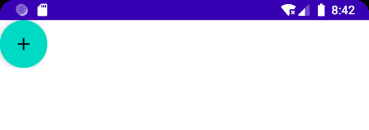
唯一值得注意的是cutoutShape屬性,如果在Scaffold中,有BottomAppBar和FloatingActionButton,可以實現下面的效果
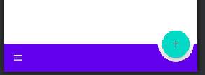
BottomNavigation
BottomNavigation裏面會有N個BottomNavigationItem,這裡就看你自己準備定義多少個菜單項了
BottomNavigation(
    modifier: Modifier = Modifier,
    backgroundColor: Color = MaterialTheme.colors.primarySurface,
    contentColor: Color = contentColorFor(backgroundColor),
    elevation: Dp = BottomNavigationDefaults.Elevation,
    content: @Composable RowScope.() -> Unit
)
BottomNavigation提供的一些參數也就是改變顏色或者陰影,重點是在BottomNavigationItem
BottomNavigationItem(
    selected: Boolean,
    onClick: () -> Unit,
    icon: @Composable () -> Unit,
    modifier: Modifier = Modifier,
    enabled: Boolean = true,
    label: @Composable (() -> Unit)? = null,
    alwaysShowLabel: Boolean = true,
    interactionSource: MutableInteractionSource = remember { MutableInteractionSource() },
    selectedContentColor: Color = LocalContentColor.current,
    unselectedContentColor: Color = selectedContentColor.copy(alpha = ContentAlpha.medium)
)
BottomNavigationItem有個selected參數,表示是否選中
icon則是圖標的設置,label則是文字,這兩個都是需要接收一個組件的
selectedContentColor選中顏色unselectedContentColor未選中顏色
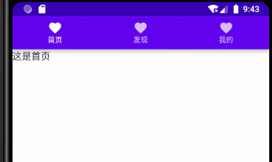
下面直接來個例子講解
var selectIndex by remember {
    mutableStateOf(0)
}
val navList = listOf("首頁","發現","我的")
BottomNavigation() {
    navList.forEachIndexed { index, str ->
        BottomNavigationItem(
            selected = index == selectIndex, onClick = { selectIndex = index },
            icon = {
                Icon(imageVector = Icons.Default.Favorite, contentDescription =null )
            },label = {Text(str)}
        )
    }
}

Text(text = "這是${navList[selectIndex]}")
效果如下所示
Scaffold
Scaffold(
    modifier: Modifier = Modifier,
    scaffoldState: ScaffoldState = rememberScaffoldState(),
    topBar: @Composable () -> Unit = {},
    bottomBar: @Composable () -> Unit = {},
    snackbarHost: @Composable (SnackbarHostState) -> Unit = { SnackbarHost(it) },
    floatingActionButton: @Composable () -> Unit = {},
    floatingActionButtonPosition: FabPosition = FabPosition.End,
    isFloatingActionButtonDocked: Boolean = false,
    drawerContent: @Composable (ColumnScope.() -> Unit)? = null,
    drawerGesturesEnabled: Boolean = true,
    drawerShape: Shape = MaterialTheme.shapes.large,
    drawerElevation: Dp = DrawerDefaults.Elevation,
    drawerBackgroundColor: Color = MaterialTheme.colors.surface,
    drawerContentColor: Color = contentColorFor(drawerBackgroundColor),
    drawerScrimColor: Color = DrawerDefaults.scrimColor,
    backgroundColor: Color = MaterialTheme.colors.background,
    contentColor: Color = contentColorFor(backgroundColor),
    content: @Composable (PaddingValues) -> Unit
)
屬性說明
topBar頂部的布局bottomBar底部的布局floatingActionButton懸浮按鈕布局floatingActionButtonPosition懸浮按鈕位置,有FabPosition.End(默認)和FabPosition.Center可選isFloatingActionButtonDocked與BottomAppBar配合使用,可以實現底部導航條的裁剪效果,效果可以看下圖drawerGesturesEnabled是否開啟側邊抽屜手勢(開啟後可側滑彈出抽屜)drawerShape抽屜的形狀drawerContent側邊抽屜內容,是個Column布局,自己可以順便排列drawerElevation側邊抽屜的陰影drawerBackgroundColor側邊抽屜的背景色drawerContentColor側邊抽屜內容顏色(似乎是覆蓋字體顏色而已)drawerScrimColor側邊抽屜遮蓋最底層的顏色
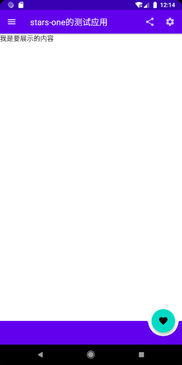
基本使用
使用5個屬性topBar bottomBar floatingActionButton floatingActionButtonPosition isFloatingActionButtonDocked,實現個簡單架構效果
Scaffold(
    topBar = {
        TopAppBar(
            navigationIcon = {
                IconButton(
                    onClick = {}
                ) {
                    Icon(Icons.Filled.Menu, null)
                }
            },
            title = {
                Text("stars-one的測試應用")
            },actions = {
                IconButton(
                    onClick = {}
                ) {
                    Icon(Icons.Filled.Share, null)
                }
                IconButton(
                    onClick = {}
                ) {
                    Icon(Icons.Filled.Settings, null)
                }
            }
        )
    },
    floatingActionButton = {
        FloatingActionButton(onClick = { /*TODO*/ }) {
            Icon(imageVector = Icons.Default.Favorite, contentDescription = null)
        }
    },
    bottomBar = {

        BottomAppBar(cutoutShape = CircleShape) {

        }
    },
    //注意此參數,可以實現圖中那種被裁剪的效果,前提是上面的cutoutShape也有設置
    isFloatingActionButtonDocked = true,
    floatingActionButtonPosition = FabPosition.End

) {
    //這裡是主界面
    Text("我是要展示的內容")
}
效果如下圖所示
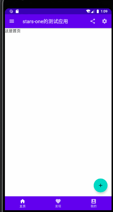
底部導航條
我們在上面的基礎改下即可(主要是bottomAppBar這個參數),代碼如下所示
//當前選擇的NavItem
var selectIndex by remember { mutableStateOf(0) }
val navTextList = listOf("主頁", "發現", "我的")
//圖標
val iconList = listOf(Icons.Default.Home,Icons.Default.Favorite,Icons.Default.AccountBox)
Scaffold(
    topBar = {
        TopAppBar(
            navigationIcon = {
                IconButton(
                    onClick = {}
                ) {
                    Icon(Icons.Filled.Menu, null)
                }
            },
            title = {
                Text("stars-one的測試應用")
            },actions = {
                IconButton(
                    onClick = {}
                ) {
                    Icon(Icons.Filled.Share, null)
                }
                IconButton(
                    onClick = {}
                ) {
                    Icon(Icons.Filled.Settings, null)
                }
            }
        )
    },
    floatingActionButton = {
        FloatingActionButton(onClick = { /*TODO*/ }) {
            Icon(imageVector = Icons.Default.Add, contentDescription = null)
        }
    },
    bottomBar = {

        BottomNavigation() {
            navTextList.forEachIndexed { index, str ->
                BottomNavigationItem(label = {Text(str)},selected = index==selectIndex , onClick = {selectIndex = index },icon = {
                    Icon(imageVector = iconList[index], contentDescription = null)
                })
            }
        }
    },
    //注意此參數,可以實現圖中那種被裁剪的效果,前提是上面的cutoutShape也有設置
    floatingActionButtonPosition = FabPosition.End

) {
    //這裡是主界面
    //根據底部導航選中的下標改變展示的頁面
    when(selectIndex){
        0 -> Text("這是首頁")
        1 -> Text("這是發現")
        2 -> Text("這是我的")
    }

}
效果如下圖所示

帶側邊抽屜
這裡需要注意的是,彈出側邊抽屜是個掛起操作(suspend),所以需要使用到Kotlin中的協程,不過不是涉及太深,我們先知道怎麼用即可,後面有空我再補充協程的用法
這裡主要是測試了帶drawer開頭的那幾個參數,及點擊左上角的菜單按鈕彈出側邊抽屜功能(即對應的點擊事件)
//狀態
val scaffoldState = rememberScaffoldState()
//協程的作用域
val scope = rememberCoroutineScope()
//當前選擇的NavItem
var selectIndex by remember { mutableStateOf(0) }
val navTextList = listOf("主頁", "發現", "我的")
//圖標
val iconList =
    listOf(Icons.Default.Home, Icons.Default.Favorite, Icons.Default.AccountBox)
Scaffold(
    scaffoldState = scaffoldState,
    topBar = {
        TopAppBar(
            navigationIcon = {
                IconButton(
                    onClick = {
                        //使用協程
                        scope.launch {
                            //改變狀態,顯示drawer抽屜
                            scaffoldState.drawerState.open()
                        }
                    }
                ) {
                    Icon(Icons.Filled.Menu, null)
                }
            },
            title = {
                Text("stars-one的測試應用")
            }, actions = {
                IconButton(
                    onClick = {}
                ) {
                    Icon(Icons.Filled.Share, null)
                }
                IconButton(
                    onClick = {}
                ) {
                    Icon(Icons.Filled.Settings, null)
                }
            }
        )
    },
    floatingActionButton = {
        FloatingActionButton(onClick = { /*TODO*/ }) {
            Icon(imageVector = Icons.Default.Add, contentDescription = null)
        }
    },
    bottomBar = {

        BottomNavigation() {
            navTextList.forEachIndexed { index, str ->
                BottomNavigationItem(
                    label = { Text(str) },
                    selected = index == selectIndex,
                    onClick = { selectIndex = index },
                    icon = {
                        Icon(
                            imageVector = iconList[index],
                            contentDescription = null
                        )
                    })
            }
        }
    },
    //注意此參數,可以實現圖中那種被裁剪的效果,前提是上面的cutoutShape也有設置
    floatingActionButtonPosition = FabPosition.End,
    drawerContent = {
        Text("這是抽屜的內容")
    },

    drawerContentColor = Color.Black,
    drawerBackgroundColor = Color.Green,
    drawerGesturesEnabled = true,
    drawerScrimColor = Color.Red,
    drawerShape = RoundedCornerShape(20.dp)

) {
    //這裡是主界面
    //根據底部導航選中的下標改變展示的頁面
    when (selectIndex) {
        0 -> Text("這是首頁")
        1 -> Text("這是發現")
        2 -> Text("這是我的")
    }

}