[UWP] 模仿嗶哩嗶哩的一鍵三連
1. 一鍵三連
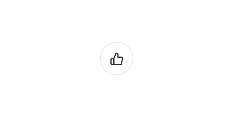
什麼是一鍵三連?
嗶哩嗶哩彈幕網中用戶可以通過長按點贊鍵同時完成點贊、投幣、收藏對UP主表示支持,後UP主多用「一鍵三連」向視頻瀏覽者請求對其作品同時進行點贊、投幣、收藏。
去年在雲之幻大佬的 嗶哩 項目里看到一鍵三連的 UWP 實現,覺得挺有趣的,這次參考它的代碼重新實現一次,最終成果如下:

下面這些是一鍵三連的核心功能:
- 可以控制並顯示進度
- 有普通狀態和完成狀態
- 可以點擊或長按
- 當切換到完成狀態時彈出寫泡泡
- 點擊切換狀態
- 長按 2 秒鐘切換狀態,期間有進度顯示
這篇文章將介紹如何使用自定義控件實現上面的功能。寫簡單的自定義控件的時候,我推薦先寫完代碼,然後再寫控件模板,但這個控件也適合一步步增加功能,所以這篇文章用逐步增加功能的方式介紹如何寫這個控件。
2. ProgressButton
萬事起頭難,做控件最難的是決定控件名稱。不過反正也是玩玩的 Demo,就隨便些用 ProgressButton 吧,因為有進度又可以點擊。
第二件事就是決定這個按鈕繼承自哪個控件,可以選擇繼承 Button 或 RangeBase 以減少需要自己實現的功能。因為長按這個需求破壞了點擊這個行為,所以還是放棄 Button 選擇 RangeBase 比較好。然後再加上 Content 屬性,控件的基礎代碼如下:
[ContentProperty(Name = nameof(Content))]
public partial class ProgressButton : RangeBase
{
    public ProgressButton()
    {
        DefaultStyleKey = typeof(ProgressButton);
    }

    public object Content
    {
        get => (object)GetValue(ContentProperty);
        set => SetValue(ContentProperty, value);
    }
}
在控件模板中用一個 CornerRadius 很大的 Border 模仿圓形邊框,ContentControl 顯示 Content,RadialProgressBar 顯示進度,控件模板的大致結構如下:
<ControlTemplate TargetType="local:ProgressButton">
    <Grid x:Name="RootGrid">
        <Border x:Name="RootBorder"
                        Margin="{TemplateBinding Padding}"
                        Background="{TemplateBinding Background}"
                        BorderBrush="{TemplateBinding BorderBrush}"
                        BorderThickness="1"
                        CornerRadius="100">
            <ContentControl x:Name="ContentControl"
                                    HorizontalAlignment="{TemplateBinding HorizontalContentAlignment}"
                                    VerticalAlignment="{TemplateBinding VerticalContentAlignment}"
                                    Content="{TemplateBinding Content}"
                                    Foreground="{TemplateBinding Foreground}" />
        </Border>
        <control:RadialProgressBar x:Name="PressProgressBar"
                                           Background="Transparent"
                                           Foreground="{StaticResource PrimaryColor}"
                                           Maximum="{TemplateBinding Maximum}"
                                           Minimum="{TemplateBinding Minimum}"
                                           Outline="Transparent"
                                           Value="{TemplateBinding Value}" />
    </Grid>
</ControlTemplate>
這時候的調用方式及效果如下所示:
<lab:ProgressButton x:Name="LikeButton" Content="" />
<lab:ProgressButton x:Name="CoinButton" Content="" Value="0.5" />
<lab:ProgressButton x:Name="FavoriteButton" Content="" Value="1" />

3. 狀態
有了上面的代碼,後面的功能只需要按部就班地一個個添加上去。我從以前的代碼里抄來狀態相關的代碼。雖然定義了這麼多狀態備用,其實我也只用到 Idle 和 Completed,其它要用到的話可以修改 ControlTemplate。
public enum ProgressState
{
    Idle,
    InProgress,
    Completed,
    Faulted,
}
- Idle,空閑的狀態。
- InProgress,開始的狀態,暫時不作處理。
- Completed,完成的狀態。
- Faulted,出錯的狀態,暫時不作處理。
在控件模板中添加一個粉紅色的帶一個同色陰影的圓形背景,其它狀態下隱藏,在切換到 Completed 狀態時顯示。為了好看,還添加了 ImplictAnimation 控制淡入淡出。
<ContentControl x:Name="CompletedElement"
                Template="{StaticResource CompletedTemplate}"
                Visibility="Collapsed">
    <animations:Implicit.HideAnimations>
        <animations:OpacityAnimation SetInitialValueBeforeDelay="True"
                                     From="1"
                                     To="0"
                                     Duration="0:0:0.3" />
    </animations:Implicit.HideAnimations>
    <animations:Implicit.ShowAnimations>
        <animations:OpacityAnimation SetInitialValueBeforeDelay="True"
                                     From="0"
                                     To="1"
                                     Duration="0:0:0.6" />
    </animations:Implicit.ShowAnimations>
</ContentControl>
在 VisualStateManager 中加入 ProgressStates 這組狀態,只需要控制 Completed 狀態的 Setters,顯示粉紅色的背景,隱藏邊框,文字變白色。
<VisualStateGroup x:Name="ProgressStates">
    <VisualState x:Name="Idle" />
    <VisualState x:Name="InProgress" />
    <VisualState x:Name="Completed">
        <VisualState.Setters>
            <Setter Target="RootBorder.BorderBrush" Value="Transparent" />
            <Setter Target="ContentControl.Foreground" Value="White" />
            <Setter Target="CompletedElement.Visibility" Value="Visible" />
        </VisualState.Setters>
    </VisualState>
    <VisualState x:Name="Faulted" />
</VisualStateGroup>

4. Button 的 CommonStates
作為一個 Button,按鈕的 PointOver 和 Pressed 狀態當然必不可少,這些邏輯我參考了 真篇文章 最後一部分代碼(不過我沒有加入 Click 事件)。在控件模板中也製作了最簡單的處理:
<VisualStateGroup x:Name="CommonStates">
    <VisualState x:Name="PointerOver">
        <VisualState.Setters>
            <Setter Target="ContentControl.Opacity" Value="0.8" />
        </VisualState.Setters>
    </VisualState>
    <VisualState x:Name="Pressed">
        <VisualState.Setters>
            <Setter Target="ContentControl.Opacity" Value="0.6" />
        </VisualState.Setters>
    </VisualState>
</VisualStateGroup>
5. 氣泡
氣泡動畫來源於火火的 BubbleButton,它封裝得很優秀,ProgressButton 只需要在 Completed 狀態下設置 BubbleView.IsBubbing = true 即可觸發氣泡動畫,這大大減輕了 XAML 的工作:
<Setter Target="BubbleView.IsBubbing" Value="True" />

<bubblebutton:BubbleView x:Name="BubbleView"
                         HorizontalAlignment="Stretch"
                         VerticalAlignment="Stretch"
                         Foreground="{StaticResource PrimaryColor}" />
6. Tapped 和 Holding
因為要實現長按功能,所以我沒有實現 Button 的 Click,而是使用了 GestureRecognizer 的 Tapped 和 Holding,訂閱這兩個事件,觸發後重新拋出。
private GestureRecognizer _gestureRecognizer = new GestureRecognizer();

public ProgressButton()
{
    _gestureRecognizer.GestureSettings = GestureSettings.HoldWithMouse | GestureSettings.Tap | GestureSettings.Hold;
    _gestureRecognizer.Holding += OnGestureRecognizerHolding;
    _gestureRecognizer.Tapped += OnGestureRecognizerTapped;
}

public event EventHandler<HoldingEventArgs> GestureRecognizerHolding;
public event EventHandler<TappedEventArgs> GestureRecognizerTapped;

protected override void OnPointerPressed(PointerRoutedEventArgs e)
{
    // SOME CODE
    var points = e.GetIntermediatePoints(null);
    if (points != null && points.Count > 0)
    {
        _gestureRecognizer.ProcessDownEvent(points[0]);
        e.Handled = true;
    }
}

protected override void OnPointerReleased(PointerRoutedEventArgs e)
{
    // SOME CODE
    var points = e.GetIntermediatePoints(null);
    if (points != null && points.Count > 0)
    {
        _gestureRecognizer.ProcessUpEvent(points[0]);
        e.Handled = true;
        _gestureRecognizer.CompleteGesture();
    }
}

protected override void OnPointerMoved(PointerRoutedEventArgs e)
{
    // SOME CODE
    _gestureRecognizer.ProcessMoveEvents(e.GetIntermediatePoints(null));
}

private void OnGestureRecognizerTapped(GestureRecognizer sender, TappedEventArgs args)
{
    GestureRecognizerTapped?.Invoke(this, args);
}

private void OnGestureRecognizerHolding(GestureRecognizer sender, HoldingEventArgs args)
{
    GestureRecognizerHolding?.Invoke(this, args);
}
由於一鍵三連屬於業務方面的功能(要聯網、檢查狀態、還可能回退),不屬於控件應該提供的功能,所以 ProgressButton 只需要實現到這一步就完成了。
7. 實現一鍵三連
終於要實現一鍵三連啦。首先創建三個 ProgressButton, 然後互相雙向綁定 Value 的值並訂閱事件:
<lab:ProgressButton x:Name="LikeButton"
Content=""
GestureRecognizerHolding="OnGestureRecognizerHolding"
GestureRecognizerTapped="OnGestureRecognizerTapped" />
<lab:ProgressButton x:Name="CoinButton"
Content=""
GestureRecognizerHolding="OnGestureRecognizerHolding"
GestureRecognizerTapped="OnGestureRecognizerTapped"
Value="{Binding ElementName=LikeButton, Path=Value}" />
<lab:ProgressButton x:Name="FavoriteButton"
Content=""
GestureRecognizerHolding="OnGestureRecognizerHolding"
GestureRecognizerTapped="OnGestureRecognizerTapped"
Value="{Binding ElementName=LikeButton, Path=Value}" />
處理 Tapped 的代碼很簡單,就是反轉一下狀態:
private void OnGestureRecognizerTapped(object sender, Windows.UI.Input.TappedEventArgs e)
{
    var progressButton = sender as ProgressButton;
    if (progressButton.State == ProgressState.Idle)
        progressButton.State = ProgressState.Completed;
    else
        progressButton.State = ProgressState.Idle;
}
Holding 的代碼就複雜一些,設置一個動畫的 Taget 然後啟動動畫,動畫完成後把所有 ProgressButton 的狀態改為 Completed,最後效果可以參考文章開頭的 gif:
private void OnGestureRecognizerHolding(object sender, Windows.UI.Input.HoldingEventArgs e)
{
    var progressButton = sender as ProgressButton;
    if (e.HoldingState == HoldingState.Started)
    {
        if (!_isAnimateBegin)
        {
            _isAnimateBegin = true;
            (_progressStoryboard.Children[0] as DoubleAnimation).From = progressButton.Minimum;
            (_progressStoryboard.Children[0] as DoubleAnimation).To = progressButton.Maximum;
            Storyboard.SetTarget(_progressStoryboard.Children[0] as DoubleAnimation, progressButton);
            _progressStoryboard.Begin();
        }
    }
    else
    {
        _isAnimateBegin = false;
        _progressStoryboard.Stop();
    }
}

private void OnProgressStoryboardCompleted(object sender, object e)
{
    LikeButton.State = ProgressState.Completed;
    CoinButton.State = ProgressState.Completed;
    FavoriteButton.State = ProgressState.Completed;
}
8. 最後
很久沒有認真寫 UWP 的博客了,我突然有了個大膽的想法,在這個時間點,會不會就算我胡說八道都不會有人認真去驗證我寫的內容?畢竟現在寫 UWP 的人又不多。不過放心,我對 UWP 是認真的,我保證我是個誠實的男人。
不過這個一鍵三連功能做出來後,又好像,完全沒機會用到嘛。難得都做出來了,就用來皮一下。


