完美實現CSS垂直居中的11種方法
- 2020 年 11 月 11 日
- 筆記
在做前端項目時CSS的水平居中我們經常使用,但有時還會用到CSS垂直居中,對於小白來說這個就有些難度了,下面看一下我是如何實現的
本人前端小白,正在做一個小程序開發的項目,css樣式調整搞的頭都大了。關於垂直居中,已嘗試了文中的幾個垂直居中css樣式設置,已成功解決我的問題,故轉載來備份下。
CSS垂直居中11種實現方法分別如下:
1. 使用絕對定位和負外邊距對塊級元素進行垂直居中
html代碼:
 1 <div id="box">
 2   <div id="child">我是測試DIV</div>
 3 </div></pre>
 4 css代碼:
 5 #box {
 6  width: 300px;
 7  height: 300px;
 8  background: #ddd;
 9  position: relative;
10 }
11 #child {
12  width: 150px;
13  height: 100px;
14  background: orange;
15  position: absolute; top: 50%;
16  margin: -50px 0 0 0;
17  line-height: 100px;
18 }
運行結果如下:
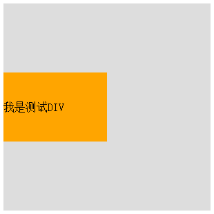
這個方法兼容性不錯,但是有一個小缺點:必須提前知道被居中塊級元素的尺寸,否則無法準確實現垂直居中。
2. 使用絕對定位和transform
html代碼:
 1 <div id="child"> 我是一串很長很長很長很長很長很長很長很長很長很長很長很長很長很長很長很長的文本 </div></pre>
 2 css代碼:
 3 #box {
 4  width: 300px;
 5  height: 300px;
 6  background: #ddd;
 7  position: relative;
 8 }
 9 #child {
10  background: #93BC49;
11  position: absolute;
12  top: 50%;
13  transform: translate(0, -50%);
14 }
運行結果如下:
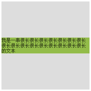
這種方法有一個非常明顯的好處就是不必提前知道被居中元素的尺寸了,因為transform中translate偏移的百分比就是相對於元素自身的尺寸而言的。
3. 另外一種使用絕對定位和負外邊距進行垂直居中的方式
html代碼:
 1 <div id="box">
 2   <div id="child">我也是個測試DIV</div>
 3 </div></pre>
 4 css代碼:
 5 #box {
 6  width: 300px;
 7  height: 300px;
 8  background: #ddd;
 9  position: relative;
10 }
11 #child {
12  width: 50%;
13  height: 30%;
14  background: pink;
15  position: absolute;
16  top: 50%;
17  margin: -15% 0 0 0;
18 }
運行結果如下:

這種方式的原理實質上和前兩種相同。補充的一點是:margin的取值也可以是百分比,這時這個值規定了該元素基於父元素尺寸的百分比,可以根據實際的使用場景來決定是用具體的數值還是用百分比。
4. 絕對定位結合margin: auto
html代碼:
 1 <div id="box">
 2   <div id="child">獃獃今天退役了(。﹏。)</div>
 3 </div></pre>
 4 css代碼:
 5 #box {
 6  width: 300px;
 7  height: 300px;
 8  background: #ddd;
 9  position: relative;
10 }
11 #child {
12  width: 200px;
13  height: 100px;
14  background: #A1CCFE;
15  position: absolute; top: 0;
16  bottom: 0;
17  margin: auto;
18  line-height: 100px;
19 }
運行結果如下:
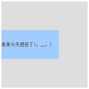
這種實現方式的兩個核心是:把要垂直居中的元素相對於父元素絕對定位,top和bottom設為相等的值,我這裡設成了0,當然你也可以設為99999px或者-99999px無論什麼,只要兩者相等就行,這一步做完之後再將要居中元素的margin設為auto,這樣便可以實現垂直居中了。
被居中元素的寬高也可以不設置,但不設置的話就必須是圖片這種自身就包含尺寸的元素,否則無法實現。
5. 使用padding實現子元素的垂直居中
html代碼:
 1 <div id="box">
 2   <div id="child">今天西安的霾嚴重的嚇人,剛看了一眼PM2.5是422</div>
 3 </div>
 4 css代碼:
 5 #box {
 6  width: 300px;
 7  background: #ddd;
 8  padding: 100px 0;
 9 }
10 #child {
11  width: 200px;
12  height: 100px;
13  background: #F7A750;
14  line-height: 50px;
15 }
運行結果如下:
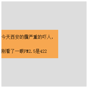
這種實現方式非常簡單,就是給父元素設置相等的上下內邊距,則子元素自然是垂直居中的,當然這時候父元素是不能設置高度的,要讓它自動被填充起來,除非設置了一個正好等於上內邊距+子元素高度+下內邊距的值,否則無法精確的垂直居中。
這種方式看似沒有什麼技術含量,但其實在某些場景下也是非常好用的。
6. 設置第三方基準
html代碼:
 1 <div id="box">
 2   <div id="base"></div>
 3   <div id="child">今天寫了第一篇博客,希望可以堅持寫下去!
 4   </div>
 5 </div>
 6 css代碼:
 7 #box {
 8  width: 300px;
 9  height: 300px;
10  background: #ddd;
11 }
12 #base {
13  height: 50%;
14  background: #AF9BD3;
15 }
16 #child {
17  height: 100px;
18  background: rgba(131, 224, 245, 0.6);
19  line-height: 50px;
20  margin-top: -50px;
21 }
運行結果如下:
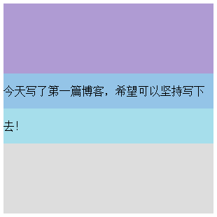
這種方式也非常簡單,首先設置一個高度等於父元素高度一半的第三方基準元素,那麼此時該基準元素的底邊線自然就是父元素縱向上的中分線,做完這些之後再給要垂直居中的元素設置一個margin-top,值的大小是它自身高度的一半取負,則實現垂直居中。
7. 使用flex布局
html代碼:
1 <div id="box">霧霾天氣,太久沒有打球了</div>
2 css代碼:
3 #box {
4  width: 300px;
5  height: 300px;
6  background: #ddd;
7  display: flex;
8  align-items: center;
9 }
運行結果如下:

這種方式同樣適用於塊級元素:
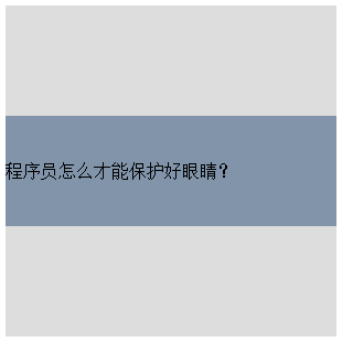
html代碼:
 1 <div id="box">
 2   <div id="child"> 程序員怎麼才能保護好眼睛? </div>
 3 </div>
 4 css代碼:
 5 #box {
 6  width: 300px;
 7  height: 300px;
 8  background: #ddd;
 9  display: flex;
10  align-items: center;
11 }
12 #child {
13  width: 300px;
14  height: 100px;
15  background: #8194AA;
16  line-height: 100px;
17 }
運行結果如下:
flex也就是flexible,意為靈活的、柔韌的、易彎曲的。
元素可以通過設置display:flex;將其指定為flex布局的容器,指定好了容器之後再為其添加align-items屬性,該屬性定義項目在交叉軸(這裡是縱向軸)上的對齊方式,可能的取值有五個,分別如下:
flex-start::交叉軸的起點對齊;
flex-end:交叉軸的終點對齊;
center:交叉軸的中點對齊;
baseline:項目第一行文字的基線對齊;
stretch(該值是默認值):如果項目沒有設置高度或者設為了auto,那麼將佔滿整個容器的高度。
8. 第二種使用彈性布局的方式
html代碼:
 1 <div id="box">
 2   <div id="child"> 答案當然是多用綠色的背景哈哈 </div>
 3 </div>
 4 css代碼:
 5 #box {
 6  width: 300px;
 7  height: 300px;
 8  background: #ddd;
 9  display: flex;
10  flex-direction: column;
11  justify-content: center;
12 }
13 #child {
14  width: 300px;
15  height: 100px;
16  background: #08BC67;
17  line-height: 100px;
18 }
運行結果如下:
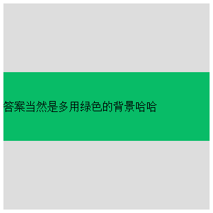
這種方式也是首先給父元素設置display:flex,設置好之後改變主軸的方向flex-direction: column,該屬性可能的取值有四個,分別如下:
row(該值為默認值):主軸為水平方向,起點在左端;
row-reverse:主軸為水平方向,起點在右端;
column:主軸為垂直方向,起點在上沿;
column-reverse:主軸為垂直方向,起點在下沿。
justify-content屬性定義了項目在主軸上的對齊方式,可能的取值有五個,分別如下(不過具體的對齊方式與主軸的方向有關,以下的值都是假設主軸為從左到右的):
flex-start(該值是默認值):左對齊;
flex-end:右對齊;
center:居中對齊;
space-between:兩端對齊,各個項目之間的間隔均相等;
space-around:各個項目兩側的間隔相等。
9. 使用 line-height 對單行文本進行垂直居中
html代碼:
1 <div id="box"> 我是一段測試文本 </div>
2 css代碼:
3 #box{
4  width: 300px;
5  height: 300px;
6  background: #ddd;
7  line-height: 300px;
8 }
運行結果如下:
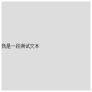
這裡有一個小坑需要大家注意:line-height(行高) 的值不能設為100%,我們來看看官方文檔中給出的關於line-height取值為百分比時候的描述:基於當前字體尺寸的百分比行間距。所以大家就明白了,這裡的百分比並不是相對於父元素尺寸而言,而是相對於字體尺寸來講的。
10. 使用 line-height 和 vertical-align 對圖片進行垂直居中
html代碼:
 1 <div id="box">
 2   <img src="duncan.jpeg">
 3 </div>
 4 css代碼:
 5 #box{
 6  width: 300px;
 7  height: 300px;
 8  background: #ddd;
 9  line-height: 300px;
10 }
11 #box img {
12  vertical-align: middle;
13 }
運行結果如下:
vertical-align並不像看起來那樣天真無邪童叟無欺,以後會單獨拎出來專門寫一篇。
11. 使用 display 和 vertical-align 對容器里的文字進行垂直居中
html代碼:
 1 <div id="box">
 2   <div id="child">我也是一段測試文本</div>
 3 </div>
 4 css代碼:
 5 #box {
 6  width: 300px;
 7  height: 300px;
 8  background: #ddd;
 9  display: table;
10 }
11 #child {
12  display: table-cell;
13  vertical-align: middle;
14 }
運行結果如下:

這裡關於vertical-align啰嗦兩句:vertical-align屬性只對擁有valign特性的html元素起作用,例如表格元素中的<td><th>等等,而像<div><span>這樣的元素是不行的。
valign屬性規定單元格中內容的垂直排列方式,語法:<td valign=”value”>,value的可能取值有四種:
top:對內容進行上對齊
middle:對內容進行居中對齊
bottom:對內容進行下對齊
baseline:基線對齊
關於baseline值:基線是一條虛構的線。在一行文本中,大多數字母以基線為基準。baseline 值設置行中的所有表格數據都分享相同的基線。該值的效果常常與 bottom 值相同。不過,如果文本的字號各不相同,那麼 baseline 的效果會更好。


