网易云UI模仿–>侧边栏
侧边栏
效果图
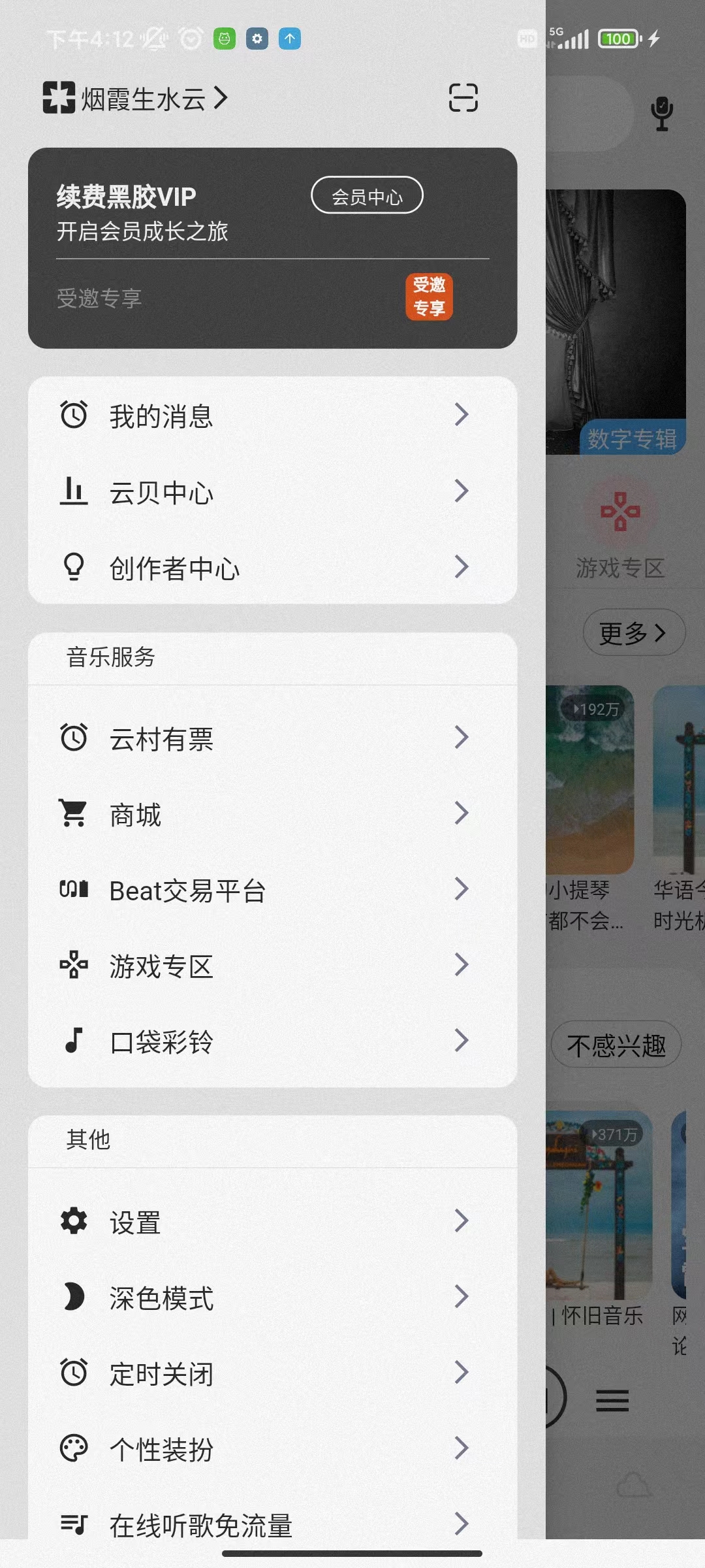
界面分解
可以看到从上到下的流式布局。需要一个Column来容纳,并且在往上滑动的过程中顶部的个人信息是不会动的。所以接下来需要将剩余部分占满使用Flexibel组件。
实现
个人信息
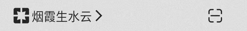
从左到右的布局,最外面使用一个Container包裹
Container(
  //外间距,不添加会紧挨着顶部
  padding: EdgeInsets.fromLTRB(20.w, 40.h, 20.w, 0),
  //行布局
  child: Row(
    children: [
      //头像,这里使用图标替代,自行更换
      Icon(Icons.pages),
      //呢称
      Text("烟霞生水云"),
      //呢称后面的箭头图标
      Icon(
        Icons.arrow_forward_ios_outlined,
        //设置图标的大小
        size: 16,
      ),
      //占位组件,不赋予子组件就只能占位
      SizedBox(
        width: 110.w,
      ),
      //最后的扫描图标,这里是自定义的,个人可将其修改为官方自带图标
      Icon(Iconfont.saoyisao)
    ],
  ),
)
会员卡片
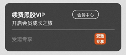
总体为列,但是列里面又嵌套着行。其中会员中心按钮和会员专享用了自定义组件。
Container(
  //设置外边界
  padding: EdgeInsets.all(15.w),
  //容器装饰器
  decoration: BoxDecoration(
    //设置背景色,当BoxDecoration中有color属性时,
    //Container中就不能定义该属性,否则报错。
    color: AppColors.heijiao,
    //设置圆角
    borderRadius: BorderRadius.all(Radius.circular(10.h)),
  ),
  //总体为列布局
  child: Column(
    //列布局对齐方式,在从轴的开始处对齐
    //列布局的主轴方向为从上到下,从轴方向为从左到右。
    //行布局的主轴方向为从左到右,从轴方向为从上到下。
    crossAxisAlignment: CrossAxisAlignment.start,
    children: [
      //行布局
      Row(
        //行中子组件
        children: [
          Text(
            '续费黑胶VIP',
            //Text样式
            style: TextStyle(
              //颜色
              color: AppColors.secondaryElement,
              //字重,此处为加粗
              fontWeight: FontWeight.bold,
            ),
          ),
          //占位组件
          SizedBox(
            //只指定了宽度
            width: 60.w,
          ),
          //自定义的圆弧框线按钮,一个需要显示的字符串和一个动作方法
          btnTextButtonWidget(
            buttonText: "会员中心",
            onPressed: () {},
          ),
        ],
      ),
      Text(
        "开启会员成长之旅",
        //Text样式
        style: TextStyle(
          //颜色
          color: AppColors.secondaryElement,
          //字号
          fontSize: 12,
        ),
      ),
      //分割线
      Divider(
        //分割线颜色
        color: AppColors.secondaryElement,
      ),
      //行布局
      Row(
        //子组件
        children: [
          Text(
            "受邀专享",
            style: TextStyle(
              color: AppColors.thirdElementText,
              fontSize: 12,
            ),
          ),
          SizedBox(
            width: 140.w,
          ),
          //自定义的章印传入两行文字。
          textTagOne(one: '受邀', two: '专享')
        ],
      )
    ],
  ),
)
自定义圆弧框线按钮

///带边框圆角按钮,取消高度受限
Widget btnTextButtonWidget({
  //必须要的参数,使用required修饰
  required VoidCallback onPressed,
  double width = 60,
  double height = 20,
  required String buttonText,
}) {
  //返回的组件
  return Container(
    width: width.w,
    height: height.h,
    //容器装饰属性
    decoration: BoxDecoration(
      //边框圆角
      borderRadius: BorderRadius.all(Radius.circular(15.h)),
      //框线,框线颜色,还可以设置粗细
      border: Border.all(color: AppColors.primaryBackground),
    ),
    //文本按钮
    child: TextButton(
      //按钮样式
      style: ButtonStyle(
        //取消高度限制,不取消,按钮固定高度,UI达不到预期
        visualDensity: VisualDensity.compact,
      ),
      child: Text(
        //传入的字符串参数
        buttonText,
        //字体样式
        style: TextStyle(color: AppColors.secondaryElement, fontSize: 10),
      ),
      //传入的点击事件方法
      onPressed: onPressed,
    ),
  );
}
自定义小章印

///红色章印
Widget textTagOne(
    {
    //第一行文本
    required String one,
    //第二行文本
    required String two,
    //宽高
    double hw = 25}) {
  return Container(
    //方形,宽高一致
    height: hw.h,
    width: hw.h,
    //容器装饰属性
    decoration: BoxDecoration(
      //背景颜色
      color: AppColors.tagText,
      //圆角弧度
      borderRadius: BorderRadius.all(Radius.circular(5.h)),
    ),
    //子组件列布局
    child: Column(
      children: [
        //第一行文本
        Text(
          //传入的第一行文本参数
          one,
          //Text组件样式
          style: TextStyle(
            //字体大小,字号
            fontSize: 9,
            //字体粗细,字重,文字加粗
            fontWeight: FontWeight.bold,
            //字体颜色
            color: AppColors.primaryBackground,
          ),
        ),
        //第二行文本同上
        Text(
          two,
          style: TextStyle(
              fontSize: 9,
              fontWeight: FontWeight.bold,
              color: AppColors.primaryBackground),
        ),
      ],
    ),
  );
}
未完待续…


