使用 media 实现响应式布局
- 2019 年 10 月 3 日
- 筆記
最近工作有一个需求是将一个界面改为响应式布局,由于UI还没有给设计,于是自己先查了一下资料做了一个demo。其实实现响应式布局的方式有很多,利用media实现就是其中一种,但是他也有一些缺点,比如说要对特别的屏幕单独定制样式代码。在我的代码里面我把屏幕分为了三种,代表为iPhone、iPad、PC三种,分别对应着三种不同的样式。
目前可以实现:
- 根据界面大小自动调整布局
- 界面宽度小到一定程度时会隐藏header,将其放到侧拉栏中
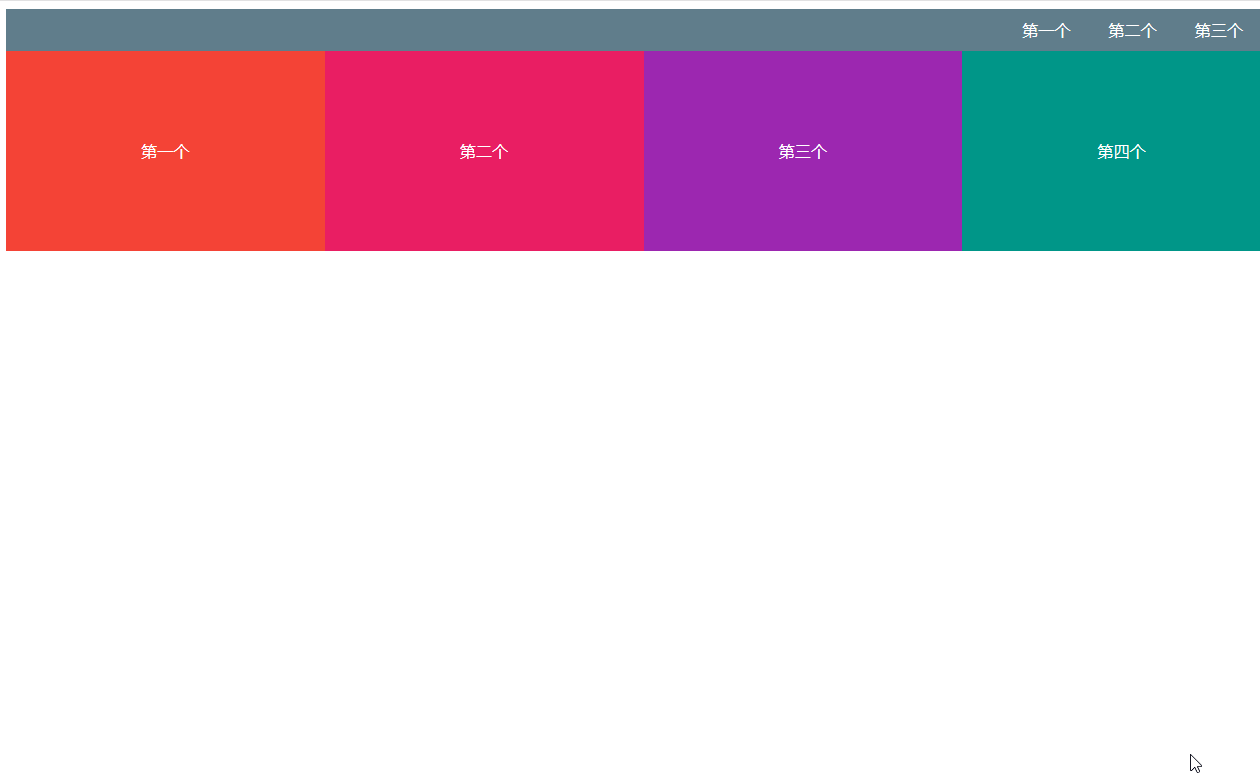
效果图如下(代码会在下面全部放上来):
media使用
原理
media简单来说就是一种查询工具,加入说你想知道打开你网页的屏幕宽度是768px的时候才使用这个样式,这个时候你就可以这样写:
@media screen and (max-width:768px){ body{ background-color: black } }这个代码的效果就是当前界面的宽度小于768px的时候,将网页背景变成黑色。screen是用于电脑屏幕、平板电脑、智能手机等。对于@media的更多媒体类型如下:
| 值 | 描述 |
|---|---|
| all | 用于所有设备 |
| 用于打印机或打印预览 | |
| screen | 用于电脑屏幕、平板电脑、智能手机等 |
| speech | 用于屏幕阅读器等发声设备 |
在做响应式布局的时候我主要用到max-width和min-width两种属性,min-width的作用于max-width的作用相反。
应用
<link rel="stylesheet" href="./index.css"> <link rel="stylesheet" href="./index_ipad.css" media="screen and (max-width:1200px)"> <link rel="stylesheet" href="./index_mobile.css" media="screen and (max-width:768px)">由我的代码可以得知我将页面分为三种大小,分别为(1200, +∞),(768, 1200),(0, 768),这个分类我是参照bootstrap来分的。
首先引入index.css,这也是你的电脑打开时的默认样式,当你的电脑宽度逐渐减小时,就会开始应用index_ipad.css这个样式文件,在这个文件中并不是将index.css的样式代码全部重写了一遍,而是把需要更改样式的代码做了编写。
举个例子,比如说我index.css中有四个方块,默认布局是float布局,全部排在一行,但是当页面宽度变为ipad大小是页面方块就会变成两行,原理是改一下方块的宽度。具体实现代码如下:
/* index.css */ .board { display: flex; align-items: center; justify-content: center; height: 200px; float: left; width: 25%; color: white } .first { background-color: #F44336 } .second { background-color: #E91E63 } .third { background-color: #9C27B0 } .fourth { background-color: #009688 }/* index_ipad.css */ .first, .second, .third, .fourth { width: 50%; }侧拉栏
侧拉栏的原理其实并不难,就是先写一个div,保持与header元素相同,然后再设置其left属性,使其隐藏,通过js操作其left,将其显示出来。
<div class="nav"> <ul> <li> <a>第一个</a> </li> <li> <a>第二个</a> </li> <li> <a>第三个</a> </li> </ul> </div>.nav { position: absolute; z-index: 11; left: -10rem; top: 0; width: 10rem; height: 100%; background: #607D8B; }window.onload = function() { let btn = document.getElementsByClassName('menu')[0] let nav = document.getElementsByClassName('nav')[0] // 改变侧拉栏状态 btn.addEventListener('click', function() { nav.style.left = nav.style.left == '-10rem' || nav.style.left.length == 0 ? 0 : '-10rem'; }, false); }全部代码
<!-- index.html --> <!DOCTYPE html> <html lang="en"> <head> <meta charset="UTF-8"> <meta name="viewport" content="width=device-width, initial-scale=1.0"> <meta http-equiv="X-UA-Compatible" content="ie=edge"> <title>响应式布局</title> <link rel="stylesheet" href="./index.css"> <link rel="stylesheet" href="./index_ipad.css" media="screen and (max-width:1200px)"> <link rel="stylesheet" href="./index_mobile.css" media="screen and (max-width:768px)"> <script src="./index.js"></script> </head> <body> <div class="nav"> <ul> <li> <a>第一个</a> </li> <li> <a>第二个</a> </li> <li> <a>第三个</a> </li> </ul> </div> <nav> <img src="./img/菜单.png" alt="菜单" class="menu"> <a href="#">第一个</a> <a href="#">第二个</a> <a href="#">第三个</a> </nav> <div> <div class="board first"> 第一个 </div> <div class="board second"> 第二个 </div> <div class="board third"> 第三个 </div> <div class="board fourth"> 第四个 </div> </div> </body> </html>/* index.css */ .board { display: flex; align-items: center; justify-content: center; height: 200px; float: left; width: 25%; color: white } .first { background-color: #F44336 } .second { background-color: #E91E63 } .third { background-color: #9C27B0 } .fourth { background-color: #009688 } nav { background-color: #607D8B; text-align: right; height: 5vh; display: flex; align-items: center; justify-content: right } a { text-decoration-line: none; color: white; margin-right: 3% } .menu { width: 1.5rem; margin-left: 0px; display: none; cursor: pointer; } ul, li { list-style: none; padding: 0; margin: 0; } .nav { position: absolute; z-index: 11; left: -10rem; top: 0; width: 10rem; height: 100%; background: #607D8B; } .nav { transition: left linear .1s; } .nav a { display: block; padding: 1em 0; border-bottom: 1px solid #888; font-size: 16px; color: #eee; text-align: center; } .nav li { cursor: pointer; }/* index_mobile.css */ .first, .second, .third, .fourth { float: none; width: 100%; } .menu { display: block; margin-right: 2%; } a { display: none }/* index_ipad.css */ .first, .second, .third, .fourth { width: 50%; } .menu { display: block; margin-right: 2%; } a { display: none }//index.js window.onload = function() { let btn = document.getElementsByClassName('menu')[0] let nav = document.getElementsByClassName('nav')[0] btn.addEventListener('click', function() { nav.style.left = nav.style.left == '-10rem' || nav.style.left.length == 0 ? 0 : '-10rem'; }, false); }